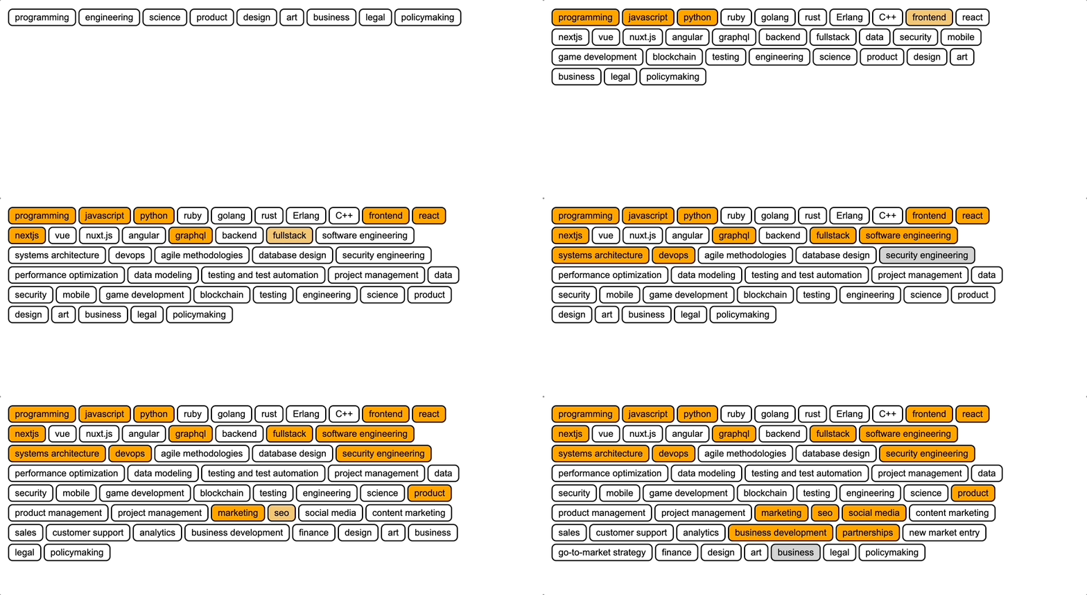
https://github.com/achadha235/react-tree-select
A React component that renders a tree of selectable options
https://github.com/achadha235/react-tree-select
react typescript
Last synced: 3 months ago
JSON representation
A React component that renders a tree of selectable options
- Host: GitHub
- URL: https://github.com/achadha235/react-tree-select
- Owner: achadha235
- Created: 2024-03-31T14:01:40.000Z (over 1 year ago)
- Default Branch: main
- Last Pushed: 2024-03-31T16:59:18.000Z (over 1 year ago)
- Last Synced: 2025-03-09T10:33:44.270Z (4 months ago)
- Topics: react, typescript
- Language: TypeScript
- Homepage: https://main--66096c98835a62cb2461bc8e.chromatic.com/
- Size: 89.8 KB
- Stars: 1
- Watchers: 1
- Forks: 0
- Open Issues: 0
-
Metadata Files:
- Readme: README.md
Awesome Lists containing this project
README
# react-tree-select
A very simple component to select options organized in a tree structure
## [👉 Try it out](https://main--66096c98835a62cb2461bc8e.chromatic.com/?path=/docs/example-treeselect--docs)

## Install
```
pnpm add @achadha235/react-tree-select
```
## Usage
```ts
import React, { useState } from "react";
// Default styles for the component
import "@achadha235/react-tree-select/style"
import { TreeSelect } from "@achadha235/react-tree-select"
const tags = [
"Tag 1",
"Tag 2",
{
value: "Tag 3",
subtags: [
"Tag 3.1",
"Tag 3.2",
{
value: "Tag 3.3",
subtags: ["Tag 3.3.1", "Tag 3.3.2"],
},
],
},
];
export function MyComponent() {
const [selected, setSelected] = useState({});
return (
setSelected(newSelected)}
selected={selected}
/>
);
}
const styles = {
container: {
display: "flex",
flexWrap: "wrap",
gap: 2,
},
};
```
## Customizing Styles
The default styles can be imported into your project using the import below
```
import "@achadha235/react-tree-select/style"
```
However, if you'd like to customize the styles, you can include your own CSS. Just override the following classes to change the styles.
```css
.tree-select {
font-family: Arial, Helvetica, sans-serif;
}
.tree-select.tag {
border: 2px solid black;
border-radius: 8px;
transition: all;
padding: 4px 10px;
background-color: white;
cursor: pointer;
}
.tree-select.tag.active {
background-color: orange;
}
.tree-select.tag:hover {
background-color: lightgray;
}
.tree-select.tag.active:hover {
background-color: rgb(243, 200, 118);
}
.tree-select.tag:active {
background-color: rgb(243, 200, 118);
}
```
## Avaliable Props
| prop | description | type |
|------------ |-------------------------------------------------------------------------------- |-------------------------------------------- |
| selected | An object where the options are keys and values are true if they are selected | Record |
| onSelected | Callback that is triggered when the selected options are changed | (updated: Record) => void |
| tags | An nested array containing all the available options | Array