https://github.com/activewidgets/react
Virtualized React Data Grid
https://github.com/activewidgets/react
data-grid data-table datagrid datatable grid react scrolling table virtual virtualized
Last synced: 8 months ago
JSON representation
Virtualized React Data Grid
- Host: GitHub
- URL: https://github.com/activewidgets/react
- Owner: activewidgets
- License: mit
- Created: 2018-02-08T08:53:32.000Z (about 8 years ago)
- Default Branch: master
- Last Pushed: 2023-04-30T18:49:20.000Z (almost 3 years ago)
- Last Synced: 2025-07-07T07:05:10.599Z (9 months ago)
- Topics: data-grid, data-table, datagrid, datatable, grid, react, scrolling, table, virtual, virtualized
- Language: JavaScript
- Homepage: https://activewidgets.com/react/data-grid/
- Size: 1.26 MB
- Stars: 2
- Watchers: 2
- Forks: 0
- Open Issues: 0
-
Metadata Files:
- Readme: README.md
- License: LICENSE
Awesome Lists containing this project
README
###
# ActiveWidgets/React • Datagrid
[](https://www.npmjs.com/package/@activewidgets/react "View this project on npm")
[](https://www.npmjs.com/package/@activewidgets/react "npm package downloads/month")
[](https://github.com/activewidgets/react/issues "See Github issues")
[](https://github.com/activewidgets/react "Open Github repo")
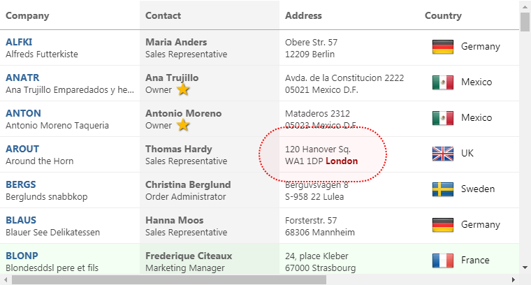
ActiveWidgets is a multi-framework UI component library. This package provides [virtualized datagrid component for React](https://activewidgets.com/react/data-grid/).
[Live demo](https://react.activewidgets.com) / [Developer guide](https://activewidgets.com/guide/) / [API reference](https://activewidgets.com/api/)
[](https://react.activewidgets.com)
- [Installation](#installation)
- [Usage](#usage)
- [CDN links](#cdn-links)
- [Data properties](#data-properties)
- [User events](#user-events)
## Installation
Add [@activewidgets/react](https://activewidgets.com/api/packages/react/) to your project dependencies -
```sh
> npm i --save @activewidgets/react
```
## Usage
Now you can import ActiveWidgets component classes -
```js
import { Datagrid } from "@activewidgets/react";
```
and use them as any standard React component.
```js
import React from "react";
import ReactDOM from "react-dom";
import { Datagrid } from "@activewidgets/react";
const rows = [
{ message: 'Hello, World!' }
];
function App(){
return
}
ReactDOM.render(, document.getElementById("app"));
```
[Live example](https://react.activewidgets.com/hello-world/) | [Source on github](https://github.com/activewidgets/react/tree/master/examples/hello-world) | [Edit on stackblitz](https://stackblitz.com/github/activewidgets/react/tree/master/examples/hello-world?file=src/index.js)
## CDN links
For quick prototyping the package is also available over ActiveWidgets CDN -
```html
```
In this case you will find the components at `ActiveWidgets.React` global namespace.
```js
var Datagrid = ActiveWidgets.React.Datagrid;
var rows = [
{ framework: 'React', source: 'CDN', language: 'ES5' }
];
var App = React.createElement(Datagrid, { rows: rows });
ReactDOM.render(App, document.getElementById("app"));
```
[Live example](https://react.activewidgets.com/examples/local/cdn-es5/) | [Source on github](https://github.com/activewidgets/react/tree/master/examples/cdn-es5) | [Edit on stackblitz](https://stackblitz.com/github/activewidgets/react/tree/master/examples/cdn-es5)
## Data properties
You have to provide [columns](https://activewidgets.com/api/datagrid/columns/) and [rows](https://activewidgets.com/api/datagrid/rows/) properties to the datagrid to show some data. The properties of each `column` object define how the data will be rendered -
- [field](https://activewidgets.com/api/datagrid/columns/#field) - where the cell data comes from (string|function)
- [header](https://activewidgets.com/api/datagrid/columns/#header) - column header (string|object)
- [width](https://activewidgets.com/api/datagrid/columns/#width) - column width (number, in pixels)
- [align](https://activewidgets.com/api/datagrid/columns/#align) - cell text alignment (left|right|center)
- [format](https://activewidgets.com/api/datagrid/columns/#format) - number/date format (string|function)
- [fixed](https://activewidgets.com/api/datagrid/columns/#fixed) - fixed (true/false) for columns on the left or right side
The `style` (string|object) or `className` properties allow to change the styling of the column and cell elements.
```js
const columns = [
{header: 'Code', field: 'customerID', width: 80, style: 'background:#def', fixed: true},
{header: 'Company Name', field: 'companyName', width: 160},
{header: 'Contact', field: 'contactName', width: 120},
{header: 'Title', field: 'contactTitle', width: 120},
{header: 'Address', field: 'address', width: 120, align: 'right'}
];
const rows = northwind.customers;
function App(){
return
}
```
[Live example](https://react.activewidgets.com/columns/) | [Source on github](https://github.com/activewidgets/react/tree/master/examples/columns) | [Edit on stackblitz](https://stackblitz.com/github/activewidgets/react/tree/master/examples/columns?file=src/index.js)
## User events
In addition to the standard DOM keyboard and mouse events the datagrid emits composite
[mouse](https://activewidgets.com/api/datagrid/mouse-event/) event which makes it easier to find the elements affected by the user action -
```js
function onMouse({row, column}){
alert(`row ${row.key} clicked!`);
}
function App(){
return
}
```
[Live example](https://react.activewidgets.com/events/) | [Source on github](https://github.com/activewidgets/react/tree/master/examples/events) | [Edit on stackblitz](https://stackblitz.com/github/activewidgets/react/tree/master/examples/events?file=src/index.js)
## More info
- [Live demo](https://react.activewidgets.com)
- [Developer guide](https://activewidgets.com/guide/)
- [API reference](https://activewidgets.com/api/)
- [Licensing](https://activewidgets.com/licenses/)
- [Support forum](https://activewidgets.com/messages/)
---
[](https://activewidgets.com)