Ecosyste.ms: Awesome
An open API service indexing awesome lists of open source software.
https://github.com/adamalbrecht/ngModal
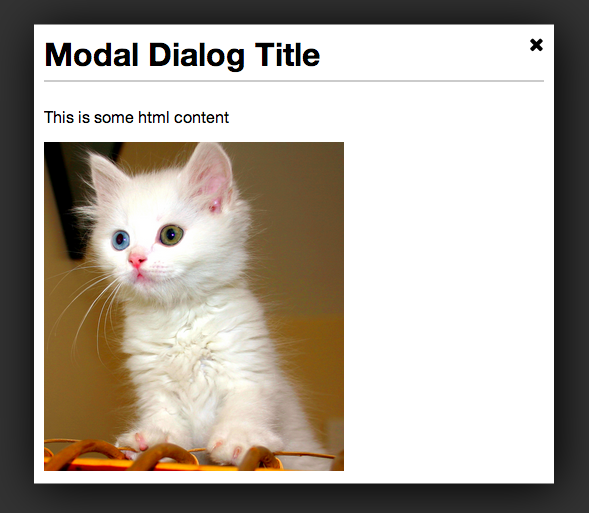
Very basic modal dialog directive for Angular.js
https://github.com/adamalbrecht/ngModal
Last synced: 4 months ago
JSON representation
Very basic modal dialog directive for Angular.js
- Host: GitHub
- URL: https://github.com/adamalbrecht/ngModal
- Owner: adamalbrecht
- License: other
- Created: 2013-12-12T22:23:46.000Z (about 11 years ago)
- Default Branch: master
- Last Pushed: 2019-10-16T10:44:32.000Z (over 5 years ago)
- Last Synced: 2024-07-20T10:06:57.629Z (7 months ago)
- Language: CoffeeScript
- Size: 269 KB
- Stars: 116
- Watchers: 14
- Forks: 48
- Open Issues: 10
-
Metadata Files:
- Readme: README.md
- License: LICENSE.txt
Awesome Lists containing this project
README
# ngModal
ngModal is very simple [Angular.js](http://angularjs.org/) modal dialog directive.

## Download
* [Version 1.2.2](https://github.com/adamalbrecht/ngModal/archive/1.2.2.zip) - Compatible with Angular 1.2.x.
You can also install the package using [Bower](http://bower.io).
```sh
bower install ngModal
```
Or add it to your bower.json file:
```javascript
dependencies: {
"ngModal": "~1.2.0"
}
```
## The Basics
To use the library, add the JS file and CSS file, and then include the module in your app:
```javascript
app = angular.module("myApp", ["ngModal"])
```
The directive itself is called *modal-dialog*. The only required attribute is `show`, which should reference a boolean variable that controls whether or not the dialog is shown. Inside, you can put whatever HTML content you'd like.
```html
Dialog content goes in here
```
## Inline Options
There are a few options that be configured inline with attributes.
| Option | Default | Description |
| -------------- | ------- | ----------------------------------------------------------------- |
| dialog-title | null | Title placed in the header of the modal dialog. |
| width | 50% | Width of the dialog. Can be specified in px or %. |
| height | 50% | Height of the dialog. Can be specified in px or %. |
| on-close | null | Call a function when the dialog is closed. Ex: `on-close='foo()'` |
**Example:**
```html
Dialog content goes in here
```
## Configuration Options
You can also pre-configure some options during your app's configuration phase.
```javascript
app.config(function(ngModalDefaultsProvider) {
ngModalDefaultsProvider.set('option', 'value');
// Or with a hash
ngModalDefaultsProvider.set({option: 'value', option2: 'value2'});
})
```
| Option | Default | Description |
| ------------------- | ------- | ---------------------------------------------------------------------------------------------------------------- |
| closeButtonHtml | 'X' | By default, the close button is just an X character. But you can set it to any HTML. For example, if you're using font-awesome, you could set it to `` |
## Browser Support
So far, it has only been tested in Chrome. There is some CSS that is not compatible with with older browsers, including IE9.
## Contributing
Contributions are welcome. Whenever possible, please include test coverage with your contribution.
1. Fork it
2. Create your feature branch (`git checkout -b my-new-feature`)
3. Commit your changes (`git commit -am 'Add some feature'`)
4. Push to the branch (`git push origin my-new-feature`)
5. Create new Pull Request
To get the project running, you'll need [NPM](https://npmjs.org/) and [Bower](http://bower.io/). Run `npm install` and `bower install` to install all dependencies. Then run `grunt` in the project directory to watch and compile changes. And you can run `karma start` to watch for changes and auto-execute unit tests.
## Potential Features Down the Road
* Ability to integrate easily with [UI-Router](https://github.com/angular-ui/ui-router). This may be possible already, but it needs to be explored.