https://github.com/ajiew/react-native-tag-group
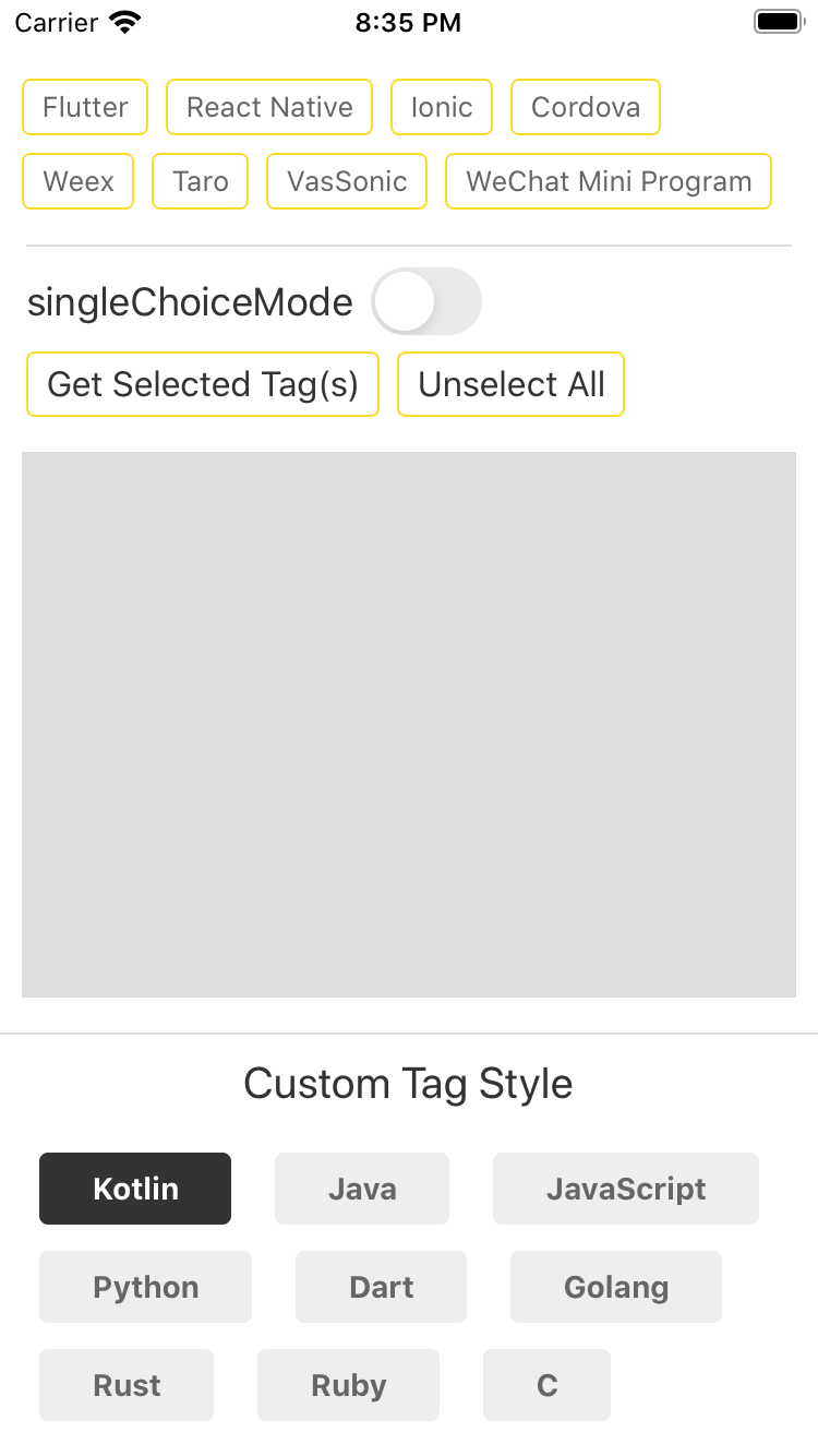
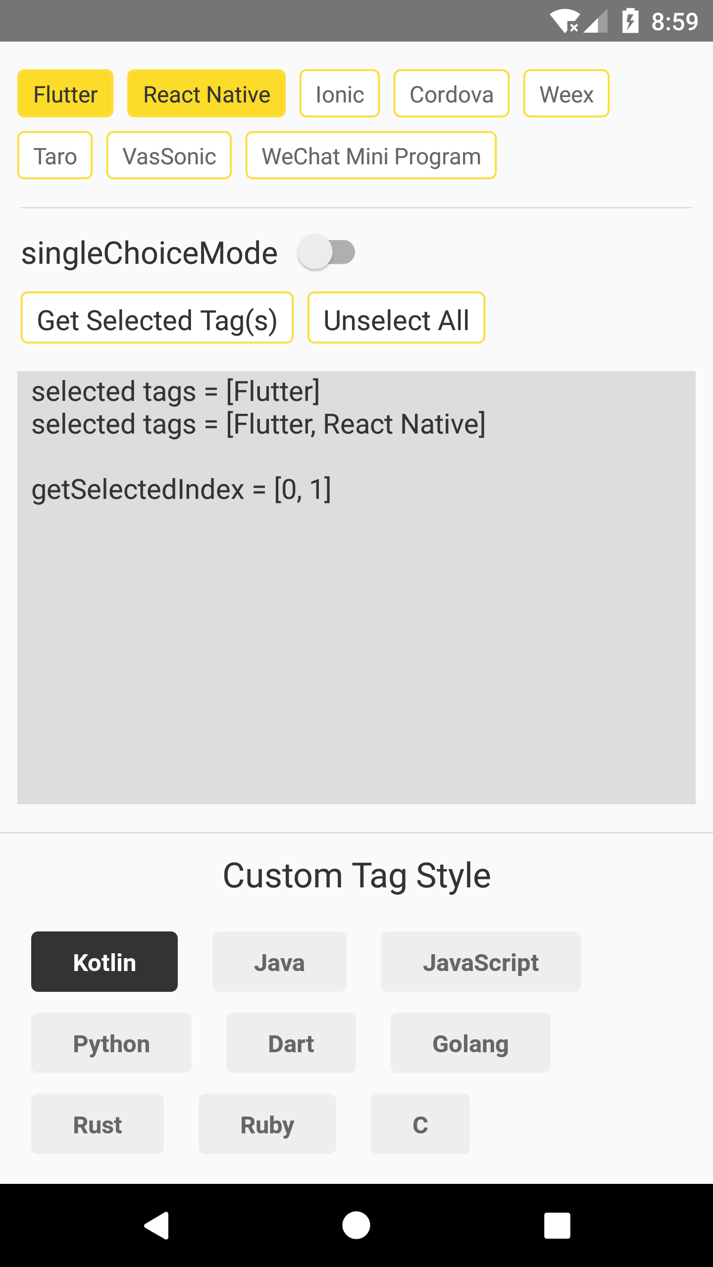
A simple Tag component that supports both single and multiple selection.
https://github.com/ajiew/react-native-tag-group
highly-customizable multiple-selection react-native single-selection tag-group tags
Last synced: over 1 year ago
JSON representation
A simple Tag component that supports both single and multiple selection.
- Host: GitHub
- URL: https://github.com/ajiew/react-native-tag-group
- Owner: aJIEw
- License: mit
- Created: 2020-05-06T13:36:14.000Z (about 6 years ago)
- Default Branch: master
- Last Pushed: 2023-01-06T05:22:19.000Z (over 3 years ago)
- Last Synced: 2025-04-20T01:03:49.321Z (over 1 year ago)
- Topics: highly-customizable, multiple-selection, react-native, single-selection, tag-group, tags
- Language: JavaScript
- Size: 3.51 MB
- Stars: 13
- Watchers: 2
- Forks: 0
- Open Issues: 15
-
Metadata Files:
- Readme: README.md
- License: LICENSE
Awesome Lists containing this project
README
## react-native-tag-group
[](https://www.npmjs.com/package/react-native-tag-group) [](https://github.com/aJIEw/react-native-tag-group/blob/master/LICENSE)
A simple Tag component that supports both single and multiple selection.


## Get Started
### Installation
```sh
npm i react-native-tag-group --save
```
### TagGroup Usage
```js
import TagGroup from 'react-native-tag-group';
// ...
render() {
return (
this.tagGroup = ref}
source={['One', 'Two', 'Three']}
onSelectedTagChange={(selected) => { this.setState({selected}); }}
/>
);
}
```
### TagGroup Props
| Props | Type | Description |
| :------------------ | :---------------- | ------------------------------------------------------------ |
| style | View style | container's style |
| source | array | source array, usually a string array. |
| singleChoiceMode | bool | only allow select one Tag at one time. Default `false`. |
| onSelectedTagChange | function | callback after Tag(s) pressed, the parameter is a string array[], or (`stringValue`, `selectedIndex`) when set `singleChoiceMode` to true. |
| tintColor | string | set the border color and background color when Tag is selected. |
| tagStyle/activeTagStyle | View style | set the Tag's style before and after selected. |
| textStyle/activeTextStyle | Text style | set the Tag's text style before and after selected. |
| touchableOpacity | bool | use TouchableOpacity instead of TouchableWithoutFeedback. |
### Methods
#### select(index)
Select Tag at the index, this WON'T invoke `onSelectedTagChange` callback.
#### unselect(index)
Unselect Tag at the index, this WON'T invoke `onSelectedTagChange` callback.
#### getSelectedIndex()
Get the index array of the selected Tag(s), return -1 if no Tag is selected.
### Tag Usage
`Tag` can also be used as a simple button, for example:
```js
import {Tag} from 'react-native-tag-group';
// ...
// ...
onTagPress = () => {
console.log('Hello world!')
}
```
### Tag Props
| Props | Type | Description |
| :------------------ | :---------------- | ------------------------------------------------------------ |
| tintColor | string | Tag's border color, you can also cusotomize it with `tagStyle` prop. |
| tagStyle | View style | Tag style. |
| textStyle | Text style | Tag's text style. |
| onPress | function | callback function when Tag is pressed. |
| touchableOpacity | bool | use TouchableOpacity instead of TouchableWithoutFeedback. |
For more information please check the [example](https://github.com/aJIEw/react-native-tag-group/tree/master/example).