https://github.com/alan-crts/shadcn-iconpicker
A searchable icon picker component built with NextJS, Lucide-react, TailwindCSS and shadcn/ui. Features infinite scroll, tooltips, and customizable trigger button.
https://github.com/alan-crts/shadcn-iconpicker
fusejs iconpicker icons lucid lucide-react nextjs radix-ui reactjs shadcn shadcn-ui tailwindcss
Last synced: 10 months ago
JSON representation
A searchable icon picker component built with NextJS, Lucide-react, TailwindCSS and shadcn/ui. Features infinite scroll, tooltips, and customizable trigger button.
- Host: GitHub
- URL: https://github.com/alan-crts/shadcn-iconpicker
- Owner: alan-crts
- License: mit
- Created: 2025-02-17T08:09:51.000Z (over 1 year ago)
- Default Branch: main
- Last Pushed: 2025-05-20T07:21:18.000Z (about 1 year ago)
- Last Synced: 2025-05-20T08:28:33.327Z (about 1 year ago)
- Topics: fusejs, iconpicker, icons, lucid, lucide-react, nextjs, radix-ui, reactjs, shadcn, shadcn-ui, tailwindcss
- Language: TypeScript
- Homepage: https://icon-picker.alan-courtois.fr/
- Size: 3.89 MB
- Stars: 34
- Watchers: 1
- Forks: 1
- Open Issues: 1
-
Metadata Files:
- Readme: README.md
- License: LICENSE
Awesome Lists containing this project
- awesome-shadcnui - Github - picker.alan-courtois.fr/) | ★49 | (Components & Libraries)
README
# Shadcn Icon Picker
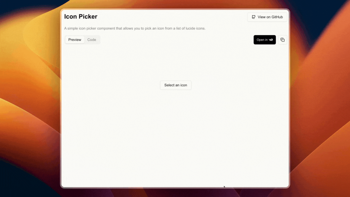
A sleek and customizable icon picker component for React, built with shadcn/ui and Lucide Icons.
## Features
- 🎨 Modern and responsive UI
- 🔍 Real-time icon search
- ⚡️ Progressive icon loading
- 🎯 Full Lucide icons support
- 🌗 Dark mode compatible
- 🎛️ Highly customizable
## Installation
### Using npm
```shell
npx shadcn@latest add "https://icon-picker.alan-courtois.fr/r/icon-picker"
```
### Using pnpm
```shell
pnpm dlx shadcn@latest add "https://icon-picker.alan-courtois.fr/r/icon-picker"
```
### Using Yarn
```shell
npx shadcn@latest add "https://icon-picker.alan-courtois.fr/r/icon-picker"
```
### Using Bun
```shell
bunx shadcn@latest add "https://icon-picker.alan-courtois.fr/r/icon-picker"
```
## Usage
```tsx
import { IconPicker } from "@/components/ui/iconPicker";
export default function Home() {
return ;
}
```
## Props
| Prop | Type | Default | Description |
|------|------|---------|-------------|
| `value` | `IconName` | - | The controlled value of the selected icon |
| `defaultValue` | `IconName` | - | The default value of the selected icon |
| `onValueChange` | `(value: IconName) => void` | - | Callback invoked when an icon is selected |
| `open` | `boolean` | - | Controlled open state of the picker |
| `defaultOpen` | `boolean` | `false` | Default open state of the picker |
| `onOpenChange` | `(open: boolean) => void` | - | Callback invoked when the open state changes |
| `children` | `ReactNode` | - | The trigger element to open the icon picker |
| `searchable` | `boolean` | `true` | Whether the icon picker is searchable |
| `searchPlaceholder` | `string` | "Search for an icon..." | The placeholder for the search input |
| `triggerPlaceholder` | `string` | "Select an icon" | The text displayed on the default trigger button when no icon is selected |
| `iconsList` | `IconList` | all lucide icons | The list of icons to display in the picker |
| `categorized` | `boolean` | `true` | Display icons in categories and add categories buttons to scroll to the desired category |
| `modal` | `boolean` | `false` | Whether the icon picker is being rendered in a modal |
## Development
### Clone the repository
```shell
git clone https://github.com/alan-crts/shadcn-iconpicker.git
```
### Install dependencies
```shell
npm install
```
### Start development server
```shell
npm run dev
```
## License
MIT © [Alan Courtois](https://github.com/alan-crts)
## Acknowledgments
- [shadcn/ui](https://ui.shadcn.com) for the UI components
- [Lucide](https://lucide.dev) for the icons
- [Next.js](https://nextjs.org) for the framework