https://github.com/albingroen/react-cmdk
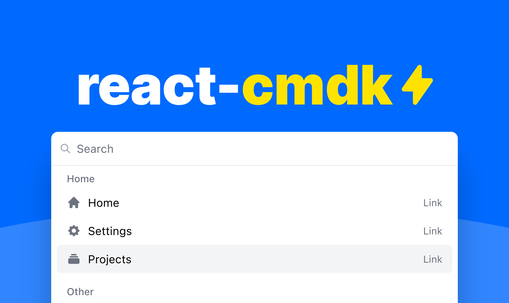
A fast, accessible, and pretty command palette for React
https://github.com/albingroen/react-cmdk
headlessui react tailwindcss tsdx typescript
Last synced: about 1 year ago
JSON representation
A fast, accessible, and pretty command palette for React
- Host: GitHub
- URL: https://github.com/albingroen/react-cmdk
- Owner: albingroen
- License: mit
- Created: 2021-11-08T19:49:13.000Z (over 4 years ago)
- Default Branch: main
- Last Pushed: 2024-06-19T03:19:11.000Z (about 2 years ago)
- Last Synced: 2025-05-10T01:04:24.047Z (about 1 year ago)
- Topics: headlessui, react, tailwindcss, tsdx, typescript
- Language: TypeScript
- Homepage: https://react-cmdk.com
- Size: 1.51 MB
- Stars: 1,170
- Watchers: 7
- Forks: 46
- Open Issues: 8
-
Metadata Files:
- Readme: README.md
- Funding: .github/FUNDING.yml
- License: LICENSE
Awesome Lists containing this project
- awesome-command-palette - React-cmd:
- awesome-command-palette - react-cmdk
README
# A command palette for React

A package with components for building your dream command palette for your web application.

Watch the [YouTube demo](https://www.youtube.com/watch?v=FN8noNclyoU) or [try it out here](https://react-cmdk.com) to get started.

- [Features](#features)

- [Installation](#installation)

- [Example usage](#example-usage)

  - [Opening the command palette](#opening-the-command-palette)

- [API](#api)

- [Utils](#utils)

- [Maintainers](#maintainers)

## Features

✓ Accessible


✓ Flexible


✓ Good looking


✓ Very fast


✓ Dark & light mode

## Installation

```

npm install react-cmdk

```

Or if you'd rather use Yarn

```

yarn add react-cmdk

```

## Example usage

You can compose your command palette pretty much however you like with the

included components. But here is an example of a command palette that uses some

of the included helpers for a very neat solution.

```typescript

import "react-cmdk/dist/cmdk.css";

import CommandPalette, { filterItems, getItemIndex } from "react-cmdk";

import { useState } from "react";

const Example = () => {

  const [page, setPage] = useState<"root" | "projects">("root");

  const [open, setOpen] = useState(true);

  const [search, setSearch] = useState("");

  const filteredItems = filterItems(

    [

      {

        heading: "Home",

        id: "home",

        items: [

          {

            id: "home",

            children: "Home",

            icon: "HomeIcon",

            href: "#",

          },

          {

            id: "settings",

            children: "Settings",

            icon: "CogIcon",

            href: "#",

          },

          {

            id: "projects",

            children: "Projects",

            icon: "RectangleStackIcon",

            closeOnSelect: false,

            onClick: () => {

              setPage("projects");

            },

          },

        ],

      },

      {

        heading: "Other",

        id: "advanced",

        items: [

          {

            id: "developer-settings",

            children: "Developer settings",

            icon: "CodeBracketIcon",

            href: "#",

          },

          {

            id: "privacy-policy",

            children: "Privacy policy",

            icon: "LifebuoyIcon",

            href: "#",

          },

          {

            id: "log-out",

            children: "Log out",

            icon: "ArrowRightOnRectangleIcon",

            onClick: () => {

              alert("Logging out...");

            },

          },

        ],

      },

    ],

    search

  );

  return (


        {filteredItems.length ? (

          filteredItems.map((list) => (


              {list.items.map(({ id, ...rest }) => (


              ))}


          ))

        ) : (


        )}


        {/* Projects page */}


  );

};

export default Example;

```

### Opening the command palette

The package does include a helper hook for opening the command palette,

but you can actually open it however you want. Here are some examples.

#### Helper

```typescript

const [isOpen, setIsOpen] = useState(false);

useHandleOpenCommandPalette(setIsOpen);

```

#### Custom

```typescript

const [isOpen, setIsOpen] = useState(false);

useEffect(() => {

  function handleKeyDown(e: KeyboardEvent) {

    if (

      (navigator?.platform?.toLowerCase().includes("mac")

        ? e.metaKey

        : e.ctrlKey) &&

      e.key === "k"

    ) {

      e.preventDefault();

      e.stopPropagation();

      setIsOpen((currentValue) => {

        return !currentValue;

      });

    }

  }

  document.addEventListener("keydown", handleKeyDown);

  return () => {

    document.removeEventListener("keydown", handleKeyDown);

  };

}, []);

```

## API

### `CommandPalette`

| name             | type                     | required | default    | description                                 |

| ---------------- | ------------------------ | -------- | ---------- | ------------------------------------------- |

| onChangeSearch   | (value: string) => void  | true     |            | Function for setting search value           |

| onChangeOpen     | (value: boolean) => void | true     |            | Function for setting open state             |

| children         | React.ReactNode          | true     |            | Children of command palette                 |

| isOpen           | boolean                  | true     |            | Open state                                  |

| search           | string                   | true     |            | Search state                                |

| placeholder      | string                   | false    | `"Search"` | Search field placeholder                    |

| page             | string                   | false    |            | The current page id                         |

| renderLink       | RenderLink               | false    |            | Function for customizing rendering of links |

| footer           | React.ReactNode          | false    |            | Footer component                            |

| selected         | number                   | false    |            | The current selected item index             |

| onChangeSelected | (value: number) => void  | false    |            | Function for setting selected item index    |

### `CommandPalette.Page`

FYI. Using pages is completely optional

| name         | type            | required | default | description                             |

| ------------ | --------------- | -------- | ------- | --------------------------------------- |

| id           | string          | true     |         | A unique page id                        |

| children     | React.ReactNode | true     |         | Children of the list                    |

| searchPrefix | string[]        | false    |         | Prefix to the left of the search bar    |

| onEscape     | () => void      | false    |         | Function that runs upon clicking escape |

### `CommandPalette.List`

| name     | type            | required | default | description          |

| -------- | --------------- | -------- | ------- | -------------------- |

| children | React.ReactNode | true     |         | Children of the list |

| heading  | string          | false    |         | Heading of the list  |

### `CommandPalette.ListItem`

| name          | type                 | required | default    | description                                     |

| ------------- | -------------------- | -------- | ---------- | ----------------------------------------------- |

| index         | number               | true     |            | Index for list item                             |

| closeOnSelect | boolean              | false    |            | Whether to close the command palette upon click |

| icon          | (IconName, React.FC) | false    | `false`    | Icon for list item                              |

| iconType      | IconType             | false    | `"solid" ` | Icon for list item                              |

| showType      | boolean              | false    | true       | Whether to show the item type                   |

| disabled      | boolean              | false    |            | Whether the item is disabled                    |

| keywords      | Array        | false    |            | Underlying search keywords for the list item    |

The list item also extends the `HTMLAnchorElement & HTMLButtonElement` types

### `CommandPalette.FreeSearchAction`

| name  | type   | required | default        | description         |

| ----- | ------ | -------- | -------------- | ------------------- |

| index | number | false    | `0`            | Index for list item |

| label | string | false    | `"Search for"` | Button label        |

The search action also extends the `HTMLAnchorElement & HTMLButtonElement` types

### `RenderLink`

```typescript

(

  props: DetailedHTMLProps<

    AnchorHTMLAttributes,

    HTMLAnchorElement

  >

) => ReactNode;

```

### `JsonStructure`

Array of

| name    | type                       | required | default | description      |

| ------- | -------------------------- | -------- | ------- | ---------------- |

| id      | string                     | true     |         | Id for list      |

| items   | Array<`JsonStructureItem`> | true     |         | Items for list   |

| heading | string                     | false    |         | Heading for list |

### `JsonStructureItem`

`CommandPalette.ListItem`

Omits `index` & extends

| name | type   | required | default | description      |

| ---- | ------ | -------- | ------- | ---------------- |

| id   | string | true     |         | Id for list item |

## Utils

### `getItemIndex`

A function for getting the current index of a item within the json structure

```typescript

(items: JsonStructure, listItemId: string, startIndex = 0) => number;

```

### `filterItems`

A function for filtering the json structure from a search string

```typescript

(

  items: JsonStructure,

  search: string,

  options?: { filterOnListHeading: boolean }

) => JsonStructure;

```

### `renderJsonStructure`

A function for rendering a json structure

```typescript

(items: JsonStructure) => JSX.Element[]

```

### `useHandleOpenCommandPalette`

```typescript

(fn: React.Dispatch>) => void

```

## Maintainers
