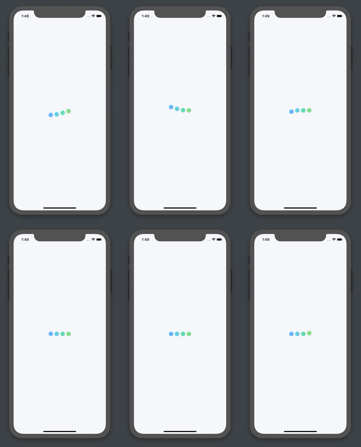
https://github.com/alexvcasillas/react-native-loading-dots
A React Native loading component with dots or custom components and a smooth animation
https://github.com/alexvcasillas/react-native-loading-dots
animated animation dots loading native react react-native
Last synced: 3 months ago
JSON representation
A React Native loading component with dots or custom components and a smooth animation
- Host: GitHub
- URL: https://github.com/alexvcasillas/react-native-loading-dots
- Owner: alexvcasillas
- License: mit
- Created: 2019-06-16T11:12:13.000Z (about 6 years ago)
- Default Branch: master
- Last Pushed: 2024-10-02T07:34:59.000Z (9 months ago)
- Last Synced: 2025-04-17T19:17:23.754Z (3 months ago)
- Topics: animated, animation, dots, loading, native, react, react-native
- Homepage: https://www.npmjs.com/package/react-native-loading-dots
- Size: 6.28 MB
- Stars: 22
- Watchers: 1
- Forks: 8
- Open Issues: 2
-
Metadata Files:
- Readme: README.md
- Funding: .github/FUNDING.yml
Awesome Lists containing this project
README
## React Native Loading Dots
Smooth dot loading component for your React Native project.

## Installation
```
npm i react-native-loading-dots
```
```
yarn add react-native-loading-dots
```
## Usage
```js
import React from "react";
import { View, StyleSheet } from "react-native";
import LoadingDots from "react-native-loading-dots";
function LoadingScreen() {
return (
);
}
const styles = StyleSheet.create({
loadingScreen: {
flex: 1,
display: "flex",
alignItems: "center",
justifyContent: "center",
},
dotsWrapper: {
width: 100,
},
});
```
The above code will produce the same outcome as the demo screen capture.
## Customization
You can pass a few props to configure the outcome a little:
### dots
```js
@type Number
default 4
```
This prop will change the number of dots that will be displayed in the animation.
### colors
```js
@type String[]
default ["#4dabf7", "#3bc9db", "#38d9a9", "#69db7c"]
```
This prop will change the color of the dots in the given array order. If you declare the array but the length doesn't match with the amount of dots defined, the dot that cannot take a color from this array will instead use a fallback color of `"#4dabf7"`.
### size
```js
@type Number
default 20
```
This prop will control the size of each dot that will be displayed for the animation.
### borderRadius
```
@type Number
```
This prop will control the border radius of the dots in case you want a specific amount of border radius. If you don't fill this prop it will use a rounded border radius with the formula: `size / 2`.
### bounceHeight
```js
@type Number
default 20
```
This prop will control the height of the bouncing for the loading dots. The higher the value the higher the will bounce up and down. From `0` to `bounceHeight` and from `0` to `-bounceHeight`.
### components
```js
@type React.ReactNode[]
default null
```
This prop will allow you to pass an array of the elements that you'd like to be rendered instead of the colored dots. If you pass `components` the `dots`, `colors`, `size` and `borderRadius` props will be ignored.