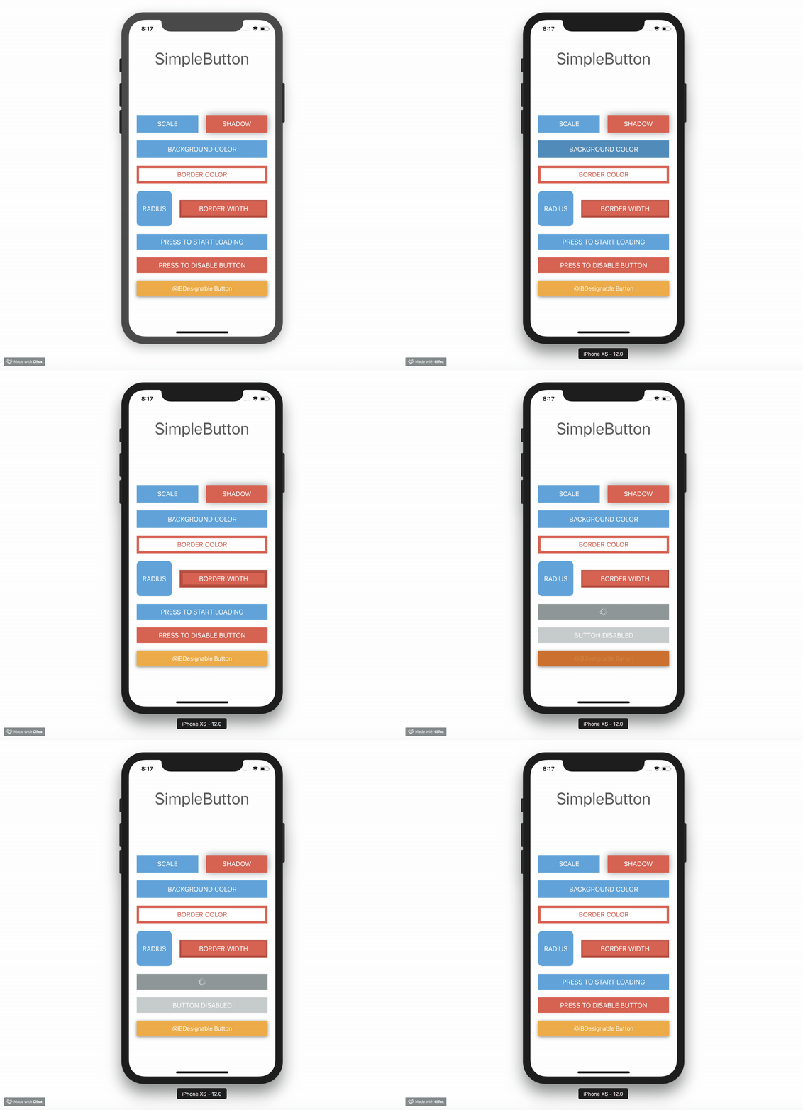
https://github.com/aloco/simplebutton
Simple UIButton subclass with additional state change animations (e.g. backgroundColor) and missing features
https://github.com/aloco/simplebutton
animation ios simplebutton swift uibutton-subclass
Last synced: 11 months ago
JSON representation
Simple UIButton subclass with additional state change animations (e.g. backgroundColor) and missing features
- Host: GitHub
- URL: https://github.com/aloco/simplebutton
- Owner: aloco
- License: mit
- Created: 2015-03-26T11:06:49.000Z (almost 11 years ago)
- Default Branch: master
- Last Pushed: 2021-09-08T13:59:24.000Z (over 4 years ago)
- Last Synced: 2025-03-02T13:08:10.469Z (12 months ago)
- Topics: animation, ios, simplebutton, swift, uibutton-subclass
- Language: Swift
- Homepage:
- Size: 2.04 MB
- Stars: 177
- Watchers: 14
- Forks: 51
- Open Issues: 4
-
Metadata Files:
- Readme: README.md
- License: LICENSE
Awesome Lists containing this project
README
# SimpleButton

[](https://travis-ci.org/aloco/SimpleButton)

UIButton subclass with animated, state-aware attributes. Easy to subclass and configure! [Full API docs](http://aloco.github.io/SimpleButton/swift_output)

## Usage
Just create your own `SimpleButton` subclass and configure your button attributes by overriding `configureButtonStyles`.
```swift
class PrimaryButton: SimpleButton {
override func configureButtonStyles() {
super.configureButtonStyles()
setBorderWidth(4.0, for: .normal)
setBackgroundColor(UIColor(red: 52/255, green: 73/255, blue: 94/255, alpha: 1.0), for: .normal)
setBackgroundColor(UIColor(red: 44/255, green: 62/255, blue: 80/255, alpha: 1.0), for: .highlighted)
setBorderColor(UIColor(red: 44/255, green: 62/255, blue: 80/255, alpha: 1.0), for: .normal)
setScale(0.98, for: .highlighted)
setTitleColor(UIColor.whiteColor(), for: .normal)
}
}
```
For usage in Interfacebuilder, just use your `SimpleButton` subclass as custom class for any `UIButton` element. All defined styles gets applied automatically.
You can also configure your button without a subclass directly inline.
```swift
let awesomeButton = SimpleButton(type: .custom)
awesomeButton.setBorderWidth(2.0, for: .normal)
awesomeButton.setBorderColor(UIColor.redColor(), for: .highlighted)
view.addSubview(awesomeButton)
```
Note that you should use `UIButtonType.custom` to avoid undesired effects.
Please checkout the example project for a detailed usage demo.
#### @IBDesignable
Have a look on [DesignableButton](Example/DesignableButton.swift) subclass within the Example Project for `@IBDesignable` usage.
### Animation
Each state change of `SimpleButton` animates by default. Sometimes you need to define which state transition should animate and which should happen immediately. Therefore you can control that behaviour with the `animated` and `animationDuration` parameters.
```
setBorderWidth(4.0, for: .normal, animated: true, animationDuration: 0.2)
setBorderWidth(8.0, for: .highlighted, animated: false)
```
This means, every state change to `.normal` animates the `borderWidth` to `4.0`.
Every state change to `.highlighted` changes instantly the `borderWidth` to `8.0` without animation.
### Loading state
`SimpleButton` has a custom `loading` state. You can toggle this state by setting `simpleButton.isLoading`. The button shows an `UIActivityIndicator` instead of the title when adding the `loading` state.
```
simpleButton.setCornerRadius(20, for: SimpleButtonControlState.loading)
simpleButton.isLoading = true
```
If you don´t like the default loading indicator, you can set your own `UIView` by doing
```
simpleButton.loadingView = CustomAwesomeLoadingView()
```
Please note, when using a custom loading view don´t forget to handle the position and initial add to subview by yourself to fit your needs.
## Configurable attributes
Take a look at the ```Setter for state attributes``` section of the [API Docs](http://aloco.github.io/SimpleButton/swift_output/Classes/SimpleButton.html#/Setter%20for%20state%20attributes)
## Installation
Note that SimpleButton is written in `swift 5` and may not be compatible with previous versions of swift.
#### Swift Package Manager (Recommended)
Add the following dependency to your `Package.swift` file:
```
.package(url: "https://github.com/allaboutapps/SimpleButton.git", from: "5.0.0")
```
#### Carthage
Add the following line to your [Cartfile](https://github.com/Carthage/Carthage/blob/master/Documentation/Artifacts.md#cartfile).
```
github "allaboutapps/SimpleButton" ~> 5.0
```
Then run `carthage update`.
#### Manually
Just drag and drop the `SimpleButton.swift` file into your project.
## Contributing
* Create something awesome, make the code better, add some functionality,
whatever (this is the hardest part).
* [Fork it](http://help.github.com/forking/)
* Create new branch to make your changes
* Commit all your changes to your branch
* Submit a [pull request](http://help.github.com/pull-requests/)