https://github.com/altschuler/imgui-knobs
Knob widgets for Dear ImGui
https://github.com/altschuler/imgui-knobs
cpp gui imgui
Last synced: 10 months ago
JSON representation
Knob widgets for Dear ImGui
- Host: GitHub
- URL: https://github.com/altschuler/imgui-knobs
- Owner: altschuler
- License: mit
- Created: 2022-04-17T14:26:03.000Z (over 4 years ago)
- Default Branch: main
- Last Pushed: 2025-06-23T06:16:10.000Z (about 1 year ago)
- Last Synced: 2025-06-23T07:28:41.738Z (about 1 year ago)
- Topics: cpp, gui, imgui
- Language: C++
- Homepage:
- Size: 711 KB
- Stars: 369
- Watchers: 9
- Forks: 49
- Open Issues: 1
-
Metadata Files:
- Readme: README.md
- License: LICENSE
Awesome Lists containing this project
README
# ImGui Knobs
This is a port/adaptation of [imgui-rs-knobs](https://github.com/DGriffin91/imgui-rs-knobs), for C++.
## Usage
Add `imgui-knobs.cpp` and `imgui-knobs.h` to your project and include `imgui-knobs.h` in some source file.
```cpp
static float value = 0;
if (ImGuiKnobs::Knob("Volume", &value, -6.0f, 6.0f, 0.1f, "%.1fdB", ImGuiKnobVariant_Tick)) {
// value was changed
}
```
Draw knobs using either `Knob` or `KnobInt`. The API is:
```
bool ImGuiKnobs::Knob(label, *value, min, max, [speed, format, variant, size, flags, steps, angle_min, angle_max])
bool ImGuiKnobs::KnobInt(label, *value, min, max, [speed, format, variant, size, flags, steps, angle_min, angle_max])
```
You can implement **double click to reset** using standard imgui functionality:
```cpp
ImGuiKnobs::Knob("Volume", &value, -6.0f, 6.0f, 0.1f, "%.1fdB", ImGuiKnobVariant_Tick);
// Double click to reset, must be directly after drawing the knob so the right imgui "item" is used
if (ImGui::IsItemActive() && ImGui::IsMouseDoubleClicked(0)) {
value = 0;
}
```
See `example/main.cpp` for a demo.
### Variants
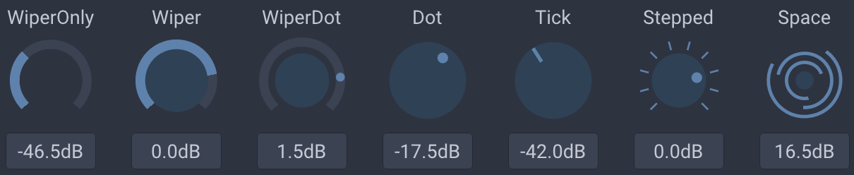
`variant` determines the visual look of the knob. Available variants are: `ImGuiKnobVariant_Tick`, `ImGuiKnobVariant_Dot`, `ImGuiKnobVariant_Wiper`, `ImGuiKnobVariant_WiperOnly`, `ImGuiKnobVariant_WiperDot`, `ImGuiKnobVariant_Stepped`, `ImGuiKnobVariant_Space`.
### Flags
- `ImGuiKnobFlags_NoTitle`: Hide the top title.
- `ImGuiKnobFlags_NoInput`: Hide the bottom drag input.
- `ImGuiKnobFlags_ValueTooltip`: Show a tooltip with the current value on hover.
- `ImGuiKnobFlags_DragHorizontal`: Use horizontal dragging only (default is bi-directional).
- `ImGuiKnobFlags_DragVertical`: Use vertical dragging only (default is bi-directional).
- `ImGuiKnobFlags_AlwaysClamp`: Clamp input values that the user types into the input field. If not set, it's possible to override the min/max range via the input field.
- `ImGuiKnobFlags_Logarithmic`: Use logarithmic scale for the knob (otherwise linear).
### Size
You can specify a size given as the width of the knob (will be scaled according to ImGui's `FontGlobalScale`). Default (0) will use 4x line height.
### Colors
By default the knobs are styled using colors from the imgui theme. You can push/pop style colors to change individual colors. The color ids/flags default to button colors, thus:
| ImGui Color | Knob meaning |
|---|---|
| `ImGuiCol_ButtonActive` | The "filled" part |
| `ImGuiCol_ButtonHovered` | The "filled" part, when hovered |
| `ImGuiCol_Button` | The knob track |
Use `ImGuiCol_FrameBg`/`ImGuiCol_Text` to change the input field colors.
### Steps
Steps determines the number of steps draw, it is only used for the `ImGuiKnobVariant_Stepped` variant.