https://github.com/amyx000/react-heatgrid
React HeatGrid is a versatile and customizable heatmap component for React applications.
https://github.com/amyx000/react-heatgrid
Last synced: 3 months ago
JSON representation
React HeatGrid is a versatile and customizable heatmap component for React applications.
- Host: GitHub
- URL: https://github.com/amyx000/react-heatgrid
- Owner: Amyx000
- License: mit
- Created: 2023-09-09T05:09:08.000Z (over 1 year ago)
- Default Branch: main
- Last Pushed: 2023-09-10T04:34:06.000Z (over 1 year ago)
- Last Synced: 2025-02-05T06:46:52.242Z (4 months ago)
- Language: TypeScript
- Homepage: https://www.npmjs.com/package/react-heatgrid
- Size: 25.4 KB
- Stars: 1
- Watchers: 1
- Forks: 0
- Open Issues: 0
-
Metadata Files:
- Readme: README.md
- License: LICENSE
Awesome Lists containing this project
README
# React HeatGrid
React HeatGrid is a versatile and customizable heatmap component for React applications.

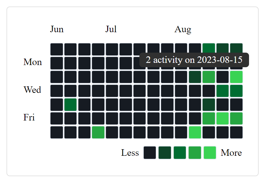
ToolTip when hover on each grid.
## Installation
You can install React HeatGrid via npm or yarn:
```bash
npm i react-heatgrid --save
```
## Usage
To use the `Calendar` component from the `react-heatgrid` package, you need to import it and pass the required props. Below is an example of how to use the `Calendar` component along with an explanation of its props:
```jsx
import React from 'react';
import { Calendar } from 'react-heatgrid';
const MyCalendar = () => {
const calendarData = [
{ value: 9, day: '2023-08-23' },
{ value: 20, day: '2023-08-10' },
{ value: 49, day: '2023-07-17' },
{ value: 45, day: '2023-08-21' },
{ value: 7, day: '2023-07-23' },
{ value: 11, day: '2023-08-15' },
{ value: 28, day: '2023-08-26' },
{ value: 11, day: '2023-09-07' },
{ value: 27, day: '2023-09-08' },
// you can add random day, skip a day and day can be date format like...
{ value: 27, day: new Date('2023-09-09') },
];
const heatmapColors = ["#161b22","#0e4429","#006d32","#26a641","#39d353"];
return (
My Calendar Heatmap
);
};
export default MyCalendar;
```
## Props Guide
| Prop | Description | Default Value |
| ------------------ | --------------------------------------------------------------------------------------------------------------------------------------- | ------------- |
| `months` | The number of months to display in the calendar. | 3 |
| `gridSize` | The size of each grid cell in the calendar. | "20px" |
| `gap` | The gap between grid cells in the calendar. | "2px" |
| `data` | An array of data objects representing each day in the calendar. Each object should have a 'value' (number) and 'day' (string) property. | Required |
| `colors` | An array of colors from low intensity to high. e.g ["#161b22","#0e4429","#006d32","#26a641","#39d353"] | Required |
| `fontSize` | Size of text throughout the calendar. | "12px" |
| `fontColor` | Color of the text | "black" |
| `DisabledToolTip` | Disable tooltips for grid cells. | false |
| `DisabledLegend` | Disable the legend of chart | false |
| `placement` | The placement of tooltips relative to the grid cell ("top" or "bottom"). | "top" |
| `tooltipBg` | The background color of tooltips. | "#303030" |
| `tooltipTextColor` | The text color of tooltips. | "white" |
| `tooltipLabel` | The label for the tooltip, which can be one of "activity", "contributions", or a custom string. | "activity" |
| `tooltipStyle` | Additional CSS styles to apply to the tooltip. e.g {border:"1px solid red"} | None |
| `dateFormat` | Either "yyyy-mm-dd" (e.g 2023-01-31) or "WeekDay, Month Date, Year" (e.g Tue, Jan 31, 2023) | "yyyy-mm-dd" |