https://github.com/apsl/react-native-section-menu
A multi-platform React Native sectioned menu
https://github.com/apsl/react-native-section-menu
Last synced: about 1 year ago
JSON representation
A multi-platform React Native sectioned menu
- Host: GitHub
- URL: https://github.com/apsl/react-native-section-menu
- Owner: APSL
- License: mit
- Created: 2016-05-07T23:47:10.000Z (about 10 years ago)
- Default Branch: master
- Last Pushed: 2018-09-12T14:22:15.000Z (almost 8 years ago)
- Last Synced: 2024-09-15T17:43:16.772Z (almost 2 years ago)
- Language: JavaScript
- Size: 104 KB
- Stars: 10
- Watchers: 5
- Forks: 0
- Open Issues: 2
-
Metadata Files:
- Readme: README.md
- License: LICENSE
Awesome Lists containing this project
README
# react-native-section-menu
[](https://travis-ci.org/APSL/react-native-section-menu)
A multi-platform React Native sectioned menu.
## ⚠️ DEPRECATED ⚠️
This component has been deprecated. Use it at your own risk.
## Installation
```sh
$ npm i --save-dev react-native-section-menu
```
## Usage
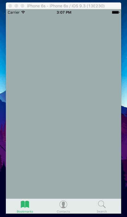
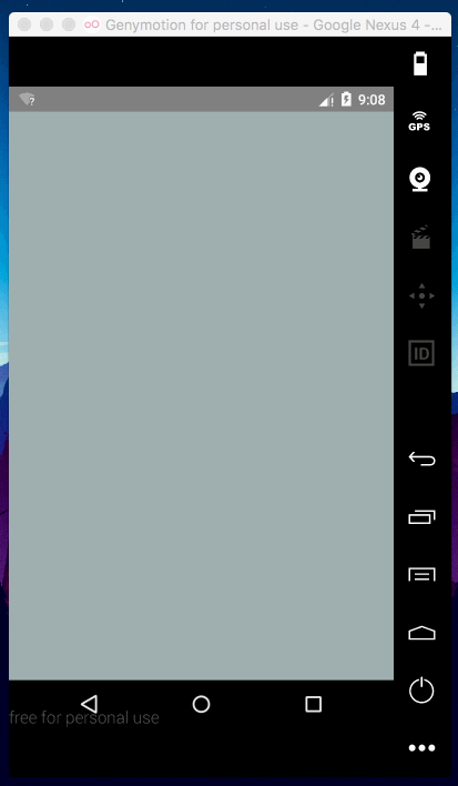
To render a basic menu, take the following code as an example. It will render a green header in Android with a drawer-based animation and a TabBar navigation for iOS. You can combine this component with [react-native-vector-icons](https://github.com/oblador/react-native-vector-icons) to fully customize the icons of your menu.
```js
import { Menu } from 'react-native-section-menu'
class MyMenu extends React.Component {
render () {
return (
}
initialEntry={0}
tintColor='#27ae60'
entries={[
{
id: 0,
element: ,
title: 'Bookmarks',
},
{
id: 1,
element: ,
title: 'Contacts',
},
{
id: 2,
element: ,
title: 'Search',
}
]}
/>
)
}
}
```
## API
### Required
| Prop | Type | Description |
|------|------|-------------|
| `entries` | `Array` | An array of menu entries. |
#### `Entry` object
| Prop | Type | Description |
|------|------|-------------|
| `id` | `number` | A numeric identifier. |
| `title` | `string` | The title of the section. |
| `element` | `element` | The element to render in the section. |
### Not required
| Prop | Type | Description |
|------|------|-------------|
| `initialEntry` | `number` | A number to mark the entry to render by default. |
### iOS specific
| Prop | Type | Description |
|------|------|-------------|
| | `TabBarIOS.propTypes` | You can pass all the props. Docs [here](http://facebook.github.io/react-native/releases/0.34/docs/tabbarios.html#tabbarios). |
#### `Entry` object
| Prop | Type | Description |
|------|------|-------------|
| `itemComponent` | `func` | Pass here `Icon.TabBarItemIOS` to use `react-native-vector-icons` TabBar item. |
| `iconName` | `string` | The `react-native-vector-icons` icon name. |
| `selectedIconName` | `string` | The `react-native-vector-icons` selected icon name. |
| `iconSize` | `number` | The `react-native-vector-icons` icon size. |
### Android specific
| Prop | Type | Description |
|------|------|-------------|
| | `DrawerLayoutAndroid.propTypes` | `DrawerLayoutAndroid` available props. |
| `containerStyle` | `View.propTypes.style` | The style of the parent container view. |
| `header` | `node` | Optional header to display above the menu list. |
#### `Entry` object
| Prop | Type | Description |
|------|------|-------------|
| `androidIcon` | `node` | A React node to render as an icon. |
| `androidBackground` | `TouchableNativeFeedback.propTypes.background` | The background effect of the entry section. |
| `tintColor` | `string` | The tint color of the selected entry. |
## License
MIT
## How to contribute
Please open an issue or send a PR ☺️.
## Authors
Álvaro Medina Ballester `amedina at apsl.net`.
Dani Sastre `dsastre at apsl.net`