https://github.com/aslam97/shadcn-minimal-tiptap
Minimal Tiptap Editor
https://github.com/aslam97/shadcn-minimal-tiptap
shadcn-tiptap tiptap-editor wysiwyg-editor
Last synced: 10 days ago
JSON representation
Minimal Tiptap Editor
- Host: GitHub
- URL: https://github.com/aslam97/shadcn-minimal-tiptap
- Owner: Aslam97
- License: mit
- Created: 2024-06-21T12:52:52.000Z (11 months ago)
- Default Branch: main
- Last Pushed: 2025-04-02T06:23:06.000Z (about 2 months ago)
- Last Synced: 2025-05-14T19:09:00.377Z (10 days ago)
- Topics: shadcn-tiptap, tiptap-editor, wysiwyg-editor
- Language: TypeScript
- Homepage: https://shadcn-minimal-tiptap.vercel.app
- Size: 1.56 MB
- Stars: 1,379
- Watchers: 7
- Forks: 84
- Open Issues: 27
-
Metadata Files:
- Readme: README.md
- License: LICENSE
Awesome Lists containing this project
README
# Minimal Tiptap Editor
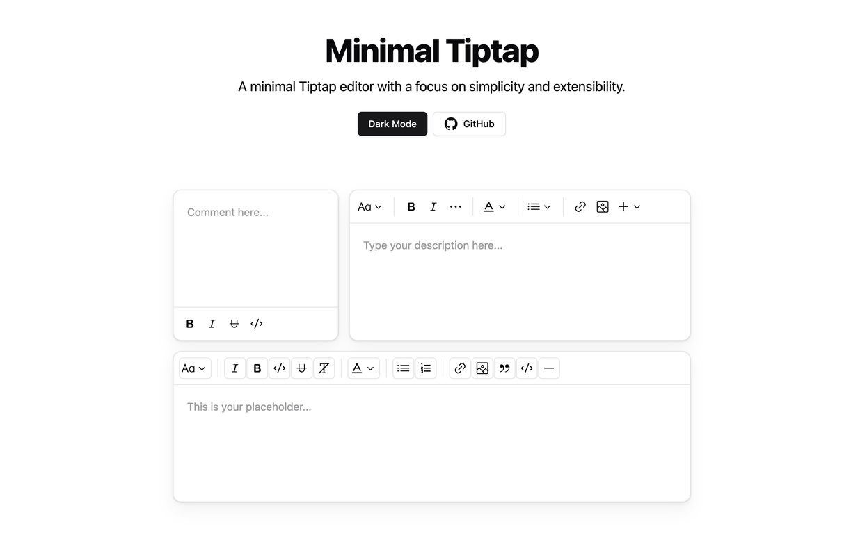
## Overview
The Minimal Tiptap Editor is a lightweight, customizable rich text editor component designed for integration with [Shadcn UI](https://ui.shadcn.com). It provides an intuitive interface for text formatting and editing while maintaining excellent performance.
## Table of Contents
- [Minimal Tiptap Editor](#minimal-tiptap-editor)
- [Overview](#overview)
- [Table of Contents](#table-of-contents)
- [Installation](#installation)
- [Dependencies](#dependencies)
- [Usage](#usage)
- [Props](#props)
- [Image Support](#image-support)
- [Configuration](#configuration)
- [Upload Management](#upload-management)
- [Error Management](#error-management)
- [Toolbar Configuration](#toolbar-configuration)
- [Key Features](#key-features)
- [Related Projects](#related-projects)
- [License](#license)
## Tailwind 4 & React 19 Support
There is an open PR for migrating this project to **Tailwind CSS v4** and **React 19**, but it has not been merged since I am not currently using these versions.
If you want to use Tailwind 4 and React 19, you can check out the [`tailwind-v4`](https://github.com/Aslam97/shadcn-minimal-tiptap/pull/91) branch. Contributions and feedback are welcome!
## Installation
1. Install the required dependencies:
```bash
npm install @tiptap/extension-code-block-lowlight lowlight react-medium-image-zoom @tiptap/extension-color @tiptap/extension-heading @tiptap/extension-horizontal-rule @tiptap/extension-image @tiptap/extension-link @tiptap/extension-placeholder @tiptap/extension-text-style @tiptap/extension-typography @tiptap/pm @tiptap/react @tiptap/starter-kit @tiptap/extension-underline
```
2. Configure the `TooltipProvider`:
Add the `TooltipProvider` to your application's root component (e.g., `App.tsx` or `main.tsx`):
```tsx
import { TooltipProvider } from "@/components/ui/tooltip"
export const App = () => {
return (
{/* Application components */}
)
}
```
## Dependencies
The following Shadcn UI components are required:
- [Button](https://ui.shadcn.com/docs/components/button)
- [Dropdown Menu](https://ui.shadcn.com/docs/components/dropdown-menu)
- [Input](https://ui.shadcn.com/docs/components/input)
- [Label](https://ui.shadcn.com/docs/components/label)
- [Popover](https://ui.shadcn.com/docs/components/popover)
- [Separator](https://ui.shadcn.com/docs/components/separator)
- [Switch](https://ui.shadcn.com/docs/components/switch)
- [Toggle](https://ui.shadcn.com/docs/components/toggle)
- [Tooltip](https://ui.shadcn.com/docs/components/tooltip)
- [Dialog](https://ui.shadcn.com/docs/components/dialog)
- [Toggle Group](https://ui.shadcn.com/docs/components/toggle-group)
- [Sonner](https://ui.shadcn.com/docs/components/sonner)
## Usage
1. Copy the `minimal-tiptap` directory into your project
2. Implement the component in your React application:
```tsx
import { useState } from "react"
import { Content } from "@tiptap/react"
import { MinimalTiptapEditor } from "./minimal-tiptap"
export const App = () => {
const [value, setValue] = useState("")
return (
)
}
```
## Props
The editor accepts all standard Tiptap editor props, plus these additional configuration options:
| Prop | Type | Default | Description |
| ------------------------ | -------------------------- | ------- | ------------------------------------------ |
| `value` | string | - | Initial editor content |
| `onChange` | function | - | Content change event handler |
| `editorContentClassName` | string | - | CSS class for the editor content container |
| `output` | 'html' \| 'json' \| 'text' | 'html' | Desired output format |
| `placeholder` | string | - | Editor placeholder text |
| `editorClassName` | string | - | CSS class for the editor container |
| `throttleDelay` | number | 0 | Update throttling delay in milliseconds |
## Image Support
### Configuration
Configure the Image extension with custom options:
> Note: The `uploadFn` must return the uploaded image URL. If no `uploadFn` is specified, enable the `allowBase64` option.
```typescript
Image.configure({
allowedMimeTypes: ["image/jpeg", "image/png", "image/gif"],
onImageRemove: handleImageRemove,
maxFileSize: 5 * 1024 * 1024, // 5MB
uploadFn: customImageUploader,
onActionSuccess: handleActionSuccess,
onActionError: handleActionError,
onValidationError: handleValidationError,
})
```
### Upload Management
Implement a custom upload handler:
```typescript
const customImageUploader = async (file: File, editor: Editor) => {
// Implement upload logic
// Return the uploaded image URL
return "https://example.com/uploaded-image.jpg"
}
Image.configure({
uploadFn: customImageUploader,
})
```
### Error Management
Implement comprehensive error handling:
```typescript
Image.configure({
onActionError: (error, props) => {
console.error("Image upload failed:", error, props)
// Implement user notification
},
onValidationError: (errors) => {
console.error("Image validation failed:", errors)
// Display validation feedback
},
})
```
## Toolbar Configuration
Customize toolbar sections using various configuration options:
```typescript
```
To prevent Dropdown Menu Trigger focus after selection:
```typescript
onCloseAutoFocus={event => event.preventDefault()}
```
## Key Features
- Automatic formatting removal when pressing Enter or creating new blocks
- Performance optimization through configurable `shouldRerenderOnTransaction`
- Comprehensive image handling with upload support
- Customizable toolbar with flexible section configuration
## Related Projects
- [React Fancy Switch](https://github.com/Aslam97/react-fancy-switch)
- [React Confirm Dialog](https://github.com/Aslam97/react-confirm-dialog)
## License
This project is licensed under the MIT License. See the [LICENSE](LICENSE) file for details.