https://github.com/atomjoy/vue3-input
Vue3 form field components with search and passowrd validation.
https://github.com/atomjoy/vue3-input
vue3-components vue3-form-fields vue3-form-inputs vue3-forms vue3-input-components
Last synced: 5 months ago
JSON representation
Vue3 form field components with search and passowrd validation.
- Host: GitHub
- URL: https://github.com/atomjoy/vue3-input
- Owner: atomjoy
- Created: 2023-05-01T08:40:53.000Z (about 3 years ago)
- Default Branch: main
- Last Pushed: 2024-04-07T13:28:02.000Z (about 2 years ago)
- Last Synced: 2025-06-03T19:20:38.934Z (about 1 year ago)
- Topics: vue3-components, vue3-form-fields, vue3-form-inputs, vue3-forms, vue3-input-components
- Language: Vue
- Homepage: https://github.com/atomjoy/vue3-input
- Size: 438 KB
- Stars: 4
- Watchers: 1
- Forks: 0
- Open Issues: 0
-
Metadata Files:
- Readme: README.md
Awesome Lists containing this project
README
# Vue3 form field components
Vue3 form field components with search and passowrd validation.
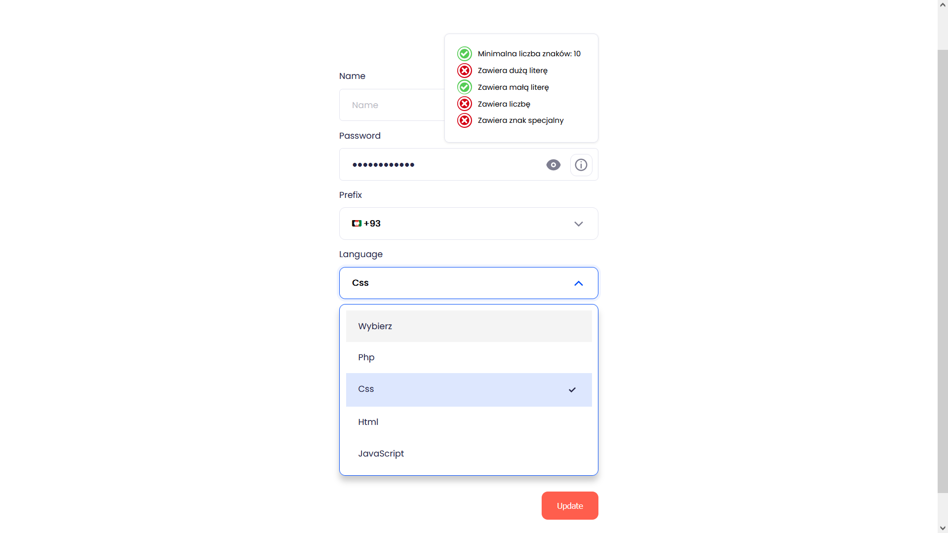
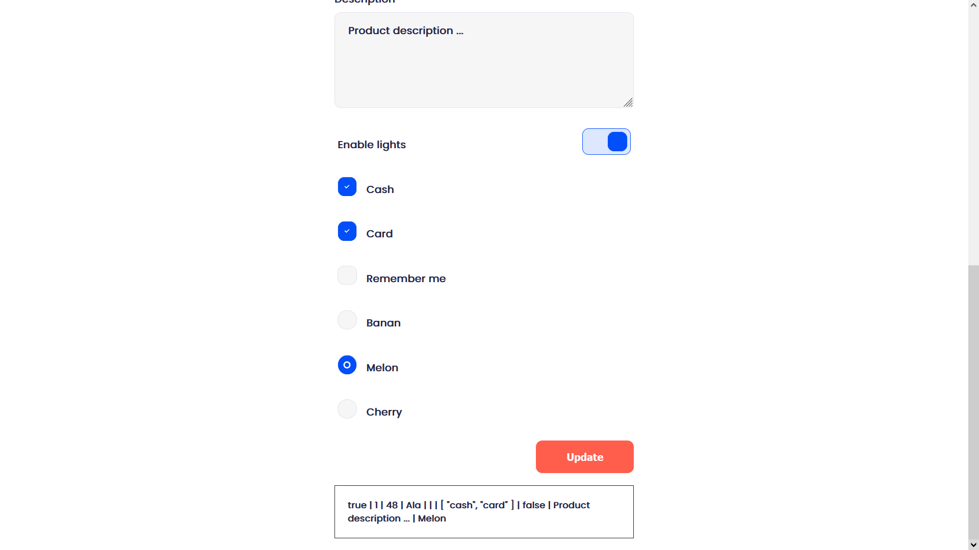
## Inputs (light/dark mode)
- Input
- Textarea
- Select (search)
- Password (validation)
- Radiobox (select one)
- Checkbox (multiple, single, onoff toggle)
- Phone prefix (flags emoji, country name, country code)
## Import fonts
assets/css/main.css
```css
@import url('https://fonts.googleapis.com/css2?family=Poppins&display=swap');
html, input, select, textarea, option, label, div {
font-family: 'Poppins', Arial, Helvetica, sans-serif;
}
label i {
float: right;
}
h1.full {
text-align: left;
}
```
## Demo page
## RWD settings and dark mode style
Style in input-root.css
```css
@media (prefers-color-scheme: dark) {
html,
body {
background: var(--wow-bg);
}
}
@media (max-width: 1600px) {
:root {
--wow-font-size: 18px;
}
}
@media (max-width: 1280px) {
:root {
--wow-font-size: 16px;
}
}
@media (max-width: 1024px) {
:root {
--wow-font-size: 14px;
}
}
@media (max-width: 480px) {
:root {
--wow-font-size: 14px;
}
}
```
## Images

## LICENSE
This project is licensed under the terms of the GNU GPLv3 license.