https://github.com/austinv11/pybuencolors
A Pythonic port of the BuenColors R package
https://github.com/austinv11/pybuencolors
matplotlib matplotlib-figures matplotlib-style-sheets matplotlib-styles
Last synced: 4 months ago
JSON representation
A Pythonic port of the BuenColors R package
- Host: GitHub
- URL: https://github.com/austinv11/pybuencolors
- Owner: austinv11
- License: mit
- Created: 2025-12-08T04:32:21.000Z (7 months ago)
- Default Branch: master
- Last Pushed: 2025-12-10T16:08:15.000Z (7 months ago)
- Last Synced: 2026-01-04T06:01:50.371Z (6 months ago)
- Topics: matplotlib, matplotlib-figures, matplotlib-style-sheets, matplotlib-styles
- Language: Python
- Homepage: https://austinv11.github.io/PyBuenColors
- Size: 12.1 MB
- Stars: 1
- Watchers: 0
- Forks: 0
- Open Issues: 0
-
Metadata Files:
- Readme: README.md
- License: LICENSE
Awesome Lists containing this project
README
# PyBuenColors
[](https://pypi.org/project/buencolors/)
[](https://github.com/austinv11/PyBuenColors/actions)
[](https://github.com/austinv11/PyBuenColors/blob/master/LICENSE)
A pythonic port of the [BuenColors R package](https://github.com/caleblareau/BuenColors) for convenient scientific color palettes and matplotlib styles.
Color palettes are a direct port from the R package, with many based on the [wesanderson](https://github.com/karthik/wesanderson) R package.
## Installation
```bash
pip install buencolors
```
## Quick Start
### Using the Pretty Plot Style
The easiest way to improve your matplotlib plots is to use the included `pretty-plot` style:
```python
import matplotlib.pyplot as plt
import numpy as np
# Apply the pretty-plot style
plt.style.use('pretty-plot')
# Create a beautiful plot
x = np.linspace(0, 10, 100)
plt.plot(x, np.sin(x), label='sin(x)')
plt.plot(x, np.cos(x), label='cos(x)')
plt.xlabel('x')
plt.ylabel('y')
plt.legend()
plt.show()
```
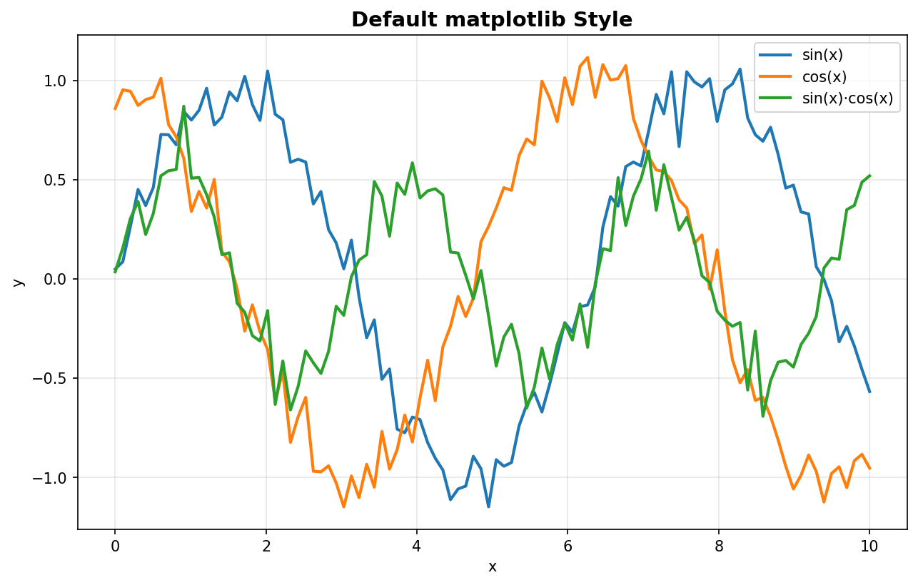
**Before (default):**
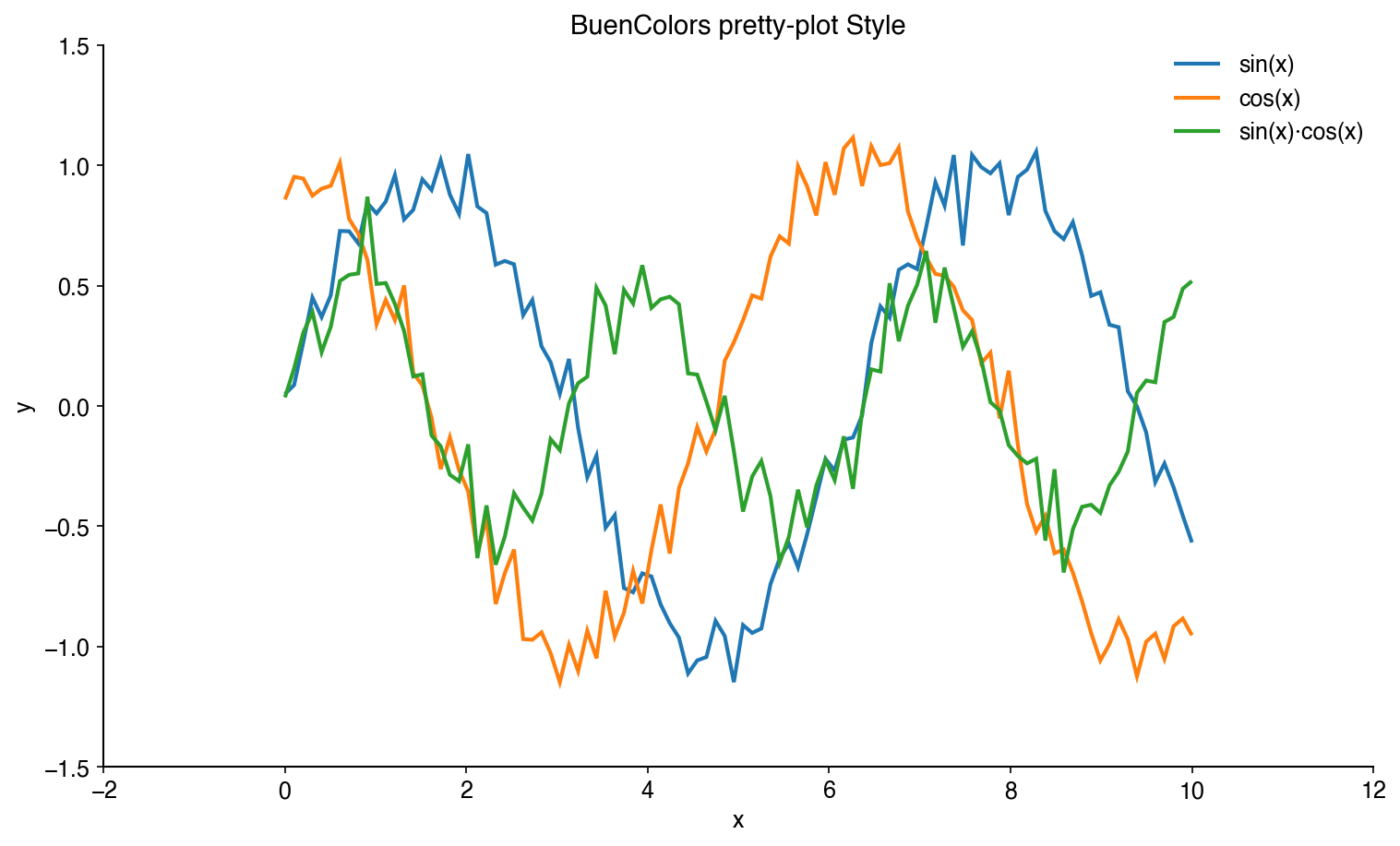
**After (pretty-plot):**
### Using Color Palettes
BuenColors automatically registers all palettes as matplotlib colormaps:
```python
import buencolors as bc
import matplotlib.pyplot as plt
import numpy as np
# List available palettes
bc.list_palettes()
# Palettes are available directly as colormaps
plt.style.use('pretty-plot')
data = np.random.randn(100, 100)
plt.imshow(data, cmap='Zissou')
plt.colorbar()
plt.show()
# Or use get_palette() to extract individual colors
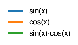
colors = bc.get_palette('Zissou')
for i, color in enumerate(colors):
plt.plot([0, 1], [i, i], color=color, linewidth=10)
plt.show()
```
## Features
### Helper Functions
BuenColors provides several utility functions to make your plots publication-ready:
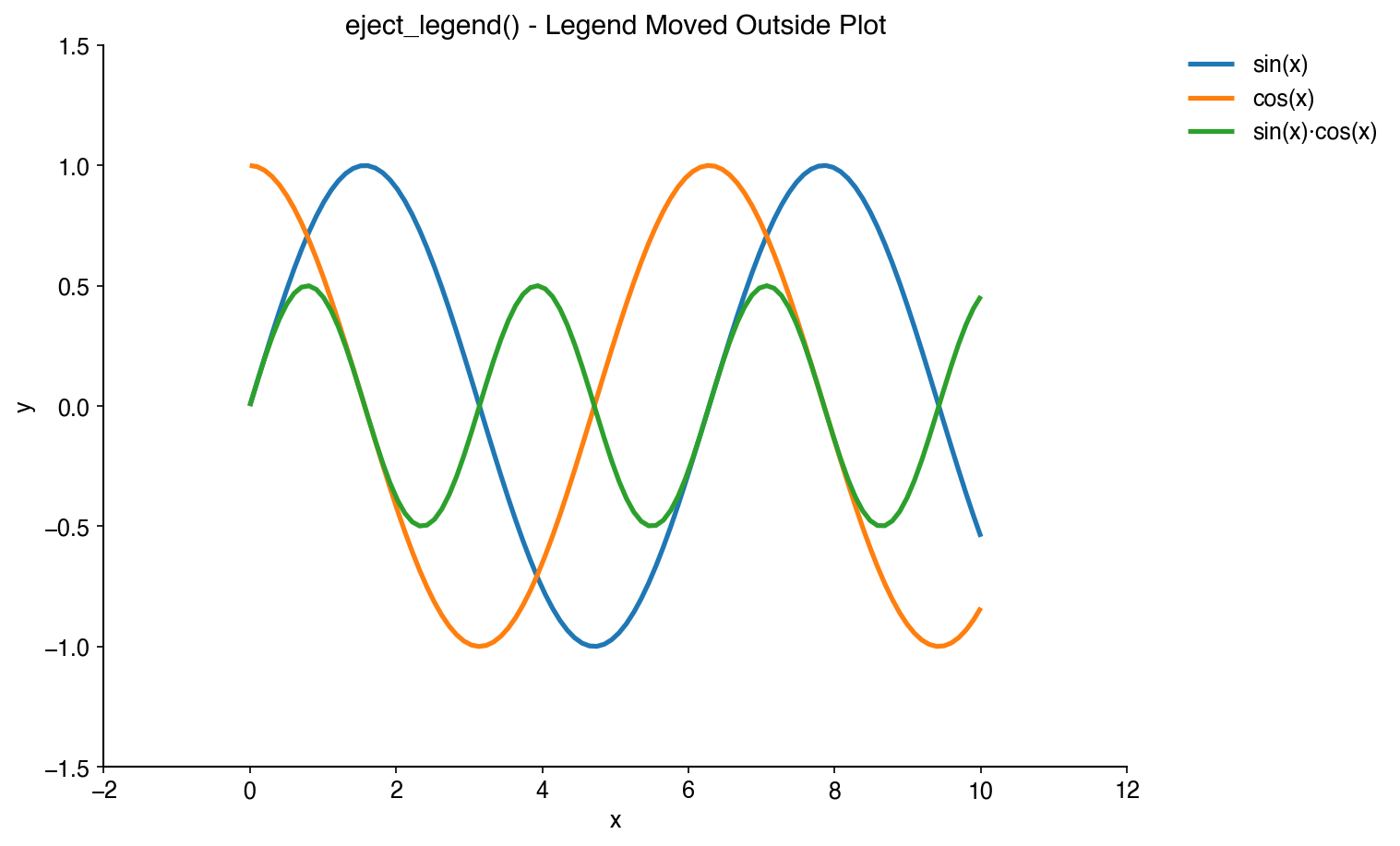
#### Eject Legend
Move legends outside the plot area to avoid obscuring data:
```python
import matplotlib as plt
import buencolors as bc
# Your plot code here
plt.plot(x, y1, label='Dataset 1')
plt.plot(x, y2, label='Dataset 2')
# Eject the legend to the right
bc.eject_legend()
```
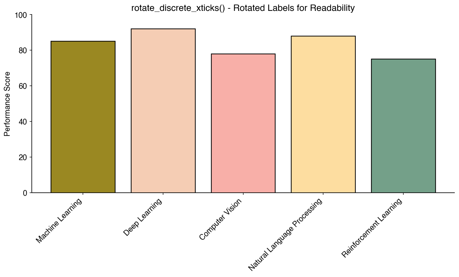
#### Rotate X-Tick Labels
Automatically rotate discrete x-tick labels for better readability:
```python
bc.rotate_discrete_xticks()
```
#### Grab Legend
Extract a legend to a separate figure for independent saving or publication:
```python
# Create a plot with legend
plt.plot(x, y1, label='Dataset 1')
plt.plot(x, y2, label='Dataset 2')
plt.legend()
# Extract legend to separate figure (removes from original by default)
legend_fig = bc.grab_legend()
legend_fig.savefig('legend.pdf', bbox_inches='tight')
plt.savefig('plot.pdf') # Plot saved without legend
# Or keep legend on original plot
legend_fig = bc.grab_legend(remove=False)
legend_fig.savefig('legend_copy.pdf', bbox_inches='tight')
plt.show() # Original plot still has legend
```
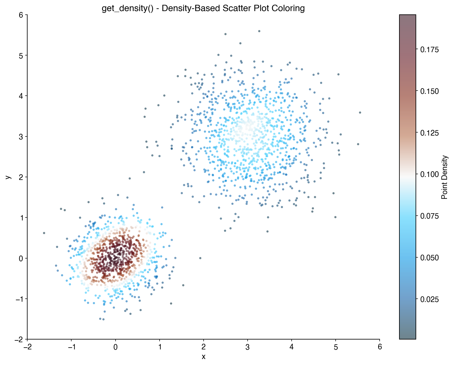
#### Color by Density
Color scatter plot points by their density:
```python
x = np.random.randn(1000)
y = np.random.randn(1000)
density = bc.get_density(x, y)
plt.scatter(x, y, c=density, cmap='viridis', s=5)
plt.colorbar(label='Density')
```
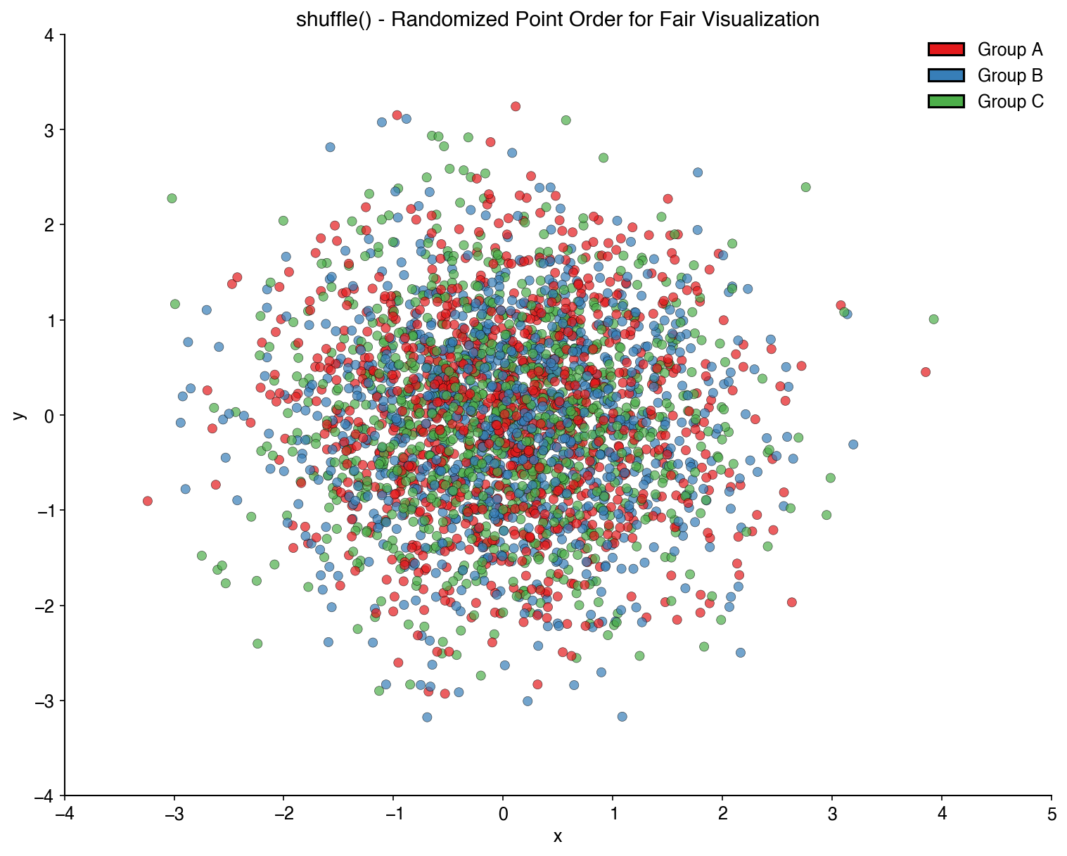
#### Shuffle Plot Order
Randomize the order of plot elements to avoid overplotting bias:
```python
x_shuffled, y_shuffled, colors_shuffled = bc.shuffle(x, y, colors)
plt.scatter(x_shuffled, y_shuffled, c=colors_shuffled)
```
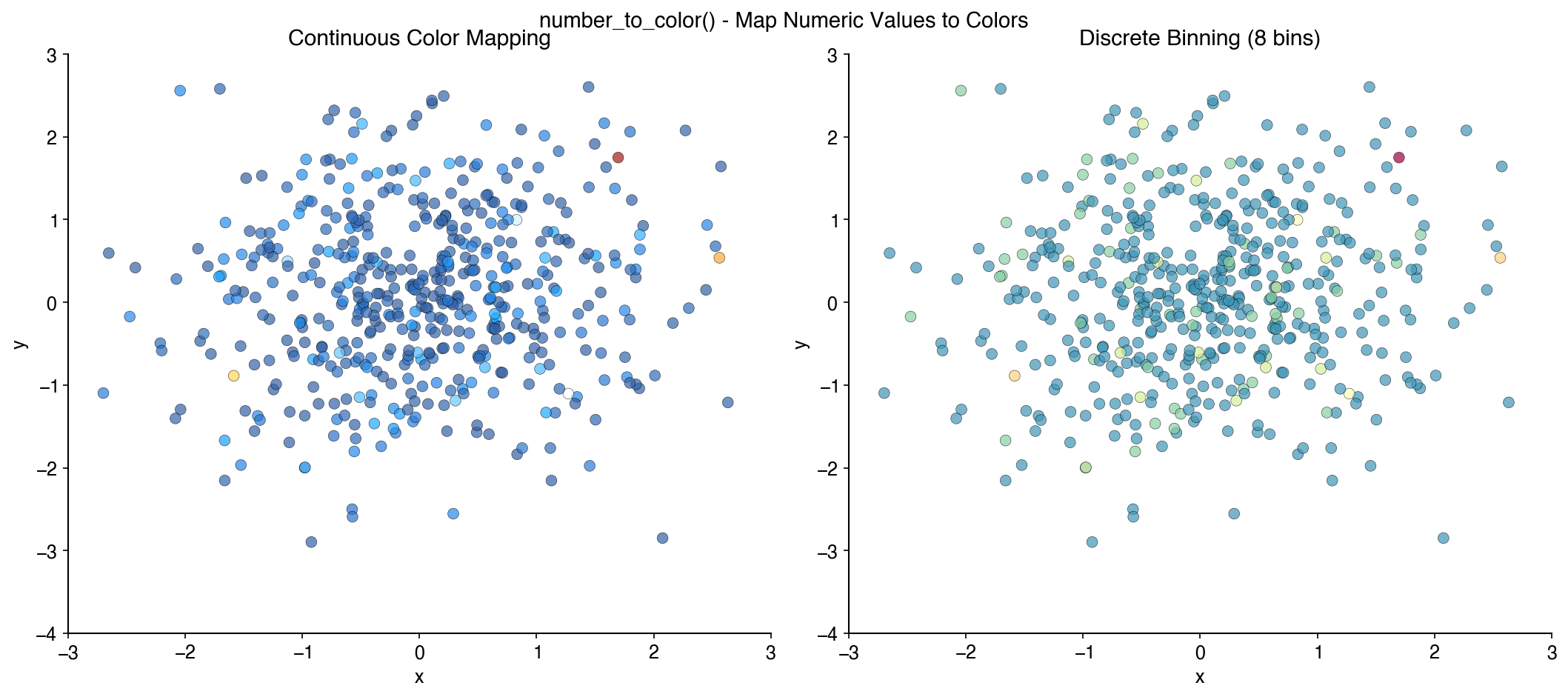
#### Number to Color
Map numerical values to colors from a palette:
```python
values = [1, 2, 3, 4, 5]
colors = bc.number_to_color(values, palette='Zissou')
```
## Single-Cell Analysis
BuenColors provides specialized functions for single-cell analysis visualization, designed to work seamlessly with Scanpy and AnnData objects.
### Installation for Single-Cell Features
To use the single-cell features, install with scanpy and anndata:
```bash
pip install buencolors scanpy anndata
```
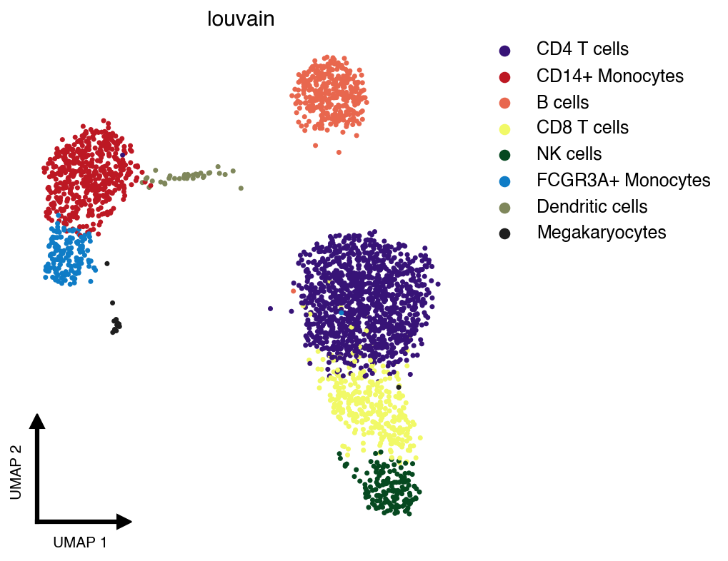
### Clean UMAP Visualization
The `clean_umap()` function creates publication-ready UMAP plots with minimal decorations:
```python
import scanpy as sc
import buencolors as bc
import matplotlib.pyplot as plt
# Load example dataset
adata = sc.datasets.pbmc3k_processed()
# Create a clean UMAP colored by cell type
with plt.style.context('pretty-plot'):
bc.clean_umap(adata, color='louvain', palette='lawhoops')
```
Features of `clean_umap()`:
- **Minimal decorations**: No borders, ticks, or frame
- **Custom L-shaped axis indicators**: Small arrows showing UMAP dimensions
- **Auto-ejected legend**: Automatically positioned to the right to avoid obscuring data
- **Shuffled cells**: Randomizes plotting order to avoid non-random ordering artifacts
## Examples
For detailed examples and interactive notebooks, see the [documentation](https://austinv11.github.io/PyBuenColors/) or the [docs/examples directory](docs/examples/).
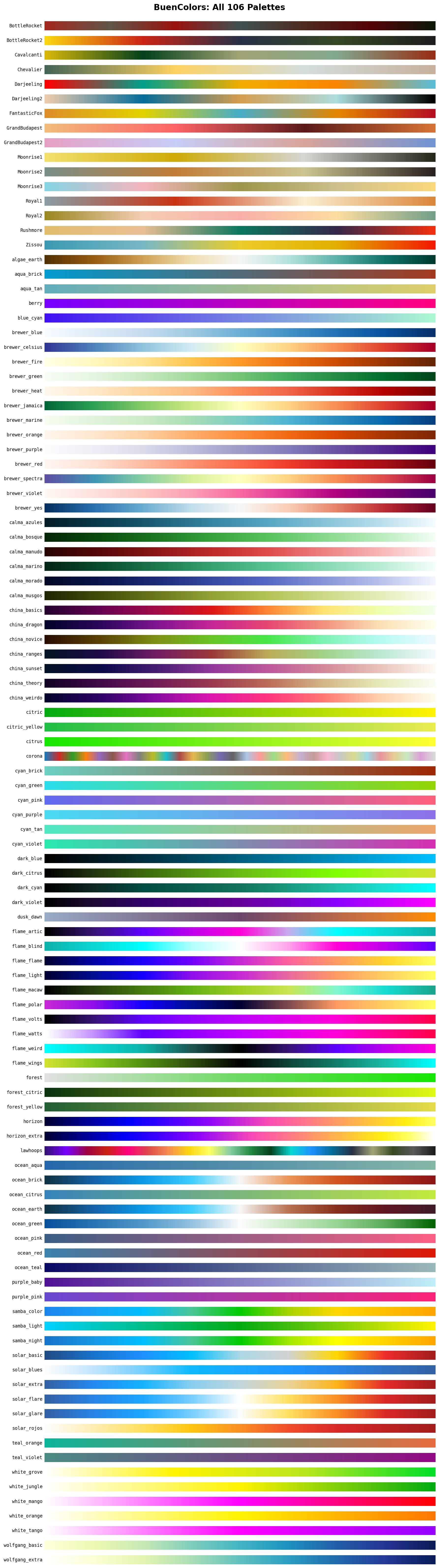
## Available Palettes
## License
This project is licensed under the MIT License.
## Credits
- Original [BuenColors R package](https://github.com/caleblareau/BuenColors)
- Wes Anderson palettes inspired by [wesanderson](https://github.com/karthik/wesanderson)