https://github.com/awebcode/react-input-emoji-v3
https://github.com/awebcode/react-input-emoji-v3
Last synced: 9 months ago
JSON representation
- Host: GitHub
- URL: https://github.com/awebcode/react-input-emoji-v3
- Owner: awebcode
- Created: 2024-12-29T14:39:02.000Z (over 1 year ago)
- Default Branch: master
- Last Pushed: 2025-01-01T04:17:14.000Z (over 1 year ago)
- Last Synced: 2025-02-21T10:44:36.273Z (over 1 year ago)
- Language: TypeScript
- Size: 37.1 KB
- Stars: 0
- Watchers: 1
- Forks: 0
- Open Issues: 0
-
Metadata Files:
- Readme: README.md
Awesome Lists containing this project
README
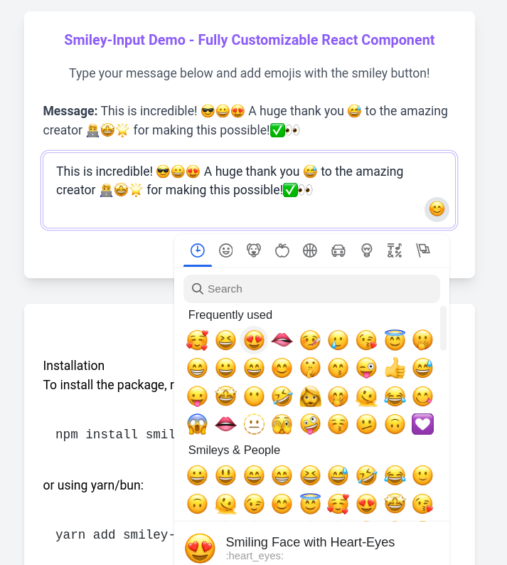
# react-input-emoji-v3 😄😎✅👀
`react-input-emoji-v3` is a React component that enables users to input text and emojis effortlessly. This component is ideal for chat applications, social media platforms, and any interactive applications where emoji input is required.
## Live Demo
Check out the [Live Demo here](https://smiley-input.vercel.app/).
Watch the video demo on [YouTube](https://youtu.be/PTPCZTBhw9Y).
## Features
- Easy integration into any React application
- Customizable emoji picker
- Supports emoji insertion at the cursor position
- Responsive design for different screen sizes
- Configurable emoji picker options
- Styled with Tailwind CSS
## Installation
To install the package, run the following command:
```bash
npm install react-input-emoji-v3
```
or using yarn/bun:
```bash
yarn add react-input-emoji-v3 || bun add react-input-emoji-v3
```
## Usage
Here is a simple example to get you started with `react-input-emoji-v3`:
### Import the Component
```jsx
import React, { useState } from "react";
import { SmileyInput } from "react-input-emoji-v3";
const App = () => {
const [message, setMessage] = useState("");
const handleSendMessage = (value) => {
//Call Api
console.log("Message sent:", value);
setMessage("");
};
return (
{" "}
handleSendMessage(message)}
>
Send
{" "}
);
};
export default App;
```
### Tailwind CSS Setup
If you haven't already set up Tailwind CSS in your project, follow these steps:
1\. Install Tailwind CSS:
```bash
npm install -D tailwindcss postcss autoprefixer
npx tailwindcss init -p
```
2\. Configure your `tailwind.config.js`:
```js
// tailwind.config.js
module.exports = {
content: [
'./src/\*_/_.{js,jsx,ts,tsx}',
],
theme: {
extend: {},
},
plugins: [],
}
```
3\. Add Tailwind's directives to your CSS file:
```css
/_ styles.css _/
@tailwind base;
@tailwind components;
@tailwind utilities;
```
4\. Import the CSS file in your entry point (e.g., `index.tsx`):
```jsx
import './styles.css';
```
### Example Styles
```css
/* Custom styles for the textarea and emoji button */
.custom-textarea {
@apply border border-gray-300 p-2 text-base rounded-md;
}
.custom-emoji-button {
@apply bg-none border-none cursor-pointer text-lg;
}
```
## Props
The `SmileyInput` component accepts the following props:
| Prop | Type | Description |
|---------------------|-------------------------------------------------|----------------------------------------------------------|
| `value` | `string` | The current value of the input |
| `setValue` | `(value: string) => void` | Function to update the input value |
| `keepOpened` | `boolean` | Keep the emoji picker open after selecting an emoji |
| `className` | `string` | Custom class name for the input |
| `pickerOptions` | `Omit` | Configuration options for the emoji picker |
| `emojiButtonElement`| `React.ReactNode` | Custom element for the emoji button |
| `emojiButtonClassName`| `string` | Custom class name for the emoji button |
## Contributing
Contributions are welcome! If you find a bug or have a feature request, please open an issue. If you would like to contribute code, please open a pull request.
## License
This project is licensed under the MIT License. See the [LICENSE](./LICENSE) file for details.
---
This README now includes live demo links at the beginning, along with the rest of the essential information to help users get started with `react-input-emoji-v3`. If you need any further adjustments or additional information, feel free to ask!