https://github.com/bbc-data-unit/equal-pay-day
Equal pay day: What is the gender pay gap like where you are?
https://github.com/bbc-data-unit/equal-pay-day
average gender ons pay
Last synced: 9 months ago
JSON representation
Equal pay day: What is the gender pay gap like where you are?
- Host: GitHub
- URL: https://github.com/bbc-data-unit/equal-pay-day
- Owner: BBC-Data-Unit
- Created: 2017-11-15T09:49:13.000Z (over 8 years ago)
- Default Branch: master
- Last Pushed: 2017-11-15T16:59:29.000Z (over 8 years ago)
- Last Synced: 2025-08-21T07:58:16.496Z (11 months ago)
- Topics: average, gender, ons, pay
- Homepage: http://www.bbc.co.uk/news/uk-england-41805053
- Size: 463 KB
- Stars: 0
- Watchers: 4
- Forks: 0
- Open Issues: 0
-
Metadata Files:
- Readme: README.md
Awesome Lists containing this project
README
# Equal pay day: What is the gender pay gap like where you are?

On November 10 - the day that campaigners highlight a woman on an average wage stops being paid relative to their male counterparts - we [published a special feature allowing users to "Find out what the gender pay gap is in your area"](http://www.bbc.co.uk/news/uk-england-41805053).
## Get the data
* Analysis: [mean and median dates women 'stop being paid' by local authority region](https://github.com/BBC-Data-Unit/equal-pay-day/blob/master/gendergap.xlsx)
* ONS: [Annual Survey of Hours and Earnings: 2017 provisional and 2016 revised results](https://www.ons.gov.uk/employmentandlabourmarket/peopleinwork/earningsandworkinghours/bulletins/annualsurveyofhoursandearnings/latest)
* ONS: [Explore the gender pay gap by occupation](https://visual.ons.gov.uk/explore-the-gender-pay-gap-and-test-your-knowledge/#interactive)
## Visualisation and interactivity
* Interactive map: Find out what the gender pay gap is in your area
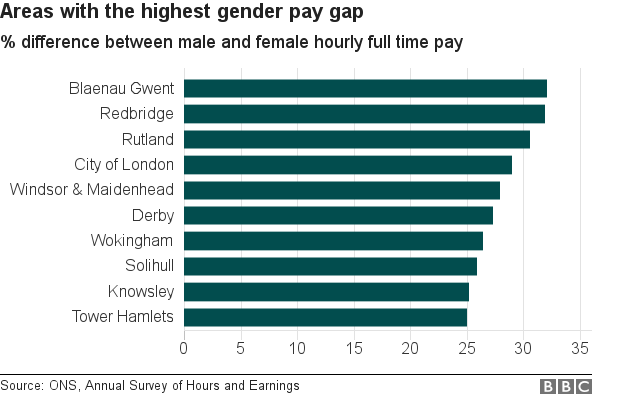
* Bar chart: Areas with the highest gender pay gap
* Bar chart: Areas where the gender pay gap is most towards women
* Multiple bar chart: The pay gap in high-earning occupations
## Further work outside the team

Chris Love took the data from this repo and [made a scatterchart showing the distribution of pay inequality by area](https://twitter.com/ChrisLuv/status/930779264122851328), followed by [an interactive Tableau dashboard](https://public.tableau.com/profile/chrisluv#!/vizhome/EqualPayDay/EqualPayDay) complete with a full working calendar that updated to reflect the area selected.
## Statistical context: mean vs median average
Depending on whether you use a mean average or a median average, the pay gap can be either 14% or 9%. Our story included an analysis by Robert Cuffe, BBC News Head of Statistics explaining the choice to use a mean average. He said:
> "Both [averages] come from the Office for National Statistics. They use different averages. The 9% figure uses the middle (median) number. The 14% figure uses the mean average. The mean can be pushed up by very a small number of high values. If Bill Gates walks into your local pub, the mean wealth there will shoot up by millions, but the median won't change much.
>
> "The ONS prefer 9% for that reason but campaigners say that the average should reflect the gaps across all of society.
>
> "Whether equal pay day lands on 10 November (mean), 27 November (median) or on a different day in your area, this analysis shows that there are few places in the UK where it lands on 31 December."