https://github.com/benjamin-dobell/react-native-android-toolbar-badge
React Native support for displaying badges in ToolbarAndroid
https://github.com/benjamin-dobell/react-native-android-toolbar-badge
android badge-view react-component react-native
Last synced: 6 months ago
JSON representation
React Native support for displaying badges in ToolbarAndroid
- Host: GitHub
- URL: https://github.com/benjamin-dobell/react-native-android-toolbar-badge
- Owner: Benjamin-Dobell
- License: mit
- Created: 2017-04-12T20:55:58.000Z (about 9 years ago)
- Default Branch: master
- Last Pushed: 2021-03-11T19:21:08.000Z (over 5 years ago)
- Last Synced: 2025-02-11T12:41:42.080Z (over 1 year ago)
- Topics: android, badge-view, react-component, react-native
- Language: Java
- Size: 29.3 KB
- Stars: 2
- Watchers: 4
- Forks: 0
- Open Issues: 1
-
Metadata Files:
- Readme: README.md
- Funding: .github/FUNDING.yml
- License: LICENSE
Awesome Lists containing this project
README
# react-native-android-toolbar-badge

A simple module that allows you to attach badges to action icons in your Android toolbars.
## Install
Install the node module:
yarn add react-native-android-toolbar-badge
Then link the native code into your Android project with:
react-native link
After linking the code you'll need to make a small change to the native Android (Java) code included in your React Native app.
In the file(s) that define your React Native Android activities (classes that extends `ReactActivity`), typically just `MainActivity`, you'll need to add the following imports:
```
import au.com.glassechidna.react.drawables.DrawableProviderResourcesWrapper;
import au.com.glassechidna.react.toolbar.badge.ToolbarBadgeAndroidModule;
```
then inside your class definition, add/override `getResources()` as follows:
```
@Override
public Resources getResources() {
return new DrawableProviderResourcesWrapper(super.getResources(), ToolbarBadgeAndroidModule.getDrawableStore());
}
```
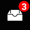
## Appearance
### Default


### No Number

### Large Number (Prevent Overflow)

### Automatically Hides (`number` == 0)

### Custom Background Color

### Custom Text (and Background) Color

### Custom Text Size

## Basic Usage
Instead of directly using the `ToolbarAndroid` provided by React Native, you'll use `BadgeToolbarAndroid`, which is just a simple wrapper around `ToolbarAndroid`.
Import `BadgeToolbarAndroid` like so:
```
import { BadgeToolbarAndroid } from 'react-native-android-toolbar-badge'
```
then in your render method, you can use `BadgeToolbarAndroid` exactly as you would `ToolbarAndroid` e.g.
```
```
However, now your actions can include an optional `badge` property. `badge` is an object with the following properties:
### `badge` Properties
| Property | Type | Default | Description |
| --------------- | ------ | ------- | -------------------------------------------------------------------------------------------------------------------------------------------------------------------------------------------------------------------------- |
| width | number | 32 | Width of the badge bounds (including transparent region around the action icon). |
| height | number | 32 | Width of the badge bounds (including transparent region around the action icon). |
| backgroundColor | color | '#f00' | Fill color of the badge circular background. |
| textColor | color | '#fff' | Color of the number/text displayed on the badge (if displayed, see `number`). |
| textSize | number | 16 | Size of the number/text displayed on the badge (if displayed, see `number`) |
| maxNumber | number | 9 | The maximum number displayed on the badge. If `number` exceeds this value, 3 vertically centered dots ("...") are displayed instead. This functionality exists to stop long numbers overflowing outside the badge circle. |
| number | number | 0 | If the value is zero, the badge will be hidden. If the value is greater than zero, the number (or 3 dots) will be displayed. If you wish to show the badge without any text, you can specify a negative number. |
**Note:** Icons found in an Android toolbar are typically 24dp x 24dp (20dp x 20dp safe area). It's recommended you stick to that size. The default badge size of 32dp x 32dp gives the badge some additional room to be displayed without completely obscuring the icon or having illegibly small font. Your icon will _not_ be stretched.
### Usage with [react-native-vector-icons](https://github.com/oblador/react-native-vector-icons)
_react-native-vector-icon_'s `Icon.ToolbarAndroid` (or whatever you've imported it as) wraps a regular `ToolbarAndroid`, however we need to use `BadgeToolbarAndroid` in order to display badges.
Unfortunately, we can't use composition (as you would normally in React) because `Icon.ToolbarAndroid` doesn't take any props to support our use case. However, using ES6 class inheritance we can trivially extend `Icon.ToolbarAndroid` and override `render()` to display `BadgeToolbarAndroid` instead of `ToolbarAndroid`.
```
export class BadgeIconToolbarAndroid extends Icon.ToolbarAndroid {
render() {
return
}
}
```
Now you can simply use `BadgeIconToolbarAndroid` instead of `ToolbarAndroid` or `Icon.ToolbarAndroid` - you'll have support for both badges and vector icons.
Admittedly, the solution is not particularly elegant as we've utilised internal knowledge of how _react-native-vector-icons_ works, however it gets the job done.
## How does this library work?
React Native's `ToolbarAndroid` uses the real Android SDK-provided toolbar, not a react view hierarchy. Doing so amounts to a more consistent experience for Android users, however we can't customise the toolbar as we would a regular React Native view hierarchy.
In particular, action icons are not specified as views at all. Rather, they're specified as either a static image, or a "[drawable](https://developer.android.com/reference/android/graphics/drawable/Drawable.html)", which is just a general abstraction for something that can be drawn, and much more light-weight than a view. Static images obviously won't do for badges (not without a lot of pre-generated assets), however drawables afford us much greater flexibility.
Unfortunately, given that drawables are inherently an Android feature/representation, React Native doesn't expose a simple means to utilise drawables from Javascript.
Quite frankly, this library is a bit dodgy in how it's implemented, I don't exactly recommend looking through the code-base for inspiration! Basically, it just so happens that the way `ToolbarAndroid` is implemented in React Native, if the specified image URI is not a `file://`, `http://` or `https://` URL then it'll fallback to grabbing a `Drawable` from the Android app's resources. Consequently, we utilise [react-native-android-drawables](https://github.com/Benjamin-Dobell/react-native-android-drawables) to facilitate injection of our badge drawables into the Android app's "resources" at runtime, where React Native can, inadvertedly, find them.
### Memory usage
Badged icon images and generated drawables, once first displayed, are kept in memory (cached and reused) whilst your app remains running. Generally I'd expect this to be a non-issue as we're talking about tiny toolbar icons, likely only one or two of which actually have badges displayed, and are frequently visibile, hence in memory anyway.
However, if you have a use-case that makes this non-desirable, pull requests are welcome :)