https://github.com/berkaycatak/adaptive_platform_ui
Adaptive Flutter widgets with native iOS 26+ Liquid Glass designs and automatic platform detection for iOS, Android, and web.
https://github.com/berkaycatak/adaptive_platform_ui
flutter-cupertino flutter-cupertino-widgets flutter-ios26 flutter-liquid flutter-liquid-glass flutter-material-widgets flutter-package flutter-packages liquid-glass
Last synced: 3 months ago
JSON representation
Adaptive Flutter widgets with native iOS 26+ Liquid Glass designs and automatic platform detection for iOS, Android, and web.
- Host: GitHub
- URL: https://github.com/berkaycatak/adaptive_platform_ui
- Owner: berkaycatak
- License: mit
- Created: 2025-10-10T12:05:17.000Z (8 months ago)
- Default Branch: main
- Last Pushed: 2025-11-20T11:30:01.000Z (7 months ago)
- Last Synced: 2025-11-20T13:16:23.255Z (7 months ago)
- Topics: flutter-cupertino, flutter-cupertino-widgets, flutter-ios26, flutter-liquid, flutter-liquid-glass, flutter-material-widgets, flutter-package, flutter-packages, liquid-glass
- Language: Dart
- Homepage: http://pub.dev/packages/adaptive_platform_ui/
- Size: 7.55 MB
- Stars: 61
- Watchers: 1
- Forks: 12
- Open Issues: 15
-
Metadata Files:
- Readme: README.md
- Changelog: CHANGELOG.md
- Contributing: .github/CONTRIBUTING.md
- License: LICENSE
Awesome Lists containing this project
README
# Adaptive Platform UI
[](https://github.com/berkaycatak/adaptive_platform_ui/actions)
[](https://github.com/berkaycatak/adaptive_platform_ui/releases)
[](https://opensource.org/licenses/MIT)
[](https://flutter.dev)
A Flutter package that provides adaptive platform-specific widgets with native iOS 26+ designs, traditional Cupertino widgets for older iOS versions, and Material Design for Android.

## iOS 26+ Native Toolbar & Tab Bar


Native iOS 26 UIToolbar and UITabBar with Liquid Glass blur effects, minimize behavior, and native gesture handling.
## Features
**AdaptiveApp** - Unified app configuration for all platforms:
- Separate themes for Material (Android) and Cupertino (iOS)
- Full theme mode support (light, dark, system)
- Router support via `AdaptiveApp.router()`
- Zero configuration required
**iOS 26+ Native Designs** - Modern iOS 26 components with:
- **Native UIToolbar** - Liquid Glass blur effects with native iOS 26 design
- **Native UITabBar** - Tab bar with minimize behavior and smooth animations
- **Native UIButton** - Button styles with spring animations and haptic feedback
- **Native UISegmentedControl** - Segmented controls with SF Symbol support
- **Native UISwitch & UISlider** - Switches and sliders with native animations
- Native corner radius and shadows
- Smooth spring animations
- Dynamic color system (light/dark mode)
- Multiple component styles
**iOS Legacy Support** - Traditional Cupertino widgets for iOS 18 and below
**Material Design** - Full Material 3 support for Android
**Automatic Platform Detection** - Zero configuration required
**Version-Aware Rendering** - Automatically selects appropriate widget based on iOS version
## Widget Showcase
### Important: Localization Setup
⚠️ **For proper localization support (automatic translations for date/time pickers, buttons, etc.), you must add localization delegates to your `AdaptiveApp`:**
```dart
import 'package:flutter_localizations/flutter_localizations.dart';
AdaptiveApp(
localizationsDelegates: [
GlobalMaterialLocalizations.delegate,
GlobalCupertinoLocalizations.delegate, // Important!
GlobalWidgetsLocalizations.delegate,
],
supportedLocales: [
Locale('en', ''), // English
Locale('de', ''), // German
Locale('tr', ''), // Turkish
// Add more locales as needed
],
// ... rest of your app configuration
)
```
Without these delegates, date/time pickers and other widgets will show English text regardless of system language.
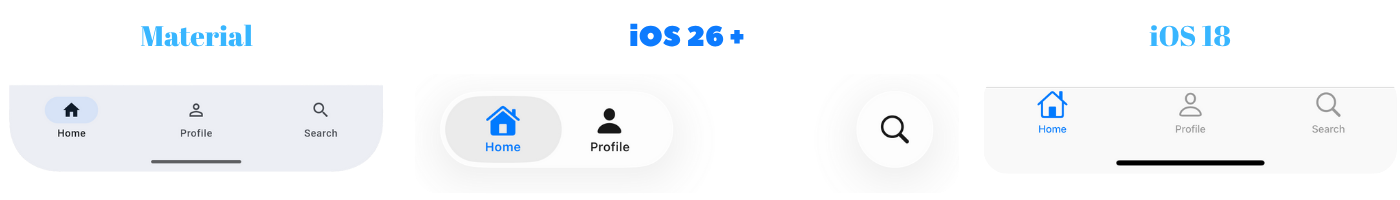
### AdaptiveScaffold with AdaptiveAppBar

**Basic Usage:**
```dart
AdaptiveScaffold(
appBar: AdaptiveAppBar(
title: 'My App',
actions: [
AdaptiveAppBarAction(
onPressed: () {},
iosSymbol: 'gear',
icon: Icons.settings,
),
],
),
bottomNavigationBar: AdaptiveBottomNavigationBar(
items: [
AdaptiveNavigationDestination(
icon: 'house.fill',
label: 'Home',
),
AdaptiveNavigationDestination(
icon: 'person.fill',
label: 'Profile',
),
],
selectedIndex: 0,
onTap: (index) {},
),
body: YourContent(),
)
```
**iOS 26 Native Toolbar:**
```dart
AdaptiveScaffold(
appBar: AdaptiveAppBar(
title: 'My App',
useNativeToolbar: true, // Enable native iOS 26 UIToolbar with Liquid Glass effects
actions: [...],
),
body: YourContent(),
)
```
**iOS 26 Native Bottom Bar:**
```dart
AdaptiveScaffold(
bottomNavigationBar: AdaptiveBottomNavigationBar(
useNativeBottomBar: true, // Enable native iOS 26 UITabBar with Liquid Glass effects (default)
items: [...],
selectedIndex: 0,
onTap: (index) {},
),
body: YourContent(),
)
```
**No AppBar or Bottom Navigation:**
```dart
// If appBar and bottomNavigationBar are null, neither will be shown
AdaptiveScaffold(
body: YourContent(),
)
```
**Key Features:**
- 🎨 **AdaptiveAppBar**: Centralized app bar configuration
- 📱 **AdaptiveBottomNavigationBar**: Centralized bottom navigation configuration
- 🔧 **Custom Navigation Bars**: Provide your own navigation components
- 🌟 **Native iOS 26 Components**: Optional Liquid Glass effects with native UIKit
- 🎯 **Priority System**: Custom bars take priority over auto-generated ones
- 🔄 **Flexible**: Null parameters hide components
Adaptive Bottom Navigation Bar (Destinations):
### AdaptiveButton
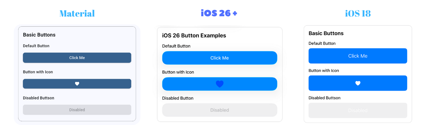
```dart
// Basic button with label
AdaptiveButton(
onPressed: () {},
label: 'Click Me',
)
// Button with custom child
AdaptiveButton.child(
onPressed: () {},
child: Row(
children: [
Icon(Icons.add),
Text('Add Item'),
],
),
)
// Icon button
AdaptiveButton.icon(
onPressed: () {},
icon: Icons.favorite,
)
```
### AdaptiveAlertDialog
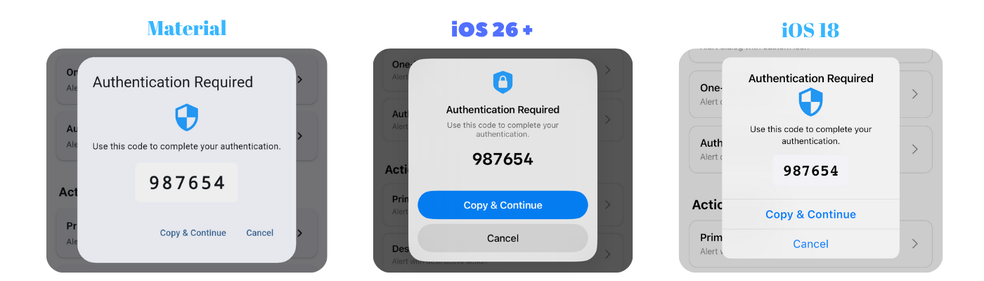
```dart
// Basic alert dialog
AdaptiveAlertDialog.show(
context: context,
title: 'Confirm',
message: 'Are you sure?',
icon: 'checkmark.circle.fill',
actions: [
AlertAction(
title: 'Cancel',
style: AlertActionStyle.cancel,
onPressed: () {},
),
AlertAction(
title: 'Confirm',
style: AlertActionStyle.primary,
onPressed: () {
// Do something
},
),
],
);
// Alert dialog with text input
final result = await AdaptiveAlertDialog.show(
context: context,
title: 'Enter Your Name',
message: 'Please provide your name',
icon: 'person.fill',
input: AdaptiveAlertDialogInput(
placeholder: 'Your name',
initialValue: '',
keyboardType: TextInputType.text,
),
actions: [
AlertAction(
title: 'Cancel',
style: AlertActionStyle.cancel,
onPressed: () {},
),
AlertAction(
title: 'Submit',
style: AlertActionStyle.primary,
onPressed: () {},
),
],
);
// result contains the text entered by the user
if (result != null) {
print('User entered: $result');
}
```
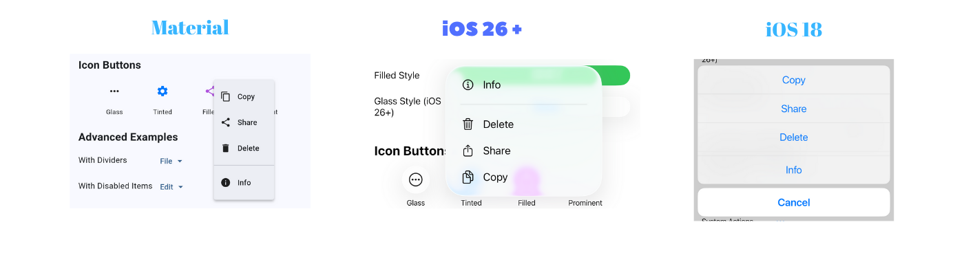
### AdaptiveContextMenu
```dart
AdaptiveContextMenu(
actions: [
AdaptiveContextMenuAction(
title: 'Edit',
icon: PlatformInfo.isIOS ? CupertinoIcons.pencil : Icons.edit,
onPressed: () {
print('Edit pressed');
},
),
AdaptiveContextMenuAction(
title: 'Share',
icon: PlatformInfo.isIOS ? CupertinoIcons.share : Icons.share,
onPressed: () {
print('Share pressed');
},
),
AdaptiveContextMenuAction(
title: 'Delete',
icon: PlatformInfo.isIOS ? CupertinoIcons.trash : Icons.delete,
isDestructive: true,
onPressed: () {
print('Delete pressed');
},
),
],
child: Container(
padding: EdgeInsets.all(16),
child: Text('Long press me'),
),
)
```
**iOS**: Uses `CupertinoContextMenu` with preview and native animations.
**Android**: Uses `PopupMenuButton` with Material Design styling.
### AdaptivePopupMenuButton
```dart
// Text button with popup menu
AdaptivePopupMenuButton.text(
label: 'Options',
items: [
AdaptivePopupMenuItem(
label: 'Edit',
icon: PlatformInfo.isIOS26OrHigher() ? 'pencil' : Icons.edit,
value: 'edit',
),
AdaptivePopupMenuItem(
label: 'Delete',
icon: PlatformInfo.isIOS26OrHigher() ? 'trash' : Icons.delete,
value: 'delete',
),
AdaptivePopupMenuDivider(),
AdaptivePopupMenuItem(
label: 'Share',
icon: PlatformInfo.isIOS26OrHigher() ? 'square.and.arrow.up' : Icons.share,
value: 'share',
),
],
onSelected: (index, item) {
print('Selected: ${item.value}');
},
)
// Icon button with popup menu
AdaptivePopupMenuButton.icon(
icon: 'ellipsis.circle',
items: [...],
onSelected: (index, item) { },
buttonStyle: PopupButtonStyle.glass,
)
// Custom widget with popup menu
AdaptivePopupMenuButton.widget(
items: [
AdaptivePopupMenuItem(label: 'Option 1', value: 'opt1'),
AdaptivePopupMenuItem(label: 'Option 2', value: 'opt2'),
],
onSelected: (index, item) {
print('Selected: ${item.value}');
},
child: Container(
padding: EdgeInsets.symmetric(horizontal: 12, vertical: 8),
decoration: BoxDecoration(
color: Colors.blue.withOpacity(0.1),
borderRadius: BorderRadius.circular(8),
),
child: Row(
mainAxisSize: MainAxisSize.min,
children: [
Icon(Icons.menu),
SizedBox(width: 8),
Text('Custom Button'),
],
),
),
)
```
### AdaptiveSegmentedControl

```dart
AdaptiveSegmentedControl(
labels: ['One', 'Two', 'Three'],
selectedIndex: 0,
onValueChanged: (index) {
print('Selected: $index');
},
)
// With icons (SF Symbols on iOS)
AdaptiveSegmentedControl(
labels: [],
sfSymbols: [
'house.fill',
'person.fill',
'gear',
],
selectedIndex: 0,
onValueChanged: (index) {},
iconColor: CupertinoColors.systemBlue,
)
```
### AdaptiveSwitch

```dart
AdaptiveSwitch(
value: true,
onChanged: (value) {
print('Switch: $value');
},
)
```
### AdaptiveSlider

```dart
AdaptiveSlider(
value: 0.5,
onChanged: (value) {
print('Slider: $value');
},
min: 0.0,
max: 1.0,
)
```
### AdaptiveCheckbox
```dart
AdaptiveCheckbox(
value: true,
onChanged: (value) {
print('Checkbox: $value');
},
)
// Tristate checkbox
AdaptiveCheckbox(
value: null, // Can be true, false, or null
tristate: true,
onChanged: (value) {
print('Checkbox: $value');
},
)
```
### AdaptiveRadio
```dart
enum Options { option1, option2, option3 }
Options? _selectedOption = Options.option1;
AdaptiveRadio(
value: Options.option1,
groupValue: _selectedOption,
onChanged: (Options? value) {
setState(() {
_selectedOption = value;
});
},
)
```
### AdaptiveCard
```dart
AdaptiveCard(
padding: EdgeInsets.all(16),
child: Text('Card Content'),
)
// Card with custom styling
AdaptiveCard(
padding: EdgeInsets.all(16),
color: Colors.blue.withValues(alpha: 0.1),
borderRadius: BorderRadius.circular(20),
elevation: 8, // Android only
child: Column(
children: [
Text('Custom Card'),
Text('With multiple elements'),
],
),
)
```
### AdaptiveBadge
```dart
AdaptiveBadge(
count: 5,
child: Icon(Icons.notifications),
)
// Badge with text label
AdaptiveBadge(
label: 'NEW',
backgroundColor: Colors.red,
child: Icon(Icons.mail),
)
// Large badge
AdaptiveBadge(
count: 99,
isLarge: true,
child: Icon(Icons.message),
)
```
### AdaptiveTooltip
```dart
AdaptiveTooltip(
message: 'This is a tooltip',
child: Icon(Icons.info),
)
// Tooltip positioned above
AdaptiveTooltip(
message: 'Tooltip appears above',
preferBelow: false,
child: Icon(Icons.help),
)
```
### AdaptiveSnackBar
```dart
// Basic snackbar
AdaptiveSnackBar.show(
context,
message: 'Operation completed successfully!',
type: AdaptiveSnackBarType.success,
)
// Snackbar with action button
AdaptiveSnackBar.show(
context,
message: 'File deleted',
type: AdaptiveSnackBarType.info,
action: 'Undo',
onActionPressed: () {
// Undo action
},
)
// Custom duration
AdaptiveSnackBar.show(
context,
message: 'This will stay longer',
duration: Duration(seconds: 8),
)
// Different types
AdaptiveSnackBar.show(context, message: 'Info', type: AdaptiveSnackBarType.info);
AdaptiveSnackBar.show(context, message: 'Success', type: AdaptiveSnackBarType.success);
AdaptiveSnackBar.show(context, message: 'Warning', type: AdaptiveSnackBarType.warning);
AdaptiveSnackBar.show(context, message: 'Error', type: AdaptiveSnackBarType.error);
```
**iOS**: Banner-style notification at the top with slide/fade animations, tap to dismiss, and icon indicators.
**Android**: Material SnackBar at the bottom with standard Material Design appearance.
### AdaptiveDatePicker
```dart
// Basic date picker
final selectedDate = await AdaptiveDatePicker.show(
context: context,
initialDate: DateTime.now(),
);
// Date picker with range
final selectedDate = await AdaptiveDatePicker.show(
context: context,
initialDate: DateTime.now(),
firstDate: DateTime(2020),
lastDate: DateTime(2025),
);
// Date and time picker (iOS)
final selectedDateTime = await AdaptiveDatePicker.show(
context: context,
initialDate: DateTime.now(),
mode: CupertinoDatePickerMode.dateAndTime,
);
if (selectedDate != null) {
print('Selected: ${selectedDate.toString()}');
}
```
**iOS**: Uses `CupertinoDatePicker` in a modal bottom sheet with Cancel/Done buttons.
**Android**: Uses Material `DatePickerDialog`.
### AdaptiveTimePicker
```dart
// 12-hour format
final selectedTime = await AdaptiveTimePicker.show(
context: context,
initialTime: TimeOfDay.now(),
use24HourFormat: false,
);
// 24-hour format
final selectedTime = await AdaptiveTimePicker.show(
context: context,
initialTime: TimeOfDay.now(),
use24HourFormat: true,
);
if (selectedTime != null) {
print('Selected: ${selectedTime.format(context)}');
}
```
**iOS**: Uses `CupertinoDatePicker` in time mode in a modal bottom sheet.
**Android**: Uses Material `TimePickerDialog`.
### AdaptiveListTile
```dart
// Basic list tile
AdaptiveListTile(
title: Text('Profile'),
subtitle: Text('View your profile'),
onTap: () {
// Handle tap
},
)
// List tile with leading and trailing
AdaptiveListTile(
leading: Icon(Icons.person),
title: Text('Profile'),
subtitle: Text('View your profile'),
trailing: Icon(Icons.chevron_right),
onTap: () {
// Handle tap
},
)
// Selectable list tile
AdaptiveListTile(
leading: Icon(Icons.star),
title: Text('Favorite'),
selected: true,
trailing: Icon(Icons.check_circle),
onTap: () {
// Handle tap
},
)
// List tile with custom trailing widget
AdaptiveListTile(
title: Text('Enable Feature'),
subtitle: Text('Toggle to enable'),
trailing: AdaptiveSwitch(
value: switchValue,
onChanged: (value) {
// Handle change
},
),
)
```
**iOS**: Uses CupertinoListTile-like styling with bottom border separator.
**Android**: Uses Material `ListTile`.
### AdaptiveTextField
```dart
// Basic text field
AdaptiveTextField(
placeholder: 'Enter your name',
onChanged: (value) {
print('Text: $value');
},
)
// Text field with icons
AdaptiveTextField(
placeholder: 'Search',
prefixIcon: Icon(
PlatformInfo.isIOS ? CupertinoIcons.search : Icons.search,
),
suffixIcon: IconButton(
icon: Icon(
PlatformInfo.isIOS ? CupertinoIcons.clear : Icons.clear,
),
onPressed: () {
// Clear text
},
),
)
// Password field
AdaptiveTextField(
placeholder: 'Enter password',
obscureText: true,
prefixIcon: Icon(
PlatformInfo.isIOS ? CupertinoIcons.lock : Icons.lock,
),
)
// Multiline text field
AdaptiveTextField(
placeholder: 'Enter description',
maxLines: 5,
minLines: 3,
keyboardType: TextInputType.multiline,
)
```
**iOS**: Uses `CupertinoTextField` with tertiarySystemBackground color and rounded corners.
**Android**: Uses Material `TextField` with outlined border.
### AdaptiveTextFormField
```dart
// Form with validation
Form(
key: _formKey,
child: Column(
children: [
AdaptiveTextFormField(
placeholder: 'Email',
keyboardType: TextInputType.emailAddress,
validator: (value) {
if (value == null || value.isEmpty) {
return 'Please enter your email';
}
if (!value.contains('@')) {
return 'Please enter a valid email';
}
return null;
},
onSaved: (value) => _email = value,
),
AdaptiveButton(
onPressed: () {
if (_formKey.currentState!.validate()) {
_formKey.currentState!.save();
// Process form
}
},
label: 'Submit',
),
],
),
)
```
**iOS**: Uses custom `FormField` wrapper with `CupertinoTextField` for proper validation with error display.
**Android**: Uses Material `TextFormField`.
### AdaptiveFloatingActionButton
```dart
// Basic floating action button
AdaptiveFloatingActionButton(
onPressed: () {},
child: Icon(Icons.add),
)
// Mini FAB
AdaptiveFloatingActionButton(
onPressed: () {},
mini: true,
child: Icon(Icons.edit),
)
// Custom colors
AdaptiveFloatingActionButton(
onPressed: () {},
backgroundColor: Colors.red,
foregroundColor: Colors.white,
child: Icon(Icons.favorite),
)
```
**iOS**: Circular button with custom shadow effects.
**Android**: Material `FloatingActionButton` with elevation.
### AdaptiveFormSection
```dart
// Basic form section
AdaptiveFormSection(
header: Text('Personal Information'),
footer: Text('Please provide accurate information'),
children: [
CupertinoFormRow(
prefix: Text('Name'),
child: AdaptiveTextField(placeholder: 'Enter name'),
),
CupertinoFormRow(
prefix: Text('Email'),
child: AdaptiveTextField(placeholder: 'Enter email'),
),
],
)
// Inset grouped style
AdaptiveFormSection.insetGrouped(
header: Text('Settings'),
children: [
CupertinoFormRow(
prefix: Text('Notifications'),
child: AdaptiveSwitch(value: true, onChanged: (v) {}),
),
],
)
```
**iOS**: Uses `CupertinoFormSection` with native iOS styling.
**Android**: Uses Material `Card` with similar grouped layout.
### AdaptiveExpansionTile
```dart
// Basic expansion tile
AdaptiveExpansionTile(
title: Text('Settings'),
children: [
ListTile(title: Text('Option 1')),
ListTile(title: Text('Option 2')),
],
)
// With leading and subtitle
AdaptiveExpansionTile(
leading: Icon(Icons.settings),
title: Text('Advanced Settings'),
subtitle: Text('Configure advanced options'),
initiallyExpanded: true,
children: [
ListTile(title: Text('Option 1')),
ListTile(title: Text('Option 2')),
],
)
// With custom colors
AdaptiveExpansionTile(
title: Text('Premium Features'),
backgroundColor: Colors.amber.withValues(alpha: 0.1),
iconColor: Colors.amber,
onExpansionChanged: (expanded) {
print('Expanded: $expanded');
},
children: [
ListTile(title: Text('Feature 1')),
ListTile(title: Text('Feature 2')),
],
)
```
**iOS**: Modern custom design with rounded corners, smooth shadows, animated chevron, and gradient separator.
**Android**: Material `ExpansionTile` with InkWell effects.
### AdaptiveTabBarView
Horizontal swipeable tab view with tabs at the top.
```dart
// Tab bar view at the top
AdaptiveTabBarView(
tabs: ['Latest', 'Popular', 'Trending'],
children: [
LatestPage(),
PopularPage(),
TrendingPage(),
],
onTabChanged: (index) {
print('Tab changed to: $index');
},
)
```
**iOS**: Uses `CupertinoSlidingSegmentedControl` for tab selection.
**Android**: Uses Material `TabBar` + `TabBarView`.
## Usage
### Button Styles
```dart
// Filled button (primary action)
AdaptiveButton(
onPressed: () {},
style: AdaptiveButtonStyle.filled,
label: 'Filled',
)
// Tinted button (secondary action)
AdaptiveButton(
onPressed: () {},
style: AdaptiveButtonStyle.tinted,
label: 'Tinted',
)
// Gray button (neutral action)
AdaptiveButton(
onPressed: () {},
style: AdaptiveButtonStyle.gray,
label: 'Gray',
)
// Bordered button
AdaptiveButton(
onPressed: () {},
style: AdaptiveButtonStyle.bordered,
label: 'Bordered',
)
// Plain text button
AdaptiveButton(
onPressed: () {},
style: AdaptiveButtonStyle.plain,
label: 'Plain',
)
```
### Button Sizes
```dart
// Small button (28pt height on iOS)
AdaptiveButton(
onPressed: () {},
size: AdaptiveButtonSize.small,
label: 'Small',
)
// Medium button (36pt height on iOS) - default
AdaptiveButton(
onPressed: () {},
size: AdaptiveButtonSize.medium,
label: 'Medium',
)
// Large button (44pt height on iOS)
AdaptiveButton(
onPressed: () {},
size: AdaptiveButtonSize.large,
label: 'Large',
)
```
### Custom Styling
```dart
AdaptiveButton(
onPressed: () {},
label: 'Custom Button',
color: Colors.red,
padding: EdgeInsets.symmetric(horizontal: 24, vertical: 12),
borderRadius: BorderRadius.circular(16),
minSize: Size(200, 50),
)
```
### Disabled State
```dart
AdaptiveButton(
onPressed: () {},
label: 'Disabled',
enabled: false,
)
```
## Platform Detection
Use the `PlatformInfo` utility class to check platform and iOS version:
```dart
import 'package:adaptive_platform_ui/adaptive_platform_ui.dart';
// Check platform
if (PlatformInfo.isIOS) {
print('Running on iOS');
}
if (PlatformInfo.isAndroid) {
print('Running on Android');
}
// Check iOS version
if (PlatformInfo.isIOS26OrHigher()) {
print('Using iOS 26+ features');
}
if (PlatformInfo.isIOS18OrLower()) {
print('Using legacy iOS widgets');
}
// Get iOS version number
int version = PlatformInfo.iOSVersion; // e.g., 26
// Check version range
if (PlatformInfo.isIOSVersionInRange(24, 26)) {
print('iOS version is between 24 and 26');
}
// Get platform description
String description = PlatformInfo.platformDescription; // e.g., "iOS 26"
```
## Installation
Add this to your package's `pubspec.yaml` file:
```yaml
dependencies:
adaptive_platform_ui: ^0.1.0
```
Then run:
```bash
flutter pub get
```
## Quick Start
### AdaptiveApp - Platform-Specific App Configuration
Use `AdaptiveApp` to automatically configure your app for each platform:
```dart
import 'package:adaptive_platform_ui/adaptive_platform_ui.dart';
void main() {
runApp(const MyApp());
}
class MyApp extends StatelessWidget {
const MyApp({super.key});
@override
Widget build(BuildContext context) {
return AdaptiveApp(
title: 'My App',
themeMode: ThemeMode.system,
materialLightTheme: ThemeData.light(),
materialDarkTheme: ThemeData.dark(),
cupertinoLightTheme: const CupertinoThemeData(
brightness: Brightness.light,
),
cupertinoDarkTheme: const CupertinoThemeData(
brightness: Brightness.dark,
),
home: const HomePage(),
);
}
}
```
**With Router Support (GoRouter, etc.):**
```dart
AdaptiveApp.router(
routerConfig: router,
title: 'My App',
themeMode: ThemeMode.system,
materialLightTheme: ThemeData.light(),
materialDarkTheme: ThemeData.dark(),
cupertinoLightTheme: const CupertinoThemeData(
brightness: Brightness.light,
),
cupertinoDarkTheme: const CupertinoThemeData(
brightness: Brightness.dark,
),
)
```
**Key Features:**
- 🎨 Separate themes for Material (Android) and Cupertino (iOS)
- 🌓 Full theme mode support (light, dark, system)
- 🔄 Automatic platform detection
- 🚀 Router support via `AdaptiveApp.router()`
- 🛠️ Platform-specific callbacks for advanced configuration
## iOS 26 Native Features
When running on iOS 26+, widgets automatically use **native UIKit platform views** with Liquid Glass design:
### Platform Architecture
- **Native UIKit Views**: Uses `UiKitView` to render actual iOS 26 UIKit components
- **Platform Channels**: Bidirectional communication between Flutter and native iOS code
- **Liquid Glass Design**: Authentic iOS 26 visual effects rendered by UIKit
- **Zero Overhead**: No custom painting or emulation - pure native rendering
### Visual Features
- **Modern corner radius**: Native iOS 26 design language
- **Dynamic shadows**: Subtle multi-layer shadows
- **Spring animations**: Smooth spring damping with 0.95x scale on press
- **Native color system**: Uses iOS system colors with proper light/dark mode support
- **Liquid Glass effects**: Native iOS 26 translucency and blur effects
- **SF Symbols**: Native SF Symbol rendering with hierarchical color support
### Interaction
- **Press states**: Visual feedback with scale animation
- **Gesture handling**: Native UIKit gesture recognizers
- **Haptic feedback**: Medium impact feedback on interactions
- **Disabled states**: Proper opacity and interaction blocking
### Typography
- **SF Pro font**: Native iOS system font with proper weights
- **Dynamic Type**: Respects system font size settings
- **Weight**: Appropriate font weights for each component
## Example App
Run the example app to see all widgets in action:
```bash
cd example
flutter run
```
The example app includes:
- Platform information display
- All widget types showcase
- Interactive demos
- Style and size comparisons
- Dark mode support
### IOS26NativeSearchTabBar (EXPERIMENTAL) (Do not confuse it with a different widget, AdaptiveBottomNavigationBar.)
⚠️ **WARNING: This is a highly experimental feature with significant limitations. Only use for prototyping and demos.**
Native iOS 26+ search tab bar with UITabBarController that transforms the tab bar into a search bar when the search tab is selected.
```dart
import 'package:adaptive_platform_ui/adaptive_platform_ui.dart';
// Enable native search tab bar
await IOS26NativeSearchTabBar.enable(
tabs: [
const NativeTabConfig(
title: 'Home',
sfSymbol: 'house.fill',
),
const NativeTabConfig(
title: 'Search',
sfSymbol: 'magnifyingglass',
isSearchTab: true, // This tab transforms into search
),
const NativeTabConfig(
title: 'Profile',
sfSymbol: 'person.fill',
),
],
selectedIndex: 0,
onTabSelected: (index) {
print('Tab selected: $index');
},
onSearchQueryChanged: (query) {
print('Search query: $query');
},
onSearchSubmitted: (query) {
print('Search submitted: $query');
},
onSearchCancelled: () {
print('Search cancelled');
},
);
// Disable when done
await IOS26NativeSearchTabBar.disable();
// Programmatically show search
await IOS26NativeSearchTabBar.showSearch();
```
**Features:**
- ✨ Native UITabBarController integration
- 🔍 Search tab transforms into UISearchController
- 💎 iOS 26+ Liquid Glass effects
- 🎯 Method channel communication
- 📱 Native animations and gestures
**Known Issues & Limitations:**
This feature replaces Flutter's root view controller with a native UITabBarController, which creates fundamental architectural conflicts:
1. **Widget Lifecycle**: `initState`, `dispose`, and other lifecycle methods may not work correctly
2. **Navigation Stack**: `Navigator.pop()` and related methods become unreliable
3. **State Management**: Provider, Riverpod, Bloc, etc. may lose state or behave unpredictably
4. **Hot Reload**: Does not work properly - requires full app restart
5. **Memory Leaks**: Potential memory management issues between Flutter and UIKit
6. **Gesture Conflicts**: Native and Flutter gestures may interfere with each other
7. **Frame Synchronization**: Potential visual stuttering during transitions
**Why These Issues Occur:**
The feature attempts to merge two incompatible architectural philosophies:
- **Flutter**: Single-threaded, declarative, expects to own entire screen
- **UIKit**: Multi-threaded, imperative, view controller-based
When UITabBarController becomes root, Flutter engine still believes it owns the screen, creating a parent-child relationship neither framework was designed to handle.
**Recommendation:**
- ✅ Use for prototyping and concept validation
- ✅ Use for demos and presentations
- ❌ Do NOT use in production apps
- ❌ Do NOT rely on Flutter navigation when active
- ❌ Do NOT expect hot reload to work
For production apps, use Flutter's built-in `TabBar` or implement search within the existing navigation structure.
See the example app's Native Search Tab demo page for detailed technical explanation.
---
## Widget Catalog
Currently available adaptive widgets:
- ✅ **AdaptiveApp** - Platform-specific app configuration with theme support and router
- ✅ **AdaptiveAppBar** - Centralized app bar configuration with custom navigation bar support
- ✅ **AdaptiveBottomNavigationBar** - Centralized bottom navigation configuration with custom tab bar support
- ✅ **AdaptiveScaffold** - Scaffold with optional native iOS 26 toolbar and tab bar
- ✅ **AdaptiveButton** - Buttons with iOS 26+ native designs
- ✅ **AdaptiveSegmentedControl** - Native segmented controls
- ✅ **AdaptiveSwitch** - Native switches
- ✅ **AdaptiveSlider** - Native sliders
- ✅ **AdaptiveCheckbox** - Checkboxes with adaptive styling
- ✅ **AdaptiveRadio** - Radio button groups with adaptive styling
- ✅ **AdaptiveCard** - Cards with platform-specific styling
- ✅ **AdaptiveBadge** - Notification badges with adaptive styling
- ✅ **AdaptiveTooltip** - Platform-specific tooltips
- ✅ **AdaptiveSnackBar** - Platform-specific notification snackbars
- ✅ **AdaptiveAlertDialog** - Native alert dialogs with text input support
- ✅ **AdaptiveContextMenu** - Long-press context menus with platform-specific styling
- ✅ **AdaptivePopupMenuButton** - Native popup menus
- ✅ **AdaptiveDatePicker** - Platform-specific date selection dialogs
- ✅ **AdaptiveTimePicker** - Platform-specific time selection dialogs
- ✅ **AdaptiveListTile** - Platform-specific list item tiles
- ✅ **AdaptiveTextField** - Platform-specific text input fields
- ✅ **AdaptiveTextFormField** - Platform-specific form fields with validation
- ✅ **AdaptiveFloatingActionButton** - Platform-specific circular action buttons
- ✅ **AdaptiveFormSection** - Grouped form sections with headers and footers
- ✅ **AdaptiveExpansionTile** - Modern expandable/collapsible content
- ✅ **AdaptiveTabBarView** - Horizontal swipeable tab bar view
- ⚠️ **IOS26NativeSearchTabBar** - EXPERIMENTAL native search tab bar (iOS 26+ only)
## Design Philosophy
This package follows Apple's Human Interface Guidelines for iOS and Material Design guidelines for Android. The goal is to provide:
1. **Native Look & Feel**: Widgets that feel at home on each platform
2. **Zero Configuration**: Automatic platform detection and adaptation
3. **Version Awareness**: Leverage new platform features while maintaining backward compatibility
4. **Consistency**: Unified API across platforms
5. **Customization**: Allow overrides when needed
## iOS Version Support
- **iOS 26+**: Modern native iOS 26 designs
- **iOS 18 and below**: Traditional Cupertino widgets
- **Automatic fallback**: Seamless degradation for older versions
## Requirements
- Flutter SDK: >=1.17.0
- Dart SDK: ^3.9.2
## Contributing
Contributions are welcome! Please feel free to submit a Pull Request.
## License
This project is licensed under the MIT License - see the [LICENSE](LICENSE) file for details.
## Acknowledgments
- Inspired by cupertino_native
- Design guidelines from Apple's Human Interface Guidelines
- Material Design guidelines from Google
## Contributors
Thanks to all contributors who helped improve this package!

## Author
Berkay Çatak
## Support
- 💬 **[Discussions](https://github.com/berkaycatak/adaptive_platform_ui/discussions)** - Ask questions, share ideas, and showcase your projects
- 🐛 **[Issues](https://github.com/berkaycatak/adaptive_platform_ui/issues)** - Report bugs and request features
- 📖 **[Contributing Guide](.github/CONTRIBUTING.md)** - Learn how to contribute