https://github.com/beschuetzer/thumbnail-carousel
React component library that provides a carousel with a wide range of options
https://github.com/beschuetzer/thumbnail-carousel
css3 javascript jest scss typescript
Last synced: about 1 month ago
JSON representation
React component library that provides a carousel with a wide range of options
- Host: GitHub
- URL: https://github.com/beschuetzer/thumbnail-carousel
- Owner: Beschuetzer
- Created: 2023-11-05T15:36:47.000Z (over 1 year ago)
- Default Branch: main
- Last Pushed: 2025-04-04T13:01:42.000Z (about 2 months ago)
- Last Synced: 2025-04-11T18:45:25.019Z (about 1 month ago)
- Topics: css3, javascript, jest, scss, typescript
- Language: TypeScript
- Homepage: https://beschuetzer.github.io/thumbnail-carousel/?path=/docs/thumbnail-carousel-getting-started--docs
- Size: 48.2 MB
- Stars: 0
- Watchers: 1
- Forks: 0
- Open Issues: 0
-
Metadata Files:
- Readme: README.md
- Changelog: CHANGELOG.md
Awesome Lists containing this project
README
# thumbnail-carousel
A React carousel with a wide range of options. See [this](https://beschuetzer.github.io/thumbnail-carousel/?path=/docs/thumbnail-carousel-getting-started--docs) for quick start examples.
## Use Case
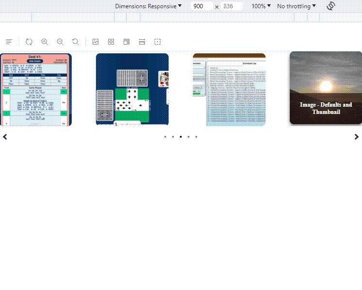
If you want to display multiple images/videos inside of a single carousel, this package will do that for you. It's not recommended to use this package if the videos are large in size, since this package uses the `` tag to display items.
## Getting starting
Any image [supported](https://developer.mozilla.org/en-US/docs/Web/HTML/Element/img#supported_image_formats) by the `![]() ` tag will work,
` tag will work,
and any video type [supported](https://developer.mozilla.org/en-US/docs/Web/HTML/Element/video) by the `` tag will work.
```
//import files to use from project (`/public` or `/src`)
import img1 from "./imgs/img1.jpg";
import img1Thumbnail from "./imgs/thumbnails/img1.jpg";
import clipHighRes from "./clips/1-high.mp4";
import clipLowRes from "./clips/1-low.mp4";
...
//import carousel
import { Carousel, CarouselItemProps } from 'react-thumbnail-carousel'
//items are of type `CarouselItemProps`
const items = [
{
description: 'Simple Video Example', //displays in the thumbnail overlay (when applicable) and in item description
srcMain: clipWithNoOptimizations
srcThumbnail: clipThumbnail, //necessary for videos, otherwise no image is shown in the thumbnail
},
{
description: 'Example of optimized video item when `itemDisplayLocation` is set to `above`/`below`',
srcMain: {
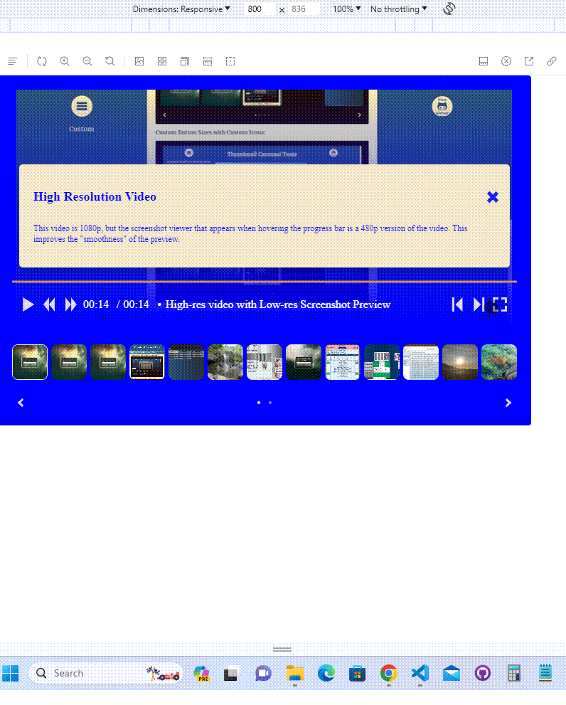
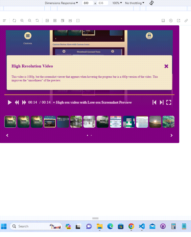
hiRes: clipHighRes, //this clip is used in fullscreen mode (1080p or higher res is generally best here)
loRes: clipLowRes //this clip is used everywhere else (480p is generally the best here)
},
srcThumbnail: clipThumbnail,
},
{
description: 'Example of optimized Image item (i.e. has thumbnail)',
srcMain: img1,
srcThumbnail: img1Thumbnail,
},
{
description: 'My Image with no Thumbnail (full image is used as thumbnail)',
srcMain: img2,
},
{
description: "Using itemStyles to Pass Style to Item's Underlying Tag (works with videos too)",
srcMain: img3,
srcThumbnail: img3Thumbnail,
itemStyles: {
objectFit: "cover", //image covers the available space (default is contain)
objectPosition: "top", //image is positioned top (default is center)
},
},
...
] as CarouselItemProps[]
//instantiate Carousel with default options
//instantiate Carousel with current item displayed above and some padding
...
```
## Features
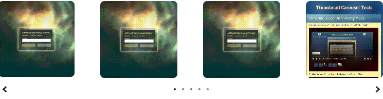
### Basic Carousel
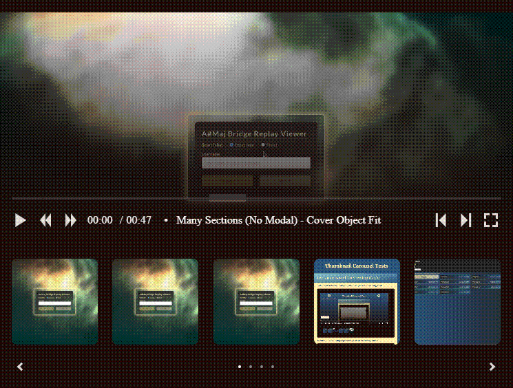
### Current Item Displayed Above
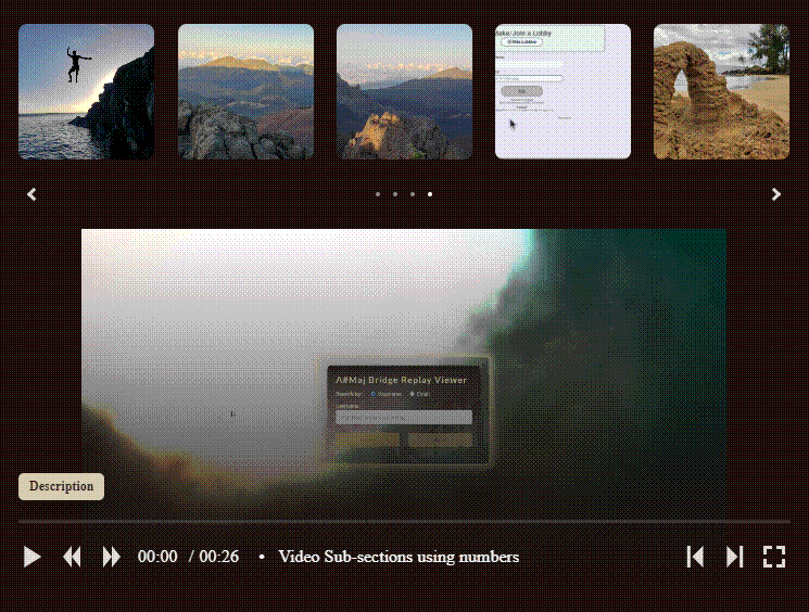
### Current Item Displayed Below
### Fullscreen Mode
### Dynamic Carousel Options
Option fields that take the `CarouselElementValue` type can be specified in a few different ways:
#### A simple value:
```
options: {
layout: {
itemDisplayLocation: "above",
},
}
// => current item is always displayed above the carousel
```
#### Based on viewport width (`CarouselElementValueTuple`):
```
options: {
layout: {
itemDisplayLocation: [["above"], ["none", 900], ["below", 902, "min-width"]],
},
}
// => "none" when viewport <= 900
// => "below" when viewport >= 902
// => "above" otherwise (901 in this case)
```
#### Based on Viewing Mode (fullscreen or nonFullscreen):
```
options: {
styling: {
colorTheme: {
colorOne: {
fullscreen: 'red',
nonFullscreen: 'blue',
}
},
}
},
// => "red" when fullscreen
// => "blue" when not fullscreen
```
#### Based on Viewing Mode and Viewport Width:
```
options: {
styling: {
colorTheme: {
colorOne: {
fullscreen: [['red'], ['green', 800]],
nonFullscreen: [['blue'], ['purple', 800]],
}
},
}
},
// => "green" when fullscreen and viewport <= 800
// => "red" when fullscreen otherwise
// => "purplse" when not fullscreen and viewport <= 800
// => "blue" when not fullscreen otherwise
```
## Item Customization
### Video Items
#### Screenshot Viewer
Videos will have an embedded progress bar by default (change `options.layout.isToolbarPositionedInVideo` to `false` to move the toolbar below the video):
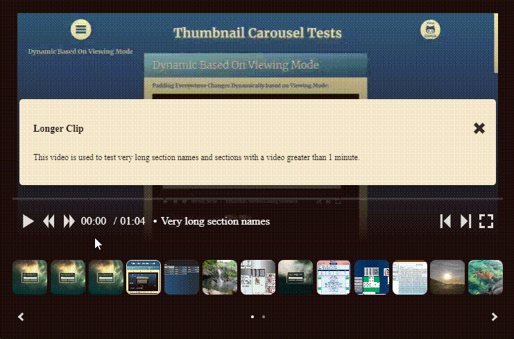
#### Sections
There are two ways to add sections to a video:
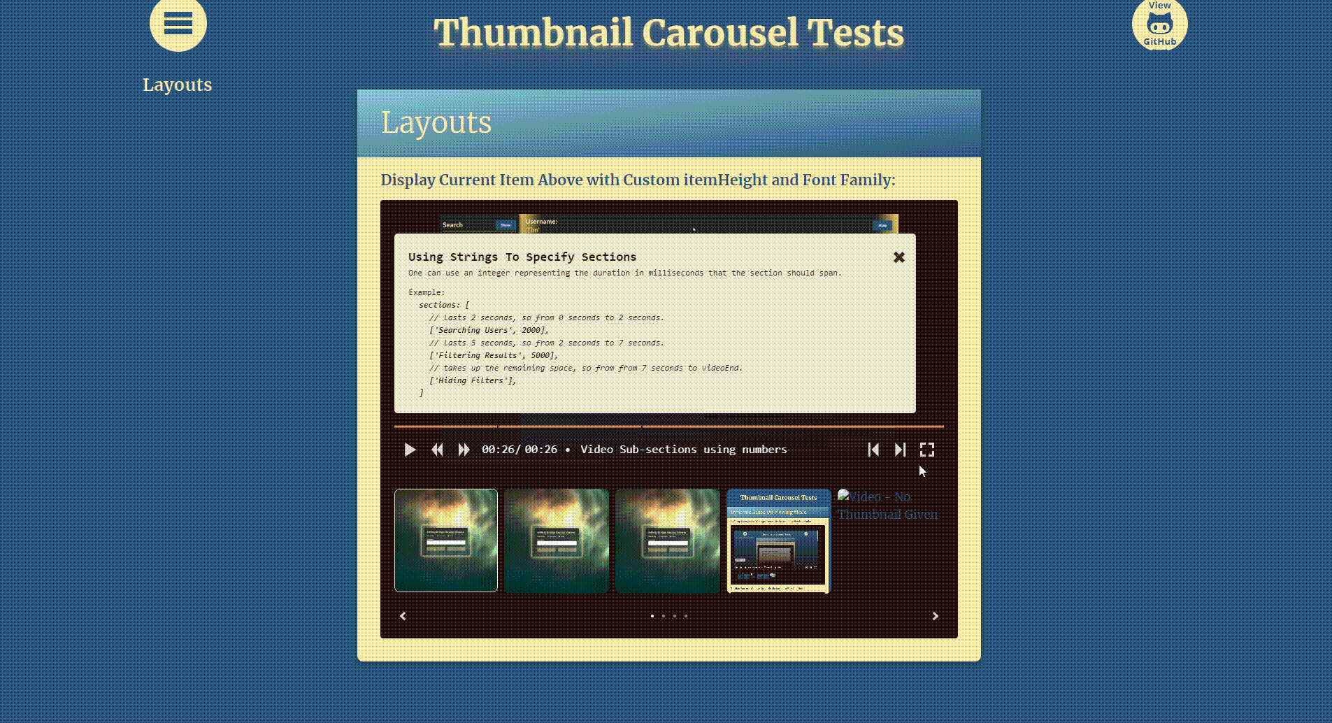
1. Using Strings (i.e. specifying the start time of each section)
```
video: {
sections: [
["Section with a very long description that would overflow"], //always start at 0 seconds so can omit or use empty string to keep ts happy
"Another section with a very long description that would overflow",
"10:00", //starts at 10 seconds
],
[
"Yet Another section with a very long description that would overflow",
"20:240", //starts at 20 seconds and 240 milliseconds
],
[
"Even Yet Another section with a very long description that would overflow",
"1:03:100", //starts at 1 minute 3 seconds and 100 milliseconds
],
],
}
```
2. Using Numbers (i.e. specifying the start time of each section)
```
video: {
sections: [
["Ensuring Options are Correct", 1000], //1000 milliseconds long
["Selecting the Regular Expression to Use for the Site", 1000], //1000 milliseconds long
["Selecting the Save Location", 2000], //2000 milliseconds long
[
"Downloading the All Files Recursively since Last Download Date",
3000, //3000 milliseconds long
],
["Verifying the Downloaded Files"], //can omit last value (or enter any number to keep ts happy) since it will take up remaining space
],
},
```
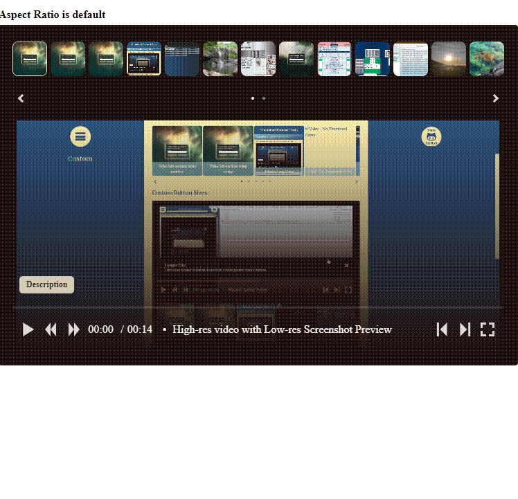
#### Aspect Ratio
By default the aspect ratio of the item viewer is determined by the item with the largest aspect ratio. The item viewer is only displayed if `itemDisplayLocation` is not `none`, which is the default. If the aspect ratio is set to `auto` then the first item's aspect ratio is used.
To change the aspect ratio:
```
options: {
layout: {
itemDisplayLocation: "below", //required to show the item viewer since default is none
},
itemViewer: {
aspectRatio: 0.33, //this would be 3:1
},
},
```
#### Optimzations
1. Using a low-res version of the video (480p or lower resolution) will result in better performance for videos. The low-res version is used when not in fullscreen mode and `itemDisplayLocation` is not `none`. Sites like this [one](https://www.freeconvert.com/video-compressor) can convert your videos for free.
```
const items = [
{
srcMain: {
hiRes: clipHighRes, //this clip is used in fullscreen mode (1080p or higher res is generally best here)
loRes: clipLowRes //this clip is used everywhere else (480p is generally the best here)
},
...
},
...
] as CarouselItemProps[]
```
### All Items
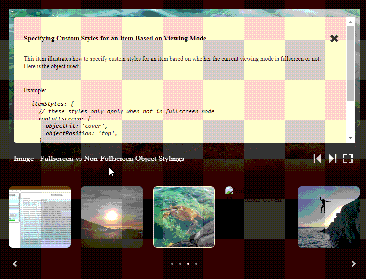
#### Optional Description Modal
1. Using Built-in Modal Builder
Each object is a section. If the section is section is code, use `codeSection`:
```
...
items={[
{
...
modal: {
sections: [
{
title: "Specifying Custom Styles for an Item Based on Viewing Mode",
text: "This item illustrates how to specify custom styles for an item based on whether the current viewing mode is fullscreen or not. Here is the object used:",
},
{
text: "Example: ",
},
{
codeSection: {
lines: [
`itemStyles: {`,
` // these styles only apply when not in fullscreen mode`,
` nonFullscreen: {`,
` objectFit: 'cover',`,
` objectPosition: 'top',`,
` },`,
` // these styles only apply when in fullscreen mode`,
` fullscreen: {`,
` objectFit: 'scale-down',`,
` objectPosition: 'left',`,
` }`,
`}`,
],
startTabCount: 1,
tabSpacing: 15,
},
},
],
},
},
...
]}
```
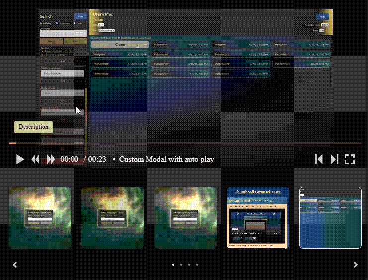
2. Using JSX
```
...
items={[
{
...
modal: {
closeButtonTop: 25,
children: (
Using JSX to Create a Modal (Avoiding Conflicts with Button by
Adding 30px Padding to the Right of Title Div)
You can use the modal.children field to pass in
your own JSX for the modal.
),
},
},
...
]}
```
## Default Behavior
- takes up the width of the container in which it resides
- fits as many thumbnails into a page as it can based on the thumbnail size
- spaces the thumbnails with a [left-alignment](https://beschuetzer.github.io/thumbnail-carousel/?path=/story/thumbnail-carousel-layout--layout-3) (can be changed by setting `options.thumbnail.spacingStrategy` to `max` ([example](https://beschuetzer.github.io/thumbnail-carousel/?path=/story/thumbnail-carousel-layout--layout-4))).
- for videos, when the toolbar is embedded in the video, the overlay hides after 2 seconds of no mouse activity or when the cursor leaves the video (similar to how Youtube videos work).
- by default the aspect ratio of the item viewer is determined by the item with the largest aspect ratio. This is only relevant if `itemDisplayLocation` is not `none`. See aspect ratio [examples](https://beschuetzer.github.io/thumbnail-carousel/?path=/docs/thumbnail-carousel-aspect-ratio-options--docs) for more details.
## Troubleshooting
- if the styling is not lining up properly, try wrapping the carousel in a div with a specified width value (e.g. `100%` or `700px`). Alternatively, you can use the
## Storybook
The [story book](https://beschuetzer.github.io/thumbnail-carousel/?path=/docs/thumbnail-carousel-getting-started--docs) is the best way to learn about customization options.