https://github.com/bfulop/grunt-email-workflow-hybrid-layout
https://github.com/bfulop/grunt-email-workflow-hybrid-layout
Last synced: 2 months ago
JSON representation
- Host: GitHub
- URL: https://github.com/bfulop/grunt-email-workflow-hybrid-layout
- Owner: bfulop
- License: mit
- Created: 2016-02-18T15:16:55.000Z (over 9 years ago)
- Default Branch: master
- Last Pushed: 2016-04-12T17:59:31.000Z (about 9 years ago)
- Last Synced: 2025-01-22T07:32:10.481Z (4 months ago)
- Language: JavaScript
- Size: 1.43 MB
- Stars: 0
- Watchers: 2
- Forks: 1
- Open Issues: 3
-
Metadata Files:
- Readme: readme.md
- License: license.txt
Awesome Lists containing this project
README
# Grunt Email Workflow with Hybrid layout
This is a fork of the Lee Munroe's [Grunt Email Design Workflow repo](https://github.com/leemunroe/grunt-email-workflow).
I just replaced the example files with a hybrid layout solution based Nicole Merlin's article [Creating a Future-Proof Responsive Email Without Media Queries](http://webdesign.tutsplus.com/tutorials/creating-a-future-proof-responsive-email-without-media-queries--cms-23919) on tutsplus.
The handlebars module needed to be updated to ^4.0 in order for partials embedding to work.
## Installation and running
See the original [Grunt Email Design Workflow repo](https://github.com/leemunroe/grunt-email-workflow) for details.
The biggest difference is the dependency on the latest (^4.0.0) version of Handlebars. This is necessary to abstract out the template to create column grids and be able to pass the name of your component to be rendered into each column.
# Car dealer demo email
To a see more common and much more challenging example, check out the car-dealer branch!
Here's what you'll find:
## A fluid, mobile-first layout, that survives without any CSS at all
This demo newsletter represents a typical challenge that I face daily when building emails for clients.
We have a multiple-column layout on desktop, that should change to a single-column one for mobile clients. Each content block has unique background color, so they should take up always 100% of the available space. In addition it would be preferable that the email displays normally on archaic webmail clients such as free.fr that strips out 100% of your CSS.
It's based on the [hybrid/fluid approach](http://webdesign.tutsplus.com/tutorials/creating-a-future-proof-responsive-email-without-media-queries--cms-23919) but had to be extended so that the individual blocks extend to the full width of their containers.
To summarise the characteristics of the template for those who prefer skim reading:
- mobile-first
- columns to expand 100% to their containers
- support the typical selection of email clients (Outlook, Gmail, iOS, Android, Apple Mail, Yahoo, etc.)
- don't break on old clients that strip 100% of CSS (free.fr)
- target images based on viewport breakpoints (mobile-first strategy)
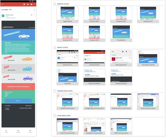
### Test results (car-dealer branch)
Here's the result of my tests of different clients, hosted by Email on Acid:
https://www.emailonacid.com/app/acidtest/display/summary/SoMGFYV63M9Gqkdo0jkjeg8KEAja7WjswGXTmmq0lHNZB/shared