https://github.com/birmehto/dropx
A fully customizable dropdown package for Flutter with keyboard navigation support.
https://github.com/birmehto/dropx
cross-platform dart dartlang dropdown dropdown-menu dropdownlist dropx flutter package
Last synced: about 1 month ago
JSON representation
A fully customizable dropdown package for Flutter with keyboard navigation support.
- Host: GitHub
- URL: https://github.com/birmehto/dropx
- Owner: birmehto
- License: mit
- Created: 2025-11-13T14:28:28.000Z (7 months ago)
- Default Branch: main
- Last Pushed: 2025-11-13T14:31:50.000Z (7 months ago)
- Last Synced: 2025-11-13T16:28:55.683Z (7 months ago)
- Topics: cross-platform, dart, dartlang, dropdown, dropdown-menu, dropdownlist, dropx, flutter, package
- Language: Dart
- Homepage:
- Size: 287 KB
- Stars: 0
- Watchers: 0
- Forks: 0
- Open Issues: 0
-
Metadata Files:
- Readme: README.md
- Changelog: CHANGELOG.md
- Contributing: CONTRIBUTING.md
- License: LICENSE
Awesome Lists containing this project
README
# DropX
A fully customizable dropdown package for Flutter with keyboard navigation support.
[](https://pub.dev/packages/dropx)
[](LICENSE)
[](https://pub.dev/packages/flutter_lints)
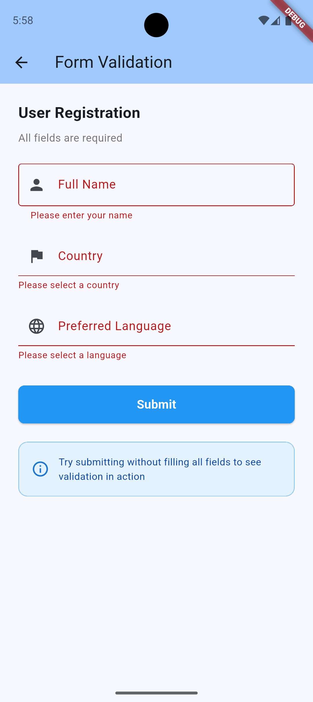
## Screenshots
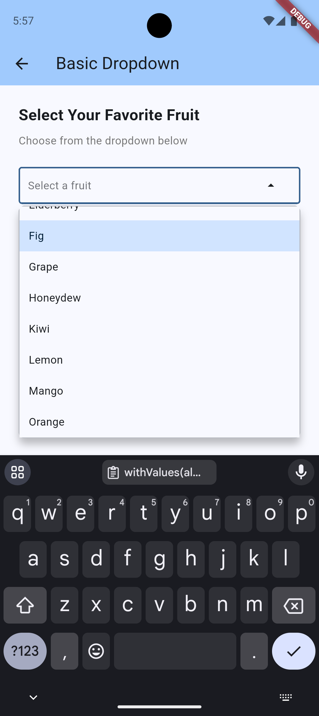
Basic Dropdown
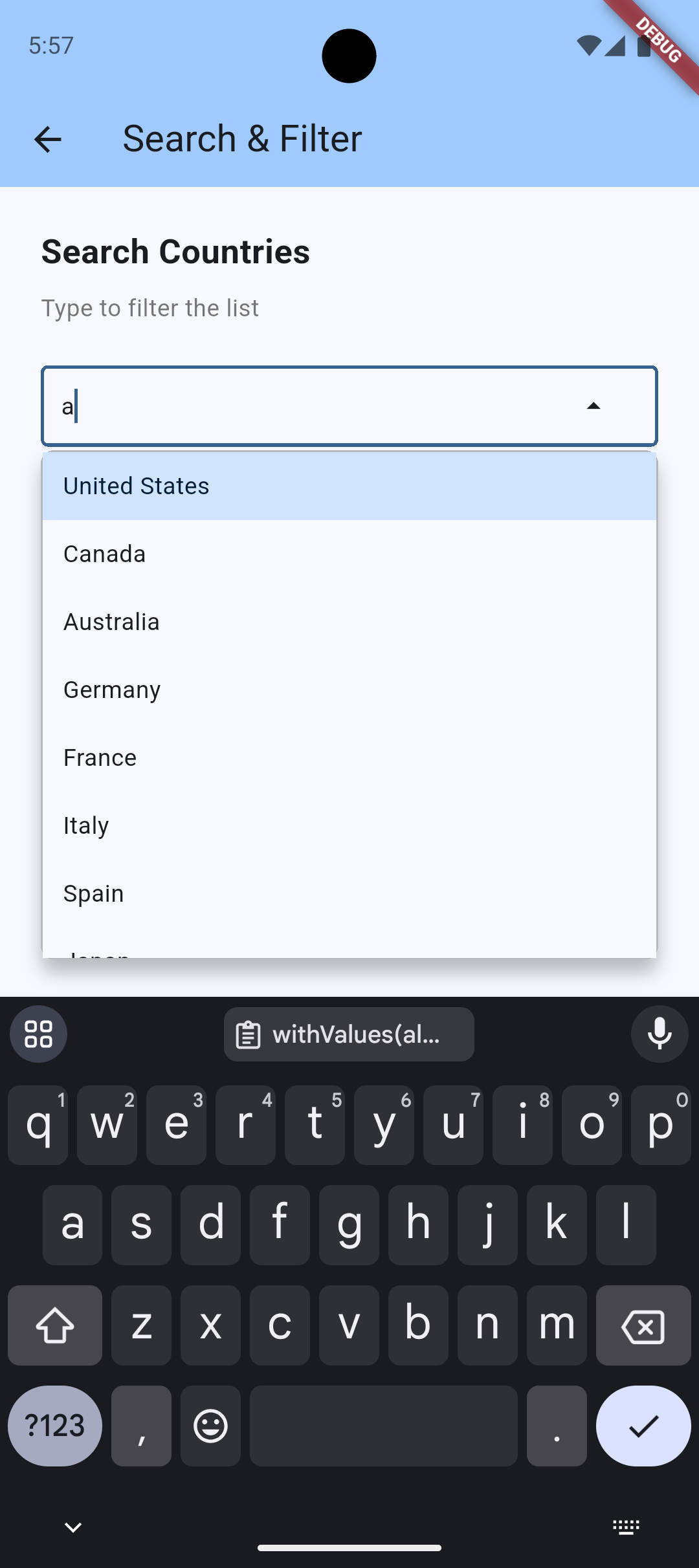
Search & Filter
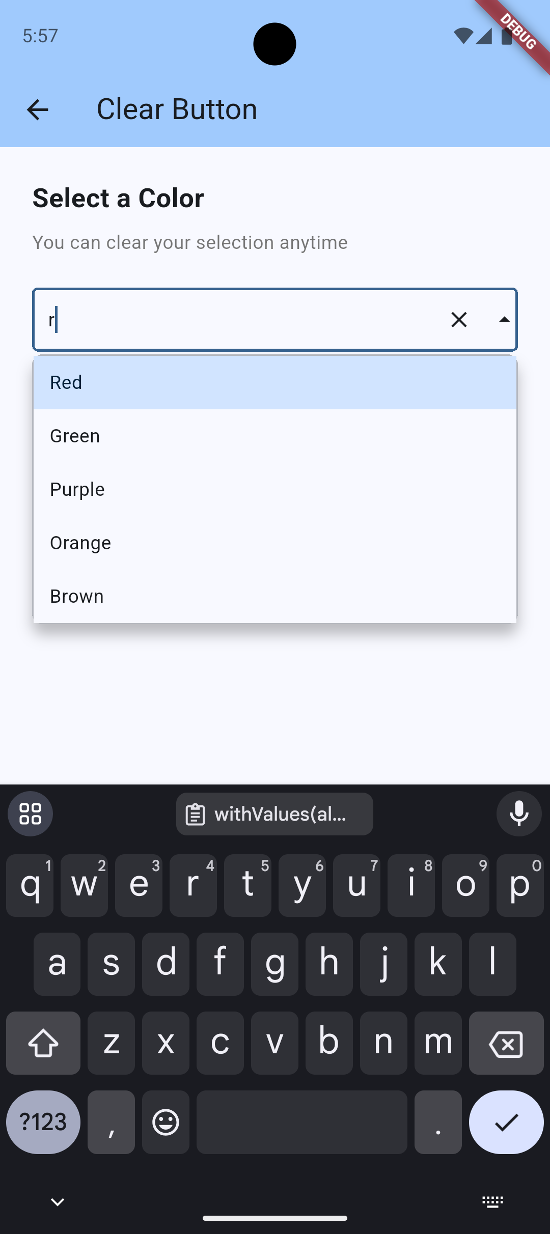
Clear Button
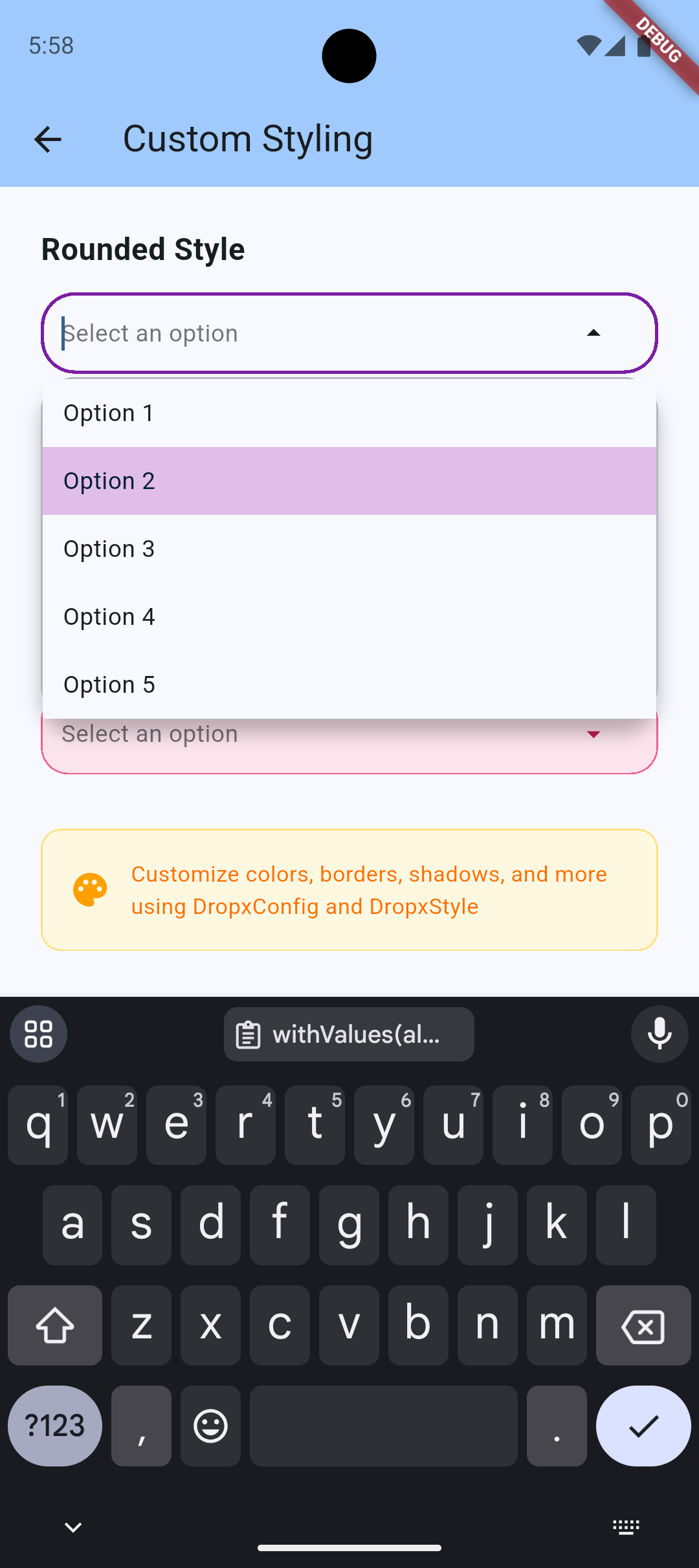
Custom Styling
Form Validation
> 💡 **Try it yourself!** Run the example app to see all features in action:
> ```bash
> cd example && flutter run
> ```
## Features
- ✨ **Full keyboard navigation** - Arrow keys, Enter, Escape
- 🔍 **Built-in search and filtering** - With custom filter support and debouncing
- 📍 **Smart auto-positioning** - Shows above/below based on available space
- 🎨 **Fully customizable styling** - Every color and dimension configurable
- 🌈 **Theme-aware** - Automatically adapts to your app's theme
- ⚡ **Loading states** - Built-in loading indicator support
- 🎯 **Custom item builders** - Complete control over item rendering
- 📱 **Responsive** - Works on all screen sizes
- ♿ **Accessible** - Semantic labels and focus management
- 🖱️ **Click outside to close** - Dropdown closes when clicking outside
- 🔄 **Dynamic updates** - Items automatically update when data changes
- ❌ **Clear button** - Optional clear button to reset selection
- 📝 **Form validation** - Built-in FormField wrapper for easy form integration
- ⏱️ **Search debouncing** - Optimize performance for large lists
## Installation
```yaml
dependencies:
dropx: ^0.0.2
```
## Usage
```dart
import 'package:dropx/dropx.dart';
Dropx(
items: ['Apple', 'Banana', 'Cherry'],
focusNode: FocusNode(),
hint: 'Select a fruit',
onSelected: (value) => print(value),
)
```
### Custom styling
```dart
Dropx(
items: items,
focusNode: focusNode,
hint: 'Select',
onSelected: (value) => print(value),
config: DropxConfig(
maxHeight: 400,
borderRadius: BorderRadius.circular(16),
showItemDividers: true,
style: DropxStyle(
overlayBackgroundColor: Colors.blue.shade50,
selectedItemBackgroundColor: Colors.blue.shade200,
),
),
)
```
### Custom items
```dart
Dropx(
items: users,
focusNode: focusNode,
hint: 'Select user',
displayText: (user) => user.name,
itemBuilder: (user, isSelected) {
return ListTile(
leading: CircleAvatar(child: Text(user.initials)),
title: Text(user.name),
subtitle: Text(user.email),
);
},
onSelected: (user) => print(user.name),
)
```
### Custom filter
```dart
Dropx(
items: products,
focusNode: focusNode,
displayText: (product) => product.name,
customFilter: (product, query) {
return product.name.contains(query) || product.sku.contains(query);
},
onSelected: (product) => print(product.name),
)
```
### Clear button
```dart
Dropx(
items: items,
focusNode: focusNode,
hint: 'Select',
onSelected: (value) => print(value),
showClearButton: true,
onClear: () => print('Selection cleared'),
)
```
### Form validation
```dart
Form(
key: formKey,
child: DropxFormField(
items: ['Option 1', 'Option 2', 'Option 3'],
hint: 'Select an option',
validator: (value) {
if (value == null) return 'Please select an option';
return null;
},
onSaved: (value) => print('Saved: $value'),
),
)
```
### Search debouncing
```dart
Dropx(
items: largeItemList,
focusNode: focusNode,
hint: 'Search...',
onSelected: (value) => print(value),
config: DropxConfig(
searchDebounce: Duration(milliseconds: 300),
),
)
```
### Async loading
```dart
class MyWidget extends StatefulWidget {
@override
State createState() => _MyWidgetState();
}
class _MyWidgetState extends State {
List items = [];
bool isLoading = true;
@override
void initState() {
super.initState();
_loadItems();
}
Future _loadItems() async {
// Simulate API call
await Future.delayed(Duration(seconds: 2));
setState(() {
items = ['Item 1', 'Item 2', 'Item 3'];
isLoading = false;
});
}
@override
Widget build(BuildContext context) {
return Dropx(
items: items,
focusNode: FocusNode(),
hint: 'Select item',
onSelected: (value) => print(value),
isLoading: isLoading,
);
}
}
```
## API Reference
### Dropx Parameters
| Parameter | Type | Description | Default |
|-----------|------|-------------|---------|
| `items` | `List` | List of items to display | Required |
| `focusNode` | `FocusNode` | Focus node for keyboard navigation | Required |
| `onSelected` | `Function(T)` | Callback when item is selected | Required |
| `hint` | `String?` | Placeholder text | `null` |
| `initialValue` | `T?` | Initial selected value | `null` |
| `displayText` | `String Function(T)?` | Custom text extractor | `toString()` |
| `itemBuilder` | `Widget Function(T, bool)?` | Custom item widget builder | `null` |
| `customFilter` | `bool Function(T, String)?` | Custom filter function | `null` |
| `config` | `DropxConfig?` | Configuration options | `DropxConfig()` |
| `header` | `Widget?` | Widget shown at top of dropdown | `null` |
| `footer` | `Widget?` | Widget shown at bottom of dropdown | `null` |
| `emptyWidget` | `Widget?` | Widget shown when no items | Default message |
| `isLoading` | `bool` | Show loading indicator | `false` |
| `enabled` | `bool` | Enable/disable dropdown | `true` |
| `enableSearch` | `bool` | Enable search functionality | `true` |
| `showClearButton` | `bool` | Show clear button when value selected | `false` |
| `onClear` | `VoidCallback?` | Callback when clear button pressed | `null` |
| `onChanged` | `ValueChanged?` | Callback when text changes | `null` |
| `semanticLabel` | `String?` | Accessibility label | `null` |
### DropxConfig Options
See [ARCHITECTURE.md](ARCHITECTURE.md) for complete configuration options.
## Performance Tips
- Use `const` constructors where possible
- Provide `displayText` for complex objects to avoid repeated `toString()` calls
- Use `customFilter` for optimized filtering logic
- Consider pagination for very large lists (>1000 items)
## Accessibility
DropX includes built-in accessibility features:
- Semantic labels for screen readers
- Keyboard navigation support
- Focus management
- High contrast support through theme integration
## More
See [ARCHITECTURE.md](ARCHITECTURE.md) for package details and [example/](example/) for more examples.
## Contributing
Contributions are welcome! Please read [CONTRIBUTING.md](CONTRIBUTING.md) for details.
## License
MIT License - see [LICENSE](LICENSE) file.