https://github.com/blaylockbk/pandas-rose
🐼🌹 A simple Pandas accessor for making windrose plots.
https://github.com/blaylockbk/pandas-rose
pandas windrose
Last synced: over 1 year ago
JSON representation
🐼🌹 A simple Pandas accessor for making windrose plots.
- Host: GitHub
- URL: https://github.com/blaylockbk/pandas-rose
- Owner: blaylockbk
- License: mit
- Created: 2023-08-01T04:41:55.000Z (almost 3 years ago)
- Default Branch: main
- Last Pushed: 2023-08-14T23:37:38.000Z (almost 3 years ago)
- Last Synced: 2025-03-28T01:14:26.374Z (over 1 year ago)
- Topics: pandas, windrose
- Language: Python
- Homepage: https://pandas-rose.readthedocs.io/
- Size: 1.59 MB
- Stars: 15
- Watchers: 2
- Forks: 0
- Open Issues: 2
-
Metadata Files:
- Readme: README.md
- License: LICENSE
Awesome Lists containing this project
README

# Pandas Rose
This python package adds a custom Pandas accessor to generate polar wind rose plots from a Pandas dataframe.
I don't mean to compete with the wonderful [windrose](https://github.com/python-windrose/windrose) package already available, but that package has a little too much complexity for what I wanted. This package is meant to provide a minimal, simple interface to making wind rose plots. This is done by using Pandas methods `pd.cut` and `df.groupby` and using Matplotlib regular polar axes.
# Install
Install with pip. The requirements are only pandas, numpy, and matplotlib.
```bash
pip install pandas-rose
```
# Usage
Pandas-rose is simple.
```python
import pandas as pd
import rose
# df is a pandas dataframe with columns
# "wind_speed" and "wind_direction"
df = pd.DataFrame({
"wind_speed":[1,2,3,4],
"wind_direction":[20, 10, 190,300]
})
# Display a polar wind plot of the data
df.rose.plot()
```
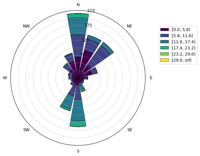
You can specify the pandas column to use for wind direction and wind speed. You may also change the number of sectors to bin the wind direction .
```python
df.rose.plot(
var_column="A", # name of variable column
dir_column="B", # name of direction column
sectors=8, # number of sectors (direction bins)
bins=range(0,30,5) # specify variable bins
normed=False # If True, values as percentage instead of counts
colors='Blues' # Name of matplotlib colormap or list of colors
)
```
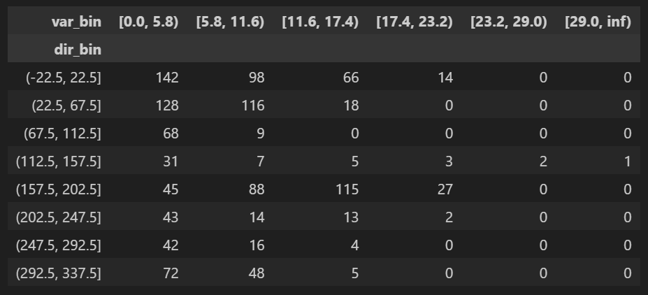
There are two other accessors that give some information.
```python
# Display a dataframe of the binned values
df.rose.table(sectors=8)
```
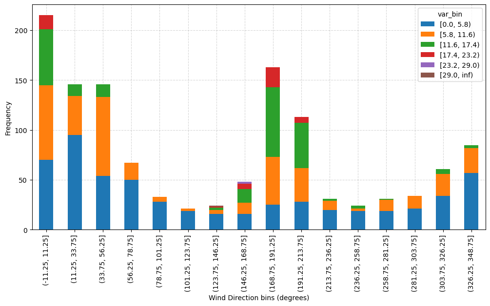
```python
# Display the binned data as bar graph on regular axes.
df.rose.bar()
```