https://github.com/bryanx/themed-toggle-button-group
Customisable toggle buttons inside a FlexboxLayout.
https://github.com/bryanx/themed-toggle-button-group
android android-development android-library android-ui kotlin kotlin-android kotlin-library toggle-button-group toggle-buttons
Last synced: about 1 year ago
JSON representation
Customisable toggle buttons inside a FlexboxLayout.
- Host: GitHub
- URL: https://github.com/bryanx/themed-toggle-button-group
- Owner: Bryanx
- License: mit
- Created: 2020-03-01T21:57:20.000Z (over 6 years ago)
- Default Branch: master
- Last Pushed: 2022-01-29T09:58:33.000Z (over 4 years ago)
- Last Synced: 2025-04-12T23:40:05.143Z (about 1 year ago)
- Topics: android, android-development, android-library, android-ui, kotlin, kotlin-android, kotlin-library, toggle-button-group, toggle-buttons
- Language: Kotlin
- Homepage:
- Size: 6.06 MB
- Stars: 748
- Watchers: 9
- Forks: 47
- Open Issues: 11
-
Metadata Files:
- Readme: README.md
- License: LICENSE
Awesome Lists containing this project
README
# ThemedToggleButtonGroup


[](https://opensource.org/licenses/MIT)
[](https://search.maven.org/search?q=g:%22nl.bryanderidder%22%20AND%20a:%22themed-toggle-button-group%22)
Customisable toggle buttons inside a [FlexboxLayout](https://github.com/google/flexbox-layout).
ThemedToggleButtonGroup is a highly modular lightweight toggle button library for Android. It can be configured for single selection or multi selection. For multi selection the minimum/maximum amount of buttons that are required/enabled can be specified. Icon's can be added. Selection includes a fun press and circular reveal animation.
The main class [ThemedToggleButtonGroup.kt](https://github.com/Bryanx/themed-toggle-button-group/blob/master/library/src/main/java/nl/bryanderidder/themedtogglebuttongroup/ThemedToggleButtonGroup.kt) extends Google's [FlexboxLayout](https://github.com/google/flexbox-layout). Allowing you to use styling similar to [CSS Flexbox](https://www.w3schools.com/css/css3_flexbox.asp) for the button's inside the toggle group.
## Notice
As of version 1.3.2 hosting will be moved from Bintray to MavenCentral. I will move all versions to mavenCentral, but to be safe please use the latest version of this library.
## Installation
Add the dependency in your app's `build.gradle` file:
```groovy
dependencies {
implementation 'nl.bryanderidder:themed-toggle-button-group:1.4.1'
}
```
For Java projects you also have to add `implementation 'org.jetbrains.kotlin:kotlin-stdlib:1.6.0'`
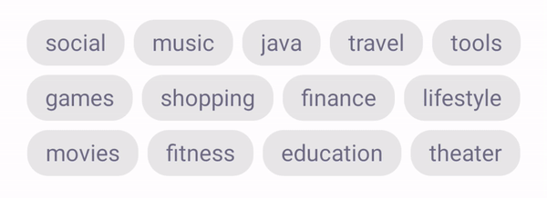
## Single selection

```xml
```
## Multiple selection
 \
Declare how many buttons **may** be selected with `toggle_selectableAmount`. \
Declare how many buttons **must** be selected with `toggle_requiredAmount`.
```xml
```
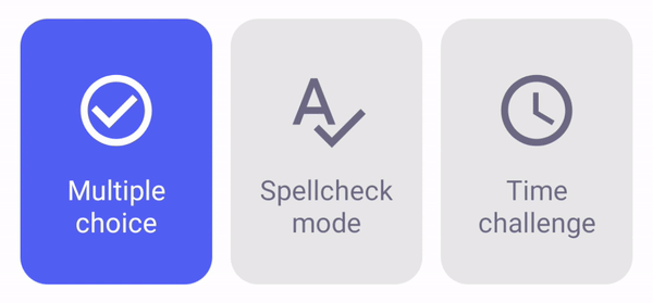
## Animations
CIRCULAR_REVEAL | FADE | HORIZONTAL_SLIDE
--- | --- | ---
 |  | 
VERTICAL_SLIDE | HORIZONTAL_WINDOW | VERTICAL_WINDOW
--- | --- | ---
 |  | 
To set the animation on your layout add this to the toggle group: `app:toggle_selectAnimation="circular_reveal"`.
You can also set the animation programmatically:
Java
```java
ThemedToggleButtonGroup themedToggleButtonGroup = findViewById(R.id.themedToggleButtonGroup);
themedToggleButtonGroup.setSelectAnimation(SelectAnimation.HORIZONTAL_SLIDE);
```
```kotlin
val themedToggleButtonGroup = findViewById(R.id.themedToggleButtonGroup)
themedToggleButtonGroup.selectAnimation = SelectAnimation.HORIZONTAL_SLIDE
```
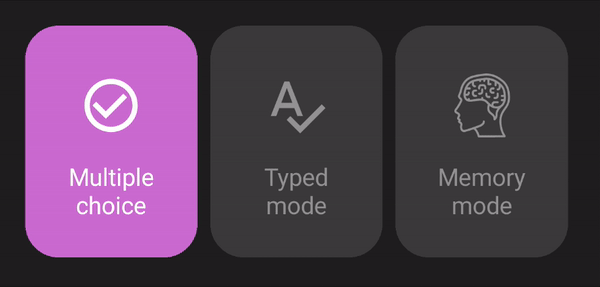
## Icon selection
 \
It is possible to add icons to the buttons and show a different icon when the button is selected. This example also shows how to add borders.
```xml
```
## Text + icon selection
 \
A demo for this example can be found here: [demo-toggle-cards](https://github.com/Bryanx/themed-toggle-button-group/tree/master/demo-toggle-cards). You need to use SVG icons to allow the color to be altered.
```xml
```
## Selection listener
The easiest way to react to selection changes is to use `group.setOnSelectListener(() -> {})`.
Java
```java
ThemedToggleButtonGroup themedButtonGroup = findViewById(R.id.idOfYourThemedButtonGroup);
themedButtonGroup.setOnSelectListener((ThemedButton btn) -> {
// handle selected button
return kotlin.Unit.INSTANCE;
});
```
```kotlin
val themedButtonGroup = findViewById(R.id.idOfYourThemedButtonGroup)
themedButtonGroup.setOnSelectListener { button: ThemedButton ->
// handle selected button
}
```
Once a button is selected its property `isSelected` will be set to true.
Java
```java
// get the selected buttons:
List selectedButtons = themedButtonGroup.getSelectedButtons();
// get all buttons
List allButtons = themedButtonGroup.getButtons();
// get all unselected buttons
List unselectedButtons = allButtons.stream().filter(btn -> !btn.isSelected()).collect(Collectors.toList());
```
```kotlin
// get the selected buttons:
val selectedButtons = themedButtonGroup.selectedButtons
// get all buttons
val allButtons = themedButtonGroup.buttons
// get all unselected buttons
val unselectedButtons = allButtons.filter { !it.isSelected }
```
## Programmatically adding buttons
A demo project for this can be found here: [programmatically-add-buttons](https://github.com/Bryanx/themed-toggle-button-group/tree/master/demo-programmatically-add-buttons). \
Programmatically create a `ThemedToggleButtonGroup`:
Java
```java
ThemedToggleButtonGroup buttonGroup = ThemedToggleButtonGroup(context);
buttonGroup.setJustifyContent(JustifyContent.CENTER);
yourRootView.addView(buttonGroup);
```
```kotlin
val buttonGroup = ThemedToggleButtonGroup(context)
buttonGroup.justifyContent = JustifyContent.CENTER
yourRootView.addView(buttonGroup)
```
Add a button:
Java
```java
ThemedButton btn1 = ThemedButton(context);
btn1.setText("Button 1");
buttonGroup.addView(btn1,
ViewGroup.LayoutParams(
ViewGroup.LayoutParams.WRAP_CONTENT,
ViewGroup.LayoutParams.MATCH_PARENT
)
);
```
```kotlin
val btn1 = ThemedButton(context)
btn1.text = "Button 1"
buttonGroup.addView(btn1,
ViewGroup.LayoutParams(
ViewGroup.LayoutParams.WRAP_CONTENT,
ViewGroup.LayoutParams.MATCH_PARENT
)
)
```
Select/deselect a button programmatically:
You can pass in the `ThemedButton` itself or its resId. This will toggle selection. Fire the method a second time to deselect the button.
```kotlin
buttonGroup.selectButtonWithAnimation(btn)
buttonGroup.selectButton(btn)
```
Enabling/disabling buttons:
Java
```java
btn.setEnabled(false);
// this will fail:
buttonGroup.selectButton(btn);
```
```kotlin
btn.isEnabled = false
// this will fail:
buttonGroup.selectButton(btn)
```
# Customization
These lists include all custom attributes from this library. Please take a look [FlexboxLayout](https://github.com/google/flexbox-layout) to see all custom attributes that can also be applied to these Views.
## ThemedToggleButtonGroup custom attributes
Attribute | Default value | Description
--- | --- | ---
`app:toggle_selectableAmount` | 1 | The amount of buttons that are allowed to be selected. If the user tries to select more buttons, the button that was last selected will be deselected.
`app:toggle_requiredAmount` | 1 | The amount of buttons that are required to be selected. If the user tries to deselect a button below the required amount, the selection is blocked. You can programmatically specify which buttons should be selected initially by setting `ThemedButton.isSelected`. Otherwise a random button will be selected initially.
`app:toggle_horizontalSpacing` | 10dp | The amount of space between the buttons when they are positioned next to each other.
`app:toggle_selectAnimation` | SelectAnimation.CIRCULAR_REVEAL | The type of animations that occur upon selecting a button. Some animations require a certain API level. If the API level is not met SelectAnimation.FADE is used instead.
## ThemedButton custom attributes
 \
You can fully customise colors, positioning, font size, etc. with these attributes.
Attribute | Default value | Description
--- | --- | ---
`app:toggle_text` | Empty string | Text of the button.
`app:toggle_selectedText` | `app:toggle_text` | Text when the button is selected. If not present the text of `toggle_text` is used.
`app:toggle_textSize` | 15sp | Size of the text in the button.
`app:toggle_textAlignment` | center | Alignment of the text. (API 17+)
`app:toggle_fontFamily` | Roboto (Android default) | The font of the text. Put your font file in `/src/main/assets`. And enter the the rest of the path here. For example if your font is in: `/src/main/assets/fonts/arial.ttf` enter this in your layout: `app:toggle_fontFamily="/fonts/arial.ttf"`
`app:toggle_backgroundColor` |  `#EBEBEB` | Background color when the button is not selected.
`app:toggle_selectedBackgroundColor` |  `#5E6FED` | Background color when the button is selected.
`app:toggle_textColor` |  `#5E5E5E` | Text color when the button is not selected. This also sets the color of the icon if it is not set.
`app:toggle_selectedTextColor` |  `#FFFFFF` | Text color when the button is selected. This also sets the color of the selected icon if it is not set.
`app:toggle_icon` | null | Optional icon inside the button.
`app:toggle_selectedIcon` | `app:toggle_icon` | Icon when the button is selected. By default the icon of `app:toggle_icon` is used.
`app:toggle_iconColor` |  `#5E5E5E` | Color of the icon when the button is not selected.
`app:toggle_btnCornerRadius` | 21dp | Curve amount of the button's corners.
`app:toggle_circularCornerRadius` | false | This makes the button circular. This overrides the corner radius.
`app:toggle_borderWidth` | 0dp | The width of the border.
`app:toggle_selectedBorderWidth` | `app:toggle_borderWidth` | The width of the border when the button is selected. By default the width of `toggle_borderWidth` is used.
`app:toggle_borderColor` |  `#5E5E5E` | The color of the border.
`app:toggle_selectedBorderColor` | `app:toggle_borderColor` | The color of the border when the button is selected.. By default the color of `app:toggle_borderColor` is used.
`app:toggle_padding` | 0dp | Padding of the button.
`app:toggle_textPadding` | 14dp (horizontal) | Padding of the text.
`app:toggle_iconPadding` | 0dp | Padding of the icon.
`app:toggle_iconGravity` | top\|start | Position of the icon.
`app:toggle_textGravity` | top\|start | Position of the text.
## Contributing
You can contribute by [opening an issue](https://github.com/Bryanx/themed-toggle-button-group/issues) or forking this repository and creating a pull request.
## License
[License of this library](https://github.com/Bryanx/themed-toggle-button-group/blob/master/LICENSE)\
[License of FlexboxLayout](https://github.com/google/flexbox-layout/blob/master/LICENSE)