https://github.com/bthurlow/nativescript-imagecropper
A nativescript image cropping plugin.
https://github.com/bthurlow/nativescript-imagecropper
Last synced: 3 months ago
JSON representation
A nativescript image cropping plugin.
- Host: GitHub
- URL: https://github.com/bthurlow/nativescript-imagecropper
- Owner: bthurlow
- License: other
- Created: 2016-03-29T20:36:32.000Z (over 10 years ago)
- Default Branch: master
- Last Pushed: 2023-03-05T12:24:47.000Z (over 3 years ago)
- Last Synced: 2025-12-02T07:55:11.157Z (7 months ago)
- Language: TypeScript
- Size: 6.64 MB
- Stars: 49
- Watchers: 4
- Forks: 35
- Open Issues: 32
-
Metadata Files:
- Readme: README.md
- License: LICENSE
Awesome Lists containing this project
- awesome-nativescript - Image Cropper - A nativescript image cropping plugin. (Awesome {N} [](https://github.com/sindresorhus/awesome) / Table of Contents)
- awesome-nativescript - Image Cropper - A NativeScript image cropping plugin. (Plugins / Utility Plugins)
README
# A {N} Image Cropping Plugin
[](http://choosealicense.com/licenses/mit/)
[](https://www.npmjs.com/package/nativescript-imagecropper) [](https://www.npmjs.com/package/nativescript-imagecropper) [](https://github.com/bthurlow/nativescript-imagecropper)
## Notes
iOS 8+
Android 17+
v2.0.0+ the version of Android Lib has changed and the cropper looks different now,
hence the breaking change
### Based on
[TOCropViewController](https://github.com/TimOliver/TOCropViewController) for iOS
[uCrop](https://github.com/Yalantis/uCrop) for Android
## Installation
### NativeScript 7+:
Run `ns plugin add nativescript-imagecropper`
### NativeScript below 7:
Run `tns plugin add nativescript-imagecropper@3.0.0`
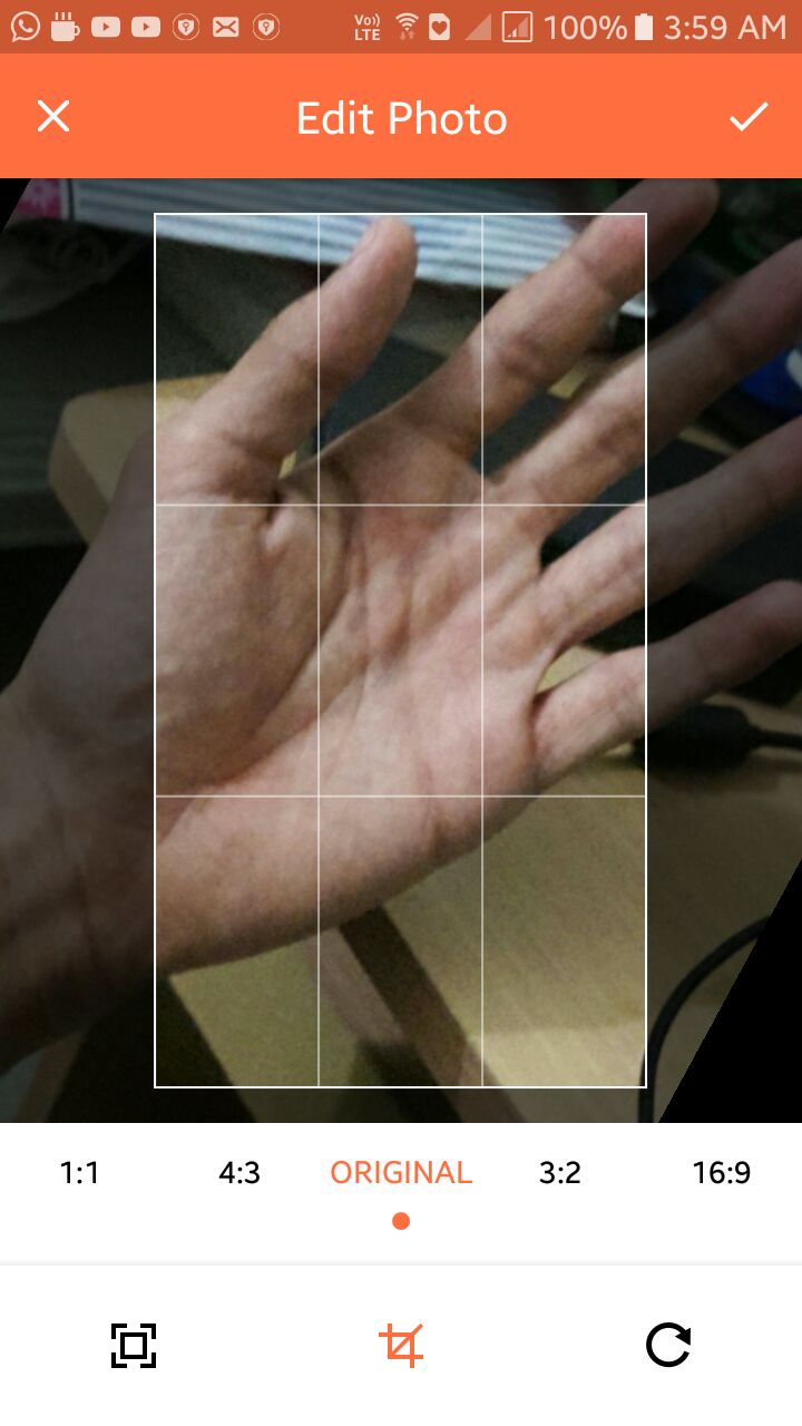
## Screenshots
### Cropper UI & End result (android)

### Cropper UI (iOS)

### Usage (for TS demo, please see the demo folder)
To use the image cropping module you must first require it.
```js
var ImageCropper = require("nativescript-imagecropper").ImageCropper;
```
### How to get the image source, from nativescript-camera plugin
```js
var camera = require("nativescript-camera");
// You might want to request camera permissions first
// check demo folder for sample implementation
camera.takePicture({width:300,height:300,keepAspectRatio:true})
.then((imageAsset) => {
let source = new imageSource.ImageSource();
source.fromAsset(imageAsset).then((source) => {
// now you have the image source
// pass it to the cropper
// recommend using setTimeout like this
setTimeout(() => {
// on iOS we want a timeout of 1second as it takes time before
// the imageSource is ready to be read by the plugin
}, isAndroid ? 0 : 1000);
});
}).catch((err) => {
console.log("Error -> " + err.message);
});
```
### Methods
`show(ImageSource)`: Returns a cropped ImageSource
```js
var imageCropper = new ImageCropper();
imageCropper.show(imageSource).then((args) => {
console.dir(args);
if(args.image !== null){
imageView.imageSource = args.image;
}
})
.catch(function(e){
console.dir(e);
});
```
`show(ImageSource,Options)`: Returns a cropped and resized ImageSource
```js
var imageCropper = new ImageCropper();
imageCropper.show(imageSource,{width:300,height:300}).then((args) => {
console.dir(args);
if(args.image !== null){
imageView.imageSource = args.image;
}
})
.catch(function(e){
console.dir(e);
});
```
### Options
Option | Type | Description
------ | ------ | ------------------------------------------------
width | number | The width of the image you would like returned.
height | number | The height of the image you would like returned.
lockSquare | boolean | Pass this as true, to lock square aspect ratio on iOS, on android, this option doesn't make any difference.
circularCrop | boolean | Pass this as true, to crop a circular image on iOS, on android, this options shows a circular mask while cropping, but returns a rectangular image.
### Android Config
```ts
export interface OptionsAndroid {
isFreeStyleCropEnabled?: boolean; // set to true to let user resize crop bounds (disabled by default)
toolbarTitle?: string; // default 'Crop Image'
toolbarTextColor?: string; // desired resolved color of Toolbar text and buttons (default is darker orange)
toolbarColor?: string; // desired resolved color of the toolbar
rootViewBackgroundColor?: string; // desired background color that should be applied to the root view
logoColor?: string; // desired resolved color of logo fill (default is darker grey)
statusBarColor?: string; // Set statusbar color
showCropGrid?: boolean; // set to true if you want to see a crop grid/guidelines on top of an image
showCropFrame?: boolean; // set to true if you want to see a crop frame rectangle on top of an image
cropFrameStrokeWidth?: number; // desired width of crop frame line in pixels
cropGridStrokeWidth?: number; // desired width of crop grid lines in pixels
cropGridColor?: string; // desired color of crop grid/guidelines
cropFrameColor?: string; // desired color of crop frame
cropGridRowCount?: number; // crop grid rows count
cropGridColumnCount?: number; // crop grid columns count
hideBottomControls?: boolean; // set to true to hide the bottom controls (shown by default)
compressionQuality?: number; // Set compression quality [0-100] that will be used to save resulting Bitmap
dimmedLayerColor?: string; // desired color of dimmed area around the crop bounds
setAspectRatioOptions?: AspectRatioOptions; // Pass an ordered list of desired aspect ratios that should be available for a user.
toolbarCropDrawable?: any; // Android Drawable (pass native drawable object ONLY)
toolbarCancelDrawable?: any; // Android Drawable (pass native drawable object ONLY)
}
export interface AspectRatio {
aspectRatioTitle: string,
aspectRatioX: number,
aspectRatioY: number;
}
export interface AspectRatioOptions {
defaultIndex: number;
aspectRatios: AspectRatio[]
}
// example aspectRatio options
setAspectRatioOptions: {
defaultIndex: 0,
aspectRatios: [
{
aspectRatioTitle: '1:1',
aspectRatioX: 1,
aspectRatioY: 1
},
{
aspectRatioTitle: '16:9',
aspectRatioX: 16,
aspectRatioY: 9
},
{
aspectRatioTitle: '18:9',
aspectRatioX: 18,
aspectRatioY: 9
}
]
}
```
### Additional notes for Android
You can override library colors just specifying colors with the same names in your colors.xml file.
For example:
```xml
#000000
```
This will make toolbar color black if specified inside your `App_Resources/Android/values/colors.xml` file.
#### Android styles to customize the cropper activity/styles
``` xml
#FF6E40
#CC5833
#fff
#000
#FF6E40
#fff
#000
#808080
#000
#80ffffff
#ffffff
#8c000000
#4f212121
```
### Returned Result Arguments
Argument | Type | Result(s)
-------- | ----------- | --------------------------------------------------------------------------
response | string | Success
Cancelled
Error
image | ImageSource | `null` if there was an error or was cancelled
`ImageSource` on success
### Bonus: Snippet for using with nativescript-imagepicker 6.x
```js
const context = imagepickerModule.create({
mode: 'single' // allow choosing single image
});
context
.authorize()
.then(function() {
return context.present();
})
.then(function(selection) {
selection.forEach(function(selected) {
selected.getImageAsync(source => {
if (source) {
const selectedImgSource = imageSource.fromNativeSource(source);
imageCropper
.show(selectedImgSource, { width: 500, height: 500 })
.then(args => {
if (args.image !== null) {
// Use args.image
}
})
.catch(function(e) {
console.log(e);
});
}
});
});
})
.catch(function(e) {
console.log(e);
});
```