https://github.com/buraksakalli/keycap
🔠 Keycap: A React UI library for dynamic keyboard components with custom styles, powered by Vite.
https://github.com/buraksakalli/keycap
hacktoberfest keycap react react-typescript
Last synced: 10 months ago
JSON representation
🔠 Keycap: A React UI library for dynamic keyboard components with custom styles, powered by Vite.
- Host: GitHub
- URL: https://github.com/buraksakalli/keycap
- Owner: buraksakalli
- Created: 2023-11-05T14:54:48.000Z (over 2 years ago)
- Default Branch: main
- Last Pushed: 2024-10-10T16:15:18.000Z (over 1 year ago)
- Last Synced: 2025-07-27T02:49:28.216Z (10 months ago)
- Topics: hacktoberfest, keycap, react, react-typescript
- Language: TypeScript
- Homepage: https://keycap.vercel.app
- Size: 49.8 KB
- Stars: 6
- Watchers: 1
- Forks: 1
- Open Issues: 0
-
Metadata Files:
- Readme: README.md
Awesome Lists containing this project
README
# Keycap
[](https://badge.fury.io/js/keycap)
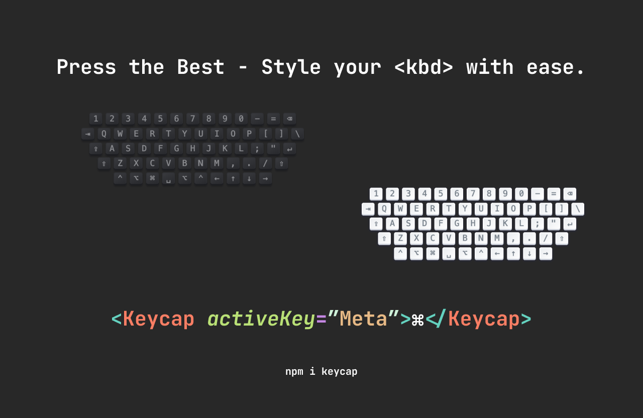
Keycap is a lightweight, customizable keyboard key (kbd) component for React. It's designed to visually represent keyboard keys in your user interface, complete with a "pressed" style to give users feedback when keys are active.
## Preview
You can see a live demo [here](https://keycap.vercel.app/).
## Features
- Lightweight with no external dependencies.
- Easy to use and integrate into your React projects.
- Customizable styles for both light and dark mode.
- Pressed key state for interactive feedback.
## Installation
To install the package, use npm:
```bash
npm install keycap
or yarn:
yarn add keycap
```
## Usage
Here is a basic example of how to use the `Keycap` component:
```jsx
import { Keycap } from "keycap";
function App() {
return (
A
B
C
⌘
↵
);
}
export default App;
```
## Props
- `activeKey`: (string) The key that the `Keycap` component should respond to.
- `children`: (node) The content to display inside the keycap, typically a single letter or symbol.
- `className`: (string) Optional. A class name to add custom styles to the keycap.
## Styling
The component uses the following CSS variables for theming, which you can override in your stylesheet:
```css
/* Light Mode */
--keycap-text-color: rgb(150, 159, 175);
--keycap-gradient: linear-gradient(
-225deg,
rgb(213, 219, 228) 0%,
rgb(248, 248, 248) 100%
);
--keycap-key-shadow: inset 0 -2px 0 0 rgb(205, 205, 230), inset 0 0 1px 1px #fff,
0 1px 2px 1px rgba(30, 35, 90, 0.4);
--keycap-key-pressed-shadow: inset 0 -2px 0 0 #cdcde6, inset 0 0 1px 1px #fff,
0 1px 1px 0 rgba(30, 35, 90, 0.4);
/* Dark Mode */
--keycap-text-color-dark: rgb(127, 132, 151);
--keycap-gradient-dark: linear-gradient(
-26.5deg,
rgb(38, 39, 43) 0%,
rgb(58, 59, 63) 100%
);
--keycap-key-shadow-dark: inset 0 -2px 0 0 rgb(28, 29, 33), inset 0 0 1px 1px
rgb(48, 49, 53), 0 2px 2px 0 rgba(3, 4, 9, 0.3);
--keycap-key-pressed-shadow-dark: inset 0 -2px 0 0 rgb(28, 29, 33), inset 0 0
1px 1px rgb(48, 49, 53), 0 1px 1px 0 rgba(3, 4, 9, 0.5);
```
You can customize these variables in your CSS to match your app's theme.
## Contributing
If you have any suggestions or improvements, please submit a pull request or open an issue. Contributions are always welcome!
## License
This project is licensed under the MIT License