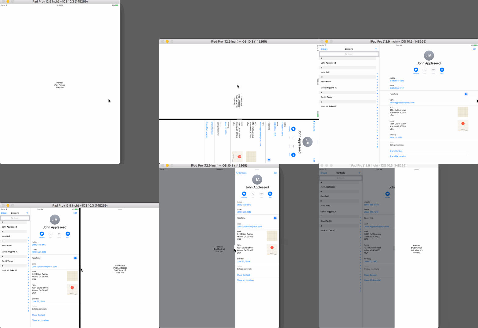
https://github.com/cemolcay/sizeclasser
Device specific UITraitCollection helper with split view detection for iOS.
https://github.com/cemolcay/sizeclasser
size-classes split-over split-view uitraitcollection
Last synced: about 1 year ago
JSON representation
Device specific UITraitCollection helper with split view detection for iOS.
- Host: GitHub
- URL: https://github.com/cemolcay/sizeclasser
- Owner: cemolcay
- License: mit
- Created: 2017-04-22T10:12:05.000Z (about 9 years ago)
- Default Branch: master
- Last Pushed: 2019-11-28T21:14:16.000Z (over 6 years ago)
- Last Synced: 2025-03-29T00:06:02.597Z (about 1 year ago)
- Topics: size-classes, split-over, split-view, uitraitcollection
- Language: Ruby
- Size: 2.14 MB
- Stars: 35
- Watchers: 6
- Forks: 5
- Open Issues: 1
-
Metadata Files:
- Readme: README.md
- License: LICENSE
Awesome Lists containing this project
README
SizeClasser
===
Device specific `UITraitCollection` helper with split view detection for iOS.
Demo
----

Requirements
----
- Swift 3.0+
- iOS 8.0+
Install
----
```
use_frameworks!
pod 'SizeClasser'
```
Usage
----
[`SizeClasser`](https://github.com/cemolcay/SizeClasser/blob/master/SizeClasser/SizeClasser.swift) is an `OptionSet` type struct.
You can initilize it with your viewController's `traitCollection` property to identify your current device specific orientation and split view status.
``` swift
let sizeClasser = SizeClasser(traitCollection: traitCollection)
```
Options:
``` swift
/// Screen height is bigger than width. Portrait mode in all devices.
public static let portrait = SizeClasser(rawValue: 1 << 0)
/// Screen width is bigger than height. Landscape mode in all devices.
public static let landscape = SizeClasser(rawValue: 1 << 1)
/// Portrait mode for iPhone devices.
public static let iPhonePortrait = SizeClasser(rawValue: 1 << 2)
/// Landscape mode for iPhone devices.
public static let iPhoneLandscape = SizeClasser(rawValue: 1 << 3)
/// Portrait mode for iPad devices.
public static let iPadPortrait = SizeClasser(rawValue: 1 << 4)
/// Landscape mode for iPad devices.
public static let iPadLandscape = SizeClasser(rawValue: 1 << 5)
/// Split mode 1/3 of visible area in iPad devices.
public static let iPadSplitOneThird = SizeClasser(rawValue: 1 << 8)
/// Split mode 1/2 of visible area in iPad devices.
public static let iPadSplitHalf = SizeClasser(rawValue: 1 << 9)
/// Split mode 2/3 of visible area in iPad devices.
public static let iPadSplitTwoThird = SizeClasser(rawValue: 1 << 10)
```
For example, if you want to detect iPad split view 1/3 on landscape orientation, simply:
``` swift
guard let trait = SizeClasser(traitCollection: traitCollection) else { return }
if trait.contains([.iPadLandscape, .iPadSplitOneThird]) {
// You are on iPad, landscape and 1/3 split view mode
if SizeClasser.isiPadPro {
// You are on 12.9" iPad
} else {
// You are on regular iPad / iPad mini
}
}
```
Also you can use `SizeClasser.isiPadPro` to detect 12.9" iPad Pro if you want to layout your views more specificly.
#### Note on `traitCollectionDidChange:previousTraitCollection` function:
This function only get called if `traitCollection` changes.
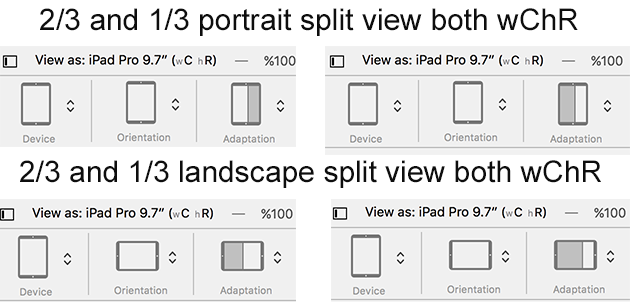
If you are on iPad, either portrait or landscape mode, it won't change 1/3 split view to 2/3 split view transitions.
iOS calculates them both `compact width regular height` mode.
So, I recommend to use `viewDidLayoutSubviews:` function to detect split view changes specificly.
