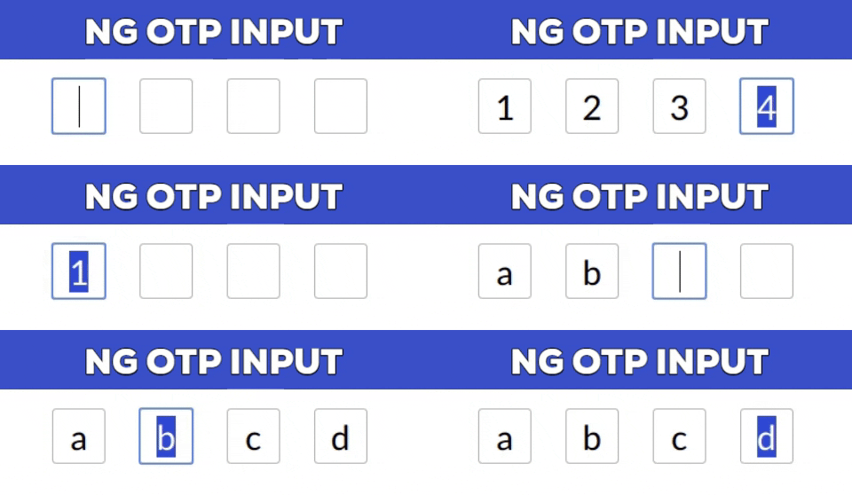
https://github.com/code-farmz/ng-otp-input
A fully customizable, one-time password input component for the web built with Angular.
https://github.com/code-farmz/ng-otp-input
Last synced: 10 months ago
JSON representation
A fully customizable, one-time password input component for the web built with Angular.
- Host: GitHub
- URL: https://github.com/code-farmz/ng-otp-input
- Owner: code-farmz
- License: mit
- Created: 2019-05-16T12:17:45.000Z (almost 7 years ago)
- Default Branch: master
- Last Pushed: 2025-05-21T08:36:22.000Z (11 months ago)
- Last Synced: 2025-06-01T16:14:06.882Z (11 months ago)
- Language: TypeScript
- Homepage:
- Size: 1.98 MB
- Stars: 115
- Watchers: 4
- Forks: 55
- Open Issues: 1
-
Metadata Files:
- Readme: README.md
- License: LICENSE
Awesome Lists containing this project
- fucking-awesome-angular - ng-otp-input - A fully customizable, one-time password (OTP) input component for the web built with Angular. (Third Party Components / Form Controls)
- awesome-angular - ng-otp-input - A fully customizable, one-time password (OTP) input component for the web built with Angular. (Third Party Components / Form Controls)
README
[](https://badge.fury.io/js/ng-otp-input) [](https://www.npmjs.com/package/ng-otp-input) [](https://www.npmjs.com/package/ng-otp-input)
A fully customizable, one-time password (OTP) input component for the web built with Angular.

[**Demo**](https://code-farmz.github.io/ng-otp-input) | [**Edit on StackBlitz**](https://stackblitz.com/github/code-farmz/ng-otp-input)
---
## Installation
#### For Angular 16 and above:
```bash
npm install --save ng-otp-input
```
#### For Angular 12 to 15:
```bash
npm install --save ng-otp-input@1.9.3
```
#### For Angular 11 and below:
```bash
npm install --save ng-otp-input@1.8.1
```
---
## Major Changes in v2
- Requires Angular 16 or above.
- Emits `null` instead of an empty string if no value is supplied.
- Fully supports **Reactive Forms** (`formControl` and `ngModel` are supported from v2.0.5 onwards).
- Deprecated the custom `formCtrl` input property. Use `formControl` instead.
---
## Usage
### Import the Module
For **Modules**:
```typescript
import { NgOtpInputModule } from 'ng-otp-input';
@NgModule({
imports: [
...otherModules,
NgOtpInputModule,
],
})
export class AppModule {}
```
For **Standalone Components**:
```typescript
import { NgOtpInputComponent } from 'ng-otp-input';
@Component({
standalone: true,
imports: [NgOtpInputComponent],
})
export class YourComponent {}
```
### Add the Component to Your Template
```html
```
---
## API Reference
### Component Inputs/Outputs
| Name | Type | Required | Default | Description |
|-----------------|----------|----------|---------|-----------------------------------------------------------------------------|
| `disabled` | boolean | No | `false` | Disables all inputs when set to `true`. |
| `onOtpChange` | `Output` | No | -- | Emits the OTP value on change. Not required if using `formControl`. |
| `onBlur` | `Output` | No | -- | Triggered when focus is lost from the component. |
| `setValue` | function | No | -- | Allows programmatic setting of the component value. |
| `config` | object | Yes | `{ length: 4 }` | Configuration object for customization (see **Config Options** below). |
---
### Config Options
| Name | Type | Required | Default | Description |
|-------------------|---------|----------|------------|----------------------------------------------------------------------------------------------|
| `allowNumbersOnly` | boolean | No | `false` | Restricts input to numeric values only. |
| `disableAutoFocus` | boolean | No | `false` | Prevents automatic focus on load or when setting the value. |
| `containerClass` | string | No | -- | Adds a custom CSS class to the container element. |
| `containerStyles` | object | No | -- | Customizes the container styles. Check [NgStyle](https://angular.io/api/common/NgStyle). |
| `inputStyles` | object | No | -- | Customizes the styles of individual inputs. |
| `inputClass` | string | No | -- | Adds a custom CSS class to each input box. |
| `isPasswordInput` | boolean | No | `false` | Masks input as password fields. |
| `length` | number | Yes | `4` | Sets the number of OTP inputs to render. |
| `letterCase` | string | No | -- | Converts input to `Upper` or `Lower` case. |
| `placeholder` | string | No | -- | Sets a placeholder for each input box. |
| `separator` | char | No | -- | Inserts a separator character between input boxes. |
| `showError` | boolean | No | `false` | Highlights inputs with red borders if `formControl` is invalid, dirty, or touched. |
---
## Advanced Features
### Updating Component Value
- Use `formControl` or `ngModel` (v2.0.5 and above) for updates.
- For earlier versions, use `setValue`:
```typescript
@ViewChild(NgOtpInputComponent, { static: false }) ngOtpInput: NgOtpInputComponent;
updateOtpValue() {
this.ngOtpInput.setValue('12345'); // Replace with your OTP value.
}
```
---
### Disabling Inputs
- Use the `disabled` property or set the `FormControl` to a disabled state (v2.0.5+).
- For earlier versions, use `disable` method:
```typescript
this.ngOtpInput.otpForm.disable();
```
---
### Focus on a Specific Input
```typescript
const eleId = this.ngOtpInput.getBoxId(0);
this.ngOtpInput.focusTo(eleId);
```
---
## License
[](https://github.com/code-farmz/ng-otp-input/blob/master/LICENSE)
---
## Contributing
Show your support by starring the repo! Feel free to open [issues](https://github.com/code-farmz/ng-otp-input/issues/new) or contribute via [pull requests](https://github.com/code-farmz/ng-otp-input/compare).