https://github.com/codebrahma/react-lite-ui
A set of React components. Themable / Customizable / Light weight library
https://github.com/codebrahma/react-lite-ui
component-library components customizable react reactjs ui-components ui-kit
Last synced: 12 months ago
JSON representation
A set of React components. Themable / Customizable / Light weight library
- Host: GitHub
- URL: https://github.com/codebrahma/react-lite-ui
- Owner: Codebrahma
- License: mit
- Created: 2018-09-28T04:43:05.000Z (almost 8 years ago)
- Default Branch: master
- Last Pushed: 2023-01-03T15:31:23.000Z (over 3 years ago)
- Last Synced: 2024-11-17T13:44:57.263Z (over 1 year ago)
- Topics: component-library, components, customizable, react, reactjs, ui-components, ui-kit
- Language: JavaScript
- Homepage:
- Size: 23.9 MB
- Stars: 40
- Watchers: 9
- Forks: 15
- Open Issues: 51
-
Metadata Files:
- Readme: README.md
- Changelog: CHANGELOG.md
- Contributing: CONTRIBUTING.md
- License: LICENSE
- Code of conduct: CODE_OF_CONDUCT.md
Awesome Lists containing this project
README

React Lite UI
A set of light weight React Components, which are easily customizable and can be bootstrapped in your project.


Key Features •
Installation •
Usage •
Documentation •
Demo
### :sparkles: Key Features:
##
* Any DOM element can be customized through a simple SASS file. :tada:
* You can import individual components which doesn't affect the bundle size of your app. :confetti_ball:
* Clean Design with minimal implementation reducing the code that is shipped to your app with pleasant UI. :sunrise_over_mountains:
* Each component is made light-weight - around half the size of components ( and even less! ) from other popular libraries. :muscle:
### :link: Installation:
##
```
npm install --save react-lite-ui
```
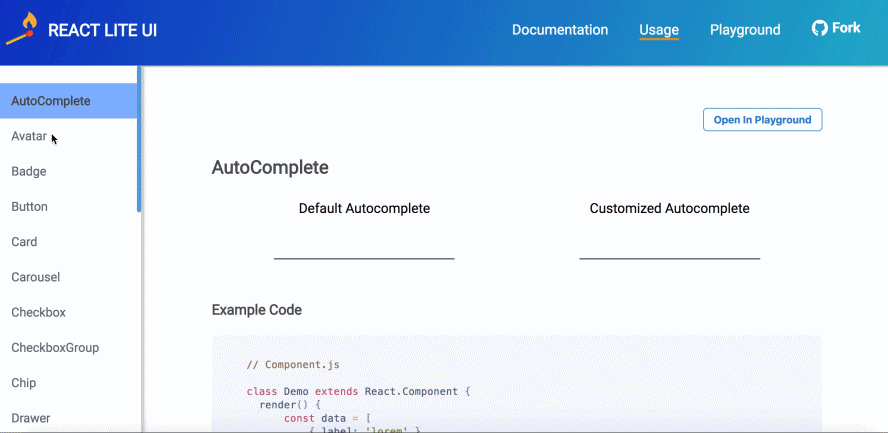
### :rocket: Usage :
##
In your `App.js` :
```jsx
import React from 'react';
import ReactDOM from 'react-dom';
import { Card } from 'react-lite-ui';
class App extends React.Component {
render() {
return (
Card content
);
}
}
ReactDOM.render(
,
document.getElementById('root')
);
```
### :art: Customisation :
##
Let's take our `App.js` file, and add a [Card](https://codebrahma.com/react-lite-ui/documentation?component=card) component to it :
```jsx
import React from 'react';
import ReactDOM from 'react-dom';
import { Card } from 'react-lite-ui';
class App extends React.Component {
render() {
return (
view more
}
elevation="medium"
>

);
}
}
ReactDOM.render(
,
document.getElementById('root')
);
```
Create a file named `theme.scss` :
```scss
:local(.card) {
z-index: 2;
height: fit-content;
width: 100%;
transition: margin 0.2s ease-in-out;
}
:local(.cardHeader) {
color: #0c549c;
text-align: center;
}
:local(.cardFooter) {
justify-content: center;
align-self: baseline;
}
```
Don't worry if this doesn't make sense to you. For now, we will add these styles and complete wiring up our styles to the card component.
Now, in our `App.js` file we will pass a `theme` prop to the `Card` component, like this :
```jsx
import React from 'react';
import ReactDOM from 'react-dom';
import { Card } from 'react-lite-ui';
import theme from 'theme.scss'; // Import the styles from theme.scss
class App extends React.Component {
render() {
return (
view more
}
elevation="medium"
>
);
}
}
...
```
So, let's take a look at what we did here :
* We defined our own styles which we wanted to customize for the component using the `card`, `cardHeader` and `cardFooter` classes.
* Then we passed the styles to the component via the `theme` prop which gets applied to the component's structure.
The styles that you passed are then combined with the default styles of the component to render your customised component!
For more info on how to customise and various props that you can pass to your components, please visit the [Documentation page](https://codebrahma.com/react-lite-ui/documentation).
That's all you need to do! And here's our customised card component :
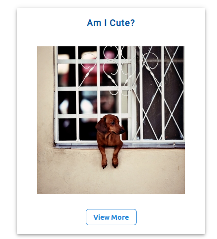
Pretty easy, right? Want to try out more components?
Simply visit our [Playground page](https://codebrahma.com/react-lite-ui/playground) to try out the components before using and have fun playing around with them!
### Contributing :
If you want to contribute, please take a look at our [Contribution guidelines](https://github.com/Codebrahma/react-lite-ui/blob/master/CONTRIBUTING.md) and raise a PR! We would love contributions!
If you find an issue or have a question, please open an issue [here](https://github.com/Codebrahma/react-lite-ui/issues) and we would love to help you out and keep improving this library! :smile:
Thanks!
### Contributors :
[](https://sourcerer.io/fame/prasanna1211/Codebrahma/react-lite-ui/links/0)[](https://sourcerer.io/fame/prasanna1211/Codebrahma/react-lite-ui/links/1)[](https://sourcerer.io/fame/prasanna1211/Codebrahma/react-lite-ui/links/2)[](https://sourcerer.io/fame/prasanna1211/Codebrahma/react-lite-ui/links/3)[](https://sourcerer.io/fame/prasanna1211/Codebrahma/react-lite-ui/links/4)[](https://sourcerer.io/fame/prasanna1211/Codebrahma/react-lite-ui/links/5)[](https://sourcerer.io/fame/prasanna1211/Codebrahma/react-lite-ui/links/6)[](https://sourcerer.io/fame/prasanna1211/Codebrahma/react-lite-ui/links/7)