https://github.com/codingfries/auto_paginated_view
https://github.com/codingfries/auto_paginated_view
Last synced: about 1 year ago
JSON representation
- Host: GitHub
- URL: https://github.com/codingfries/auto_paginated_view
- Owner: CodingFries
- License: mit
- Created: 2025-06-03T22:09:26.000Z (about 1 year ago)
- Default Branch: main
- Last Pushed: 2025-06-03T22:24:59.000Z (about 1 year ago)
- Last Synced: 2025-06-04T05:58:09.730Z (about 1 year ago)
- Language: Dart
- Size: 39.3 MB
- Stars: 0
- Watchers: 0
- Forks: 0
- Open Issues: 0
-
Metadata Files:
- Readme: README.md
- Changelog: CHANGELOG.md
- License: LICENSE
Awesome Lists containing this project
README
# AutoPaginatedView
A Flutter widget that simplifies implementing automatic pagination in list-based views. This package helps you create paginated lists with minimal code while handling loading states, errors, and empty states.
[](https://pub.dev/packages/auto_paginated_view)
## Features
- 📋 **Universal List Support**: Works with ListView, GridView, SliverList, SliverGrid, and custom list implementations
- 🔄 **Automatic Loading**: Triggers loading of more items when the user reaches the end of the list
- ⚠️ **Error Handling**: Built-in error handling with customizable error widgets and retry functionality
- 🔍 **Empty State Handling**: Displays appropriate widgets when the list is empty
- 🎨 **Customizable**: Allows full customization of loading, error, and empty state widgets
- 🔧 **Highly Configurable**: Flexible parameters for customizing behavior and appearance
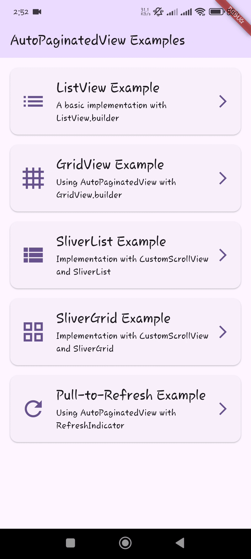
## Examples
Here are some examples of what you can build with AutoPaginatedView:
| ListView | GridView | Pull-to-Refresh |
|----------|----------|-----------------|
|  |  |  |
| SliverList | SliverGrid |
|------------|------------|
|  |  |
## Getting Started
Add the package to your `pubspec.yaml`:
```yaml
dependencies:
auto_paginated_view:
```
Then run:
```
flutter pub get
```
### Dependencies
This package uses [visibility_detector](https://pub.dev/packages/visibility_detector) to determine when to trigger loading more items. This dependency is managed automatically when you add `auto_paginated_view` to your project.
## Usage
### Basic ListView Example
```dart
import 'package:auto_paginated_view/auto_paginated_view.dart';
import 'package:flutter/material.dart';
AutoPaginatedView(
items: myItemsList,
hasReachedEnd: !hasMoreItems,
onLoadMore: () async {
try {
await loadMoreItems();
return null; // Success
} catch (e) {
return e.toString(); // Error message
}
},
itemBuilder: (context, index) => ListTile(
title: Text(myItemsList[index].title),
subtitle: Text(myItemsList[index].description),
),
builder: (context, itemCount, itemBuilder) => ListView.builder(
itemCount: itemCount,
itemBuilder: itemBuilder,
),
)
```
### GridView Example
```dart
AutoPaginatedView(
items: myImagesList,
hasReachedEnd: !hasMoreImages,
onLoadMore: () async {
try {
await fetchMoreImages();
return null;
} catch (e) {
return e.toString();
}
},
itemBuilder: (context, index) => Image.network(myImagesList[index].url),
builder: (context, itemCount, itemBuilder) => GridView.builder(
gridDelegate: SliverGridDelegateWithFixedCrossAxisCount(
crossAxisCount: 2,
mainAxisSpacing: 8,
crossAxisSpacing: 8,
),
itemCount: itemCount,
itemBuilder: itemBuilder,
),
)
```
### SliverList Example
```dart
CustomScrollView(
slivers: [
SliverAppBar(
title: Text('My Sliver List'),
floating: true,
),
AutoPaginatedView(
items: myItemsList,
hasReachedEnd: !hasMoreItems,
onLoadMore: () async {
try {
await loadMoreItems();
return null;
} catch (e) {
return e.toString();
}
},
itemBuilder: (context, index) => ListTile(
title: Text(myItemsList[index].title),
),
builder: (context, itemCount, itemBuilder) => SliverList(
delegate: SliverChildBuilderDelegate(
itemBuilder,
childCount: itemCount,
),
),
isInsideSliverView: true,
),
],
)
```
### Custom State Builders
```dart
AutoPaginatedView(
items: myItemsList,
hasReachedEnd: !hasMoreItems,
onLoadMore: loadMoreFunction,
itemBuilder: itemBuilderFunction,
builder: listBuilderFunction,
// Custom loading state
loadingStateBuilder: () => Center(
child: Column(
children: [
CircularProgressIndicator(color: Colors.blue),
SizedBox(height: 8),
Text('Loading more items...'),
],
),
),
// Custom error state
errorStateBuilder: (error, retry) => Center(
child: Column(
children: [
Icon(Icons.error, color: Colors.red, size: 48),
Text('Oops! $error'),
ElevatedButton(
onPressed: retry,
child: Text('Try Again'),
),
],
),
),
// Custom empty state
emptyStateBuilder: () => Center(
child: Column(
children: [
Icon(Icons.inbox, color: Colors.grey, size: 48),
Text('No items available'),
ElevatedButton(
onPressed: loadMoreFunction,
child: Text('Refresh'),
),
],
),
),
)
```
## Parameters
| Parameter | Type | Required | Description |
|-----------|------|----------|-------------|
| `items` | `List` | Yes | The list of items to display |
| `hasReachedEnd` | `bool` | Yes | Whether all available items have been loaded |
| `onLoadMore` | `Future Function()` | Yes | Callback to load more items. Returns null on success or error message on failure |
| `itemBuilder` | `Widget Function(BuildContext, int)` | Yes | Builder for individual items in the list |
| `builder` | `Widget Function(BuildContext, int, Widget Function(BuildContext, int))` | Yes | Builder for the list container (ListView, GridView, etc.) |
| `loadingStateBuilder` | `Widget Function()?` | No | Custom builder for the loading state widget |
| `errorStateBuilder` | `Widget Function(String, VoidCallback)?` | No | Custom builder for the error state widget |
| `emptyStateBuilder` | `Widget Function()?` | No | Custom builder for the empty state widget |
| `isInsideSliverView` | `bool` | No | Whether the widget is being used inside a sliver view. Default is `false` |
| `emptyStateHeight` | `double?` | No | Height for the empty state widget. If not provided, the empty state will take its natural height based on its content. |
| `visibilityThreshold` | `double` | No | Visibility threshold for triggering loading more items. Default is `0` |
| `autoLoadInitially` | `bool` | No | Whether to automatically load items when the widget is first built. Default is `true` |
| `autoRefreshOnEmptyList` | `bool` | No | Whether to automatically refresh when the list becomes empty. Default is `true` |
## Advanced Usage
See the `/example` folder for complete sample applications demonstrating different use cases and configurations.
## Contributing
Contributions are welcome! If you find a bug or want a feature, please open an issue.
## License
This project is licensed under the MIT License - see the LICENSE file for details.