https://github.com/codingfries/progress_dialog
https://github.com/codingfries/progress_dialog
Last synced: 11 months ago
JSON representation
- Host: GitHub
- URL: https://github.com/codingfries/progress_dialog
- Owner: CodingFries
- License: mit
- Created: 2021-10-01T14:35:14.000Z (over 4 years ago)
- Default Branch: master
- Last Pushed: 2024-02-22T15:31:36.000Z (over 2 years ago)
- Last Synced: 2024-06-01T01:57:54.107Z (about 2 years ago)
- Language: Dart
- Size: 211 KB
- Stars: 1
- Watchers: 1
- Forks: 2
- Open Issues: 3
-
Metadata Files:
- Readme: README.md
- Changelog: CHANGELOG.md
- License: LICENSE
Awesome Lists containing this project
README
# progress_dialog
A light weight package to show progress dialog. As it is a stateful widget, you can change the text shown on the dialog dynamically.
This is the original package and it's owner
https://github.com/fayaz07/progress_dialog
It was discontinued by him, but i really liked the package so I am trynna revive it :D
I added null safety and updated most of the stuff making it null safe and useable again :)
## Demo
## How to use
Import the package in your dart file
```dart
import 'package:progress_dialog/progress_dialog_null_safe.dart';
```
Create and initialise a **ProgressDialog** object inside the **build()** method passing context to it
- Initialize the ProgressDialog object
```dart
final ProgressDialog pr = ProgressDialog(context);
```
- By default it is a normal dialog to show some message, if you would like to use it to show percentage of progress done, specify the optional type parameter and specify if you want your dialog to dismiss when back button is pressed isDismissible parameter (Optional)
```dart
//For normal dialog
pr = ProgressDialog(context,type: ProgressDialogType.Normal, isDismissible: true/false, showLogs: true/false);
//For showing progress percentage
pr = ProgressDialog(context,type: ProgressDialogType.Download, isDismissible: true/false, showLogs: true/false);
```
> Note: Please initialize the ```ProgressDialog```, where you have availability of the context
- Style the progress dialog (Optional)
```dart
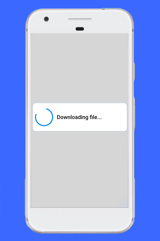
pr.style(
message: 'Downloading file...',
borderRadius: 10.0,
backgroundColor: Colors.white,
progressWidget: CircularProgressIndicator(),
elevation: 10.0,
insetAnimCurve: Curves.easeInOut,
progress: 0.0,
textDirection: TextDirection.rtl,
maxProgress: 100.0,
progressTextStyle: TextStyle(
color: Colors.black, fontSize: 13.0, fontWeight: FontWeight.w400),
messageTextStyle: TextStyle(
color: Colors.black, fontSize: 19.0, fontWeight: FontWeight.w600)
);
```
```note
Note: You don't need to use all parameters, all of them are optional
```
- Showing the progress dialog
```dart
await pr.show();
```
-
Dynamically update the content shown out there
```dart
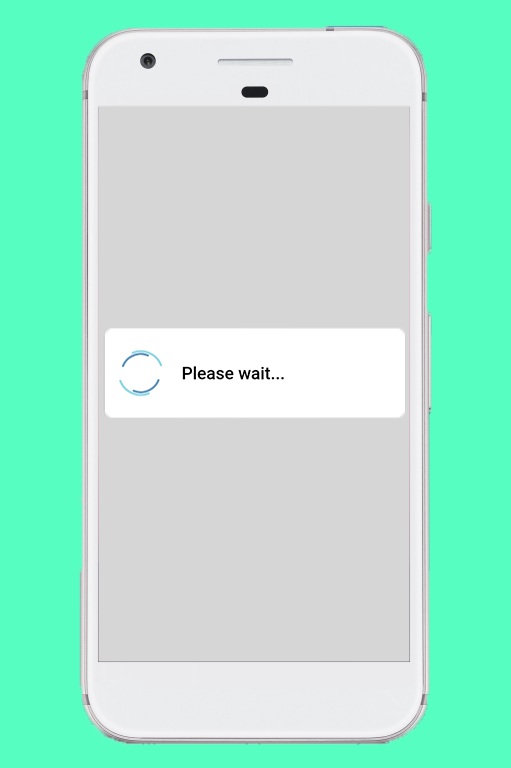
pr.update(
progress: 50.0,
message: "Please wait...",
progressWidget: Container(
padding: EdgeInsets.all(8.0), child: CircularProgressIndicator()),
maxProgress: 100.0,
progressTextStyle: TextStyle(
color: Colors.black, fontSize: 13.0, fontWeight: FontWeight.w400),
messageTextStyle: TextStyle(
color: Colors.black, fontSize: 19.0, fontWeight: FontWeight.w600),
);
```
```note
Note: You don't need to use all parameters, all of them are optional
```
-
Dismissing the progress dialog
```dart
pr.hide().then((isHidden) {
print(isHidden);
});
// or
await pr.hide();
```
> Navigating to next screens must be done after the completion of Future - hide(). [See here for example](https://gist.github.com/fayaz07/52dfe04d9f8594501465f169aa6ef6b6)
### Check if progress dialog is showing
```dart
bool isProgressDialogShowing = pr.isShowing();
print(isProgressDialogShowing);
```
### Use custom body
```dart
pr = ProgressDialog(
context,
type: ProgressDialogType.Normal,
isDismissible: true,
/// your body here
customBody: LinearProgressIndicator(
valueColor: AlwaysStoppedAnimation(Colors.blueAccent),
backgroundColor: Colors.white,
),
);
```
---
## Demo


### Default configuration/styles
If you don't like to configure/style the dialog and continue with the default style, it's okay but just have a look at our default configuration.
| Attribute | Value |
| ------------- | :-----:|
| Dismissible | true |
| ProgressDialogType | ProgressDialogType.Normal |
| BackgroundColor | Colors.white |
| BorderRadius | RoundedRectangularBorder(radius: 8.0) |
| AnimationCurve | Curves.easeInOut |
| Elevation | 8.0 |
| ProgressWidget | Double_rings_loding_indicator |
| MessageTextStyle | color: Colors.black, fontSize: 19.0, fontWeight: FontWeight.w600 |
| ProgressTextStyle | color: Colors.black, fontSize: 13.0, fontWeight: FontWeight.w400 |
| showLogs | false |
#### Well let's discuss limits for configuring it
| Attribute | Can be updated during instantiating | Can be updated during styling |Can be updated during dialog is shown |
| ------------- | :-------------------------------: |:------------------------------: |:-------------------------------: |
| Dismissible | Yes |No |No |
| ProgressDialogType | Yes |No |No |
| BackgroundColor | No |Yes |No |
| BorderRadius | No |Yes |No |
| AnimationCurve | No |Yes |No |
| Elevation | No |Yes |No |
| ProgressWidget | No |Yes |Yes |
| MessageTextStyle | No |Yes |Yes |
| ProgressTextStyle | No |Yes |Yes |
| ShowLogs | Yes |No |No |
Loading indicator -> https://loading.io/