https://github.com/cppqtdev/qt5-qml-controls
QtQML Components is a repository on GitHub that contains a collection of reusable user interface components designed for use with the Qt framework's QML language. QtQML Components is a valuable resource for developers looking to create beautiful and responsive user interfaces using Qt and QML.
https://github.com/cppqtdev/qt5-qml-controls
qml qml-applications qml-samples qt qt-quick qt5 qt6 qtcontrols
Last synced: about 1 year ago
JSON representation
QtQML Components is a repository on GitHub that contains a collection of reusable user interface components designed for use with the Qt framework's QML language. QtQML Components is a valuable resource for developers looking to create beautiful and responsive user interfaces using Qt and QML.
- Host: GitHub
- URL: https://github.com/cppqtdev/qt5-qml-controls
- Owner: cppqtdev
- Created: 2023-07-01T17:31:35.000Z (about 3 years ago)
- Default Branch: main
- Last Pushed: 2023-07-01T19:03:30.000Z (about 3 years ago)
- Last Synced: 2025-03-30T10:01:38.242Z (over 1 year ago)
- Topics: qml, qml-applications, qml-samples, qt, qt-quick, qt5, qt6, qtcontrols
- Language: QML
- Homepage: https://www.linkedin.com/company/techcoderhub
- Size: 6.96 MB
- Stars: 14
- Watchers: 3
- Forks: 2
- Open Issues: 0
-
Metadata Files:
- Readme: README.md
Awesome Lists containing this project
README
# QtQML-Components
QtQML Components is a repository on GitHub that contains a collection of reusable user interface components designed for use with the Qt framework's QML language. QtQML Components is a valuable resource for developers looking to create beautiful and responsive user interfaces using Qt and QML.
## Label Component :

/* How To Use Component*/
ColumnLayout{
anchors.centerIn: parent
spacing: 20
Label{
text: "QML Components General Label"
font.pixelSize: FontStyle.h1
}
Label{
text: "QML Components General Label"
font.pixelSize: FontStyle.h3
}
Label{
text: "QML Components General Label"
font.pixelSize: FontStyle.h2
}
Label{
text: "QML Components General Label"
}
}
## Textfield Component :

/* How To Use Component*/
ColumnLayout{
anchors.centerIn: parent
spacing: 20
TextField{
text: "QML Components General TextField"
}
TextField{
}
TextField{
echoMode: TextInput.Password
}
}
## URLS Textfield Component :

/* How To Use Component*/
ColumnLayout{
anchors.centerIn: parent
spacing: 20
UrlTextField{
text: "dabreha.blogspot.com"
}
UrlTextField{
}
UrlTextField{
}
}
## Tags Textfield Component :

/* How To Use Component*/
ColumnLayout{
anchors.centerIn: parent
spacing: 80
TagTextField{
allowMaxTags: 5
}
TagTextField{
allowMaxTags: 10
}
TagTextField{
allowMaxTags: 10
tagList: ["Button" ,"TextField","Mini Button" ,"Tab Button"]
}
}
## Label Selector Component :

/* How To Use Component*/
ColumnLayout{
anchors.centerIn: parent
spacing: 80
LabelSelector{
lableList: ["Web Developer","Software Developer"]
}
LabelSelector{
lableList: ["Lable","Lable","Lable"]
}
LabelSelector{
lableList: ["Button" ,"TextField","Mini Button" ,"Tab Button"]
}
}
## Checkbox Component :

/* How To Use Component*/
ColumnLayout{
spacing: 20
anchors.centerIn: parent
CheckBox{
text: "Label"
}
CheckBox{
enabled: false
indicatorIcon: "-"
text: "Label"
}
CheckBox{
checked: false
text: "Label"
}
}
## Switch Component :

/* How To Use Component*/
ColumnLayout{
spacing: 20
anchors.centerIn: parent
Switch{
text: "Label"
}
Switch{
enabled: false
text: "Label"
}
Switch{
checked: false
text: "Label"
}
}
## Theme Switch Component :

/* How To Use Component*/
ColumnLayout{
spacing: 20
anchors.centerIn: parent
ThemeSwitch{
text: checked ? "Light" : "Dark"
}
ThemeSwitch{
text: checked ? "Light" : "Dark"
}
}
## Stepper (SpinBox) Component :

/* How To Use Component*/
ColumnLayout{
spacing: 20
anchors.centerIn: parent
Stepper{ }
Stepper{ }
}
## Mini Button Component :

/* How To Use Component*/
RowLayout{
spacing: 50
anchors.centerIn: parent
ColumnLayout{
spacing: 20
MiniButton{
isDefault: true
text: qsTr("Mini")
}
MiniButton{
radius: 12
text: "Adesh Singh"
setIconLeft: "⚙"
}
MiniButton{
text: "Adesh"
setIconRight: "⚙️"
}
MiniButton{
radius: 12
text: qsTr("Adesh Singh Mini Button")
}
MiniButton{
text: "Adesh Singh"
setIconLeft: "⚙"
}
MiniButton{
text: qsTr("Mini Button")
}
MiniButton{
setIcon:"⚙"
}
}
ColumnLayout{
spacing: 20
MiniButton{
isDefault: false
text: qsTr("Mini")
}
MiniButton{
isDefault: false
radius: 12
text: "Adesh Singh"
setIconLeft: "⚙"
}
MiniButton{
isDefault: false
text: "Adesh"
setIconRight: "⚙️"
}
MiniButton{
isDefault: false
radius: 12
text: qsTr("Adesh Singh Mini Button")
}
MiniButton{
isDefault: false
text: "Adesh Singh"
setIconLeft: "⚙"
}
MiniButton{
isDefault: false
text: qsTr("Mini Button")
}
MiniButton{
isDefault: false
setIcon:"⚙"
}
}
}
## ComboBox Component :


/* How To Use Component*/
ColumnLayout{
spacing: 50
anchors.centerIn: parent
PrefsComboBox{
model: ComboBoxListModel{}
}
ComboBox{
model: ["Settings","Appearance","Advanced","Backups"]
}
}
## Button Component :
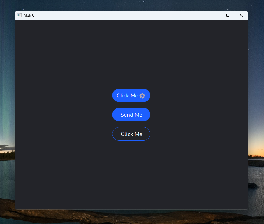
/* How To Use Component*/
ColumnLayout{
spacing: 20
Layout.fillWidth: true
anchors.centerIn: parent
Button{
text: "Click Me"
setIcon: "⚙"
}
Button{
text: "Send Me"
}
Button{
isDefault: false
text: "Click Me"
}
}
## Password Field Component :

/* How To Use Component*/
ColumnLayout{
anchors.centerIn: parent
spacing: 30
TextField{
placeholderText: "Normal Text"
}
PasswordField{
}
PasswordField{
}
}
## Icon Button Component :

/* How To Use Component*/
function generateRandomColor() {
var red = Math.random()
var green = Math.random()
var blue = Math.random()
var alpha = 1.0 // Set the alpha component to 1.0 for full opacity
return Qt.rgba(red, green, blue, alpha)
}
RowLayout{
anchors.centerIn: parent
spacing: 20
IconButton{
setIcon: "qrc:/Images/add.svg"
style: generateRandomColor()
}
IconButton{
setIcon: "qrc:/Images/airdrop.svg"
style: generateRandomColor()
isDefault: false
}
IconButton{
setIcon: "qrc:/Images/archive-add.svg"
style: generateRandomColor()
}
IconButton{
setIcon: "qrc:/Images/moon.svg"
style: generateRandomColor()
}
IconButton{
style: generateRandomColor()
}
IconButton{
setIcon: "qrc:/Images/sun.svg"
style: generateRandomColor()
}
}
## Footer Button Component :

/* How To Use Component*/
RowLayout {
spacing: 20
anchors.centerIn: parent
Item { Layout.fillWidth: true; }
FooterButton {
id: discover_button
textIcon: "\uf015";
checked: true
}
Item { Layout.fillWidth: true; }
FooterButton {
id:category_button
textIcon: "\uf002";
}
Item { Layout.fillWidth: true; }
FooterButton {
id:create_button
textIcon: "\uf055";
}
Item { Layout.fillWidth: true; }
FooterButton {
id:connection_button
textIcon: "\uf004";
}
Item { Layout.fillWidth: true; }
FooterButton {
id: profile_button
textIcon: "\uf406";
}
Item { Layout.fillWidth: true; }
}
## Tab Button and Tab Button Mini Component :

/* How To Use Component*/
ColumnLayout{
spacing: 30
width: parent.width
anchors.centerIn: parent
RowLayout {
width: parent.width
Layout.fillWidth: true
TabButton {
title: "Message"
Layout.fillWidth: true
setIcon: "\uf015"
onClicked: {
}
}
TabButton {
title: "Call"
Layout.fillWidth: true
setIcon: "\uf87c"
onClicked: {
}
}
TabButton {
title: "Whatsapp"
Layout.fillWidth: true
setIcon: "\uf2bb"
onClicked: {
}
}
}
RowLayout {
width: parent.width
Layout.fillWidth: true
TabButtonMini {
title: "Message"
Layout.fillWidth: true
setIcon: "\uf015"
onClicked: {
}
}
TabButtonMini {
title: "Call"
Layout.fillWidth: true
setIcon: "\uf87c"
onClicked: {
}
}
TabButtonMini {
title: "Whatsapp"
Layout.fillWidth: true
setIcon: "\uf2bb"
onClicked: {
}
}
}
}
## Slider Component :

/* How To Use Component*/
ColumnLayout{
spacing: 50
anchors.centerIn: parent
PrefsSlider{
backgroundHeight : 22
backgroundRadius : 12
implicitHeight: 20
implicitWidth: 250
}
PrefsSlider{
backgroundHeight : 5
backgroundRadius : 12
implicitHeight: 20
implicitWidth: 250
}
}