https://github.com/curiosum-dev/react-native-survey-kit
React Native package with survey component.
https://github.com/curiosum-dev/react-native-survey-kit
Last synced: 12 months ago
JSON representation
React Native package with survey component.
- Host: GitHub
- URL: https://github.com/curiosum-dev/react-native-survey-kit
- Owner: curiosum-dev
- License: mit
- Created: 2024-12-03T09:17:57.000Z (over 1 year ago)
- Default Branch: main
- Last Pushed: 2024-12-13T14:23:37.000Z (over 1 year ago)
- Last Synced: 2025-06-08T19:06:58.025Z (about 1 year ago)
- Language: TypeScript
- Size: 2.49 MB
- Stars: 3
- Watchers: 0
- Forks: 0
- Open Issues: 0
-
Metadata Files:
- Readme: README.md
Awesome Lists containing this project
README
# react-native-survey-kit
A highly customizable survey component for React Native.
## Table of Contents
- [Installation](#installation)
- [Usage](#usage)
- [Props](#props)
- [SurveyComponent](#surveycomponent)
- [SurveyProvider](#surveyprovider)
- [Customization](#customization)
- [Styling](#styling)
- [Contributing](#contributing)
- [License](#license)
## Installation
Install the package using npm:
```sh
npm install react-native-survey-kit
```
or yarn:
```sh
yarn add react-native-survey-kit
```
## Usage
Below is an example showing how to use the `SurveyComponent` with comprehensive usage of props and styling for some customization.
```javascript
import { useState } from 'react';
import { View, Button, StyleSheet, Text } from 'react-native';
import {
SurveyProvider,
SurveyComponent,
QuestionTypeKeys,
type SurveyData,
} from 'react-native-survey-kit';
const App = () => {
const [isSurveyVisible, setSurveyVisible] = useState(false);
const [surveyResult, setSurveyResult] = useState | null>(null);
const surveyData: SurveyData = [
{
questionId: 'q1',
questionType: QuestionTypeKeys.Info,
questionText: 'Welcome to the survey!',
questionSettings: {
type: QuestionTypeKeys.Info,
description: 'Some description!',
},
},
{
questionId: 'q2',
questionType: QuestionTypeKeys.TextInput,
questionText: 'What is your name?',
questionSettings: {
type: QuestionTypeKeys.TextInput,
maxLength: 100,
placeholder: 'Enter your name',
},
required: true,
},
{
questionId: 'q3',
questionType: QuestionTypeKeys.SelectionGroup,
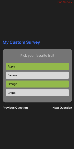
questionText: 'Pick your favorite fruit',
questionSettings: {
type: QuestionTypeKeys.SelectionGroup,
maxMultiSelect: 2,
options: [
{ value: 'apple', optionText: 'Apple' },
{ value: 'banana', optionText: 'Banana' },
{ value: 'orange', optionText: 'Orange' },
{ value: 'grape', optionText: 'Grape' },
],
},
required: true,
},
{
questionId: 'q4',
questionType: QuestionTypeKeys.SelectionGroup,
questionText: 'Select all your hobbies',
questionSettings: {
type: QuestionTypeKeys.SelectionGroup,
maxMultiSelect: 1,
options: [
{ value: 'reading', optionText: 'Reading' },
{ value: 'traveling', optionText: 'Traveling' },
{ value: 'cooking', optionText: 'Cooking' },
{ value: 'sports', optionText: 'Sports' },
],
},
required: false,
},
{
questionId: 'q5',
questionType: QuestionTypeKeys.NumericInput,
questionText: 'Rate your experience with our service (0-10)',
questionSettings: {
type: QuestionTypeKeys.NumericInput,
min: 0,
max: 10,
step: 1,
},
required: true,
},
{
questionId: 'q6',
questionType: QuestionTypeKeys.NumericInput,
questionText: 'How many cups of water do you drink daily?',
questionSettings: {
type: 'numeric',
min: 0,
max: 20,
sliderOnly: true,
},
required: true,
},
{
questionId: 'q7',
questionType: QuestionTypeKeys.SelectionGroup,
questionText: 'Do you agree with our terms?',
questionSettings: {
type: QuestionTypeKeys.SelectionGroup,
options: [
{ value: 'yes', optionText: 'Yes' },
{ value: 'no', optionText: 'No' },
],
},
required: true,
},
{
questionId: 'q8',
questionType: QuestionTypeKeys.SelectionGroup,
questionText: 'Select your hobbies',
questionSettings: {
type: QuestionTypeKeys.SelectionGroup,
maxMultiSelect: 3,
options: [
{ value: 'reading', optionText: 'Reading' },
{ value: 'traveling', optionText: 'Traveling' },
{ value: 'cooking', optionText: 'Cooking' },
],
},
required: true,
},
];
const handleSurveyComplete = (answers: any) => {
setSurveyResult(answers);
setSurveyVisible(false);
};
return (
setSurveyVisible(true)} />
setSurveyVisible(false)}
surveyData={surveyData}
modalAnimationType="fade"
onSurveyComplete={handleSurveyComplete}
textProps={{
surveyTitle: (
My Custom Survey
),
errorText: 'Please answer this question.',
previousButtonText: 'Go Back',
nextButtonText: 'Proceed',
finishButtonText: 'Submit',
}}
buttonProps={{
previousButton: (
Previous Question
),
nextButton: Next Question,
finishButton: Finish Survey,
}}
customStyles={{
container: styles.surveyContainer,
closeButtonProps: {
closeButtonTouchable: styles.closeButton,
closeButtonText: styles.closeButtonText,
},
}}
closeButtonText="End Survey"
/>
{surveyResult && (
Survey Result:
{JSON.stringify(surveyResult, null, 2)}
)}
);
};
const styles = StyleSheet.create({
container: {
flex: 1,
justifyContent: 'center',
padding: 20,
},
surveyTitle: {
fontSize: 24,
fontWeight: 'bold',
color: '#007AFF',
marginBottom: 24,
},
surveyContainer: {
padding: 20,
borderRadius: 8,
},
closeButton: {
position: 'absolute',
top: 40,
right: 10,
},
closeButtonText: {
color: '#ff0000',
},
buttonText: {
fontSize: 16,
fontWeight: 'bold',
color: 'white',
},
});
export default App;
```
## Props
### SurveyComponent
| Prop | Type | Required | Description |
| ---------------------- | ----------------------------------------------------------------- | -------- | ---------------------------------------------------------------------------------------- |
| `isVisible` | `boolean` | Yes | Controls the visibility of the survey modal. |
| `onClose` | `() => void` | Yes | Callback when the survey modal is closed. |
| `surveyData` | `SurveyData` | Yes | Array of questions defining the survey. |
| `onSurveyComplete` | `(answers: Record) => void` | Yes | Callback invoked upon survey completion with the answers. |
| `modalAnimationType` | `'slide' \| 'fade'` | No | The type of animation for modal transition. |
| `textProps` | `object` | No | Customize text elements used in the survey (e.g., title, error messages). |
| `buttonProps` | `object` | No | Provide custom components for navigation buttons (Previous, Next, Finish). |
| `customStyles` | `SurveyComponentStyles` | No | Use this for styling various parts of the survey, such as questions and navigation bars. |
| `closeButtonComponent` | `React.ReactNode` | No | Custom component for the close button. |
| `closeButtonText` | `string` | No | Text for the close button, used if `closeButtonComponent` is undefined. |
### SurveyProvider
The `SurveyProvider` provides context and state management for your survey. Wrap your app or the relevant section in `SurveyProvider`.
## Customization
The component allows extensive customization for various UI elements and interactions:
- **Text and Buttons**: Modify text and button elements with `textProps` and `buttonProps`.
- **Styles**: Fully customize styles using `customStyles`.
## Styling Individual Question Components
The survey components are highly customizable, enabling you to define specific styles for different question types. Below is a list of available style properties you can use for different question types.
### InfoQuestion
You can customize the appearance of informational questions using the following properties:
- `questionText`: Styles the main question text.
- `surveyDescription`: Styles the description text.
**Example:**
```javascript
const styles = {
infoQuestion: {
questionText: {
fontSize: 18,
color: '#333',
fontWeight: 'bold',
},
surveyDescription: {
fontSize: 16,
color: '#666',
fontStyle: 'italic',
},
},
};
```
### TextInputQuestion
Customize text input questions with these properties:
- `container`: Styles the outer container.
- `textInput`: Styles the text input field itself.
**Example:**
```javascript
const styles = {
textInputQuestion: {
container: {
padding: 10,
backgroundColor: '#f8f8f8',
},
textInput: {
borderWidth: 1,
borderColor: '#ccc',
padding: 8,
},
},
};
```
### SelectionGroupQuestion
For questions that involve selecting one or more options, use these styles:
- `flatListContainer`: Styles the flat list's container wrapping all options.
- `flatListContent`: Styles the content within the flat list.
- `optionButton`: Styles the option button itself.
- `selectedOption`: Styles applied to a selected option.
- `optionText`: Styles the text of each option.
**Example:**
```javascript
const styles = {
selectionGroupQuestion: {
flatListContainer: {
marginVertical: 20,
},
optionButton: {
backgroundColor: '#fff',
padding: 10,
borderRadius: 5,
},
selectedOption: {
backgroundColor: '#e6f7ff',
},
optionText: {
color: '#333',
},
},
};
```
### NumericInputQuestion
Numeric questions, which can include sliders, have these customizable styles:
- `container`: Styles the container for numeric input questions.
- `sliderTrack`: Styles the track of the slider.
- `sliderThumb`: Styles the thumb of the slider.
**Example:**
```javascript
const styles = {
numericInputQuestion: {
container: {
padding: 20,
alignItems: 'center',
},
sliderTrack: {
height: 10,
borderRadius: 5,
backgroundColor: '#ddd',
},
sliderThumb: {
width: 20,
height: 20,
backgroundColor: '#007aff',
},
},
};
```
### Customizing with `customStyles`
To apply these styles, pass them into the `customStyles` prop of the `SurveyComponent`. This allows you to maintain a sleek and consistent design across your entire survey.
**Example:**
```javascript
```
## Contributing
We welcome contributions! Feel free to fork the repo, make your changes, and submit a pull request. For major changes, please open an issue first to discuss what you would like to change.
## License
[Curiosum](https://curiosum.com/)
This project is licensed under the MIT License. See the [LICENSE](https://github.com/curiosum-dev/react-native-survey-kit/blob/main/LICENSE) file for details.
---
Created with [create-react-native-library](https://github.com/callstack/react-native-builder-bob)
## Screenshot