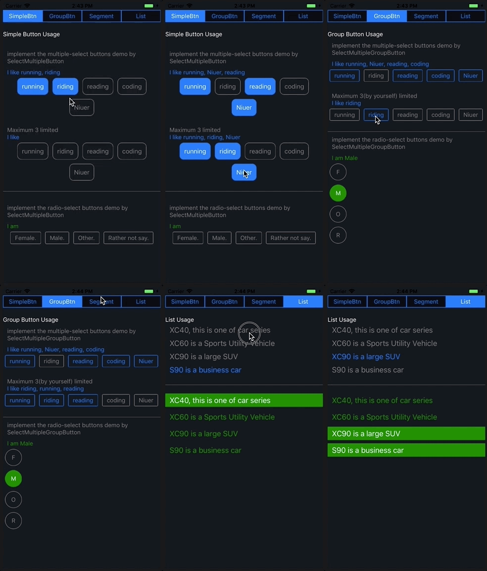
https://github.com/danceyoung/react-native-selectmultiple-button
A button (or a grouped buttons) supporting multiple or radio selection by building with React Native. https://github.com/danceyoung/selectmultiplebuttons for Swift.
https://github.com/danceyoung/react-native-selectmultiple-button
android button ios multiple radio react react-native select tag
Last synced: 9 months ago
JSON representation
A button (or a grouped buttons) supporting multiple or radio selection by building with React Native. https://github.com/danceyoung/selectmultiplebuttons for Swift.
- Host: GitHub
- URL: https://github.com/danceyoung/react-native-selectmultiple-button
- Owner: danceyoung
- License: mit
- Created: 2018-02-08T09:28:45.000Z (about 8 years ago)
- Default Branch: master
- Last Pushed: 2021-03-15T02:38:33.000Z (about 5 years ago)
- Last Synced: 2024-04-26T02:35:34.095Z (about 2 years ago)
- Topics: android, button, ios, multiple, radio, react, react-native, select, tag
- Language: JavaScript
- Homepage:
- Size: 71 MB
- Stars: 82
- Watchers: 4
- Forks: 18
- Open Issues: 4
-
Metadata Files:
- Readme: README.md
- Funding: .github/FUNDING.yml
- License: LICENSE
Awesome Lists containing this project
- awesome-react-native - react-native-selectmultiple-button ★25 - A button (or a grouped buttons) supporting multiple or radio selection (Components / UI)
- awesome-react-native - react-native-selectmultiple-button ★25 - A button (or a grouped buttons) supporting multiple or radio selection (Components / UI)
- awesome-react-native - react-native-selectmultiple-button ★25 - A button (or a grouped buttons) supporting multiple or radio selection (Components / UI)
- fucking-awesome-react-native - react-native-selectmultiple-button ★25 - A button (or a grouped buttons) supporting multiple or radio selection (Components / UI)
- awesome-reactnative-ui - react-native-selectmultiple-button - native-selectmultiple-button/blob/master/screenCapture/ios-screencapture.gif?raw=true)| (Others)
- awesome-react-native - react-native-selectmultiple-button ★25 - A button (or a grouped buttons) supporting multiple or radio selection (Components / UI)
- awesome-reactnative-ui - react-native-selectmultiple-button - native-selectmultiple-button/blob/master/screenCapture/ios-screencapture.gif?raw=true)| (Others)
README
# React Native SelectMultiple Button
This library is a button (or a grouped buttons) supporting multiple or radio selection by building with React Native. https://github.com/danceyoung/selectmultiplebuttons for Swift.
You can specify any **Layout** and **Style** for container view,button view and text through `View Style Props`, `Layout Props` and `Text Style Props` supporting by React Native
## Example running in iOS and Android(captured by GIPHY CAPTURE)

> Note:Runing a Android Virtual Device is TMDing too large memory eated.
## Instruction
- SelectMultipleButton
- SelectMultiple**Group**Button
### SelectMultipleButton
You need to set the props `selected` as `true` to highlight button's selected status and manage the data selected through event props `singleTap(valueTap)` by hard coding yourself.
### SelectMultipleGroupButton
You needn't to set these settings like SelectMultipleButton, because these features are build in the SelectMultipleGroupButton. What you do is set the event props `singleTap(valueTap)` to hold the value tap and the event props `onSelectedValuesChange(selectedValues)` to hold the array of values selected.
## Installation
cd your project root direction
$ npm install react-native-selectmultiple-button --save
## Usage
code example
[App.js](https://github.com/danceyoung/react-native-selectmultiple-button/blob/master/App.js)
code snap
```javascript
import {
SelectMultipleButton,
SelectMultipleGroupButton
} from "react-native-selectmultiple-button";
this._singleTapMultipleSelectedButtons(interest)}
/>;
this._groupButtonOnSelectedValuesChange(selectedValues)
}
group={multipleGroupData}
/>;
```
## Props
### SelectMultipleButton
| props | type | required | desc |
| -------------- | --------------------------- | -------- | ------------------------------------------------------------------------------------------------------------------------------- |
| `selected` | bool | no | Default is false. The `selected` prop determines whether the button is selected and highlighted |
| `value` | one of types(string,number) | yes | Your business key |
| `displayValue` | one of types(string,number) | no | Default is == `value` prop if not set `displayValue` prop. Displayed as button's text |
| `singleTap` | function(valueTap) | no | Handler to be called when the user taps the button. The button's props `value` is passed as an argument to the callback handler |
----------
`highLightStyle`
Normal or highlighted style, the style object `{}` contains the following keys.
- borderColor: PropTypes.string.isRequired---Normal color of button border.
- backgroundColor: PropTypes.string.isRequired---Normal color of button background.
- textColor: PropTypes.string.isRequired---Normal color of text.
- borderTintColor: PropTypes.string.isRequired---Highlighted color of button border.
- backgroundTintColor: PropTypes.string.isRequired---Highlighted color of button background.
- textTintColor: PropTypes.string.isRequired--Highlighted color of text.
Default style is
{
borderColor: 'gray',
backgroundColor: 'transparent',
textColor: 'gray',
borderTintColor: ios_blue,
backgroundTintColor: 'transparent',
textTintColor: ios_blue,
}
----------
`buttonViewStyle`
Style of button view. You can specify any [View Style Props](https://facebook.github.io/react-native/docs/view-style-props.html).
Default style is
```css
{
margin: 5,
borderRadius: 3,
alignItems: 'center',
justifyContent: 'center',
borderWidth: 1
}
```
----------
`textStyle`
Style of text. You can specify any [Text Style Props](https://facebook.github.io/react-native/docs/text.html#style)
Default style is
```css
{
textAlign: 'center',
marginTop: 5,
marginBottom: 5,
marginLeft: 10,
marginRight: 10,
}
```
### SelectMultipleGroupButton
| props | type | required | desc |
| ------------------------ | ----------------------------- | -------- | --------------------------------------------------------------------------------------------------------------------------------- |
| `multiple` | bool | no | Default is true. The `multiple` prop determines the grouped buttons are multiple or radio selected |
| `defaultSelectedIndexes` | array | no | The indexes array in `group` of the grouped buttons to be default selected and highlighted |
| `maximumNumberSelected` | number | no | Specifies maximum number for selecting buttons, and its smallest value is 2. Only enabled for `multiple` prop is set true |
| `group` | array of {value,displayValue} | yes | Just a plain array, `value` and `displayValue` props are akin to `value` and `displayValue` props of `SelectMultipleButton`. |
| `singleTap` | function(valueTap) | no | Handler to be called when the user taps the button. The button's props `value` is passed as an argument to the callback handler. |
| `onSelectedValuesChange` | function(selectedValues) | no | Handler to be called when the user taps the button.the array of selected values is passed as an argument to the callback handler. |
----------
`highLightStyle`
Normal or highlighted style, akin to `highLightStyle` of `SelectMultipleButton`.
----------
`buttonViewStyle`
Style of button view, akin to `buttonViewStyle` of `SelectMultipleButton`.
----------
`textStyle`
Style of text, akin to `textStyle` of `SelectMultipleButton`.
----------
`containerViewStyle`
Style of the grouped buttons container view. You can specify any [View Style Props](https://facebook.github.io/react-native/docs/view-style-props.html) and [Layout Props](https://facebook.github.io/react-native/docs/layout-props.html).
Default View Style and Layout props is
```css
{
flexWrap: 'wrap',
flexDirection: 'row',
justifyContent: 'center'
}
```
## License
react-native-selectmultiple-button is [MIT Licensed](https://github.com/danceyoung/react-native-selectmultiple-button/blob/master/LICENSE).