https://github.com/daniel-ioannou/flutter_adaptive_action_sheet
A action bottom sheet that adapts to the platform (Android/iOS).
https://github.com/daniel-ioannou/flutter_adaptive_action_sheet
action-sheet flutter flutter-package
Last synced: about 1 year ago
JSON representation
A action bottom sheet that adapts to the platform (Android/iOS).
- Host: GitHub
- URL: https://github.com/daniel-ioannou/flutter_adaptive_action_sheet
- Owner: Daniel-Ioannou
- License: mit
- Created: 2020-05-19T06:33:22.000Z (about 6 years ago)
- Default Branch: master
- Last Pushed: 2025-02-21T09:02:37.000Z (over 1 year ago)
- Last Synced: 2025-03-30T19:05:49.768Z (about 1 year ago)
- Topics: action-sheet, flutter, flutter-package
- Language: Dart
- Homepage: https://pub.dev/packages/adaptive_action_sheet
- Size: 540 KB
- Stars: 33
- Watchers: 2
- Forks: 24
- Open Issues: 2
-
Metadata Files:
- Readme: README.md
- Changelog: CHANGELOG.md
- License: LICENSE
Awesome Lists containing this project
README
# Adaptive action sheet
[](https://pub.dev/packages/adaptive_action_sheet)
A action bottom sheet that adapts to the platform (Android/iOS).
| iOS | Android |
| ----------------------------------------------------------------------------------------------------------------------------------------------------------- | --------------------------------------------------------------------------------------------------------------------------------------------------------------- |
| 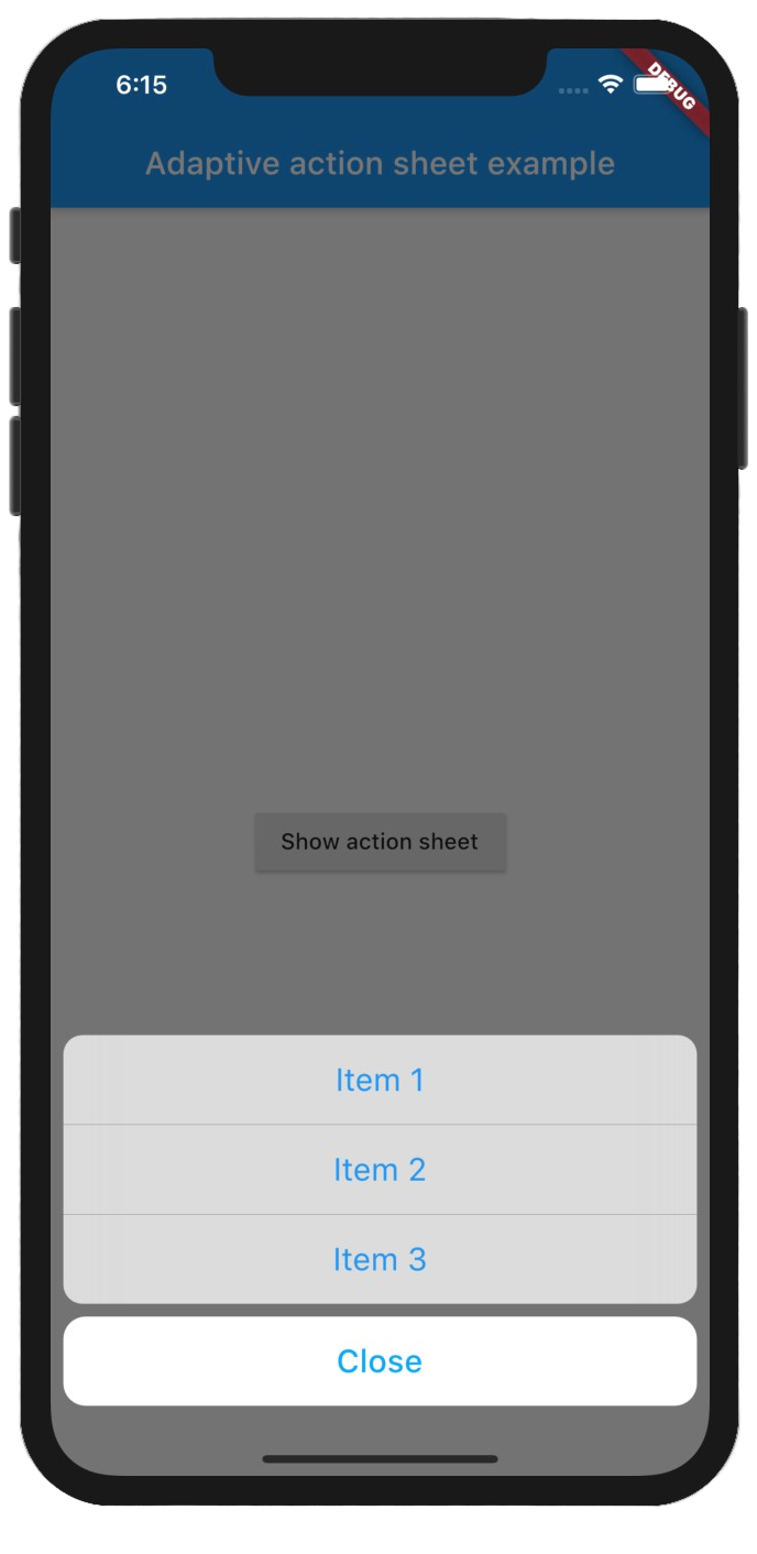 |
| 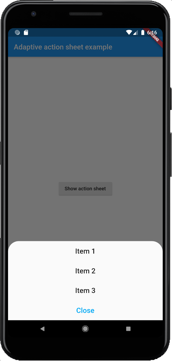 |
|
## Getting Started
Add the package to your pubspec.yaml:
```yaml
adaptive_action_sheet: ^2.0.4
```
In your dart file, import the library:
```Dart
import 'package:adaptive_action_sheet/adaptive_action_sheet.dart';
```
Instead of using a `showModalBottomSheet` use `showAdaptiveActionSheet` Widget:
```Dart
showAdaptiveActionSheet(
context: context,
title: const Text('Title'),
androidBorderRadius: 30,
actions: [
BottomSheetAction(title: const Text('Item 1'), onPressed: (context) {}),
BottomSheetAction(title: const Text('Item 2'), onPressed: (context) {}),
BottomSheetAction(title: const Text('Item 3'), onPressed: (context) {}),
],
cancelAction: CancelAction(title: const Text('Cancel')),// onPressed parameter is optional by default will dismiss the ActionSheet
);
```
### Parameters:
#### showAdaptiveActionSheet:
- `actions`: The Actions list that will appear on the ActionSheet. (required)
- `cancelAction`: The optional cancel button that show under the actions (grouped separately on iOS).
- `title`: The optional title widget that show above the actions.
- `androidBorderRadius`: The android border radius (default: 30).
- `isDismissible`: Specifies whether the bottom sheet will be dismissed when user taps outside of the bottom sheet. It is `true` by default and cannot be `null`.
- `useRootNavigator`: Can be passed to set `useRootNavigator` of `showCupertinoModalPopup` (Default true) and `useRootNavigator` of `showModalBottomSheet` (Default false)
- The optional `backgroundColor` and `barrierColor` can be passed in to customize the appearance and behavior of persistent material bottom sheets(Android only).
#### BottomSheetAction:
- `title`: The primary content of the action sheet item. (required)
- `onPressed`: The callback that is called when the action item is tapped. (required)
- `leading`: A widget to display before the title. Typically an Icon widget. (optional)
- `trailing`: A widget to display after the title. Typically an Icon or a CircleAvatar widget. (optional)
#### CancelAction:
- `title`: The primary content of the cancel action sheet item. (required)
- `onPressed`: The callback that is called when the action item is tapped. `onPressed` is optional by default will dismiss the Action Sheet.