https://github.com/danielstorey/adapt-expose
An Adapt Framework component which displays panels of content hidden behind front covers. Click to expose the content below
https://github.com/danielstorey/adapt-expose
Last synced: 3 months ago
JSON representation
An Adapt Framework component which displays panels of content hidden behind front covers. Click to expose the content below
- Host: GitHub
- URL: https://github.com/danielstorey/adapt-expose
- Owner: danielstorey
- License: gpl-3.0
- Created: 2016-11-29T23:29:04.000Z (about 8 years ago)
- Default Branch: master
- Last Pushed: 2019-04-09T14:49:21.000Z (almost 6 years ago)
- Last Synced: 2024-11-04T14:45:12.086Z (4 months ago)
- Language: CSS
- Homepage:
- Size: 27.3 KB
- Stars: 5
- Watchers: 3
- Forks: 16
- Open Issues: 13
-
Metadata Files:
- Readme: README.md
- License: LICENSE
Awesome Lists containing this project
README
# adapt-expose
**Expose** is a *presentation component* Created by Dan storey.
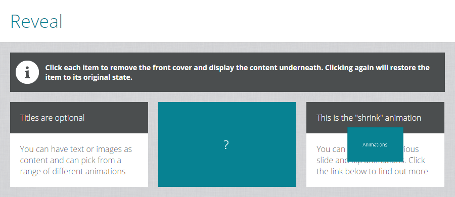
The **Expose** component displays panels of content hidden behind front covers. When clicked the cover animates to expose the content below. A range of different animations are available as listed below. When clicked again the cover is restored.
[**Click here for an interactive demo**](https://danielstorey.github.io/adapt-demo-course/#/id/co-main)
##Installation
Run the following from the command line: `adapt install adapt-expose`
## Settings Overview
The attributes listed below are used in *components.json* to configure **Expose**, and are properly formatted as JSON in [*example.json*](https://github.com/danielstorey/adapt-expose/example.json).
### Attributes
For core model attributes see [**core model attributes**](https://github.com/adaptlearning/adapt_framework/wiki/Core-model-attributes). The attributes listed below are specific to the `Expose` component.
**_component** (string): This value must be: `expose` (one word).
**_columns** (string): The number of expose items on one line. Items display full width on smaller screen sizes.
**_animationType** (string): Possible built-in values are `shrink`, `flipUp`, `flipLeft`, `slideUp`, `slideDown`, `slideLeft`, `slideRight`. You may also assign your own value and use css to create your own animation. Documentation for this coming soon.
**_equalHeights** (boolean): Heights of each item are automatically resized to match the tallest one. Set this value to `false` to override this behaviour.
**_items** (array): Each item represents a panel of content and its cover.
>**front** (string): The text for item's cover (default ?).
>**back** (object): An image to be used for the expose item (optional).
>>**title** (string): The body text for the item (optional).
>>**body** (string): The body text for the item.
>>**graphic** (object): An image to be used for the expose item (optional).
>>>**src** (string): path of the image relative to the src folder.
>>>**alt** (string): This text becomes the image’s `alt` attribute.
## Limitations
No known limitations
----------------------------
**Framework versions:** >=3.0.0
**Author / maintainer:** Dan Storey