https://github.com/danmindru/react-responsive-iframe-viewer
A React component to view iframe content in a responsive, resizable container & easily switch between devices
https://github.com/danmindru/react-responsive-iframe-viewer
device-viewer react viewer
Last synced: 4 months ago
JSON representation
A React component to view iframe content in a responsive, resizable container & easily switch between devices
- Host: GitHub
- URL: https://github.com/danmindru/react-responsive-iframe-viewer
- Owner: danmindru
- License: mit
- Created: 2024-02-05T15:31:50.000Z (over 2 years ago)
- Default Branch: main
- Last Pushed: 2025-04-03T17:03:59.000Z (over 1 year ago)
- Last Synced: 2025-12-08T16:59:50.734Z (7 months ago)
- Topics: device-viewer, react, viewer
- Language: TypeScript
- Homepage: https://react-responsive-iframe-viewer.vercel.app/
- Size: 138 KB
- Stars: 30
- Watchers: 1
- Forks: 3
- Open Issues: 1
-
Metadata Files:
- Readme: README.md
- License: LICENSE
Awesome Lists containing this project
README
# React Responsive Iframe Viewer
[](https://badge.fury.io/js/react-responsive-iframe-viewer)
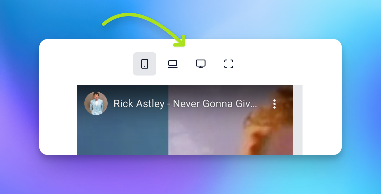
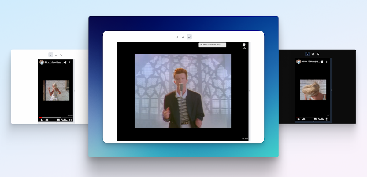
View iframe content in a responsive container that can:
- Switch between common devices sizes
- Mobile
- Tablet
- Desktop
- Resize using the provided handles
- ✨ all animated & pretty
- 🌚 and with dark mode support
[Demo 🚀](https://react-responsive-iframe-viewer.vercel.app/) / [Usage examples 👨💻](https://github.com/danmindru/react-responsive-iframe-viewer/blob/main/src/App.tsx)
## Getting started
### Install
Grab the package from npm:
```sh
npm install react-responsive-iframe-viewer
```
### Setup styles
#### With TailwindCSS
If you use TailwindCSS, you need to mark this package as content:
**tailwind.config.js**
```js
module.exports = {
content: [
+ 'node_modules/react-responsive-iframe-viewer/**/*.{js,ts,jsx,tsx,html}',
...
]
}
```
Dark mode is supported out of the box for TailwindCSS.
#### Without TailwindCSS
If you don't use TailwindCSS, you can import the styles directly:
```tsx
import 'react-responsive-iframe-viewer/dist/style.css'
```
## Usage
```tsx
import { ResponsiveIframeViewer, ViewportSize } from 'react-responsive-iframe-viewer';
```
## Options & Props
`src` - The URL of the iframe content
`title` - The title of the iframe content
`size` - The size of the iframe container
`minWidth` - The minimum width to resize down to (**default: 200**)
`minHeight` - The minimum height to resize down to (**default: 200**)
`showControls` - Whether to show device controls or not (**default: true**)
`enabledControls` - An array of controls to enable (**default: [ViewportSize.mobile, ViewportSize.tablet, ViewportSize.desktop, ViewportSize.fluid]**)
`allowResizingY` - Whether to allow resizing the iframe container vertically (**default: false**)
`allowResizingX` - Whether to allow resizing the iframe container horizontally (**default: false**)
`fluidX` - Forces the width to 100% regardless of other settings (**default: false**)
`fluidY` - Forces the height to 100% regardless of other settings (**default: false**)
`onIframeLoad` - Event handler called when the iframe content has finished loading
### Custom sizes
You can provide a custom width/height for the iframe container:
- `width` - The width of the iframe container
- `height` - The height of the iframe container
The `size` prop will be ignored if `width` and `height` are provided.
```tsx
```
## Custom controls
It is possible to only show a subset of the available viewport toggles by passing in a list of enabled controls:
```tsx
import { ResponsiveIframeViewer, ViewportSize } from "../lib/main";
```
## Supported sizes
```tsx
export const VIEWPORT_SIZES = {
miniMobile: {
width: 320,
height: 480,
},
mobile: {
width: 375,
height: 667,
},
tablet: {
width: 768,
height: 1024,
},
desktop: {
width: 1024,
height: 768,
},
fluid: {
width: "100%",
height: "100%",
},
// Tailwind Viewports
sm: {
width: 640,
height: 1136,
},
md: {
width: 768,
height: 1024,
},
lg: {
width: 1024,
height: 768,
},
xl: {
width: 1280,
height: 720,
},
"2xl": {
width: 1536,
height: 864,
},
"3xl": {
width: 1920,
height: 1080,
},
};
```

-----------------

-----------------
Save 10s of hours of work by using Shipixen to generate a customized codebases with your branding, pages and blog
― then deploy it to Vercel with 1 click.
| | |
| :- | :- |
| 
Shipixen
Create a blog & landing page in minutes with Shipixen.
Try the app on shipixen.com. |  |
|
-----------------
Apihustle is a collection of tools to test, improve and get to know your API inside and out.
[apihustle.com](https://apihustle.com)
| | | | |
| :- | :- | :- | :- |
|  | **Shipixen** | Create a personalized blog & landing page in minutes | [shipixen.com](https://shipixen.com) |
|  | **Page UI** | Landing page UI components for React & Next.js | [pageui.dev](https://pageui.dev) |
|  | **Clobbr** | Load test your API endpoints. | [clobbr.app](https://clobbr.app) |
|  | **Crontap** | Schedule API calls using cron syntax. | [crontap.com](https://crontap.com) |
|  | **CronTool** | Debug multiple cron expressions on a calendar. | [tool.crontap.com](https://tool.crontap.com) |
-----------------