https://github.com/david-fernando/medium-posts-card
React Isomorphic library that show your Medium articles.
https://github.com/david-fernando/medium-posts-card
card carousel carousel-component isomorphic isomorphic-rendering javascript javascript-library library medium react react-components react-library reactjs server-side server-side-rendering ssr
Last synced: 11 months ago
JSON representation
React Isomorphic library that show your Medium articles.
- Host: GitHub
- URL: https://github.com/david-fernando/medium-posts-card
- Owner: david-fernando
- License: mit
- Created: 2022-06-11T21:28:54.000Z (about 4 years ago)
- Default Branch: main
- Last Pushed: 2023-11-11T04:27:02.000Z (over 2 years ago)
- Last Synced: 2025-07-07T01:07:53.739Z (about 1 year ago)
- Topics: card, carousel, carousel-component, isomorphic, isomorphic-rendering, javascript, javascript-library, library, medium, react, react-components, react-library, reactjs, server-side, server-side-rendering, ssr
- Language: TypeScript
- Homepage: https://www.npmjs.com/package/mediumpostscard
- Size: 2.8 MB
- Stars: 14
- Watchers: 3
- Forks: 2
- Open Issues: 2
-
Metadata Files:
- Readme: README.md
- License: LICENSE
Awesome Lists containing this project
README

Medium Posts Card
React Isomorphic library that show your Medium articles.
[]() []() []()
---
## 📝 Table of Contents
- [About](#about)
- [Install](#install)
- [Components](#components)
- [Server Side Rendering](#server_side_rendering)
- [How to contribute](#how_to_contribute)
- [More](#more)
- [Author](#authors)
## About
Are you looking for a React library to display your medium posts that render both the client side and on the server side? So you are in the right place! **Medium Posts Card** get your medium articles, and displays them on your website through an easy to use component.
Just download and use, as simple as that.
## Install
Install this library with one of the commands below
```bash
yarn add mediumpostscard
//or
npm install mediumpostscard
```
## Components
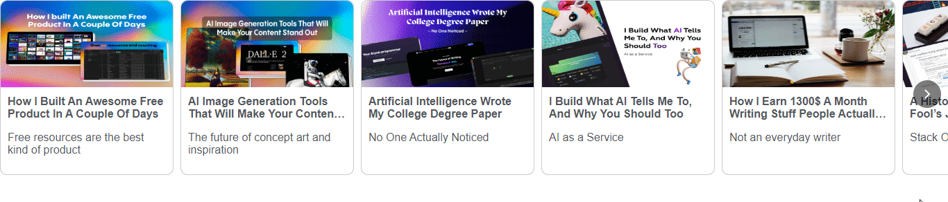
### Carousel
-
Describe
Shows a Carousel with your Medium articles
-
Screenshot
-
Basic usage (with example)
```javascript
import { Carousel } from 'mediumpostscard'
function Example(){
return (
)
}
export default Example
```
-
Valid Props
| Prop name | Description | Type | Default |
| ---------- | :-----------------------------------------------: | -----------: | ------------:|
| usernane | Sets your Medium username | _String_ | _underfined_
| dataMedium | Set data Medium (_only_ to Server Side Rendering) | _Object_ | _underfined_
| options | Object with options | _Object_ | _Object_|
-
Valid Options
| Option | Description | Type | Default |
| -------------| :------------------------------------------------: | -----------: | ------------:|
| borderRadius | Set if the card will have rounded edges | _Boolean_ | true
| openInNewTab | Set if the link of article will openned in new tab | _Boolean_ | true
| showTags | Define if the card will show article tags | _Boolean_ | false
| showDate | Set if the card will show the date of the article | _Boolean_ | false
| ssr | Set if the component should rendered on server | _Boolean_ | false|
### List
-
Describe
Shows a list with your Medium articles
-
Screenshot

-
Basic usage (with example)
```javascript
import { List } from 'mediumpostscard'
function Example(){
return (
)
}
export default Example
```
-
Valid Props
| Prop name | Description | Type | Default |
| ---------- | :-----------------------------------------------: | -----------: | ------------:|
| usernane | Sets your Medium username | _String_ | _underfined_
| dataMedium | Set data Medium (_only_ to Server Side Rendering) | _Object_ | _underfined_
| options | Object with options | _Object_ | _Object_|
-
Valid Options
| Option | Description | Type | Default |
| -------------| :------------------------------------------------: | -----------: | ------------:|
| openInNewTab | Set if the link of article will openned in new tab | _Boolean_ | true
| showTags | Define if the card will show article tags | _Boolean_ | true
| showDate | Set if the card will show the date of the article | _Boolean_ | true
| borderRadius | Set if the card will have rounded edges | _Boolean_ | false
| ssr | Set if the component should rendered on server | _Boolean_ | false|
### Label
-
Describe
Wrapper component that add label on other components
-
Screenshot

-
Example with carousel
```javascript
import { Carousel, Label } from 'mediumpostscard'
function Example(){
return (
)
}
export default Example
```
-
Example with List
```javascript
import { List, Label } from 'mediumpostscard'
function Example(){
return (
)
}
export default Example
```
-
Valid Props
| Prop name | Description | Type | Default |
| ---------- |:----------------------------------:| ----------: | ----------------:|
| text | Set text on label | _String_ | 'Medium Articles'
| children | Set component to be labeled | JSX.Element | No default
## Server Side Rendering
-
Usage
To make the component render the server do the prefetching:
```javascript
const dataMedium = fetchMedium('yourmediumusername')
```
Next define _ssr_ as true, according to the example
```javascript
```
In the example above, I used the Carousel component, but you do the same with the List component.
Next I will show an example of how to make server side on Next.js
```javascript
import Head from 'next/head'
import { List, fetchMedium } from 'mediumpostscard'
export default function Home({dataMedium}) {
return (
Create Next App
)
}
export async function getStaticProps() {
const dataMedium = await fetchMedium('alex.streza')
return {
props: {
dataMedium
}
}
}
```
## How to contribute
Fork this repository, make clone for your machine.
Install the dependencies with the command below:
```bash
yarn install
```
To view on storybook
```bash
yarn storybook
```
To build
```bash
yarn build
```
To run the tests.
```bash
yarn test
```
## More
Didn't you like any of the components? No problem! You can use Medium Posts API to build your own react component.
Moreover you too can contribute with code. Feel free to add new features to our library. We are open-source.
## ✍️ Author
- [@david-fernando](https://github.com/david-fernando) - Idea & Initial work