https://github.com/denchiklut/loadable-image
React Component to lazy load images. With smooth transition between loading states
https://github.com/denchiklut/loadable-image
lazy-image loadable-image react
Last synced: about 1 year ago
JSON representation
React Component to lazy load images. With smooth transition between loading states
- Host: GitHub
- URL: https://github.com/denchiklut/loadable-image
- Owner: denchiklut
- Created: 2022-07-28T08:38:18.000Z (almost 4 years ago)
- Default Branch: main
- Last Pushed: 2025-03-02T18:07:04.000Z (over 1 year ago)
- Last Synced: 2025-03-28T02:44:21.367Z (over 1 year ago)
- Topics: lazy-image, loadable-image, react
- Language: TypeScript
- Homepage: https://denchiklut.github.io/loadable-image
- Size: 38.8 MB
- Stars: 29
- Watchers: 1
- Forks: 1
- Open Issues: 0
-
Metadata Files:
- Readme: README.md
Awesome Lists containing this project
README
## loadable-image
[](https://www.npmjs.com/package/loadable-image)
[](https://denchiklut.github.io/loadable-image)
[](https://www.npmjs.com/package/loadable-image)
[](https://github.com/denchiklut/loadable-image)
 React Component to lazy load images.
[](https://codesandbox.io/s/loadable-image-ci4440?fontsize=14&hidenavigation=1&theme=dark)
## Installation
```
npm i loadable-image
```
Or via yarn
```
yarn add loadable-image
```
## Usage examples
`` accepts all props of `![]() ` tag.
` tag.
```tsx
import { AsyncImage } from 'loadable-image'
...
```
### Custom `Loader`/`Error`
You can pass your own `loader` and `error` components as props to `AsyncImage` component.
```tsx
import { AsyncImage } from 'loadable-image'
...
}
error={
}
/>
```
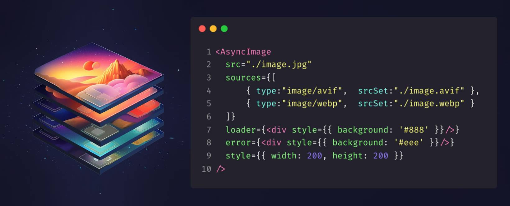
### Modern formats (WebP, Avif) with fallback
Since under the hood `` is just a `picture` element. You can pass an array of different `Sources` as a prop. And browser will pick the first one that it supports.
```tsx
import { AsyncImage } from 'loadable-image'
...
```
### Responsive image
To make image responsive you can use `aspectRatio` property in `style` prop. This way you can specify only `width` or `height` as `100%` and the other one as `auto`.
Note that if you support older browsers you might need to use `aspectRatio` [padding-hack](https://nikitahl.com/css-aspect-ratio).
```tsx
import { AsyncImage } from 'loadable-image'
...
```
## Custom Transitions
Under the hood `AsyncImage` uses [transitions-kit](https://github.com/denchiklut/transitions-kit) library
it's a collection Transition components built on top of [react-transition-group](https://github.com/reactjs/react-transition-group) its a small library maintained by **React** team for animating between different views.
You can pass your own `Transition` as a prop to `AsyncImage` component.
### Blur transition
Here’s how you can implement a `Blur` transition that replaces a `low-resolution image` with a `high-resolution` one
```tsx
import { Blur } from 'transitions-kit'
import { AsyncImage } from 'loadable-image'
...
}
loader={ }
}
/>
```
### Fade transition
By default `AsyncImage` uses `Fade` transition.
```tsx
import { Fade } from 'transitions-kit'
import { AsyncImage } from 'loadable-image'
...
}
Transition={Fade}
/>
```
### Other transitions
There are plenty different already predefined Transition components such as `Grow`, `Zoom`, `Slide`, `Blur`, `Fade` etc. in [transitions-kit](https://github.com/denchiklut/transitions-kit).
Feel free to try any of them.
```tsx
import { Grow } from 'transitions-kit'
import { AsyncImage } from 'loadable-image'
...
}
Transition={Grow}
/>
```
### Props
`` accepts all standard props for `HtmlImageElement` and the following:
| Property | Type | Description |
|------------|------------------------------------|-----------------------------------------------------------------------------------------------------------------------------------------|
| className | `String` | NOTE: CSS from `style` object has a higher priority |
| style | `CSSProperties` | CSSStyleDeclaration object |
| rootMargin | `string` by default: `'600px 0px'` | Margin around the root. Specifies when to trigger an image download. |
| loader | `ReactElement` | React element to display a `loading` state. |
| error | `ReactElement` | React element to display an `error` state. |
| sources | `Array` | An array of `options` for `` element. |
| timeout | `Number` or `Object` | The duration for the transition, in milliseconds. You may specify a single timeout for all transitions, or individually with an object. |
| Transition | `ComponentType` | Custom Transition component. Check out [transitions-kit](https://github.com/denchiklut/transitions-kit)'s predefined components |
### Requirements for loader & error props:
- Forward the ref: The transition components require the first child element to forward its ref to the DOM node. This is usually done with React.forwardRef.
- Single element: The transition components require only one child element (React.Fragment is not allowed).