https://github.com/deoostfrees/gibki
An open source grid system based on Flexbox using container queries.
https://github.com/deoostfrees/gibki
css dependency-free flexbox grid-system sass
Last synced: 3 months ago
JSON representation
An open source grid system based on Flexbox using container queries.
- Host: GitHub
- URL: https://github.com/deoostfrees/gibki
- Owner: deoostfrees
- License: mit
- Created: 2021-09-19T11:57:49.000Z (almost 5 years ago)
- Default Branch: main
- Last Pushed: 2025-03-28T19:18:18.000Z (over 1 year ago)
- Last Synced: 2025-04-03T17:01:31.058Z (over 1 year ago)
- Topics: css, dependency-free, flexbox, grid-system, sass
- Language: HTML
- Homepage: https://codepen.io/deoostfrees/pen/GREYYJa
- Size: 299 KB
- Stars: 2
- Watchers: 1
- Forks: 0
- Open Issues: 0
-
Metadata Files:
- Readme: README.md
- Changelog: CHANGELOG.md
- Funding: .github/FUNDING.yml
- License: LICENSE.md
Awesome Lists containing this project
README
# Gibki
An open source grid system based on Flexbox. [Open in CodePen](https://codepen.io/collection/pgogaZ).
## Table of Contents
- [Installation](#installation)
- [Download](#download)
- [Package Managers](#package-managers)
- [Usage](#usage)
- [General](#general)
- [Nesting](#nesting)
- [Responsive Layouts](#responsive-layouts)
- [Wrapping](#wrapping)
- [Gutters](#gutters)
- [Directions](#directions)
- [Horizontal Alignment](#horizontal-alignment)
- [Vertical Alignment](#vertical-alignment)
- [Reordering](#reordering)
- [Variables](#variables)
- [CSS Custom Properties](#css-custom-properties)
- [Sass Variables](#sass-variables)
- [Browser Support](#browser-support)
## Installation
### Download
CSS: `css/flex.min.css` (minified) or `css/flex.css` (un-minified)
### Package Managers
You can also install Gibki using npm or yarn:
```shell
npm install gibki
```
or
```shell
yarn add gibki
```
Be sure to include the corresponding SCSS or CSS file.
## Usage
### General
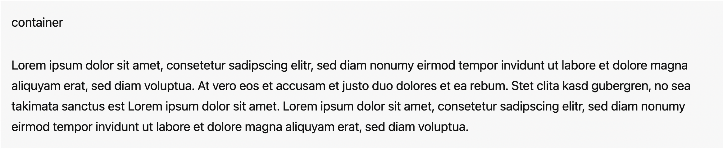
#### .container
Containers are not required for the grid, but provide a way to center content. The width can be customize using [CSS custom properties](#css-custom-properties).
```html
```
If needed, you can also use `.container--small` for a smaller width:

```html
```
or `.container--full` for a full width container:
```html
```
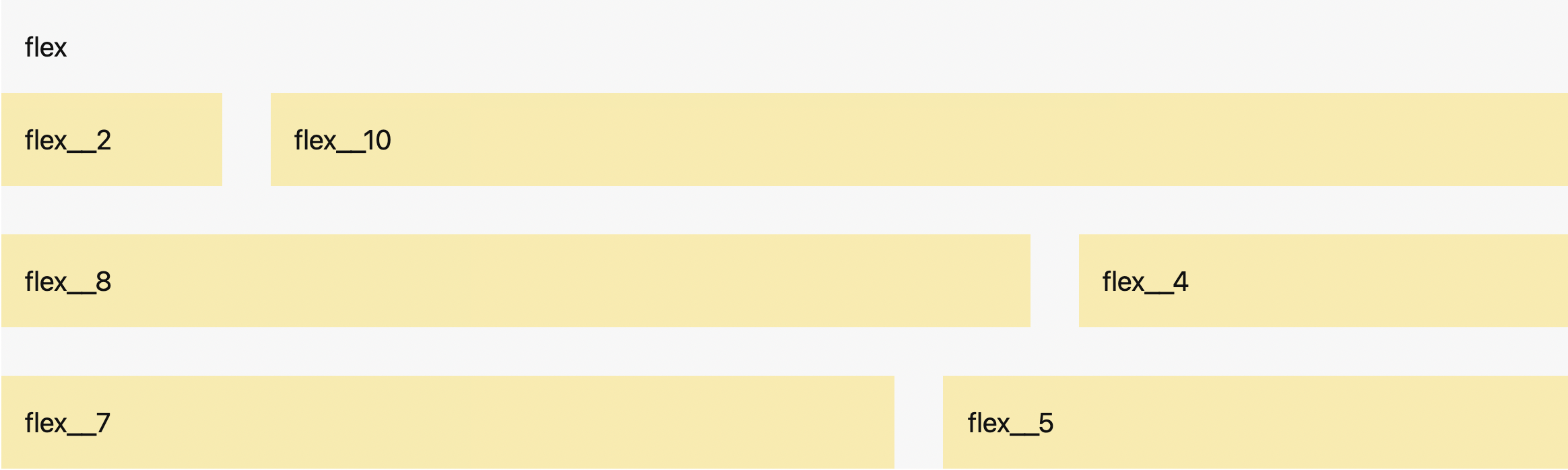
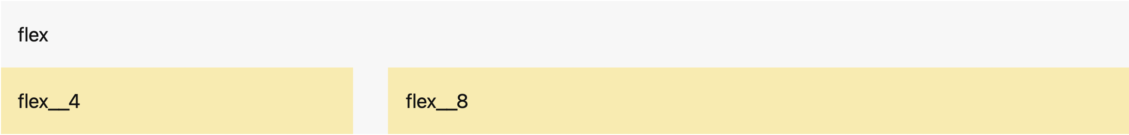
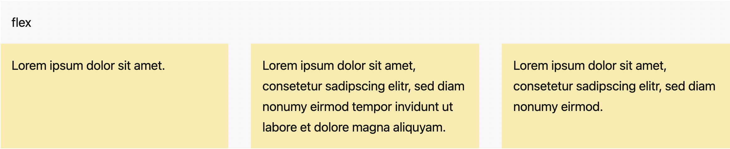
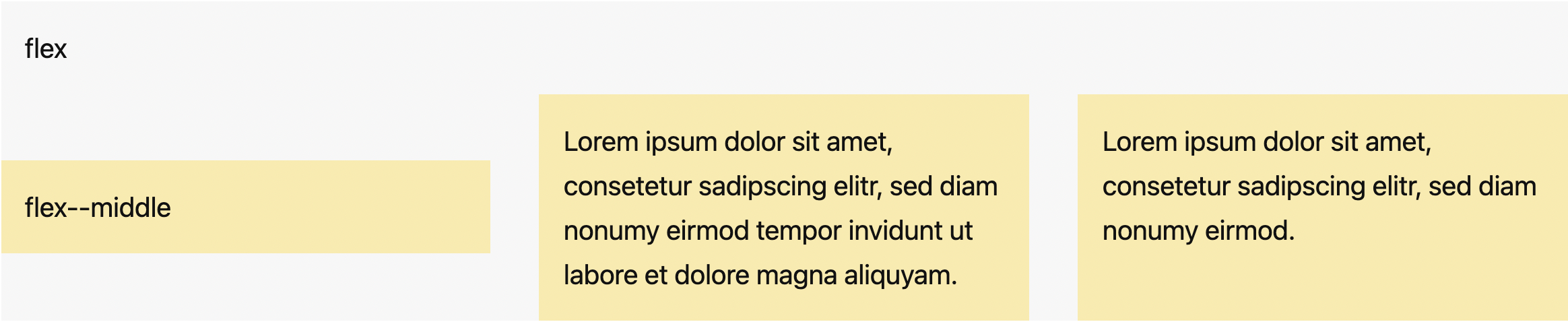
#### .flex
`.flex` is the wrapper for columns.
```html
```
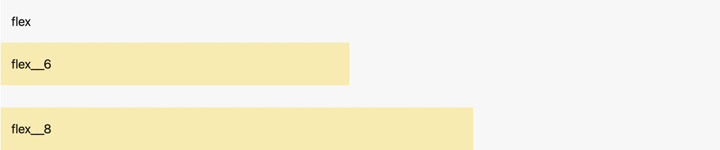
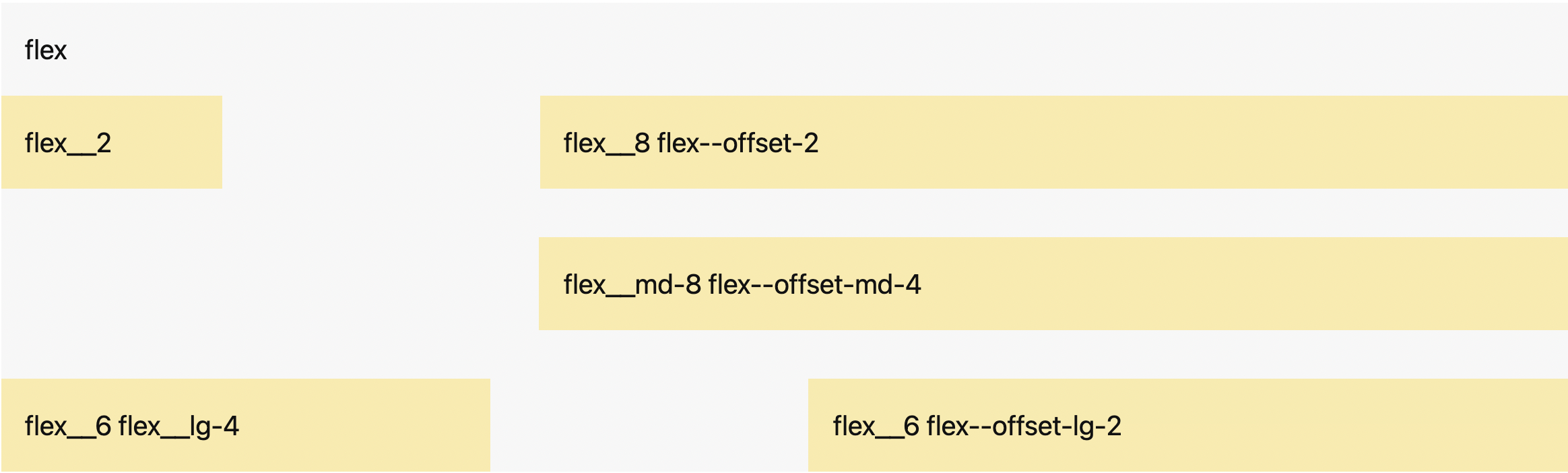
#### .flex__
`.flex__` classes create different column sizes.
```html
```
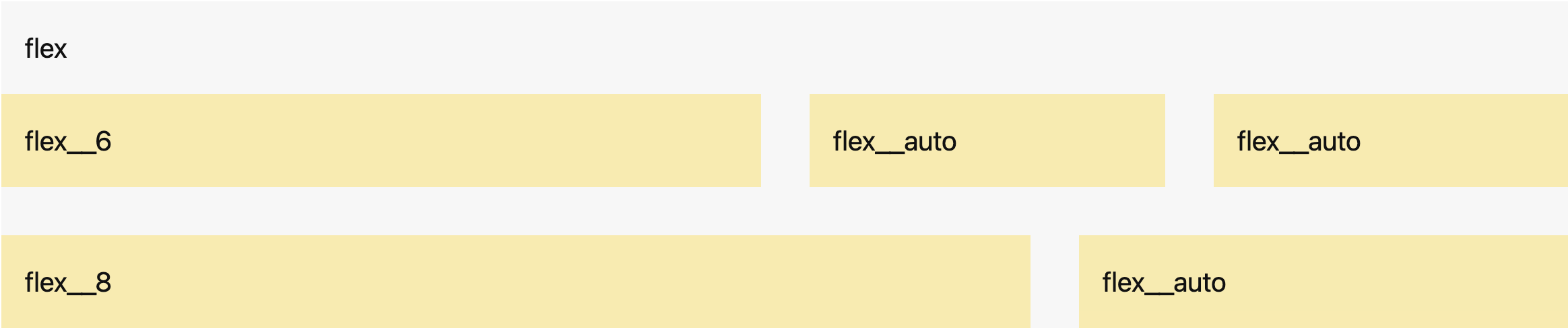
#### .flex__auto
`.flex__auto` creates columns that take up the remaining space.
```html
```
### Nesting
To nest content with the default grid, add a new `.flex` container and a set of `.flex__` columns within an existing `.flex__` column.

```html
```
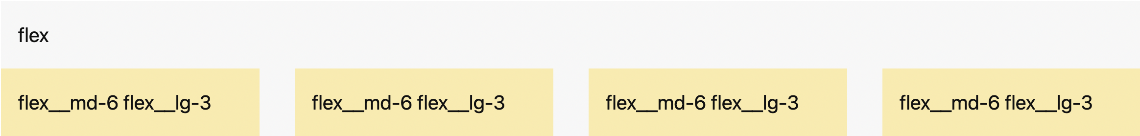
### Responsive Layouts
The grid system allows you to create responsive layouts by defining different column widths for each viewport. There are four breakpoints that determine the viewports:
- >= 500px: Small `sm`
- >= 700px: Medium `md`
- >= 1000px: Large `lg`
- >= 1200px: Extra large `xl`
These container breakpoints can be customized using [Sass variables](#sass-variables).
```html
```
### Wrapping
By default, columns will wrap if necessary.
```html
```
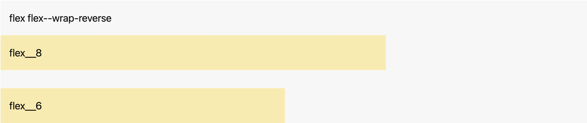
#### .flex--wrap-reverse
The columns will wrap if necessary but in reverse order.
```html
```
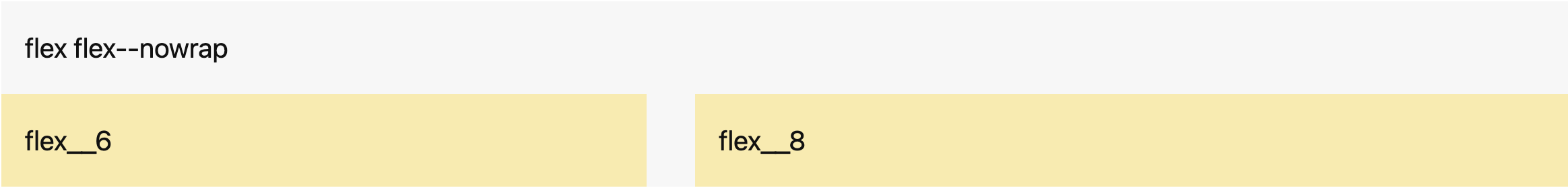
#### .flex--nowrap
The columns will not wrap.
```html
```
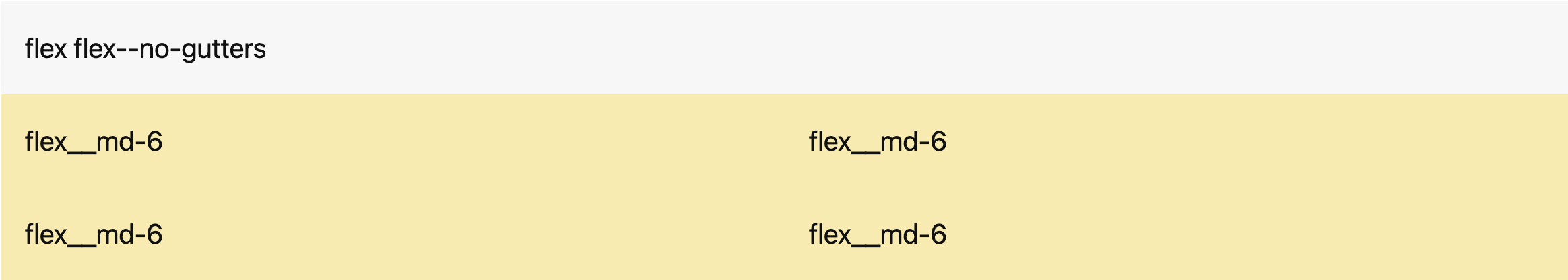
### Gutters
The columns and rows have horizontal and vertical spacing. These can be customized using [CSS custom properties](#css-custom-properties).
You can remove the spacing with `.flex--no-gutters`.
```html
```
You can also only remove the horizontal gutters with `.flex--no-horizontal-gutters`.
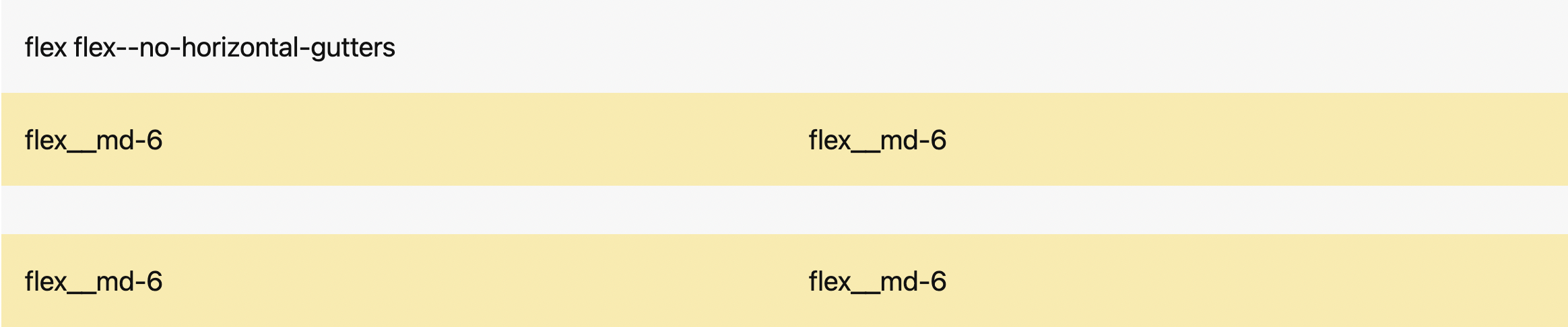
```html
```
Or you can remove only the vertical gutters with `.flex--no-vertical-gutters`.
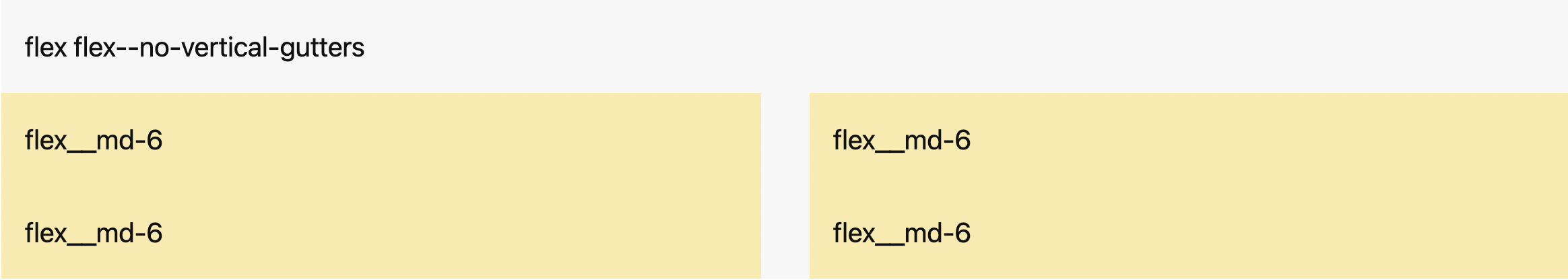
```html
```
### Directions
The following classes define the direction in which the columns are placed within the wrapper. By default, columns are set from left to right in `ltr` (left-to-right languages) and from right to left in `rtl` (right-to-left languages).
```html
```
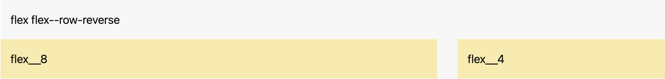
#### .flex--row-reverse
The columns are placed from right to left in `ltr` and left to right in `rtl`.
```html
```
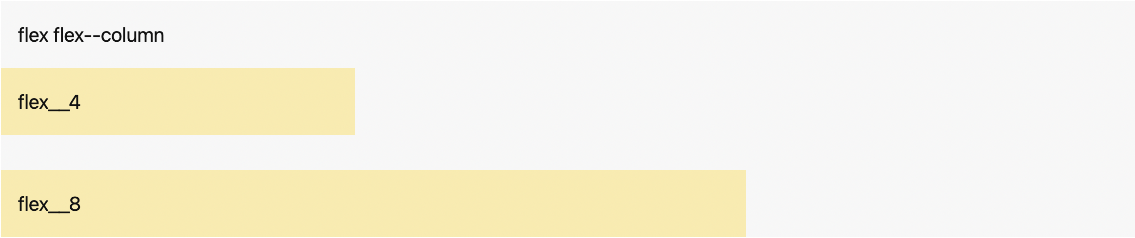
#### .flex--column
`.flex--column` behaves the same way as `.flex--row` but the columns are stacked from top to bottom.
```html
```
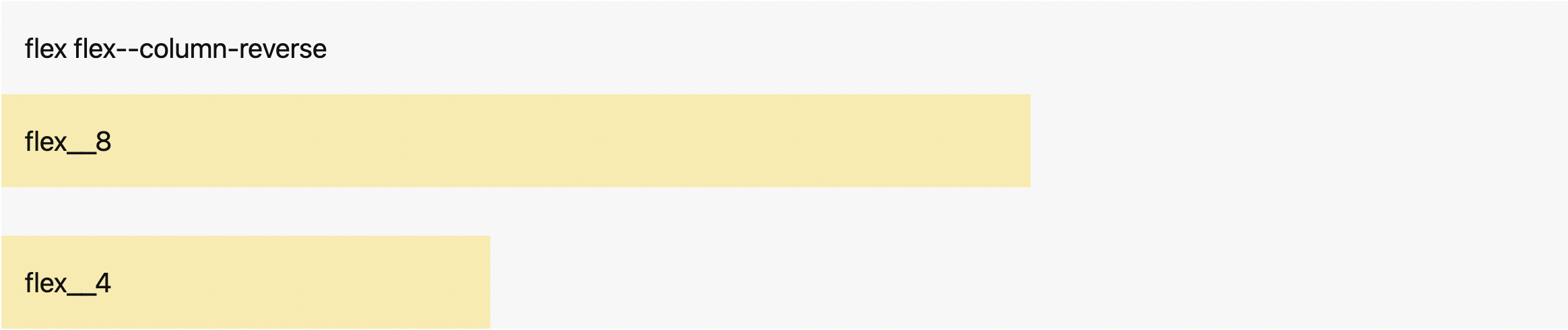
#### .flex--column-reverse
`.flex--column-reverse` behaves the same way as `.flex--row-reverse` but the columns are stacked from bottom to top.
```html
```
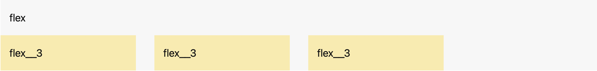
### Horizontal Alignment
The following classes define how columns are aligned along the main axis. They help distribute extra space between the items when they don't reach their maximum size. By default, columns are positioned at the beginning of the container.
```html
```
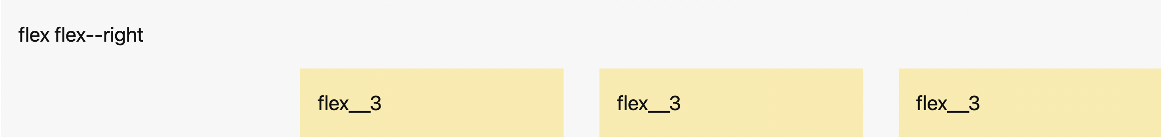
#### .flex--right
The columns are positioned at the end of the container.
```html
```
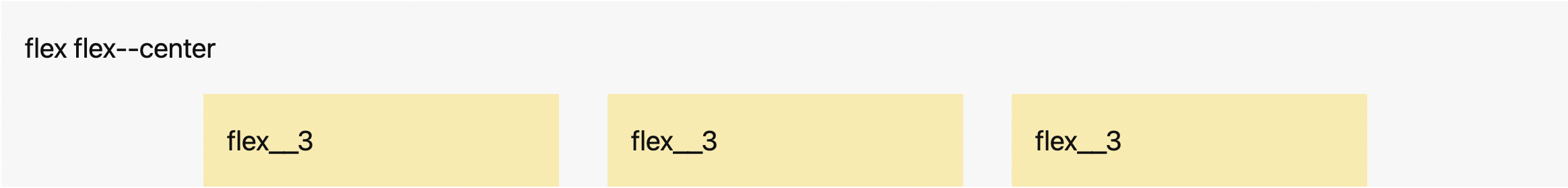
#### .flex--center
The columns are positioned at the center of the container.
```html
```
#### .flex--space-between
The columns are evenly spread horizontally; the first column is at the beginning of the container, and the last column is at the end of the container. Space is distributed between the columns.

```html
```
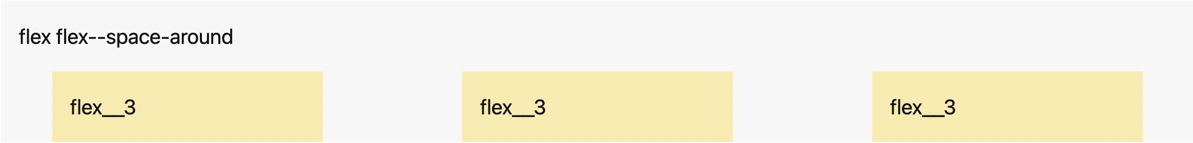
#### .flex--space-around
The columns are positioned with equal space before, between, and after them.
```html
```
### Vertical Alignment
The following classes define how columns are aligned along the cross axis when they don't reach their maximum size.
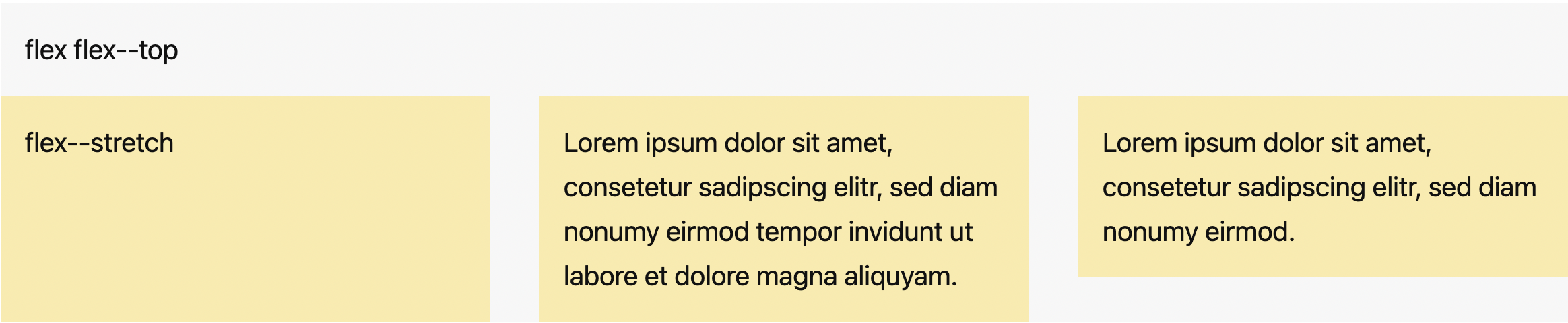
#### .flex--stretch
This is the default value. You don't need to add the class to the wrapper; it stretches the height of the columns to fill the container while respecting `min-width` and `max-width`.
```html
```
You can apply `.flex--stretch` to individual columns if necessary.
```html
```
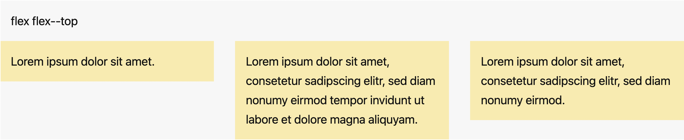
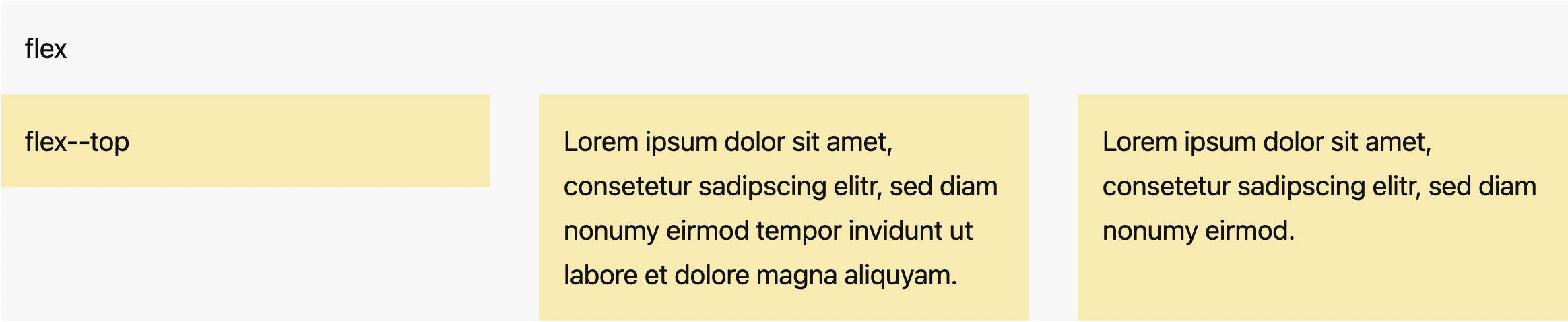
#### .flex--top
The columns are positioned at the top of the container.
```html
```
You can also apply `.flex--top` to individual columns.
```html
```
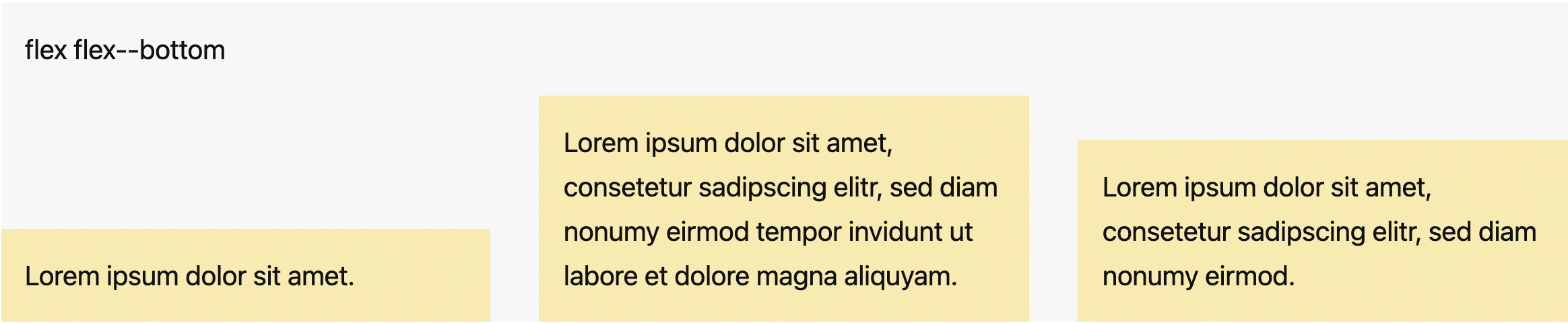
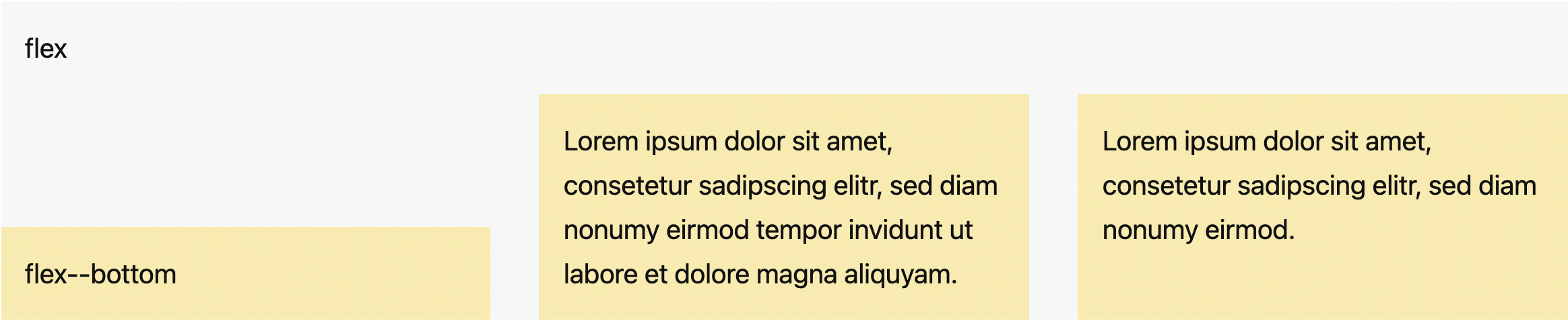
#### .flex--bottom
The columns are positioned at the bottom of the container.
```html
```
You can also apply `.flex--bottom` to individual columns.
```html
```
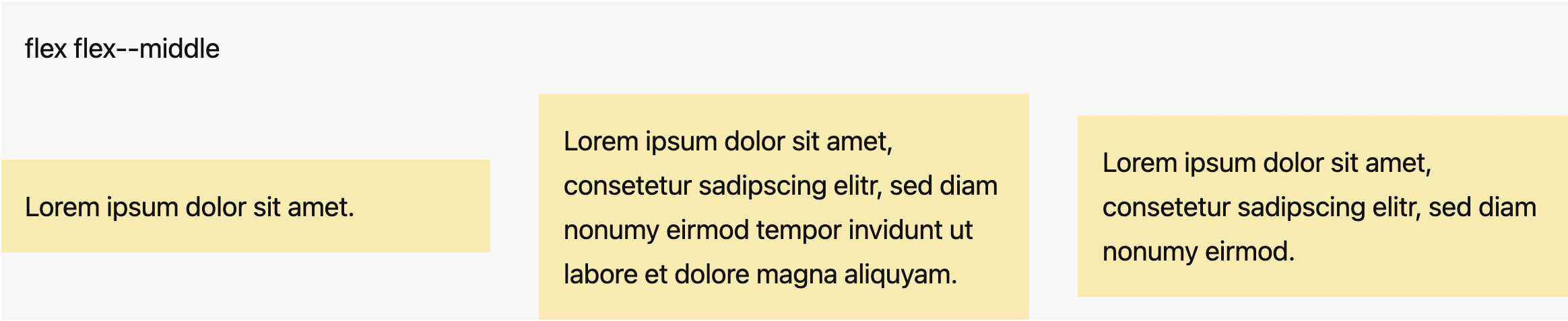
#### .flex--middle
The columns are positioned at the vertical center of the container.
```html
```
You can also apply `.flex--middle` to individual columns.
```html
```
### Reordering
Use `.flex--order-` classes to control the visual order of your content.

```html
```
#### Offsetting Columns
Offset a column by adding `.flex--offset-` classes.
```html
```
## Variables
### CSS Custom Properties
```css
/* Container max width */
/* Based on 16px */
--gibki-container-max-width: 75rem; /* 1200px */
--gibki-small-container-max-width: 38.25rem; /* 612px */
/* Container padding */
/* Based on 16px */
--gibki-container-padding: 1.5rem; /* 24px */
/* Gutter width */
/* Based on 16px */
--gibki-gutter-vertical: 1.5rem; /* 24px */
--gibki-gutter-horizontal: 1.5rem; /* 24px */
```
### Sass Variables
```scss
$use-container-queries: false !default;
// Breakpoints map
// Container queries are based on the container's width (rem).
// Media queries are based on the viewport width (em).
// Based on 16px
$gibki-breakpoints: (
'sm': 31.25em, // 31.25rem (500px) if $use-container-queries is true
'md': 43.75em, // 43.75rem (700px) if $use-container-queries is true
'lg': 62.5em, // 62.5rem (1000px) if $use-container-queries is true
'xl': 75em // 75rem (1200px) if $use-container-queries is true
) !default;
// Available columns
$gibki-columns: 12 !default;
```
To use the Sass variables, configure them via `@use ... with ()` when importing `gibki.scss`:
```scss
@use 'gibki' with (
$use-container-queries: true,
$gibki-columns: 6,
$gibki-breakpoints: ('sm': 20em, 'md': 40em)
);
```
## Browser Support
Gibki supports the following browsers (all the latest versions):
- Chrome
- Firefox
- Safari
- Edge