https://github.com/developer-mike/obsidian-advanced-canvas
⚡ Supercharge your canvas experience! Graph view integration and unlimited styling options empower flowcharts, dynamic presentations, and interconnected knowledge.
https://github.com/developer-mike/obsidian-advanced-canvas
obsidian obsidian-canvas obsidian-md obsidian-plugin obsidian-plugins
Last synced: about 2 months ago
JSON representation
⚡ Supercharge your canvas experience! Graph view integration and unlimited styling options empower flowcharts, dynamic presentations, and interconnected knowledge.
- Host: GitHub
- URL: https://github.com/developer-mike/obsidian-advanced-canvas
- Owner: Developer-Mike
- License: gpl-3.0
- Created: 2024-01-27T17:03:55.000Z (over 2 years ago)
- Default Branch: main
- Last Pushed: 2025-04-01T08:28:55.000Z (about 1 year ago)
- Last Synced: 2025-04-07T21:07:43.300Z (about 1 year ago)
- Topics: obsidian, obsidian-canvas, obsidian-md, obsidian-plugin, obsidian-plugins
- Language: TypeScript
- Homepage:
- Size: 129 MB
- Stars: 683
- Watchers: 2
- Forks: 23
- Open Issues: 15
-
Metadata Files:
- Readme: README.md
- Funding: .github/FUNDING.yml
- License: LICENSE
Awesome Lists containing this project
README

Advanced Canvas for Obsidian.md


⚡ Supercharge your canvas experience! Create presentations, flowcharts and more!
## Feature Overview
This plugin enhances the Obsidian canvas with a wide array of features:
* **Core Enhancements:**
* [Standardized Format](#standardized-format): Compatible with the JSON Canvas format, introducing the Advanced JSON Canvas format for enhanced features.
* [Full Metadata Cache Support](#full-metadata-cache-support): Integrate canvases with Obsidian's graph view, outgoing links, and backlinks.
* [Frontmatter Support](#frontmatter-support): Add custom properties to canvas files.
* [Auto File Node Edges](#auto-file-node-edges): Automatically create edges between file nodes based on their frontmatter properties.
* [Single Node Links & Embeds](#single-node-links--embeds): Link or embed a single node from a canvas into markdown files.
* [Better Default Settings](#better-default-settings): Customize default node sizes, grid alignment, and more.
* [Enhanced Readonly Mode](#better-readonly): Finer control over canvas interaction in readonly mode.
* [Improved Image Export](#image-export): Export to PNG/SVG with transparency and other options.
* **Node Customization:**
* [Node Styles](#node-styles): Includes various [Flowchart Shapes](#node-shapes), [Border Styles](#border-styles), and Text Alignment.
* [Auto Node Resizing](#auto-node-resizing): Nodes adapt to their content size automatically.
* [Variable Breakpoints](#variable-breakpoints): Control content rendering based on zoom level.
* [Z-Ordering Control](#z-ordering-control): Manage node stacking order.
* [Custom Colors](#custom-colors): Add your own colors to the picker.
* **Edge Customization:**
* [Edge Styles](#edge-styles): Includes [Path Styles](#path-styles) (dotted, dashed), [Arrow Styles](#arrow-styles), and [Pathfinding Methods](#pathfinding-methods).
* [Floating Edges](#floating-edges-automatic-edge-side): Edges automatically adjust their connection side.
* [Flip Edge](#flip-edge): Quickly reverse edge direction.
* **Interaction & Workflow:**
* [Canvas Commands](#canvas-commands): A suite of commands for efficient canvas manipulation.
* [Native-Like File Search](#native-like-file-search): Search for text within the whole canvas using a native-like interface.
* [Presentation Mode](#presentation-mode): Create and navigate slide-like presentations.
* [Portals](#portals): Embed other canvases within your current canvas.
* [Collapsible Groups](#collapsible-groups): Organize your canvas with expandable/collapsible groups.
* [Edge Highlight](#edge-highlight): Highlight edges when a connected node is selected.
* [Edge Selection](#edge-selection): Select edges connected to the selected node(s).
* [Focus Mode](#focus-mode): Highlight a single node by blurring others.
* [Encapsulate Selection](#encapsulate-selection): Move selected nodes to a new canvas, linking back to it.
* Create groups independently of the nodes.
* **Styling & Extensibility:**
* [Custom Styles](#custom-styles): Add unique CSS-based styles to nodes and edges.
* [Canvas Events](#canvas-events): Expose canvas events for use in other plugins.
All features can be enabled/disabled in the settings.
## Installation
Open the Community Plugins tab in the settings and search for "Advanced Canvas" (or click [here](https://obsidian.md/plugins?id=advanced-canvas)).
Other installation methods
* Install it using [BRAT](https://github.com/TfTHacker/obsidian42-brat)
* Manual folder creation
1. Create a folder named `advanced-canvas` in your vault's plugins folder (`/.obsidian/plugins/`).
2. Download `main.js`, `styles.css` and `manifest.json` from the latest release and put them in the `advanced-canvas` folder.
3. Enable the plugin in Settings -> Community plugins -> Installed plugins
## Support
Please consider supporting the plugin. There are many hours of work and effort behind it. The two easiest ways to support the plugin are either by starring ⭐ the repository or by donating any amount on [Ko-fi](https://ko-fi.com/X8X27IA08) ❤️. Thank you!

## Terminology
- **Canvas**: The canvas view is the view in which nodes and edges are displayed.
- **Node**: A node is a single element in a canvas that can contain text, files, or links. (Some people also call it *card* or *element* - but please always use **node**.)
- **Text Node**: A text node is a node that contains text.
- **File Node**: A file node is a node that contains a link to another file.
- **Group Node**: A group node is a node that contains other nodes.
- **Link Node**: A link node is a node that displays a website.
- **Edge**: An edge is a connection between two nodes in a canvas. It can be used to represent relationships or connections between different elements. (Please always use **edge** instead of *arrow* to avoid confusion with the edge arrow.)
- **Edge Path**: The edge path is just the line that connects two nodes in a canvas.
- **Edge Arrow**: The edge arrow is the arrow at the end (or start) of an edge that indicates the direction of the connection.
- **Popup Menu**: The popup menu is the horizontal menu that is visible if one or more canvas elements (nodes or edges) are selected.
- **Context Menu**: The context menu is menu that is visible if you right-click in a canvas view.
- **Control Menu**: The control menu is the vertical menu that is visible in the top right corner of a canvas view.
- **Card Menu**: The card menu is the horizontal menu at the bottom of the canvas view where you can find options to create new nodes.
## Standardized Format
Compatible with the [JSON Canvas](https://github.com/obsidianmd/jsoncanvas) format, the [Advanced JSON Canvas](https://github.com/Developer-Mike/obsidian-advanced-canvas/blob/main/assets/formats/advanced-json-canvas/README.md) format takes it a step further by adding more features and flexibility. The Advanced JSON Canvas format was introduced to provide longevity, readability, interoperability, and extensibility for canvases created with Advanced Canvas.
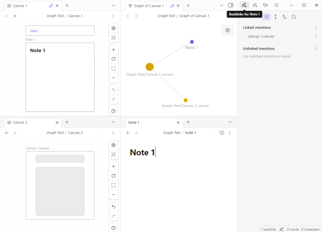
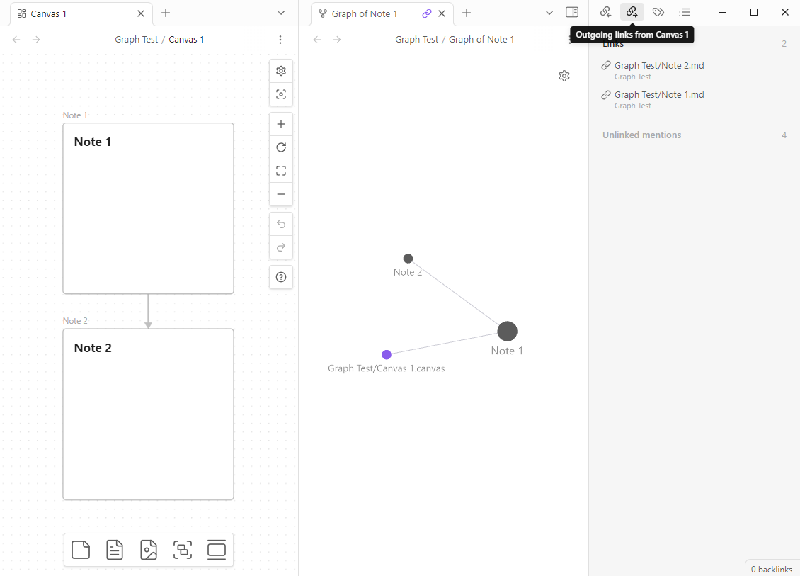
## Full Metadata Cache Support
Advanced Canvas enables `.canvas` files to be indexed by the metadata cache. This means that there is now full compatibility with the graph view, outgoing links and backlinks. You can even enable (optional) the creation of an outgoing link if two embeds in a canvas are connected by an edge. This feature brings the full power of Obsidian's linking system to the canvas file format.
Metadata Cache Support Example
Outgoing Link Using An Edge Example
Technical Details
* The file cache of a `.canvas` file now contains a value for the `hash` key (Generated from the filepath) instead of an empty string.
* Check the `app.metadataCache.fileCache[]` object to see the changes.
* The metadata cache is located in the `app.metadataCache` object - the same object that is used by Obsidian for markdown files.
* e.g. `app.metadataCache.getCache`/`app.metadataCache.getFileCache` now works with `.canvas` files.
* The `position` object which is found inside metadata cache entries now contains a new key `nodeId` for `.canvas` files.
* The metadata cache entry for a `.canvas` file now contains a new key `nodes` which is an object of type `{ [nodeId: string]: MetadataCacheEntry }` - this allows for other plugins to access the full metadata cache for single nodes. The `MetadataCacheEntry` object is the same as for markdown files (even created with the same function - 1:1 compatibility).
* The resolved links object now has entries for `.canvas` files.
* The `app.metadataCache.resolvedLinks` object values for `.canvas` files are implemented in the exact same way as for markdown files.
### Frontmatter Support
Additionally, Advanced Canvas introduces full frontmatter support for `.canvas` files. You can now view and edit the frontmatter directly within the canvas view:
* **Accessing Frontmatter:** Click the "info" icon located in the top right corner of the canvas view.
* **Functionality:** This allows you to add custom properties (metadata) to your canvas files.
* **Use Cases:**
* **Categorization & Tagging:** Add `tags` or custom keys for organization.
* **Aliases:** Use `aliases` to create alternative names for your canvas files.
* **Styling:** Use `cssclasses` to apply custom CSS styles to the entire canvas view.
* **Custom Metadata:** Define any other properties relevant to your workflow.
* **Searchability:** Properties defined in the frontmatter of your `.canvas` files are searchable using Obsidian's global search pane, further integrating canvases into your knowledge management system.
This significantly enhances the ability to manage, organize, and customize your canvases alongside your other notes in Obsidian.
## Auto File Node Edges
Advanced Canvas can automatically create edges between file nodes based on their frontmatter properties. By default (if enabled), it will create edges to files linked in the `canvas-edges` frontmatter property. This allows you to create fixed relationships between file nodes in your canvas, making it easier to visualize fixed structures or connections between different files.
### Single Node Links & Embeds
Advanced Canvas now allows you to link or embed the content of a *single node* from a `.canvas` file directly into your markdown files. This provides a granular way to reference specific pieces of information within your canvases.
* **Syntax:**
* **Linking:** Use the standard wikilink format with the node ID appended after a `#`:
`[[canvas-file-name#node-id]]`
* **Embedding:** Use the standard embed wikilink format, also with the node ID:
`![[canvas-file-name#node-id]]`
* **Functionality:** When you link or embed a node this way, the actual content of that specific node from the canvas will be displayed or linked within your markdown file. This is incredibly useful for creating direct references to diagrams, text snippets, or any other content held within individual canvas nodes.
## Better Default Settings
* Enforce all new nodes to be aligned to the grid
* Customize default text node size
* Customize default file node size
* Modify the minimum node size
* Disable the font scaling relative to the zoom level
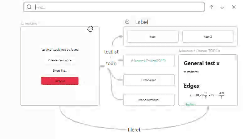
## Native-Like File Search
Quickly locate text within your canvas using a familiar search experience. Advanced Canvas integrates a native-like file search specifically for canvas content.
* **Activation:** Use the `Search current file` command, which is commonly bound to the `Ctrl+F` (or `Cmd+F` on macOS) keyboard shortcut.
* **Functionality:** This opens a search interface that allows you to search for text across all nodes within the currently active canvas.
* **Benefits:** Easily find specific information, navigate to relevant nodes, and streamline your workflow when dealing with text-heavy canvases.
Search Example
## Canvas Commands
View available commands
* `Advanced Canvas: Toggle readonly`
* Toggle the readonly state of the canvas
* `Advanced Canvas: Create text node`
* Create a new text node
* `Advanced Canvas: Create file node`
* Create a new file node
* `Advanced Canvas: Group selected nodes`
* Create a group node around the selected nodes
* `Advanced Canvas: Toggle collapse group`
* Collapse/Expand the selected group node
* `Advanced Canvas: Select all edges`
* Select all edges
* `Advanced Canvas: Zoom to selection`
* Zoom to the bounding box of the selected nodes
* `Advanced Canvas: Zoom to fit`
* Zoom to fit all nodes
* `Advanced Canvas: Navigate up/down/left/right`
* Navigate through the canvas using the aforementioned commands
* `Advanced Canvas: Clone node up/down/left/right`
* Clone the selected node in the direction of the arrow keys
* The cloned node will have the same dimensions and color as the original node
* `Advanced Canvas: Expand node up/down/left/right`
* Expand the selected node in the direction of the arrow keys
* `Advanced Canvas: Flip selection horizontally/vertically`
* Flip the selected nodes and the respective edges horizontally or vertically
* `Advanced Canvas: Swap nodes`
* Swap two selected nodes with each other (x, y and width, height will be swapped)
* `Advanced Canvas: Copy wikilink to node`
* Copy the wikilink to the selected node to the clipboard
* `Advanced Canvas: Pull outgoing links to canvas`
* Create file nodes for all outgoing links of the selected nodes / the whole canvas if no node is selected
* `Advanced Canvas: Pull backlinks to canvas`
* Create file nodes for all backlinks of the selected nodes / the whole canvas if no node is selected
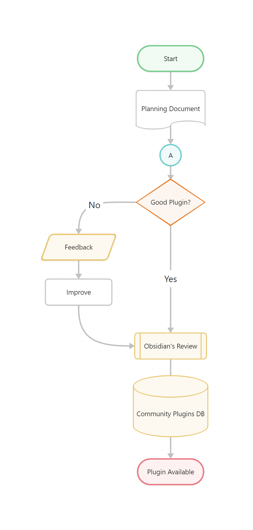
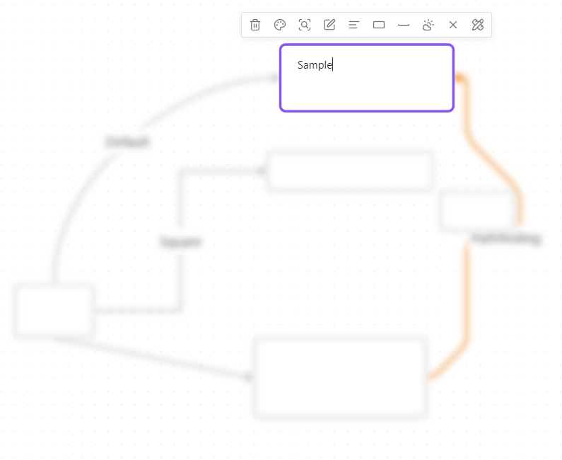
## Node Styles
You can customize the default node styles using the settings. This includes various shapes, border styles, and text alignment options.
### Node Shapes
Flowchart Example
#### Usage
* Use the updated popup menu set a node's shape.
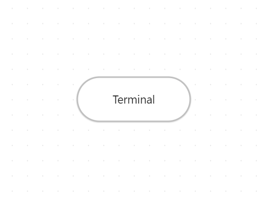
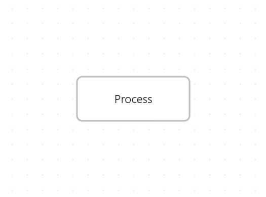
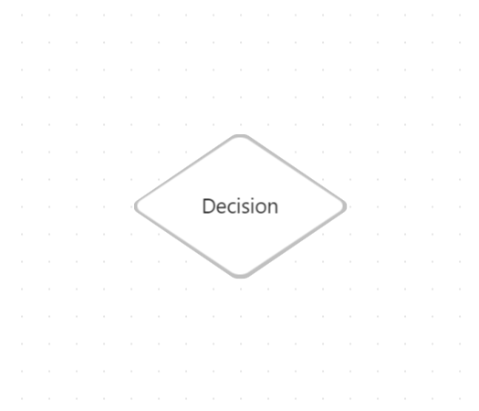
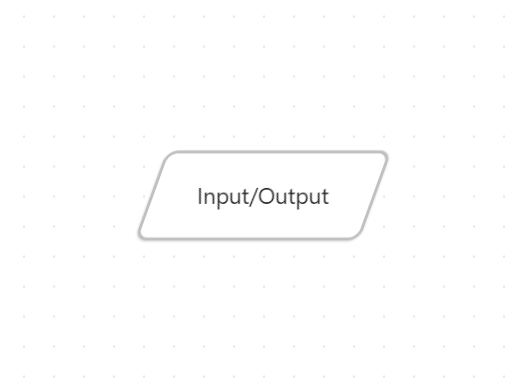
#### Shapes
Terminal Shape
Process/Center Shape
Decision Shape
Input/Output Shape
On-page Reference Shape

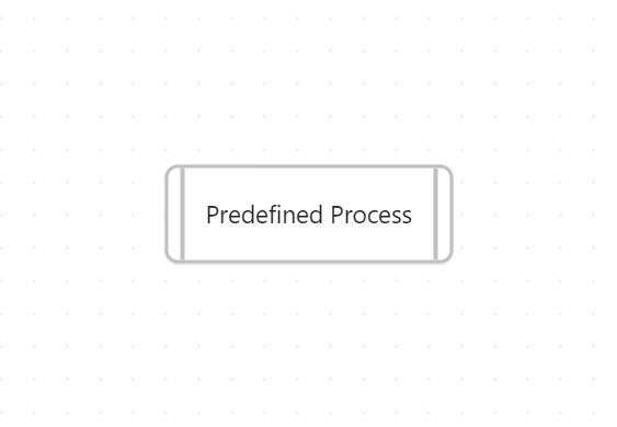
Predefined Process Shape
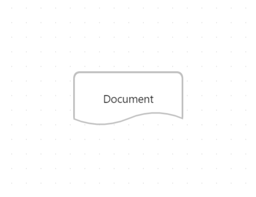
Document Shape
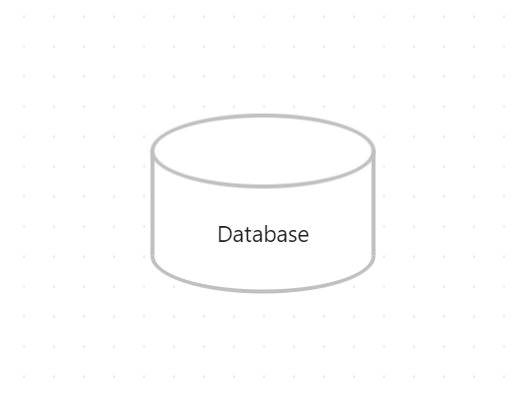
Database Shape
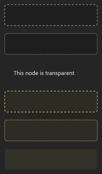
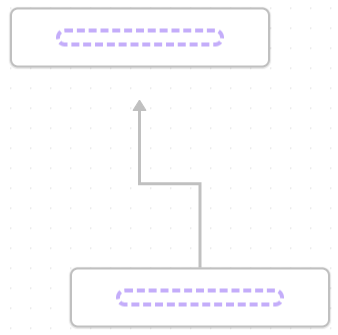
### Border Styles
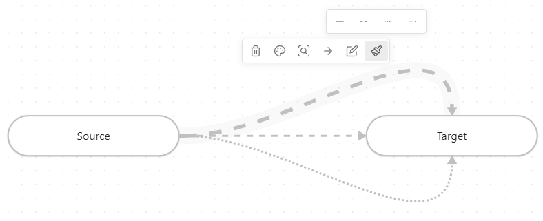
Set the style of the border to dotted, dashed or invisible.
Border Styles Example
*(Note: Text Alignment options (Left, Center, Right) are also available for nodes.)*
## Edge Styles
You can customize the default edge styles using the settings.
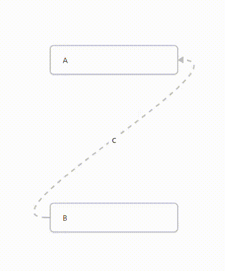
### Path Styles
Set the style of the edge paths to dotted, short-dashed or long-dashed.
Edge Path Styles Example
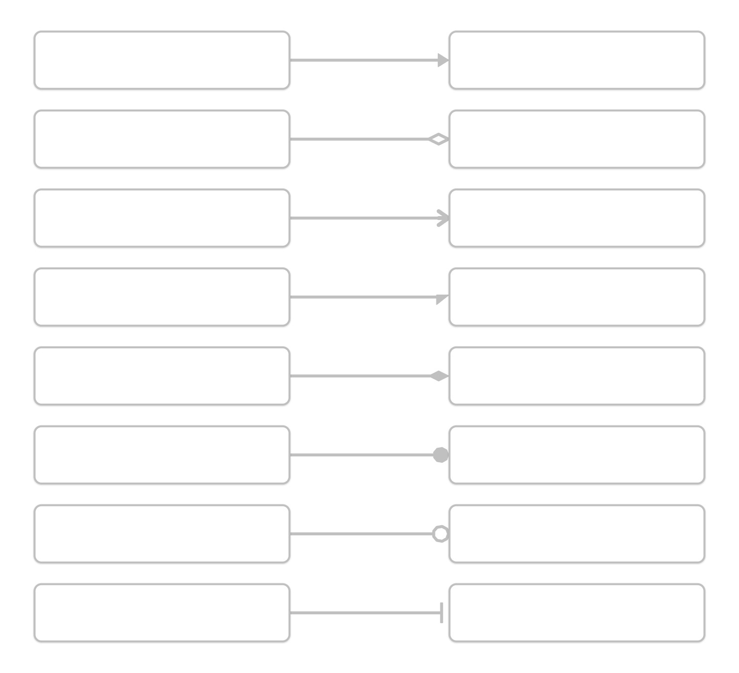
### Arrow Styles
Set the style of the arrows to triangle outline, halved triangle, thin triangle, diamond, diamond outline, circle, circle outline and blunted.
Arrow Styles Example
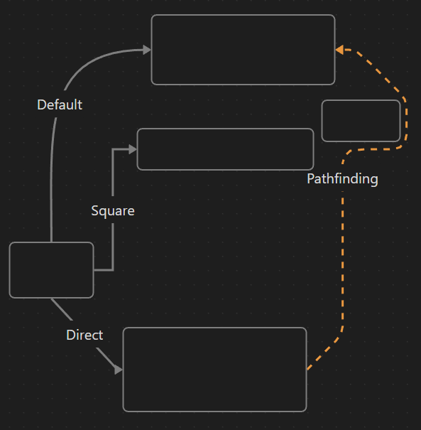
### Pathfinding Methods
Set the pathfinding method of the edges (arrows) to default, straight, squared or A*.
Edge Pathfinding Methods Example
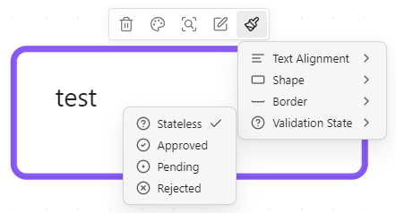
## Custom Styles
Custom style attributes for nodes and edges can easily be added. They get exposed in the `.canvas-node` dataset (for nodes) or `.canvas-edges path` dataset (for edges) and can be styled using CSS. Node styles also get exposed in the node editor iframe in the body dataset and the class `canvas-node-iframe-body` indicating that the body is inside a canvas node iframe.
1. Create a new CSS snippet in your vault:
* Navigate to `Settings > Appearance > *scroll down* > CSS snippets` and click on the folder icon to open the snippets folder.
* Create a new CSS file (e.g. `my-fancy-node-style.css`).
2. Add the custom style attribute definition:
* Open the CSS file and add the following code. The format needs to be **YAML** (within a CSS comment) and must contain the same keys as in this example. The number of options can be adjusted (minimum of one option is required). The `icon` key should contain the ID of an icon from [lucide.dev](https://lucide.dev/icons/).
* Change `@advanced-canvas-node-style` to `@advanced-canvas-edge-style` for edge styles.
```css
/* @advanced-canvas-node-style
key: validation-state
label: Validation State
options:
-
label: Stateless
value: null
icon: circle-help
-
label: Approved
value: approved
icon: circle-check
-
label: Pending
value: pending
icon: circle-dot
-
label: Rejected
value: rejected
icon: circle-x
*/
```
> [!IMPORTANT]
> There needs to be **one** option with the value `null`.
3. Add the CSS styling:
* In the same (or another) CSS file, add the styling for your custom attribute.
```css
/* General structure */
.canvas-node[data-=""] {
/* Your custom styling */
}
```
* Example for `validation-state`:
```css
.canvas-node[data-validation-state] .canvas-node-content::after {
content: "";
position: absolute;
top: 10px;
right: 10px;
font-size: 1em;
}
.canvas-node[data-validation-state="approved"] .canvas-node-content::after {
content: "✔️";
}
.canvas-node[data-validation-state="pending"] .canvas-node-content::after {
content: "⏳";
}
.canvas-node[data-validation-state="rejected"] .canvas-node-content::after {
content: "❌";
}
```
4. **Enable** the CSS snippet in Obsidian's settings and enjoy your new custom style attribute!
Example in Popup Menu
**See an example of a complete custom node style CSS file [here](https://raw.githubusercontent.com/Developer-Mike/obsidian-advanced-canvas/main/assets/docs/example-custom-node-style.css).**
## Variable Breakpoints
Add breakpoints to nodes to change at which zoom factor the node's content gets unrendered.
> [!IMPORTANT]
> Due to performance reasons, custom breakpoints get cached and are only re-fetched when the canvas gets reloaded. Changes in the CSS snippet won't be applied immediately (only after reopening the canvas).
Create a new CSS snippet in your vault (and enable it in settings):
```css
/* Any CSS selector can be used (As long as the .canvas-node element has the CSS variable defined) */
.canvas-node[data-shape="pill"] {
/* The zoom factor at which the node's content gets unrendered (Zoom level can range from 1 to -4) */
--variable-breakpoint: 0.5;
}
```
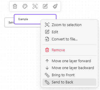
## Z-Ordering Control
Change z-ordering of nodes using the context menu.
Z-Ordering Control Example
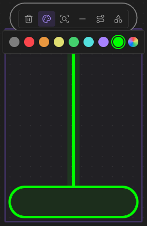
## Custom Colors
Add custom colors to the color picker. You can add them using the following CSS snippet:
```css
body {
/* Where X is the index of the color in the palette (1-6 are used by Obsidian) */
--canvas-color-X: 0, 255, 0; /* RGB values */
}
```
Custom Colors In Palette Example
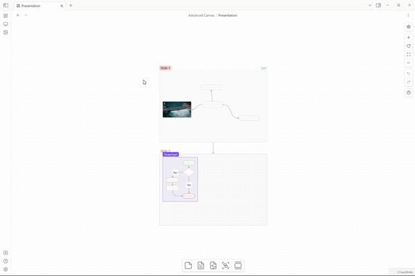
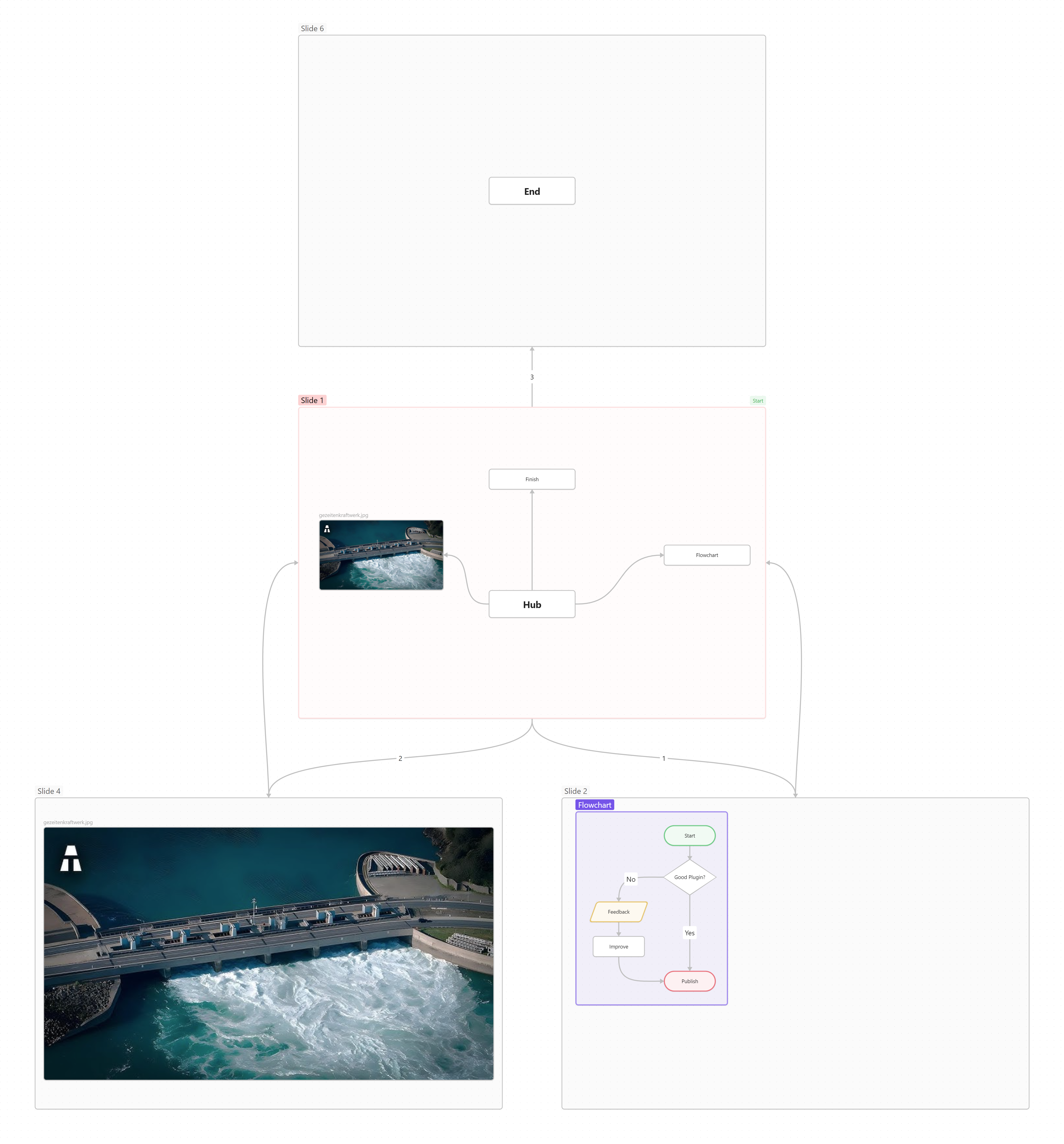
## Presentation Mode
In presentation mode, you can navigate through nodes using arrow keys or PageUp/PageDown keys (compatible with most presentation remotes). Slides/nodes are connected by arrows. For multiple outgoing arrows from one node, number them to define navigation order. While in presentation mode, the canvas is in readonly mode (so [Better Readonly](#better-readonly) features apply). Exit with `ESC` or the corresponding command. Use `Advanced Canvas: Continue presentation` to resume from the last slide.
Simple Presentation Canvas File
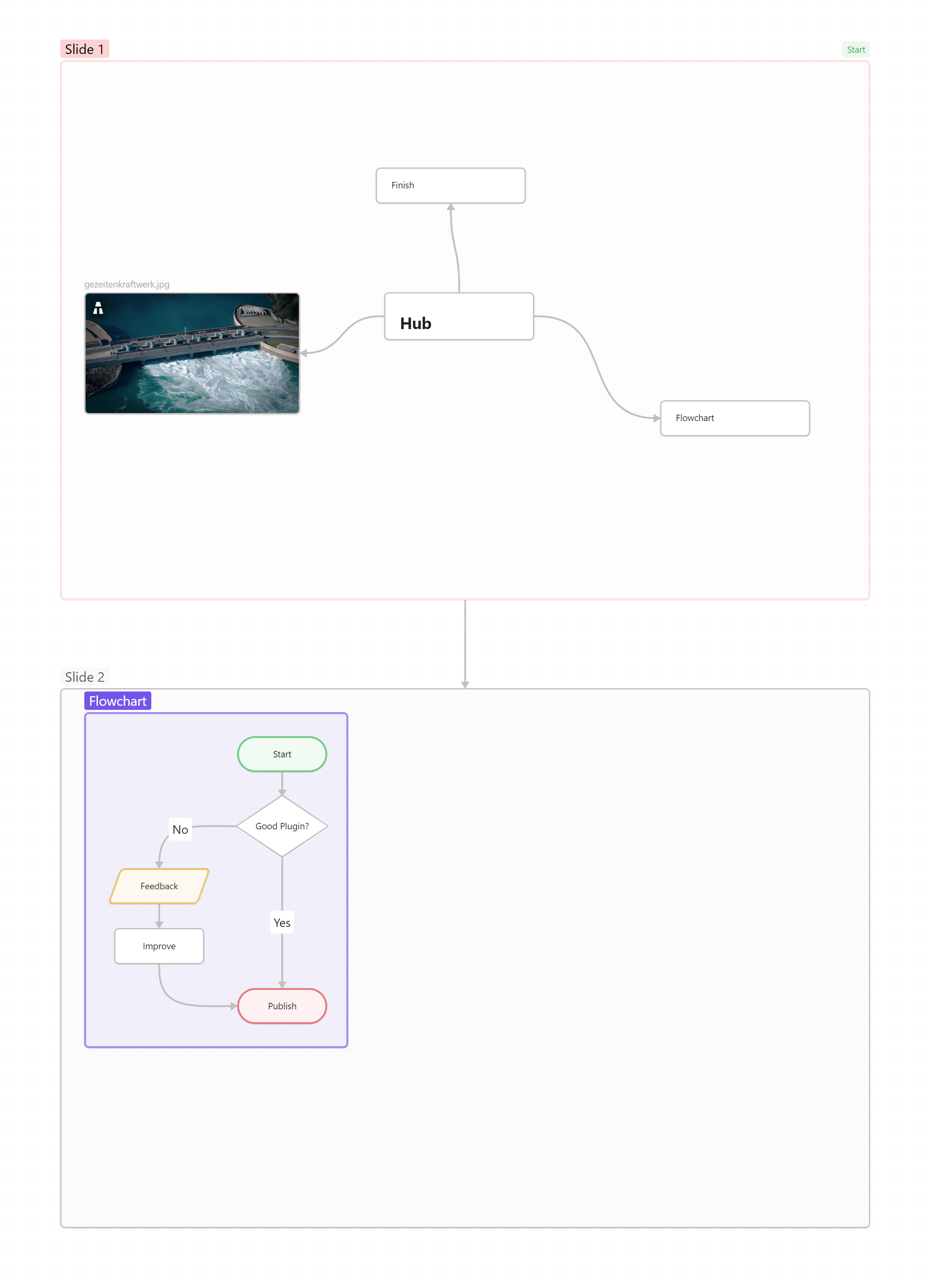
### More Complex Example
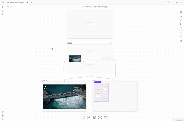
Complex Presentation Canvas File
### Usage
* **Create the first slide:**
* Use the updated popup menu to mark a node as the first slide.
* OR create a node and mark it via the updated card menu.
* **Add more slides:**
* Link slides using arrows.
* To loop back, number arrows for navigation order.
* **TIP:** Use the updated card menu for consistent slide dimensions.
* **Control the presentation:**
* Start: Command Palette (`Advanced Canvas: Start presentation`).
* Navigate: Arrow keys.
* Exit: `ESC` key.
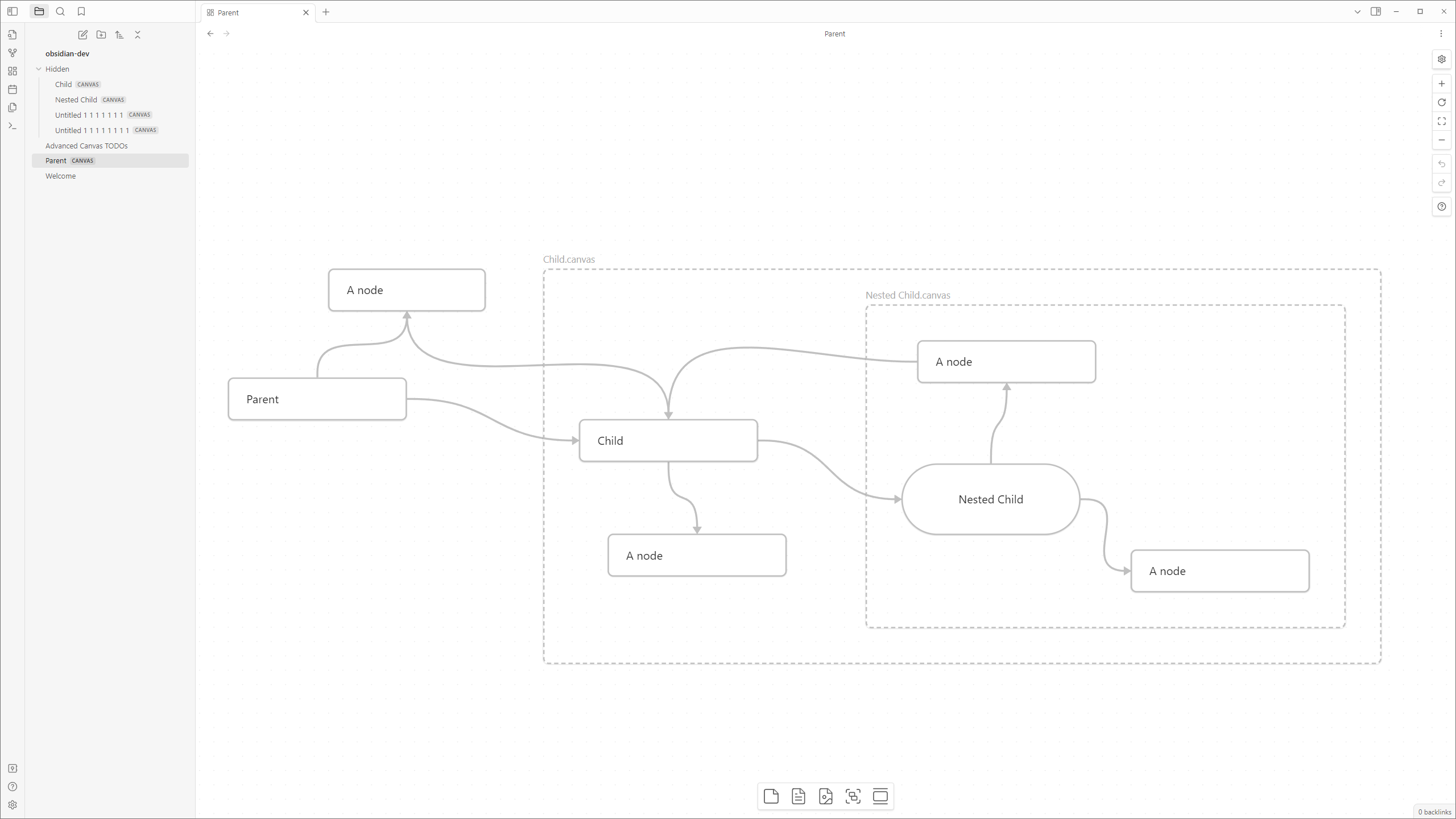
## Portals
Embed other canvases inside your current canvas and create edges (arrows) to the embedded canvas.
### Usage
* Embed a canvas file, then click the door icon in the popup menu to open it as a portal.
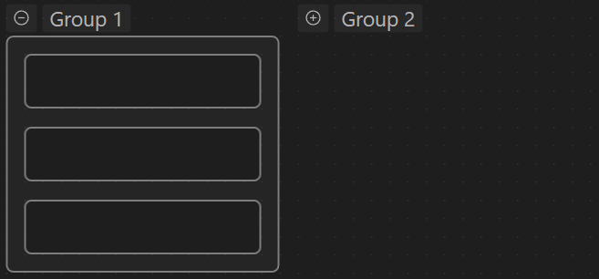
## Collapsible Groups
Collapse and expand groups to organize your canvas.
Collapsible Groups Example
## Image Export
Export the whole canvas or just a selection as a PNG/SVG image with transparency. Core plugin export options like "Privacy Mode" and "Show Logo" (extended to include Advanced Canvas logo) are also available.
Image Export Example (SVG)

## Auto Node Resizing
Resize nodes automatically when their text content changes. Toggle this feature per-node using the updated popup menu.
Auto Node Resizing Example
## Edge Highlight
Highlight edges when a connected node is selected. This feature helps to visually identify relationships between nodes.
If you want to edit the look of the highlighted edges, you need to edit the `is-focused` CSS class in a custom CSS snippet.
## Focus Mode
Focus on a single node by blurring all other nodes.
If "[Edge Highlight](#edge-highlight)" is enabled, edges connected to the focused node won't be blurred.
Focus Mode Example
## Better Readonly
* Disable node popup menus.
* Lock the canvas' position.
* Lock the canvas' zoom.
* Interactivity is retained for zooming to a bounding box (e.g., zoom to selection, zoom to fit all).
### Usage
* Use the updated control menu to toggle these features (shown only if the canvas is in readonly mode).
## Encapsulate Selection
Move the current selection to a new canvas and create a link to it in the current canvas.
### Usage
1. Select the nodes you want to encapsulate.
2. Use the context menu (right-click) to encapsulate the selection.
3. OR use the command palette (`Advanced Canvas: Encapsulate selection`).
## Floating Edges (Automatic Edge Side)
Edges automatically change their connection side to the most suitable one.
Drag the edge to the indicated drop zone inside the node to make the edge float.
Floating Edges Example
## Flip Edge
Flip the direction of an edge with one click.
Flip Edge Example
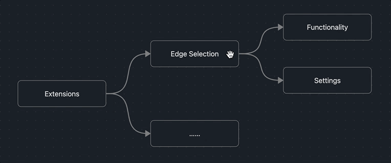
## Edge Selection
Select edges connected to the selected node(s).
Select Connected Edges Example

### Select By Direction
Select incoming or outgoing edges of the selected node(s).
Note: this requires the setting `Edge Selection > Select Edge By Direction` to be enabled.
Select Outgoing Edges Example

Select Incoming Edges Example
## Canvas Events
All custom events are prefixed with `advanced-canvas:` and can be listened to using `app.workspace.on` (just like default Obsidian events).
Check out the list of events [here](https://github.com/Developer-Mike/obsidian-advanced-canvas/blob/main/src/%40types/CustomWorkspaceEvents.d.ts).
## Settings
Every feature can be enabled/disabled in the settings. All features were made to be as customizable as possible.
## Contributing
All code contributions that **aren't made by LLMs or just update the README** are welcome!
You may want to check out issues with the `PRs appreciated` label to find issues you can start with.
But feel free to work on any issue or non-issue you want to work on!
## Star History
[](https://star-history.com/#Developer-Mike/obsidian-advanced-canvas&Date)