https://github.com/devonchurch/avocado
A React Application to create accessible color palettes that confirm to the WCAG Guidelines
https://github.com/devonchurch/avocado
accessibility color-palettes color-swatches drag-and-drop reactjs wcag-guidelines
Last synced: about 2 months ago
JSON representation
A React Application to create accessible color palettes that confirm to the WCAG Guidelines
- Host: GitHub
- URL: https://github.com/devonchurch/avocado
- Owner: devonChurch
- Created: 2019-09-14T09:00:13.000Z (almost 7 years ago)
- Default Branch: master
- Last Pushed: 2022-01-22T00:22:09.000Z (over 4 years ago)
- Last Synced: 2025-02-02T08:29:47.493Z (over 1 year ago)
- Topics: accessibility, color-palettes, color-swatches, drag-and-drop, reactjs, wcag-guidelines
- Language: JavaScript
- Homepage: https://devonchurch.github.io/avocado/
- Size: 1.43 MB
- Stars: 1
- Watchers: 2
- Forks: 0
- Open Issues: 1
-
Metadata Files:
- Readme: README.md
Awesome Lists containing this project
README
# Avocado 🥑😋
A **React** Application to create _*accessible color palettes*_ that confirm to the [WCAG Guidelines](https://www.w3.org/TR/WCAG21/)
---
### ℹ️ ➡️ [**Try there application _here_**](https://devonchurch.github.io/avocado/) 📱 💻 🖥️
---
## 💡 Sharable URL's
As you create color palettes we automatically generate a corresponding URL that you can share with others.
### Below are some example color palettes to start you off.
[ ](https://devonchurch.github.io/avocado/?s%5B0%5D=%23e6d6d1&s%5B1%5D=%23b0d1dc&s%5B2%5D=%23ada0b2&s%5B3%5D=%236b5a70&s%5B4%5D=%23532e39&c%5B0%5D%5B0%5D=1&c%5B0%5D%5B1%5D=4&c%5B1%5D%5B0%5D=0&c%5B1%5D%5B1%5D=2)
[ ](https://devonchurch.github.io/avocado/?s%5B0%5D=%23202e42&s%5B1%5D=%2338a8b7&s%5B2%5D=%23f4ebd7&s%5B3%5D=%23f0a06d&s%5B4%5D=%23d65c5b&c%5B0%5D%5B0%5D=1&c%5B0%5D%5B1%5D=0&c%5B1%5D%5B0%5D=0&c%5B1%5D%5B1%5D=3)
[ ](https://devonchurch.github.io/avocado/?s%5B0%5D=%23ddf4a1&s%5B1%5D=%239fd250&s%5B2%5D=%237c8369&s%5B3%5D=%236c695d&s%5B4%5D=%2368444d&c%5B0%5D%5B0%5D=4&c%5B0%5D%5B1%5D=0&c%5B1%5D%5B0%5D=0&c%5B1%5D%5B1%5D=3)
---
## 💡 Reorder colors palette
You can drag individual color swatches to re-order their sequence.

Color swatches are presented flush with one another to better portray any incremental color differences.

---
## 💡 Updating a color swatch
You can update a swatch reference and have _*all*_ of its inherited references reflect the color change. This feature allows for great flexibility to try new color combinations with little effort.
---
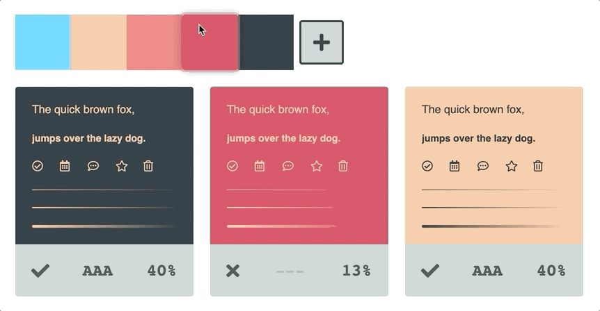
## 💡 Accessibility reference
Color combinations show the accessibility of their combined contrast via the following three identifiers.
- ❌ `---` = **Poor** contrast ratio
- ✅ `AA-` = **Acceptable** contrast ratio
- ✅ `AAA` = **Excellent** contest ratio

---
## 💡 Reveal color combinations
Hovering over a color combination reveals its corresponding color swatches.

---
## 💡 Delete color assets
Toggling on _**delete mode**_ allows you to remove color swatches and combinations from your palette.

We make sure to **not** allow users to delete color swatches that are currently associated with a color combination to avoid accidental removals 👏
---
## 💡 Create new color swatches
You can duplicate the last color swatch in your list by _clicking_ the _(add swatch)_ ➕ button.
Alternatively, you can duplicate _any_ existing color swatch by dropping it onto the _(add swatch)_ ➕ button.

---
## 💡 Create new color combinations
You can duplicate the last color combination in your list by _clicking_ the _(add combination)_ ➕ button.
Alternatively, you can drop a color swatch onto the _(add combination)_ ➕ button to create a new combination. The top _slot_ represents the **foreground** color with the bottom assigned to the **background**.

When dropping a color swatch onto a new combination _slot_ we automatically choose the best contrasting color from your list of color swatches as a starting point 👍
---
## 💡 Updating a color combination
You can drop existing color swatches onto any existing color combination _slot_ to update its palette reference.

---
## 💡 Dynamic UI color
UI states like `:focus` and `:hover` get unique color blends based on their base color.
If a color is very light, a border will appear around the swatch to differentiate it from the background.
Light and Dark colors also inherit inverted interaction states to create better contrast for our users.
