https://github.com/devonchurch/fish-pie
Styled Components Cliffs Notes
https://github.com/devonchurch/fish-pie
Last synced: 4 months ago
JSON representation
Styled Components Cliffs Notes
- Host: GitHub
- URL: https://github.com/devonchurch/fish-pie
- Owner: devonChurch
- License: mit
- Created: 2019-03-22T23:30:55.000Z (about 7 years ago)
- Default Branch: master
- Last Pushed: 2019-04-04T00:52:46.000Z (about 7 years ago)
- Last Synced: 2025-03-28T07:44:06.221Z (about 1 year ago)
- Size: 17.6 KB
- Stars: 0
- Watchers: 1
- Forks: 1
- Open Issues: 0
-
Metadata Files:
- Readme: README.md
- License: LICENSE
Awesome Lists containing this project
README
# [Styled Components](https://www.styled-components.com/) _(Cliffs Notes)_
## CSS in Javascript 😱
### Why 🤔
- ✅ **React Compositions**
- ✅ **Style Encapsulation**
- ✅ **Dynamic Styles**
### Support 👍
- ✔ [Vendor prefixing](https://www.styled-components.com/docs/basics)
- ✔ [Typescript Suport](https://www.styled-components.com/docs/api#typescript)
- ✔ [Jest Integration](https://www.styled-components.com/docs/tooling#jest-integration)
- ✔ [Enzyme Hooks](https://www.styled-components.com/docs/api#enzymefind)
- ✔ [Linting Support _(Style Lint)_](https://www.styled-components.com/docs/tooling#stylelint)
[🔽 Next](https://github.com/devonChurch/fish-pie#agenda-)
.
.
.
.
.
.
.
.
.
.
## Agenda 🗒
- 🕐 [Composition](https://github.com/devonChurch/fish-pie#composition-)
- 🕑 [Styles](https://github.com/devonChurch/fish-pie#styles-)
- 🕒 [Inheritance](https://github.com/devonChurch/fish-pie#inheritance-)
- 🕓 [Dynamic](https://github.com/devonChurch/fish-pie#dynamic-)
- 🕔 [Tagged Templates](https://github.com/devonChurch/fish-pie#tagged-templates-)
- 🕕 [Polymorphism](https://github.com/devonChurch/fish-pie#polymorphism-)
- 🕖 [Pseudo Elements](https://github.com/devonChurch/fish-pie#pseudo-elements-)
- 🕗 [Theming](https://github.com/devonChurch/fish-pie#theming-)
- 🕘 [Polished](https://github.com/devonChurch/fish-pie#polished-)
[🔽 Next](https://github.com/devonChurch/fish-pie#composition-)
.
.
.
.
.
.
.
.
.
.
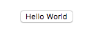
## Composition 🏗
_Lets make a button..._
### React ⚛
##### Input ✏
```javascript
const Button = styled.button``;
ReactDOM.render(Hello World, document.getElementById("app"));
```
##### Output 💎
[🔽 Next](https://github.com/devonChurch/fish-pie/blob/master/README.md#dom-injection-)
.
.
.
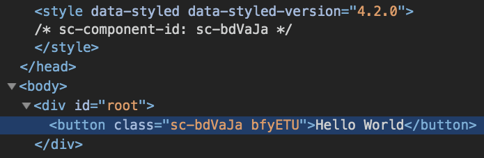
### DOM Injection 💾
##### Output 💎
[🔽 Next](https://github.com/devonChurch/fish-pie/blob/master/README.md#its-just-css-)
.
.
.
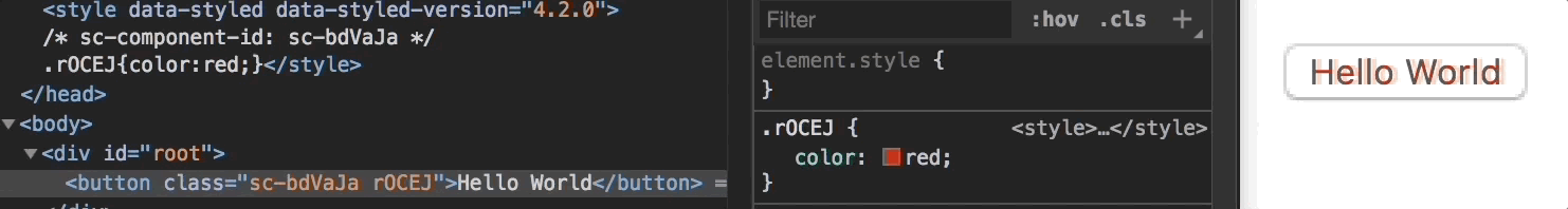
### It's just CSS 😵
##### Output 💎
[🔽 Next](https://github.com/devonChurch/fish-pie#styles-)
.
.
.
.
.
.
.
.
.
.
## Styles 💄
_Lets add some styles..._
### Traditional 💡
##### Input ✏
```javascript
const Button = styled.button`
// Reset.
background: transparent;
border: 0;
padding: 0;
// Custom.
background: blue;
border-radius: 0.2rem;
color: white;
padding: 0.5rem 1rem;
font-size: 1rem;
`;
const MyApp = () => Hello World;
```
##### Output 💎

[🔽 Next](https://github.com/devonChurch/fish-pie/blob/master/README.md#shortcut-)
.
.
.
### Shortcut 🔦
##### Input ✏
```javascript
const MyApp = () => (
Hello World
);
```
##### Output 💎

[🔽 Next](https://github.com/devonChurch/fish-pie#inheritance-)
.
.
.
.
.
.
.
.
.
.
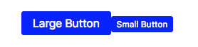
## Inheritance ⚡
_Lets focus on structure..._
### Linear Structure 👾
##### Input ✏
```javascript
const ButtonReset = styled.button`
background: transparent;
border: 0;
padding: 0;
`;
const ButtonLarge = styled(ButtonReset)`
background: blue;
border-radius: 0.2rem;
color: white;
padding: 0.5rem 1rem;
font-size: 1rem;
`;
const ButtonSmall = styled(ButtonLarge)`
padding: 0.25rem 0.5rem;
font-size: 0.75rem;
`;
const MyApp = () => (
<>
Large Button
Small Button
>
);
```
##### Output 💎
[🔽 Next](https://github.com/devonChurch/fish-pie#snippet-structure-)
.
.
.
### Snippet Structure 😺
##### Input ✏
```javascript
const ButtonReset = css`
background: transparent;
border: 0;
padding: 0;
`;
const ButtonLarge = styled.button`
${ButtonReset}
background: blue;
border-radius: 0.2rem;
color: white;
padding: 0.5rem 1rem;
font-size: 1rem;
`;
const ButtonSmall = styled(ButtonLarge)`
padding: 0.25rem 0.5rem;
font-size: 0.75rem;
`;
const MyApp = () => (
<>
Large Button
Small Button
>
);
```
##### Output 💎

[🔽 Next](https://github.com/devonChurch/fish-pie#global-structure-)
.
.
.
### Global Structure 🌎
##### Input ✏
```javascript
const GlobalStyle = createGlobalStyle`
button {
background: transparent;
border: 0;
padding: 0;
}
`;
const ButtonLarge = styled.button`
background: blue;
border-radius: 0.2rem;
color: white;
padding: 0.5rem 1rem;
font-size: 1rem;
`;
const ButtonSmall = styled(ButtonLarge)`
padding: 0.25rem 0.5rem;
font-size: 0.75rem;
`;
const MyApp = () => (
<>
Large Button
Small Button
>
);
```
##### Output 💎

[🔽 Next](https://github.com/devonChurch/fish-pie#dynamic-)
.
.
.
.
.
.
.
.
.
.
## Dynamic 🎈
_Adapting to component props..._
### Single Styles 👁
##### Input ✏
```javascript
const Button = styled.button`
background: blue;
border-radius: 0.2rem;
color: white;
padding: ${({ isSmall }) => (isSmall ? "0.25rem 0.5rem" : "0.5rem 1rem")};
font-size: ${({ isSmall }) => (isSmall ? "0.75rem" : "1rem")};
`;
const MyApp = () => (
<>
Large Button
Small Button
>
);
```
##### Output 💎

[🔽 Next](https://github.com/devonChurch/fish-pie#abstract-logic-)
.
.
.
### Abstract Logic 👠
##### Input ✏
```javascript
const Button = styled.button.attrs(({ isSmall }) => ({
padding: isSmall ? "0.25rem 0.5rem" : "0.5rem 1rem",
fontSize: isSmall ? "0.75rem" : "1rem"
}))`
${ButtonReset}
background: blue;
border-radius: 0.2rem;
color: white;
padding: ${({ padding }) => padding};
font-size: ${({ fontSize }) => fontSize};
`;
const MyApp = () => (
<>
Large Button
Small Button
>
);
```
##### Output 💎

[🔽 Next](https://github.com/devonChurch/fish-pie#style-blocks-)
.
.
.
### Style Blocks 💥
##### Input ✏
```javascript
const colors = {
success: "green",
error: "red",
disabled: "gray"
};
const Button = styled.button`
background: ${({ type }) => colors[type] || "blue"};
border-radius: 0.2rem;
color: white;
padding: 0.5rem 1rem;
font-size: 1rem;
${({ type }) =>
type === "disabled" &&
css`
color: black;
cursor: not-allowed;
opacity: 0.5;
`}
`;
const MyApp = () => (
<>
Standard Button
Error Button
Disabled Button
>
);
```
##### Output 💎

[🔽 Next](https://github.com/devonChurch/fish-pie#tagged-templates-)
.
.
.
.
.
.
.
.
.
.
## Tagged Templates 💍
_[What are they](https://developer.mozilla.org/en-US/docs/Web/JavaScript/Reference/Template_literals#Tagged_templates) and [how do they work](https://mxstbr.blog/2016/11/styled-components-magic-explained/)..._
##### Input ✏
```javascript
const myFnc = (
strings, // ["↵ padding: ", ";↵ color: ", ";↵"]
...values // ["10px", "red"]
) =>
(
strings[0] +
values[0] + // "Padding" reference.
strings[1] +
values[1] + // "Color" reference (plus "Paddings" trailing semicolon).
strings[2]
) // "Colors" trailing semicolon
.trim() // Remove white space.
.replace(/\t/gm, ""); // Remove tabs.
// Create a fictitious style declaration.
myFnc`
padding: ${"10px"};
color: ${"red"};
`;
```
##### Output 💎
```css
padding: 10px;
color: red;
```
[🔽 Next](https://github.com/devonChurch/fish-pie#polymorphism-)
.
.
.
.
.
.
.
.
.
.
## Polymorphism 🐘
_Change the root native element type..._
##### Input ✏
```javascript
const Button = styled.button`
${ButtonReset}
background: blue;
border-radius: 0.2rem;
color: white;
padding: 0.5rem 1rem;
font-size: 1rem;
${({ as }) =>
as === "a" &&
css`
cursor: pointer;
text-decoration: underline;
`}
`;
const MyApp = () => (
<>
Generic Button
Link Button
>
);
```
##### Output 💎

[🔽 Next](https://github.com/devonChurch/fish-pie#pseudo-elements-)
.
.
.
.
.
.
.
.
.
.
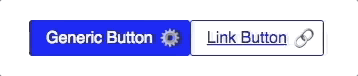
## Pseudo Elements 🍻
_Just like regular CSS..._
##### Input ✏
```javascript
const Button = styled.button`
background: blue;
border: 1px solid blue;
border-radius: 0.2rem;
color: white;
display: inline-block;
padding: 0.5rem 2.25rem 0.5rem 1rem;
position: relative;
font-size: 1rem;
transition: 200ms;
&:after {
content: " ⚙";
position: absolute;
right: 0.5rem;
top: 50%;
transform: translateY(-50%);
}
&:hover {
transform: scale(1.25);
z-index: 1;
}
${({as}) => as === 'a' && css`
color: blue;
background: white;
cursor: pointer;
text-decoration: underline;
&:after {
content: " 🔗";
}
`}
`;
const MyApp = () => (
<>
Generic Button
Link Button
>
);
```
##### Output 💎
[🔽 Next](https://github.com/devonChurch/fish-pie#theming-)
.
.
.
.
.
.
.
.
.
.
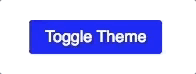
## Theming ♻
_Light -vs- Dark, Cozy -vs Compact etc..._
##### Input ✏
```javascript
const bodyBackground = theme("mode", {
light: "white",
dark: "blue"
});
const GlobalStyle = createGlobalStyle`
body {
background: ${bodyBackground};
}
`;
const buttonBackground = theme("mode", {
light: "blue",
dark: "white"
});
const buttonColor = theme("mode", {
light: "white",
dark: "blue"
});
const Button = styled.button`
background: ${buttonBackground};
border-radius: 0.2rem;
color: ${buttonColor};
padding: 0.5rem 1rem;
font-size: 1rem;
`;
const MyApp = () => {
const [isLight, setIsLight] = useState(true);
return (
<>
setIsLight(!isLight)}>Toggle Theme
>
);
};
```
##### Output 💎
[🔽 Next](https://github.com/devonChurch/fish-pie#polished-)
.
.
.
.
.
.
.
.
.
.
## [Polished](https://polished.js.org) 🌟
_SASS mixins, but in real time..._
### Color Transformations
- ✔ Is a color _Light_ or _Dark_
- ✔ Parse to `HSL` / `RGB` / `HEX`
### Measurement Transformations
- ✔ Isolate `value` and `unit`
- ✔ Add `CSS` values together
### General Helpers
- ✔ Create _retina_ image declaration
- ✔ Hide content _accessibly_
[🔽 Next](https://github.com/devonChurch/fish-pie#thanks-)
.
.
.
.
.
.
.
.
.
.
## Thanks 👍
_Any questions?..._

Try out a [CodePen](https://codepen.io/DevonChurch/pen/OqrdPV?editors=0010) that has React / Styled Components integration.
[🔼 Back to Top](https://github.com/devonChurch/fish-pie#style-components-cliffs-notes)