https://github.com/devsonuyadav/react-lite-button
https://github.com/devsonuyadav/react-lite-button
Last synced: about 1 year ago
JSON representation
- Host: GitHub
- URL: https://github.com/devsonuyadav/react-lite-button
- Owner: devsonuyadav
- Created: 2020-01-12T23:11:59.000Z (over 6 years ago)
- Default Branch: master
- Last Pushed: 2023-01-01T15:17:33.000Z (over 3 years ago)
- Last Synced: 2024-03-23T15:22:37.687Z (over 2 years ago)
- Language: JavaScript
- Size: 5.02 MB
- Stars: 0
- Watchers: 1
- Forks: 0
- Open Issues: 38
-
Metadata Files:
- Readme: README.md
Awesome Lists containing this project
README
# react-lite-button
> A simple and liteweight react button with linear gradient capabilities and with awesome loader
> This package uses [react-spinners](https://www.npmjs.com/package/react-spinners) in order to use loader functions
[](https://www.npmjs.com/package/react-lite-button) [](https://standardjs.com)
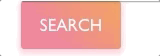
## Example
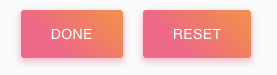
Buttom Loader example
## Install
```bash
npm install --save react-lite-button
```
## Usage
```jsx
import React, { Component } from "react";
import MyComponent from "react-lite-button";
class Example extends Component {
render() {
return ;
}
}
```
To enable loader
```jsx
import React, { Component } from "react";
import MyComponent from "react-lite-button";
class Example extends Component {
render() {
return ;
}
}
```
| Prop Name | Type | Default | Description |
| ------------ | ---------------- | ------------------------------------------ | ----------------------------------------------------------- |
| title | string | nameless | Title of the button |
| onClick | function | null | onClick function after the button in clicked |
| colors | array | ["#fe6b8b" , "#ff8e53"] | require two colors inorder work show linear-gradient |
| textColor | string | white | color of the text appears inside the button |
| textSize | number | 17 | fontSize |
| width | number or string | '100%' | specify the width of the button within the string or number |
| borderRadius | number or string | 3 | borderRadius of the button |
| height | number or string | 48 | height of the button |
| shadow | string | "0px 3px 5px 2px rgba(255, 105, 135, 0.3)" | button shadow color |
| loading | boolean | false | whether the button is currently |
| loaderType | string | ClipLoader | [More loaders @](https://www.davidhu.io/react-spinners/) |
| loaderSize | number or string | 30 | size of the loader |
| loaderColor | string | 'white' | color of the loader |
## License
MIT © [devsonuyadav](https://github.com/devsonuyadav)