https://github.com/dexplo/dexplot
Simple plotting library that wraps Matplotlib and integrated with DataFrames
https://github.com/dexplo/dexplot
data-visualization matplotlib pandas plotly python
Last synced: 5 months ago
JSON representation
Simple plotting library that wraps Matplotlib and integrated with DataFrames
- Host: GitHub
- URL: https://github.com/dexplo/dexplot
- Owner: dexplo
- License: bsd-3-clause
- Created: 2018-08-21T16:32:10.000Z (almost 8 years ago)
- Default Branch: master
- Last Pushed: 2020-11-04T12:52:30.000Z (over 5 years ago)
- Last Synced: 2025-11-07T02:16:32.647Z (9 months ago)
- Topics: data-visualization, matplotlib, pandas, plotly, python
- Language: Jupyter Notebook
- Homepage: https://dexplo.org/dexplot
- Size: 9.73 MB
- Stars: 232
- Watchers: 11
- Forks: 9
- Open Issues: 2
-
Metadata Files:
- Readme: README.md
- Funding: .github/FUNDING.yml
- License: LICENSE
Awesome Lists containing this project
README
# Dexplot
[](https://pypi.org/project/dexplot)
[](LICENSE)
Dexplot is a Python library for delivering beautiful data visualizations with a simple and intuitive user experience.
## Goals
The primary goals for dexplot are:
* Maintain a very consistent API with as few functions as necessary to make the desired statistical plots
* Allow the user tremendous power without using matplotlib
## Installation
`pip install dexplot`
## Built for long and wide data
Dexplot is primarily built for long data, which is a form of data where each row represents a single observation and each column represents a distinct quantity. It is often referred to as "tidy" data. Here, we have some long data.
Dexplot also has the ability to handle wide data, where multiple columns may contain values that represent the same kind of quantity. The same data above has been aggregated to show the mean for each combination of neighborhood and property type. It is now wide data as each column contains the same quantity (price).
## Usage
Dexplot provides a small number of powerful functions that all work similarly. Most plotting functions have the following signature:
```python
dxp.plotting_func(x, y, data, aggfunc, split, row, col, orientation, ...)
```
* `x` - Column name along the x-axis
* `y` - Column name the y-axis
* `data` - Pandas DataFrame
* `aggfunc` - String of pandas aggregation function, 'min', 'max', 'mean', etc...
* `split` - Column name to split data into distinct groups
* `row` - Column name to split data into distinct subplots row-wise
* `col` - Column name to split data into distinct subplots column-wise
* `orientation` - Either vertical (`'v'`) or horizontal (`'h'`). Default for most plots is vertical.
When `aggfunc` is provided, `x` will be the grouping variable and `y` will be aggregated when vertical and vice-versa when horizontal. The best way to learn how to use dexplot is with the examples below.
## Families of plots
There are two primary families of plots, **aggregation** and **distribution**. Aggregation plots take a sequence of values and return a **single** value using the function provided to `aggfunc` to do so. Distribution plots take a sequence of values and depict the shape of the distribution in some manner.
* Aggregation
* bar
* line
* scatter
* count
* Distribution
* box
* violin
* hist
* kde
## Comparison with Seaborn
If you have used the seaborn library, then you should notice a lot of similarities. Much of dexplot was inspired by Seaborn. Below is a list of the extra features in dexplot not found in seaborn
* Ability to graph relative frequency and normalize over any number of variables
* No need for multiple functions to do the same thing (far fewer public functions)
* Ability to make grids with a single function instead of having to use a higher level function like `catplot`
* Pandas `groupby` methods available as strings
* Ability to sort by values
* Ability to sort x/y labels lexicographically
* Ability to select most/least frequent groups
* x/y labels are wrapped so that they don't overlap
* Figure size (plus several other options) and available to change without using matplotlib
* A matplotlib figure object is returned
## Examples
Most of the examples below use long data.
## Aggregating plots - bar, line and scatter
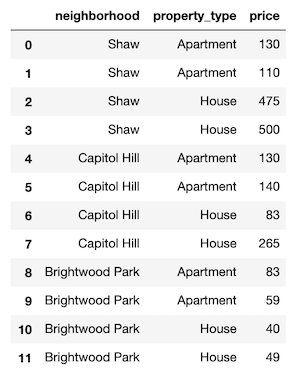
We'll begin by covering the plots that **aggregate**. An aggregation is defined as a function that summarizes a sequence of numbers with a single value. The examples come from the Airbnb dataset, which contains many property rental listings from the Washington D.C. area.
```python
import dexplot as dxp
import pandas as pd
airbnb = dxp.load_dataset('airbnb')
airbnb.head()
```
neighborhood
property_type
accommodates
bathrooms
bedrooms
price
cleaning_fee
rating
superhost
response_time
latitude
longitude
0
Shaw
Townhouse
16
3.5
4
433
250
95.0
No
within an hour
38.90982
-77.02016
1
Brightwood Park
Townhouse
4
3.5
4
154
50
97.0
No
NaN
38.95888
-77.02554
2
Capitol Hill
House
2
1.5
1
83
35
97.0
Yes
within an hour
38.88791
-76.99668
3
Shaw
House
2
2.5
1
475
0
98.0
No
NaN
38.91331
-77.02436
4
Kalorama Heights
Apartment
3
1.0
1
118
15
91.0
No
within an hour
38.91933
-77.04124
There are more than 4,000 listings in our dataset. We will use bar charts to aggregate the data.
```python
airbnb.shape
```
(4581, 12)
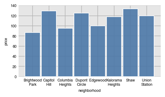
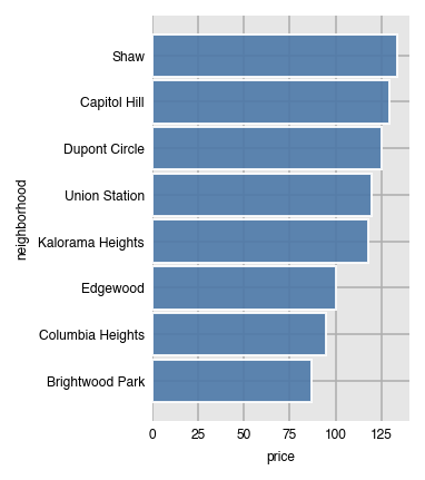
### Vertical bar charts
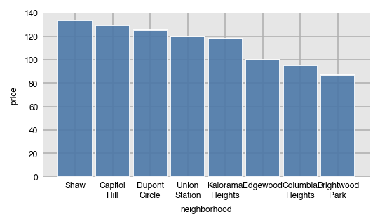
In order to performa an aggregation, you must supply a value for `aggfunc`. Here, we find the median price per neighborhood. Notice that the column names automatically wrap.
```python
dxp.bar(x='neighborhood', y='price', data=airbnb, aggfunc='median')
```
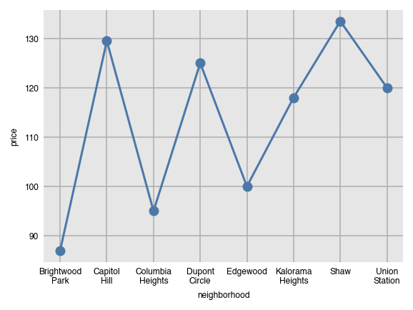
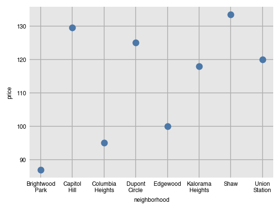
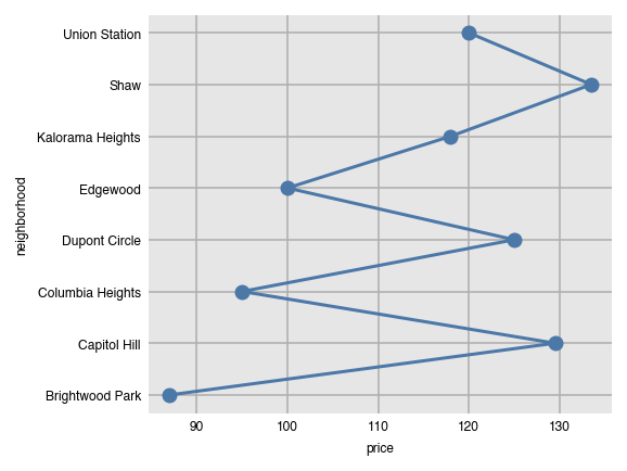
Line and scatter plots can be created with the same command, just substituting the name of the function. They both are not good choices for the visualization since the grouping variable (neighborhood) has no meaningful order.
```python
dxp.line(x='neighborhood', y='price', data=airbnb, aggfunc='median')
```
```python
dxp.scatter(x='neighborhood', y='price', data=airbnb, aggfunc='median')
```
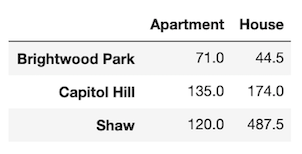
### Components of the groupby aggregation
Anytime the `aggfunc` parameter is set, you have performed a groupby aggregation, which always consists of three components:
* Grouping column - unique values of this column form independent groups (neighborhood)
* Aggregating column - the column that will get summarized with a single value (price)
* Aggregating function - a function that returns a single value (median)
The general format for doing this in pandas is:
```python
df.groupby('grouping column').agg({'aggregating column': 'aggregating function'})
```
Specifically, the following code is executed within dexplot.
```python
airbnb.groupby('neighborhood').agg({'price': 'median'})
```
price
neighborhood
Brightwood Park
87.0
Capitol Hill
129.5
Columbia Heights
95.0
Dupont Circle
125.0
Edgewood
100.0
Kalorama Heights
118.0
Shaw
133.5
Union Station
120.0
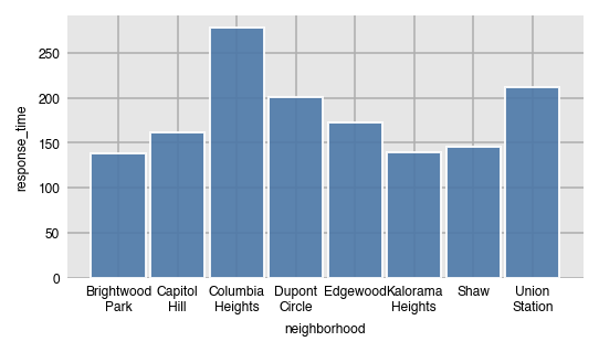
### Number and percent of missing values with `'countna'` and `'percna'`
In addition to all the common aggregating functions, you can use the strings `'countna'` and `'percna'` to get the number and percentage of missing values per group.
```python
dxp.bar(x='neighborhood', y='response_time', data=airbnb, aggfunc='countna')
```
### Sorting the bars by values
By default, the bars will be sorted by the grouping column (x-axis here) in alphabetical order. Use the `sort_values` parameter to sort the bars by value.
* None - sort x/y axis labels alphabetically (default)
* `asc` - sort values from least to greatest
* `desc` - sort values from greatest to least
```python
dxp.bar(x='neighborhood', y='price', data=airbnb, aggfunc='median', sort_values='asc')
```
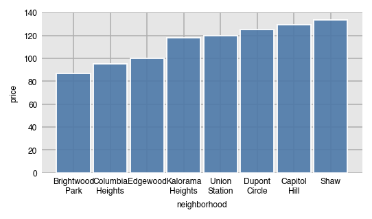
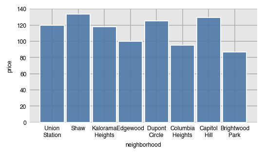
Here, we sort the values from greatest to least.
```python
dxp.bar(x='neighborhood', y='price', data=airbnb, aggfunc='median', sort_values='desc')
```
### Specify order with `x_order`
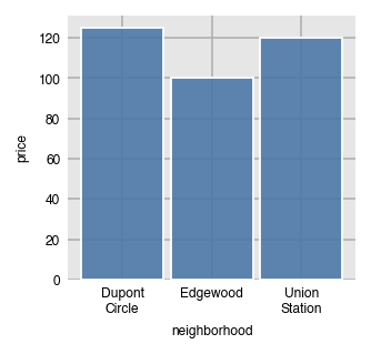
Specify a specific order of the labels on the x-axis by passing a list of values to `x_order`. This can also act as a filter to limit the number of bars.
```python
dxp.bar(x='neighborhood', y='price', data=airbnb, aggfunc='median',
x_order=['Dupont Circle', 'Edgewood', 'Union Station'])
```
By default, `x_order` and all of the `_order` parameters are set to `'asc'` by default, which will order them alphabetically. Use the string `'desc'` to sort in the opposite direction.
```python
dxp.bar(x='neighborhood', y='price', data=airbnb, aggfunc='median', x_order='desc')
```
### Filter for the neighborhoods with most/least frequency of occurrence
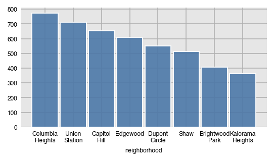
You can use `x_order` again to filter for the x-values that appear the most/least often by setting it to the string `'top n'` or `'bottom n'` where `n` is an integer. Here, we filter for the top 4 most frequently occurring neighborhoods. This option is useful when there are dozens of unique values in the grouping column.
```python
dxp.bar(x='neighborhood', y='price', data=airbnb, aggfunc='median',
x_order='top 4')
```
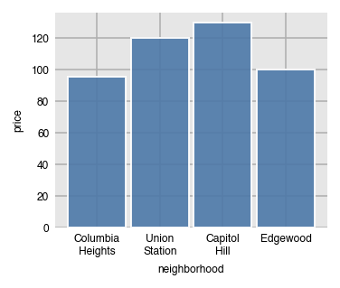
We can verify that the four neighborhoods are the most common.
```python
airbnb['neighborhood'].value_counts()
```
Columbia Heights 773
Union Station 713
Capitol Hill 654
Edgewood 610
Dupont Circle 549
Shaw 514
Brightwood Park 406
Kalorama Heights 362
Name: neighborhood, dtype: int64
### Horizontal bars
Set `orientation` to `'h'` for horizontal bars. When you do this, you'll need to switch `x` and `y` since the grouping column (neighborhood) will be along the y-axis and the aggregating column (price) will be along the x-axis.
```python
dxp.bar(x='price', y='neighborhood', data=airbnb, aggfunc='median',
orientation='h', sort_values='desc')
```
Switching orientation is possible for most other plots.
```python
dxp.line(x='price', y='neighborhood', data=airbnb, aggfunc='median', orientation='h')
```
### Split bars into groups
You can split each bar into further groups by setting the `split` parameter to another column.
```python
dxp.bar(x='neighborhood', y='price', data=airbnb, aggfunc='median', split='superhost')
```
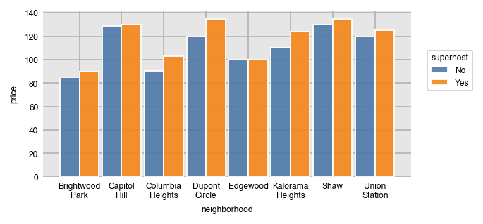
We can use the `pivot_table` method to verify the results in pandas.
```python
airbnb.pivot_table(index='superhost', columns='neighborhood',
values='price', aggfunc='median')
```
neighborhood
Brightwood Park
Capitol Hill
Columbia Heights
Dupont Circle
Edgewood
Kalorama Heights
Shaw
Union Station
superhost
No
85.0
129.0
90.5
120.0
100.0
110.0
130.0
120.0
Yes
90.0
130.0
103.0
135.0
100.0
124.0
135.0
125.0
Set the order of the unique split values with `split_order`, which can also act as a filter.
```python
dxp.bar(x='neighborhood', y='price', data=airbnb, aggfunc='median',
split='superhost', split_order=['Yes', 'No'])
```
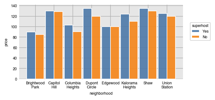
Like all the `_order` parameters, `split_order` defaults to `'asc'` (alphabetical) order. Set it to `'desc'` for the opposite.
```python
dxp.bar(x='neighborhood', y='price', data=airbnb, aggfunc='median',
split='property_type', split_order='desc')
```
Filtering for the most/least frequent split categories is possible.
```python
dxp.bar(x='neighborhood', y='price', data=airbnb, aggfunc='median',
split='property_type', split_order='bottom 2')
```
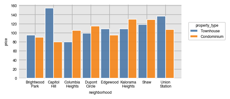
Verifying that the least frequent property types are Townhouse and Condominium.
```python
airbnb['property_type'].value_counts()
```
Apartment 2403
House 877
Townhouse 824
Condominium 477
Name: property_type, dtype: int64
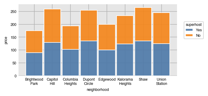
### Stacked bar charts
Stack all the split groups one on top of the other by setting `stacked` to `True`.
```python
dxp.bar(x='neighborhood', y='price', data=airbnb, aggfunc='median',
split='superhost', split_order=['Yes', 'No'], stacked=True)
```
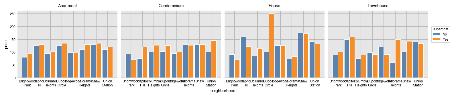
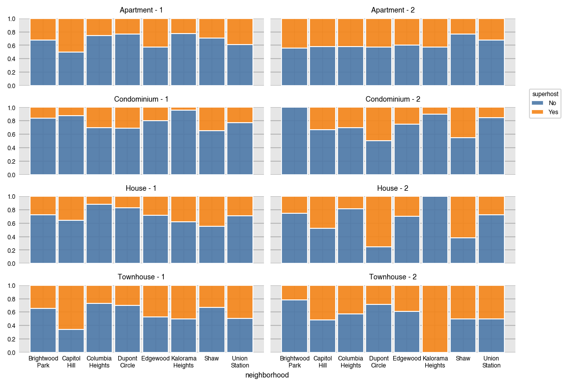
### Split into multiple plots
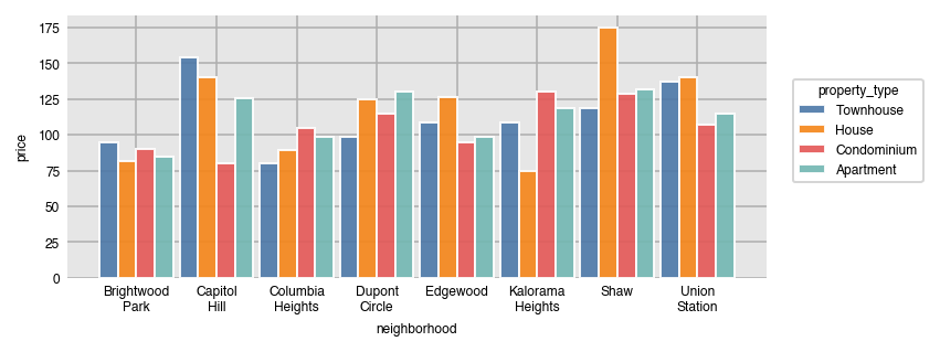
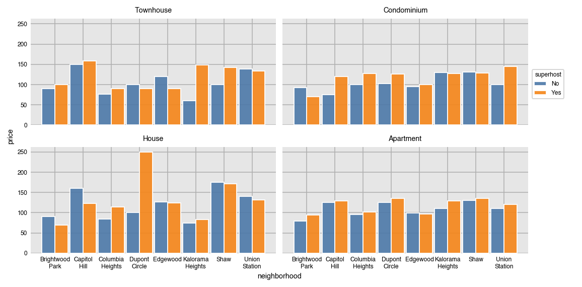
It's possible to split the data further into separate plots by the unique values in a different column with the `row` and `col` parameters. Here, each kind of `property_type` has its own plot.
```python
dxp.bar(x='neighborhood', y='price', data=airbnb, aggfunc='median',
split='superhost', col='property_type')
```
If there isn't room for all of the plots, set the `wrap` parameter to an integer to set the maximum number of plots per row/col. We also specify the `col_order` to be descending alphabetically.
```python
dxp.bar(x='neighborhood', y='price', data=airbnb, aggfunc='median',
split='superhost', col='property_type', wrap=2, col_order='desc')
```
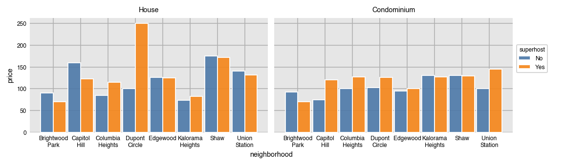
Use `col_order` to both filter and set a specific order for the plots.
```python
dxp.bar(x='neighborhood', y='price', data=airbnb, aggfunc='median',
split='superhost', col='property_type', col_order=['House', 'Condominium'])
```
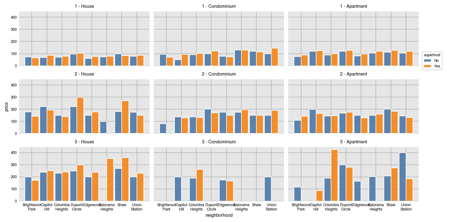
Splits can be made simultaneously along row and columns.
```python
dxp.bar(x='neighborhood', y='price', data=airbnb, aggfunc='median', split='superhost',
col='property_type', col_order=['House', 'Condominium', 'Apartment'],
row='bedrooms', row_order=[1, 2, 3])
```
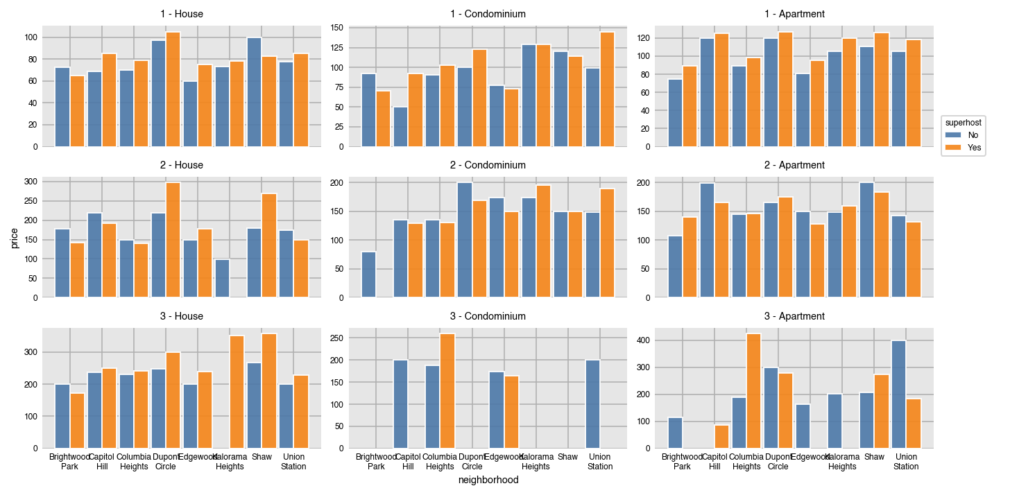
By default, all axis limits are shared. Allow each plot to set its own limits by setting `sharex` and `sharey` to `False`.
```python
dxp.bar(x='neighborhood', y='price', data=airbnb, aggfunc='median', split='superhost',
col='property_type', col_order=['House', 'Condominium', 'Apartment'],
row='bedrooms', row_order=[1, 2, 3], sharey=False)
```
### Set the width of each bar with `size`
The width (height when horizontal) of the bars is set with the `size` parameter. By default, this value is .9. Think of this number as the relative width of all the bars for a particular x/y value, where 1 is the distance between each x/y value.
```python
dxp.bar(x='neighborhood', y='price', data=airbnb,
aggfunc='median', split='property_type',
split_order=['Apartment', 'House'],
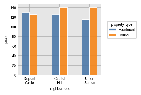
x_order=['Dupont Circle', 'Capitol Hill', 'Union Station'], size=.5)
```
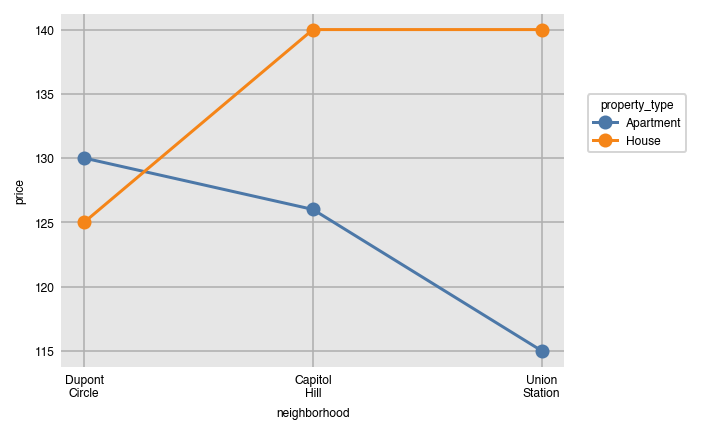
### Splitting line plots
All the other aggregating plots work similarly.
```python
dxp.line(x='neighborhood', y='price', data=airbnb,
aggfunc='median', split='property_type',
split_order=['Apartment', 'House'],
x_order=['Dupont Circle', 'Capitol Hill', 'Union Station'])
```
## Distribution plots - box, violin, histogram, kde
Distribution plots work similarly, but do not have an `aggfunc` since they do not aggregate. They take their group of values and draw some kind of shape that gives information on how that variable is distributed.
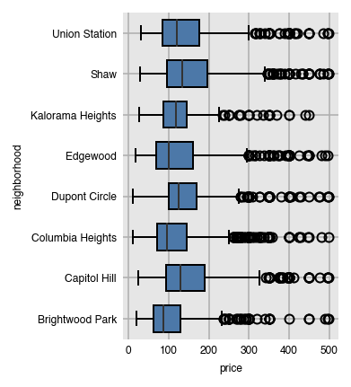
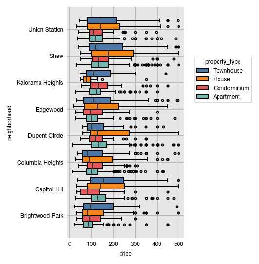
### Box plots
Box plots have colored boxes with ends at the first and third quartiles and a line at the median. The whiskers are placed at 1.5 times the difference between the third and first quartiles (Interquartile range (IQR)). Fliers are the points outside this range and plotted individually. By default, both box and violin plots are plotted horizontally.
```python
dxp.box(x='price', y='neighborhood', data=airbnb)
```
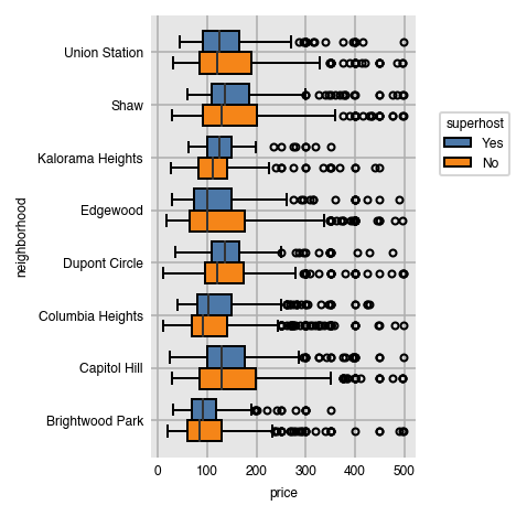
Split the groups in the same manner as with the aggregation plots.
```python
dxp.box(x='price', y='neighborhood', data=airbnb,
split='superhost', split_order=['Yes', 'No'])
```
Order the appearance of the splits alphabetically (in descending order here).
```python
dxp.box(x='price', y='neighborhood', data=airbnb,
split='property_type', split_order='desc')
```
### Filter range of values with `x_order`
It's possible to filter the range of possible values by passing in a list of the minimum and maximum to `x_order`.
```python
dxp.box(x='price', y='neighborhood', data=airbnb,
split='superhost', x_order=[50, 250])
```
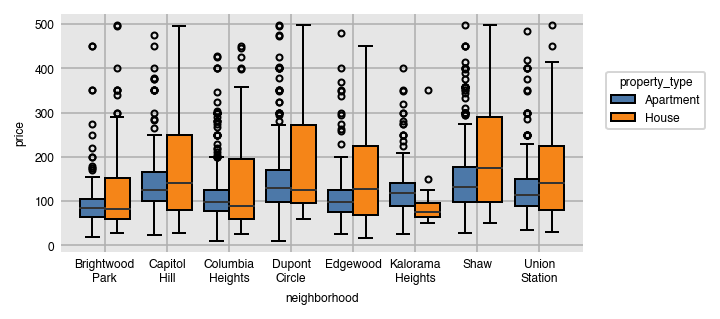
Change the `x` and `y` while setting `orientation` to make vertical bar plots.
```python
dxp.box(x='neighborhood', y='price', data=airbnb, orientation='v',
split='property_type', split_order='top 2')
```
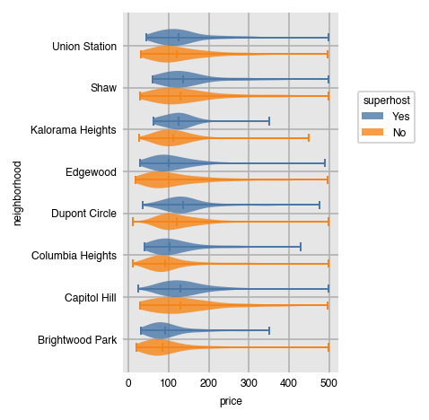
Violin plots work identically to box plots, but show "violins", kernel density plots duplicated on both sides of a line.
```python
dxp.violin(x='price', y='neighborhood', data=airbnb,
split='superhost', split_order=['Yes', 'No'])
```
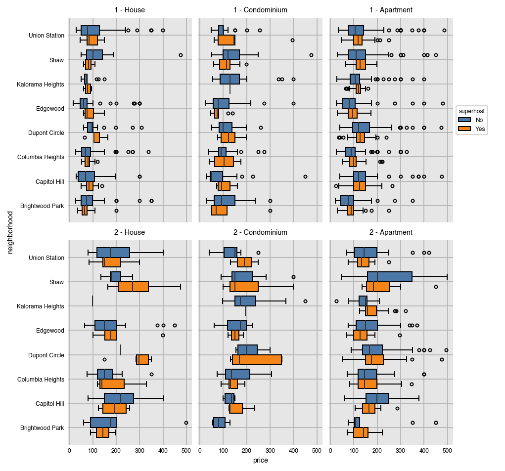
Splitting by rows and columns is possible as well with distribution plots.
```python
dxp.box(x='price', y='neighborhood', data=airbnb,split='superhost',
col='property_type', col_order=['House', 'Condominium', 'Apartment'],
row='bedrooms', row_order=[1, 2])
```
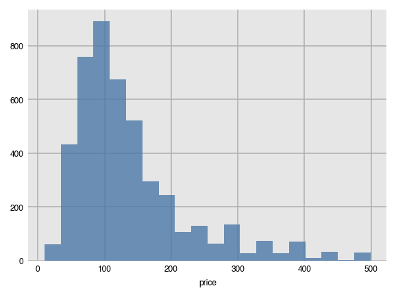
### Histograms
Histograms work in a slightly different manner. Instead of passing both `x` and `y`, you give it a single numeric column. A vertical histogram with 20 bins of the counts is created by default.
```python
dxp.hist(val='price', data=airbnb)
```
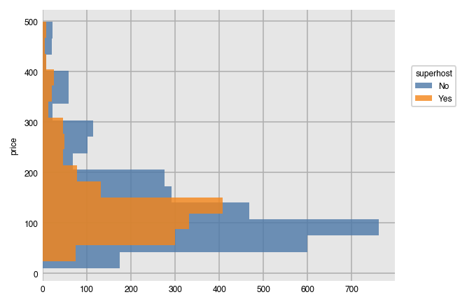
We can use `split` just like we did above and also create horizontal histograms.
```python
dxp.hist(val='price', data=airbnb, orientation='h', split='superhost', bins=15)
```
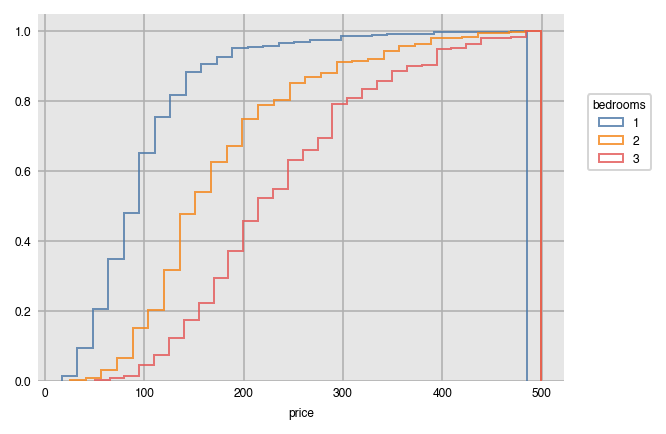
Here, we customize our histogram by plotting the cumulative density as opposed to the raw frequency count using the outline of the bars ('step').
```python
dxp.hist(val='price', data=airbnb, split='bedrooms', split_order=[1, 2, 3],
bins=30, density=True, histtype='step', cumulative=True)
```
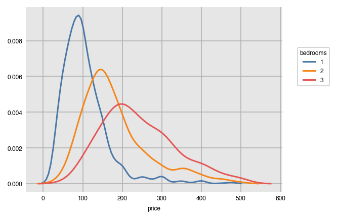
### KDE Plots
Kernel density estimates provide an estimate for the probability distribution of a continuous variable. Here, we examine how price is distributed by bedroom.
```python
dxp.kde(x='price', data=airbnb, split='bedrooms', split_order=[1, 2, 3])
```
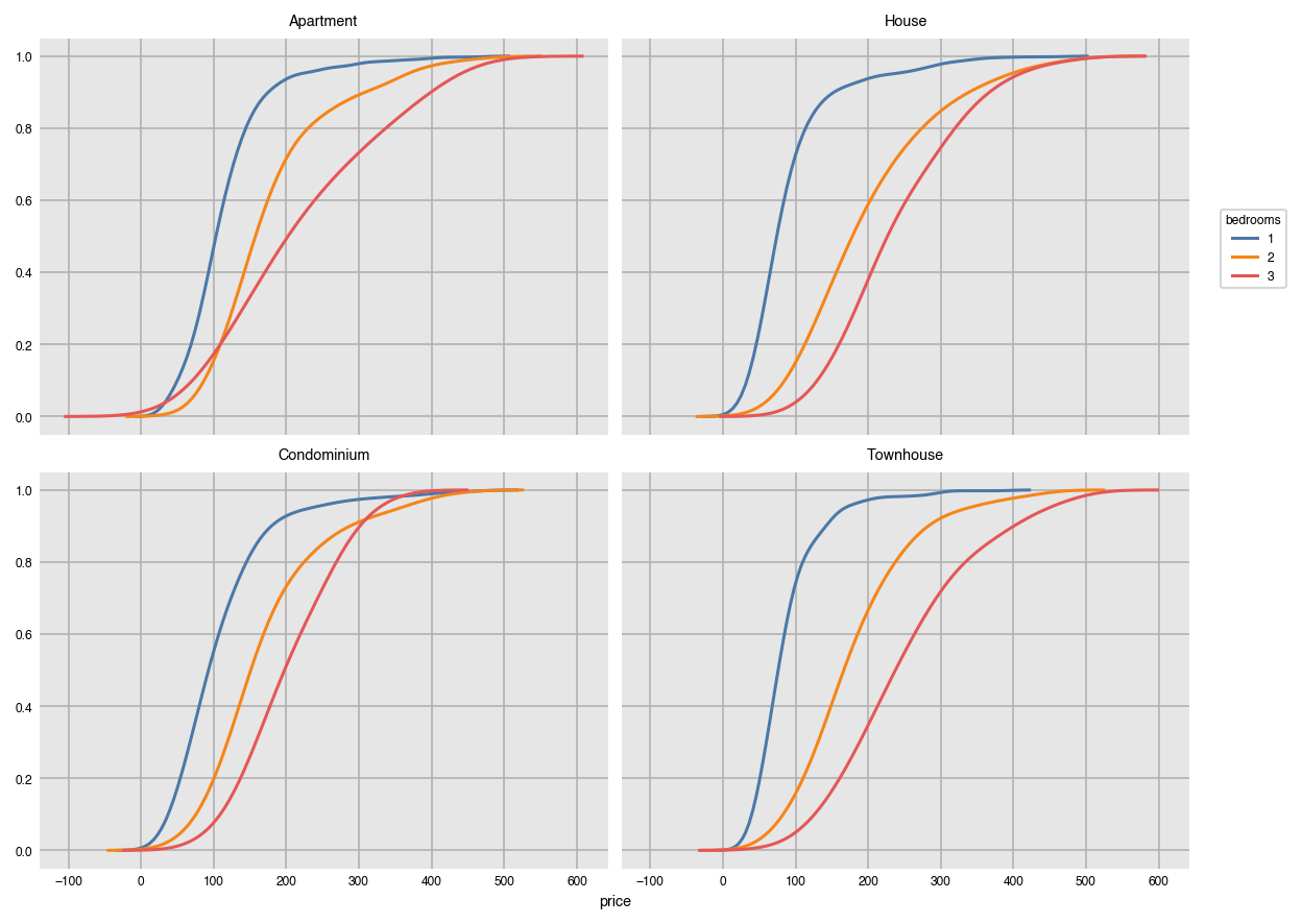
Graph the cumulative distribution instead on multiple plots.
```python
dxp.kde(x='price', data=airbnb, split='bedrooms',
split_order=[1, 2, 3], cumulative=True, col='property_type', wrap=2)
```
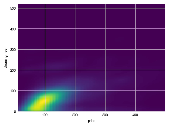
### Two-dimensional KDE's
Provide two numeric columns to `x` and `y` to get a two dimensional KDE.
```python
dxp.kde(x='price', y='cleaning_fee', data=airbnb)
```
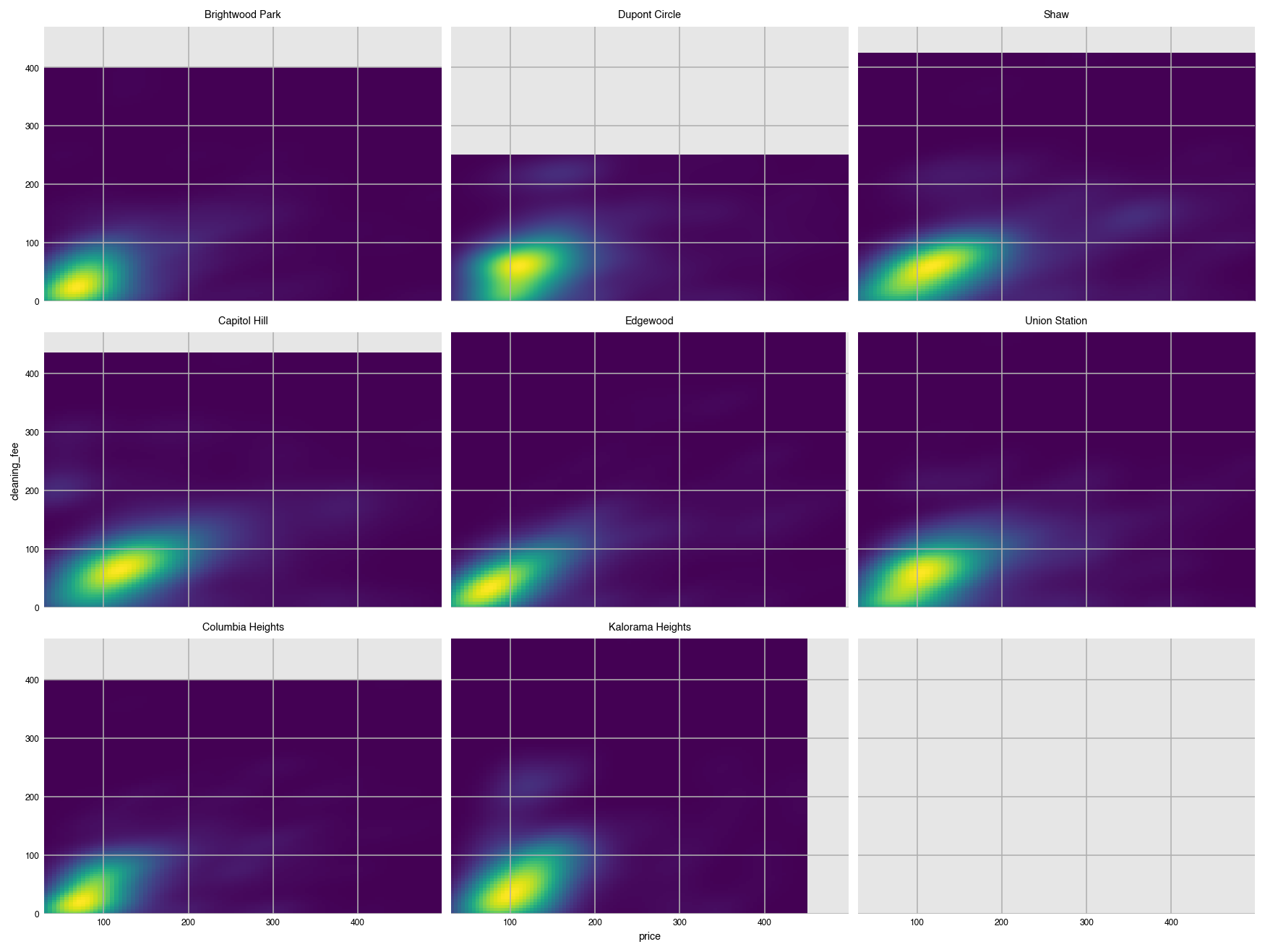
Create a grid of two-dimensional KDE's.
```python
dxp.kde(x='price', y='cleaning_fee', data=airbnb, row='neighborhood', wrap=3)
```
## Count plots
The `count` function graphs the frequency of unique values as bars. By default, it plots the values in descending order.
```python
dxp.count(val='neighborhood', data=airbnb)
```
In pandas, this is a straightforward call to the `value_counts` method.
```python
airbnb['neighborhood'].value_counts()
```
Columbia Heights 773
Union Station 713
Capitol Hill 654
Edgewood 610
Dupont Circle 549
Shaw 514
Brightwood Park 406
Kalorama Heights 362
Name: neighborhood, dtype: int64
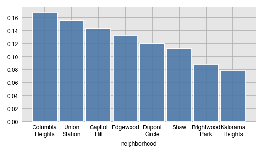
### Relative frequency with `normalize`
Instead of the raw counts, get the relative frequency by setting normalize to `True`.
```python
dxp.count(val='neighborhood', data=airbnb, normalize=True)
```
Here, we split by property type.
```python
dxp.count(val='neighborhood', data=airbnb, split='property_type')
```
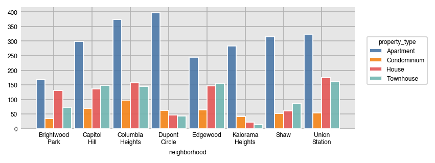
In pandas, this is done with the `crosstab` function.
```python
pd.crosstab(index=airbnb['property_type'], columns=airbnb['neighborhood'])
```
neighborhood
Brightwood Park
Capitol Hill
Columbia Heights
Dupont Circle
Edgewood
Kalorama Heights
Shaw
Union Station
property_type
Apartment
167
299
374
397
244
284
315
323
Condominium
35
70
97
62
65
42
52
54
House
131
137
157
47
146
23
61
175
Townhouse
73
148
145
43
155
13
86
161
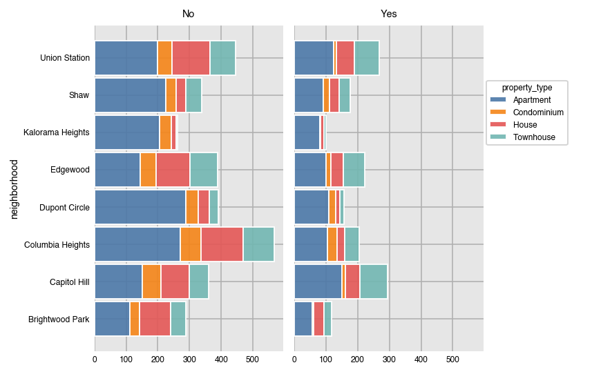
Horizontal stacked count plots.
```python
dxp.count(val='neighborhood', data=airbnb, split='property_type',
orientation='h', stacked=True, col='superhost')
```
### Normalize over different variables
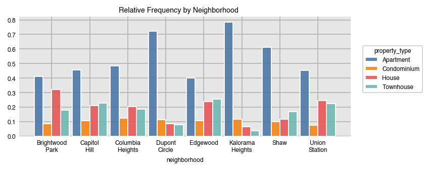
Setting `normalize` to `True`, returns the relative frequency with respect to all of the data. You can normalize over any of the variables provided.
```python
dxp.count(val='neighborhood', data=airbnb, split='property_type', normalize='neighborhood',
title='Relative Frequency by Neighborhood')
```
Normalize over several variables at once with a list.
```python
dxp.count(val='neighborhood', data=airbnb, split='superhost',
row='property_type', col='bedrooms', col_order=[1, 2],
normalize=['neighborhood', 'property_type', 'bedrooms'], stacked=True)
```
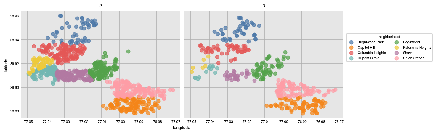
## Wide data
Dexplot can also plot wide data, or data where no aggregation happens. Here is a scatter plot of the location of each listing.
```python
dxp.scatter(x='longitude', y='latitude', data=airbnb,
split='neighborhood', col='bedrooms', col_order=[2, 3])
```
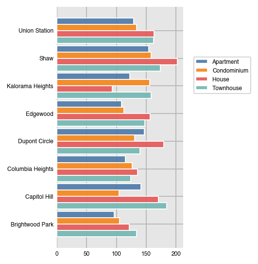
If you've already aggregated your data, you can plot it directly without specifying `x` or `y`.
```python
df = airbnb.pivot_table(index='neighborhood', columns='property_type',
values='price', aggfunc='mean')
df
```
property_type
Apartment
Condominium
House
Townhouse
neighborhood
Brightwood Park
96.119760
105.000000
121.671756
133.479452
Capitol Hill
141.210702
104.200000
170.153285
184.459459
Columbia Heights
114.676471
126.773196
135.292994
124.358621
Dupont Circle
146.858942
130.709677
179.574468
139.348837
Edgewood
108.508197
112.846154
156.335616
147.503226
Kalorama Heights
122.542254
155.928571
92.695652
158.230769
Shaw
153.888889
158.500000
202.114754
173.279070
Union Station
128.458204
133.833333
162.748571
162.167702
```python
dxp.bar(data=df, orientation='h')
```
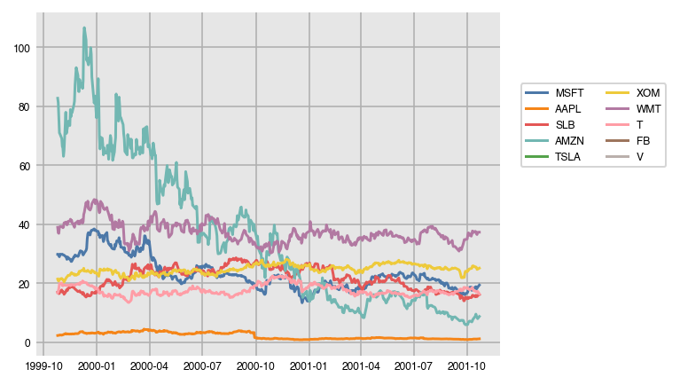
### Time series
```python
stocks = pd.read_csv('../data/stocks10.csv', parse_dates=['date'], index_col='date')
stocks.head()
```
MSFT
AAPL
SLB
AMZN
TSLA
XOM
WMT
T
FB
V
date
1999-10-25
29.84
2.32
17.02
82.75
NaN
21.45
38.99
16.78
NaN
NaN
1999-10-26
29.82
2.34
16.65
81.25
NaN
20.89
37.11
17.28
NaN
NaN
1999-10-27
29.33
2.38
16.52
75.94
NaN
20.80
36.94
18.27
NaN
NaN
1999-10-28
29.01
2.43
16.59
71.00
NaN
21.19
38.85
19.79
NaN
NaN
1999-10-29
29.88
2.50
17.21
70.62
NaN
21.47
39.25
20.00
NaN
NaN
```python
dxp.line(data=stocks.head(500))
```