Ecosyste.ms: Awesome
An open API service indexing awesome lists of open source software.
https://github.com/dg-product-design/component-library
A reusable NPM component library built with React, Typescript, Tailwind, and Storybook
https://github.com/dg-product-design/component-library
npm react storybook tailwind typescript
Last synced: about 1 month ago
JSON representation
A reusable NPM component library built with React, Typescript, Tailwind, and Storybook
- Host: GitHub
- URL: https://github.com/dg-product-design/component-library
- Owner: DG-Product-Design
- Created: 2022-09-27T18:14:32.000Z (over 2 years ago)
- Default Branch: master
- Last Pushed: 2022-10-02T22:08:36.000Z (over 2 years ago)
- Last Synced: 2024-12-25T11:32:13.289Z (about 2 months ago)
- Topics: npm, react, storybook, tailwind, typescript
- Language: CSS
- Homepage:
- Size: 4.7 MB
- Stars: 0
- Watchers: 1
- Forks: 0
- Open Issues: 0
-
Metadata Files:
- Readme: README.md
- Changelog: CHANGELOG.md
Awesome Lists containing this project
README
## Purpose of project
This project seeks to maintain UI components for a React app and their documentation.
The main purpose of this component library is to:
* Improve the developer experience by eliminating need to write CSS, with some exceptions
* Increase developer momentum by growing the library over time
* Maintain brand and style consistency across all digital products
* Keep all components documented
* Allow for both visual and functional testing via Storybook Tests
## Running the app
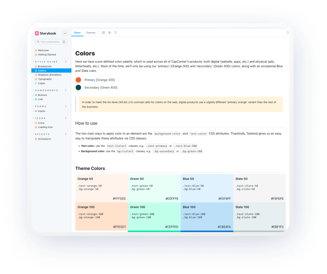
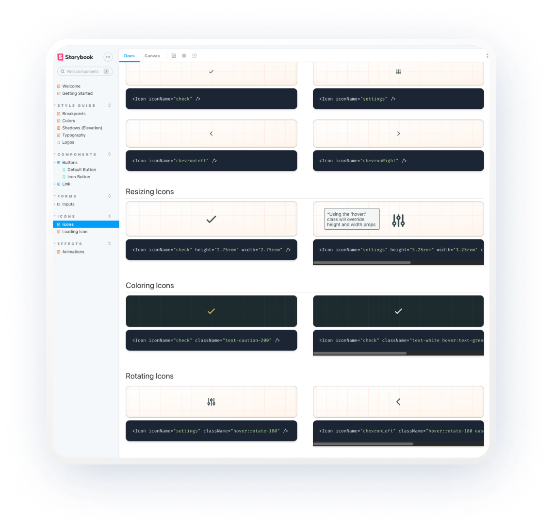
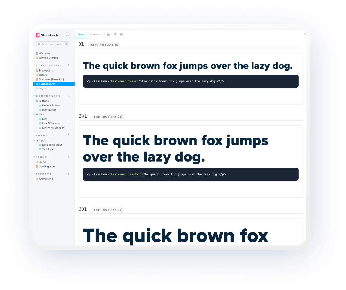
This app does not run like most React apps. Instead, this application exports its components and displays documentation via Storybook.
To view the Storybook documentation, perform the following steps:
1. Clone project from Github
1. Navigate to project's root directory in your terminal (ex: `~username/repos/componentLibrary/`)
1. Install node_modules dependencies: `npm i` or `yarn install`
1. Initialize Storybook: `npx storybook init`
1. Run Storybook: `npm run storybook` or `yarn storybook`
## Testing components
Storybook comes with it's own instrumented testing library built on Jest. This enables us to write tests which perform directly in the browser rather than strictly on the command-line.
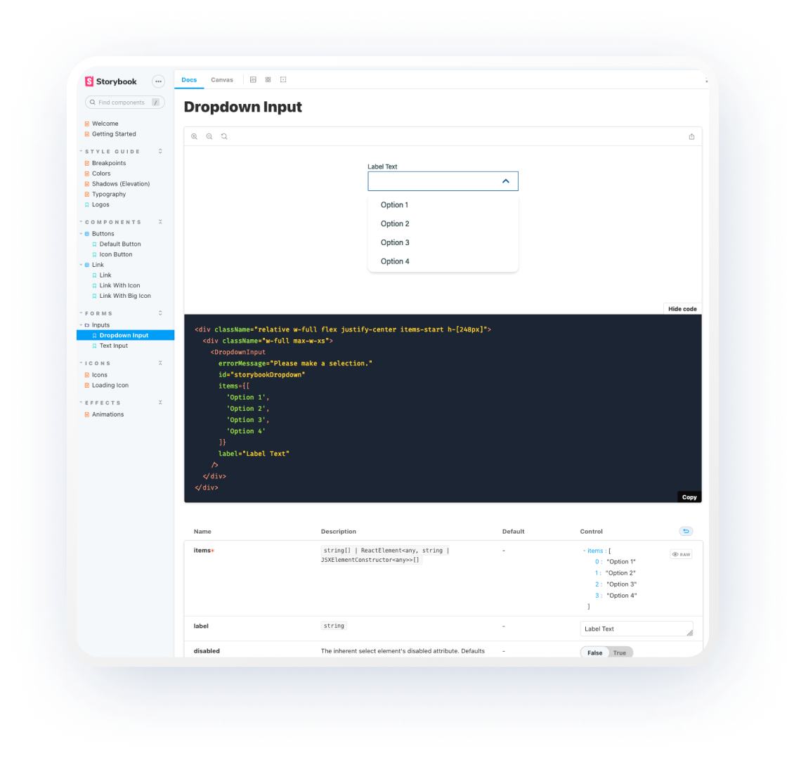
To view a functional test for the Dropdown Input component:
1. Start the Storybook app
1. Navigate to the `Dropdown Input` component (Forms > Inputs > Dropdown Input)
1. Make sure the 'Canvas' tab is selected in the top-left of the preview pane
1. Notice the controls that are now present on the screen. Find the right-most tab called 'Interactions' and select it. Here you will see a breakdown of the tests and a pass/fail readout, along with an error console when errors are present.
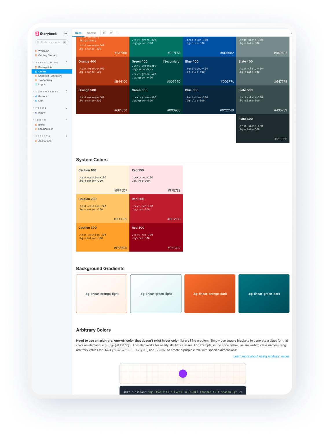
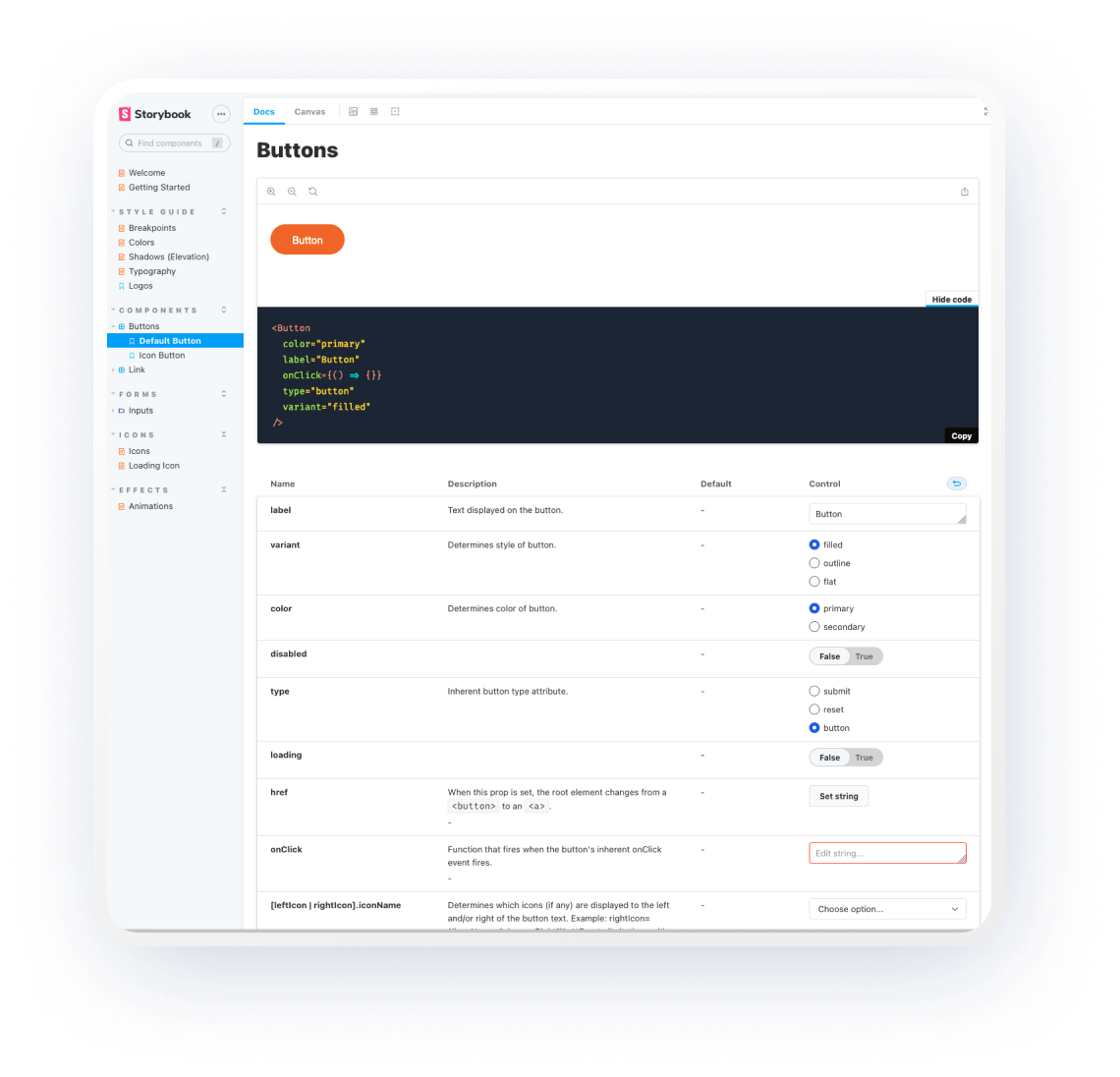
## Screenshots
