https://github.com/digrich/bubblechart-panel
Bubble chart panel for grafana monitoring system.
https://github.com/digrich/bubblechart-panel
bubble-chart d3js dashboard grafana grafana-panel metrics monitoring timeseries tsdb visualization
Last synced: about 1 year ago
JSON representation
Bubble chart panel for grafana monitoring system.
- Host: GitHub
- URL: https://github.com/digrich/bubblechart-panel
- Owner: digrich
- License: apache-2.0
- Created: 2017-06-30T22:08:43.000Z (almost 9 years ago)
- Default Branch: master
- Last Pushed: 2025-03-29T06:36:01.000Z (about 1 year ago)
- Last Synced: 2025-03-29T07:26:42.645Z (about 1 year ago)
- Topics: bubble-chart, d3js, dashboard, grafana, grafana-panel, metrics, monitoring, timeseries, tsdb, visualization
- Language: TypeScript
- Size: 21.8 MB
- Stars: 8
- Watchers: 2
- Forks: 10
- Open Issues: 13
-
Metadata Files:
- Readme: README.md
- Changelog: CHANGELOG.md
- License: LICENSE
Awesome Lists containing this project
README
# Bubble Chart Panel for Grafana
[](https://grafana.com/grafana/plugins/digrich-bubblechart-panel/)
[](https://grafana.com/grafana/plugins/digrich-bubblechart-panel)
[](LICENSE)
[](https://snyk.io/test/github/digrich/bubblechart-panel)
## Overview
This panel is designed to provide a centralized view of any component in the form of a bubble chart. Circles are grouped together into clusters based on tag values, and the size and color of each circle represent the aggregated value of time series data.
This plugin uses a D3-based library to create a bubble chart. It supports autoscaling to readjust its size according to the panel size. If the labels are too long, they will be disabled, and only a tooltip will be shown.
## Requirements
The plugin is compatible with Grafana 10 and above.
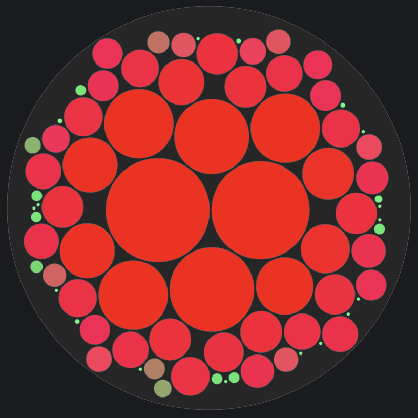
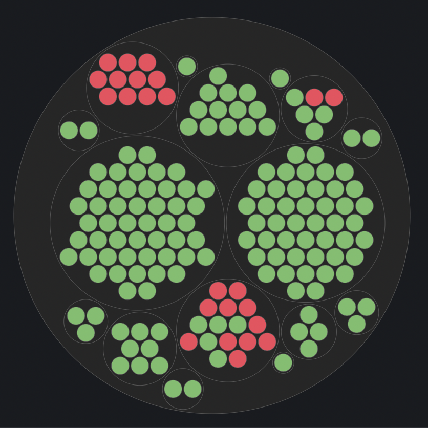
## Screenshots
| 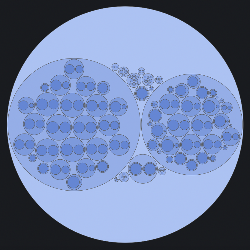 |  | 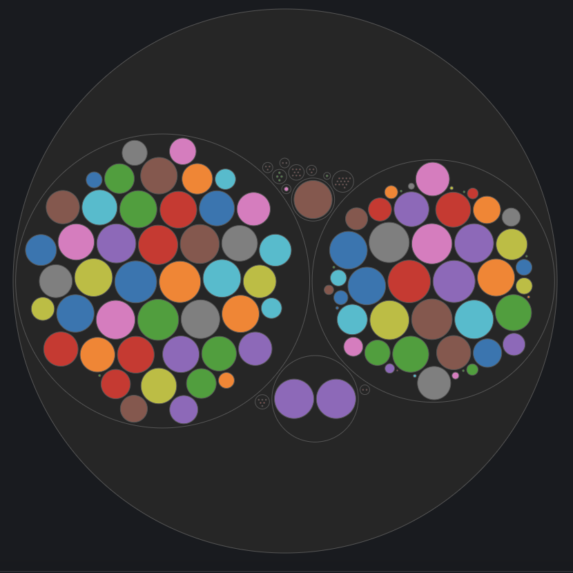
|:--:|:--:|:--:|
| Group color scheme | Gradient color scheme | Unique color scheme |
| 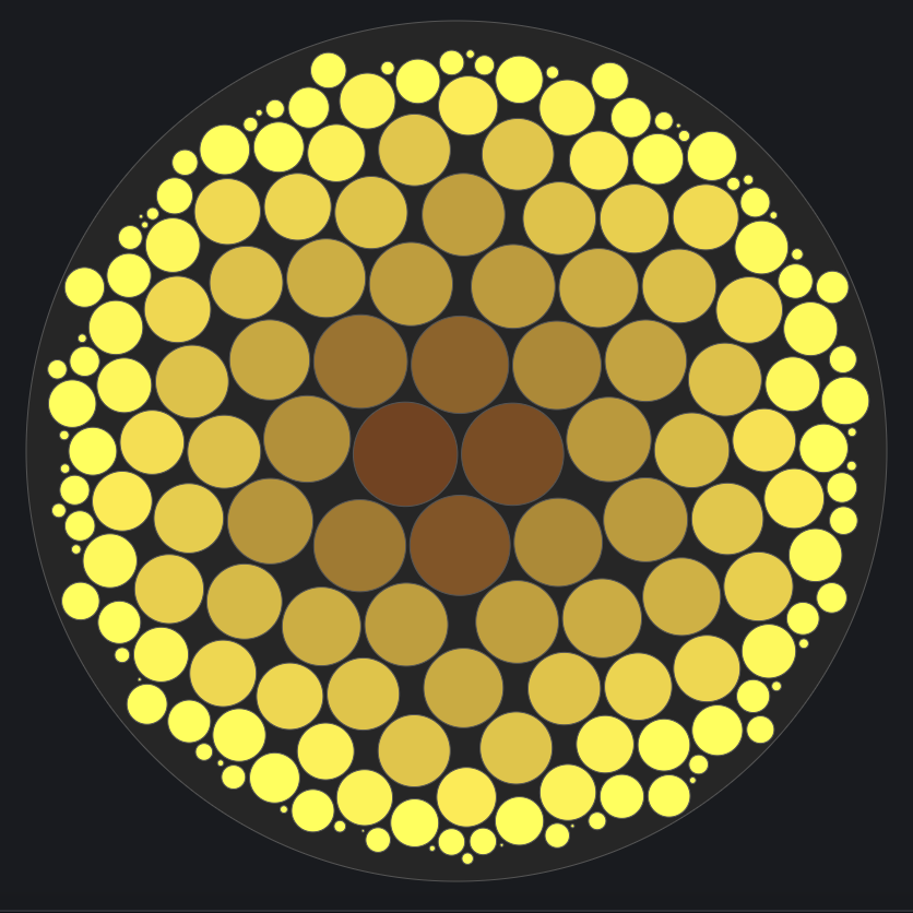 |  | 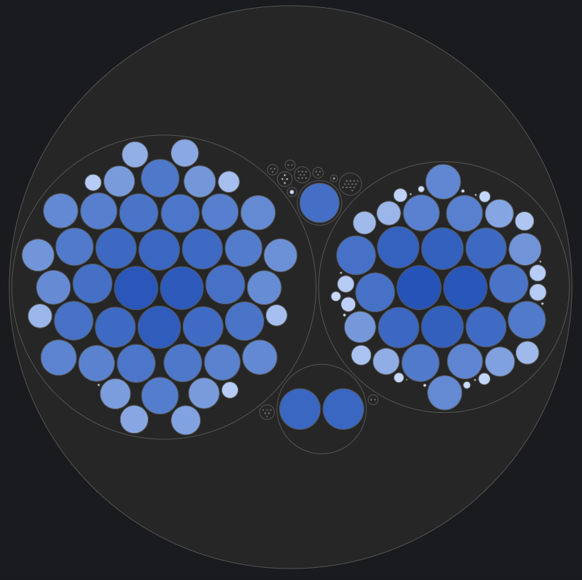 |
|:--:|:--:|:--:|
| Gradient color scheme | Threshold color scheme | Gradient color scheme |
## Grouping
This panel provides two options for grouping circles: 'Name' and 'Label.' When selecting the 'Name' option, utilize the group separator (default: comma) to split names and establish hierarchical grouping based on data naming conventions. In the datasource query, use aliases with different tag names separated by the configurable group separator to determine the hierarchy order. This dynamic feature allows you to control the organization of circles on the chart by adjusting the order of tag names in the alias. For instance, if your data involves both data centers and hosts, and your alias is structured as $tag_dc,$tag_host, the chart will automatically group all host circles under the data center circle.
Alternatively, when the 'Label' option is selected, use the dropdown menu to select labels and customize the grouping order. This flexibility is particularly useful when dealing with series that do not have a name or alias defined properly, providing better control over circle organization on the chart.
To handle non-time series formatted data, first, convert it to a multiple series format using Grafana's 'Partition by values' transformation. In the chart options, select the 'Group by' option as 'Label' and choose appropriate labels; it will parse the data properly.
## Options
### Bubble chart settings
###
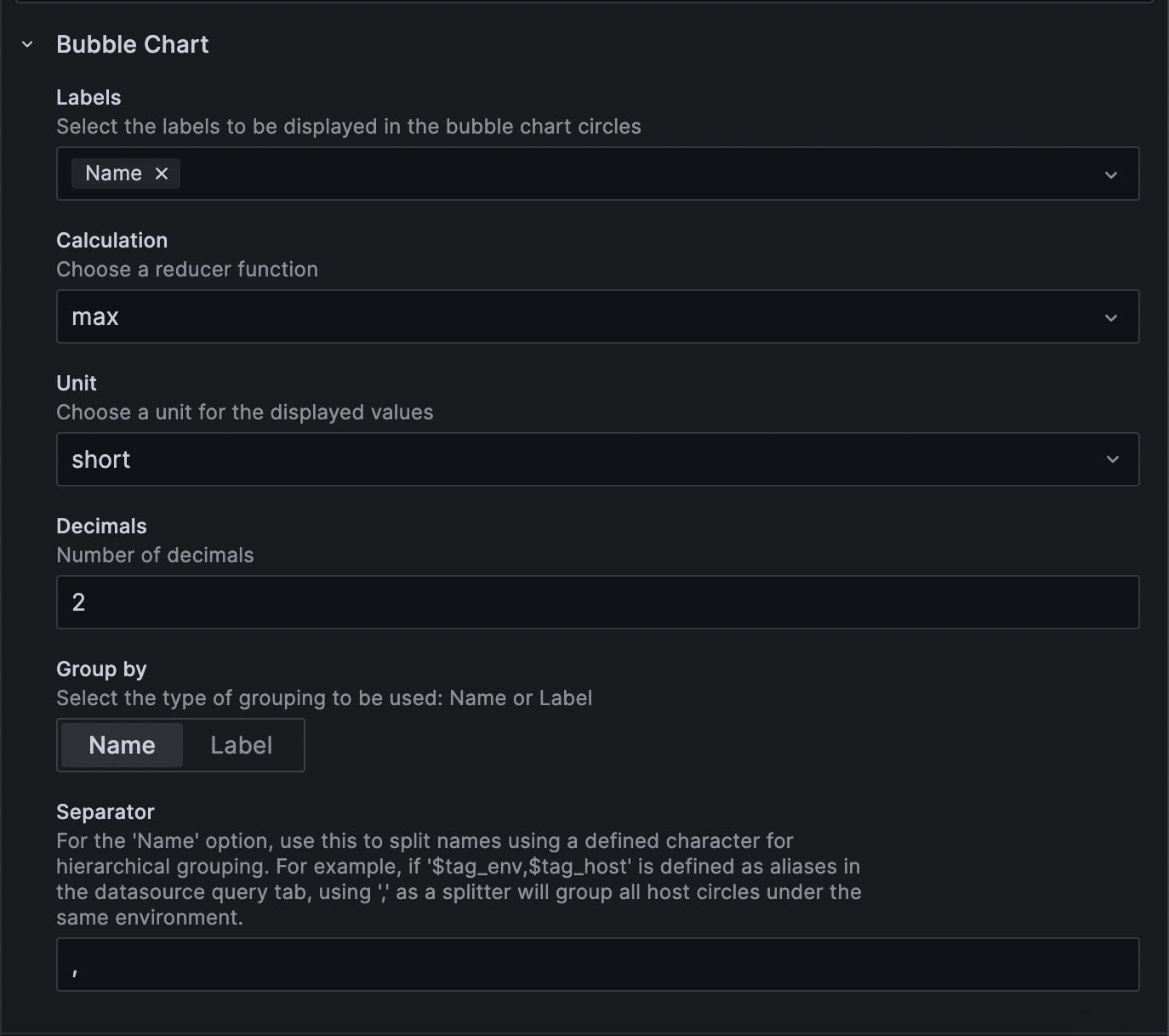
* Labels - Select the labels to be displayed in the bubble chart circles.
* Calculation - Reducer functions to aggregtaed the data.
* Unit - Unit to be displayed.
* Decimals - Number of decimals to be displayed.
* Group Separator - Tag values separator in Alias for grouping.
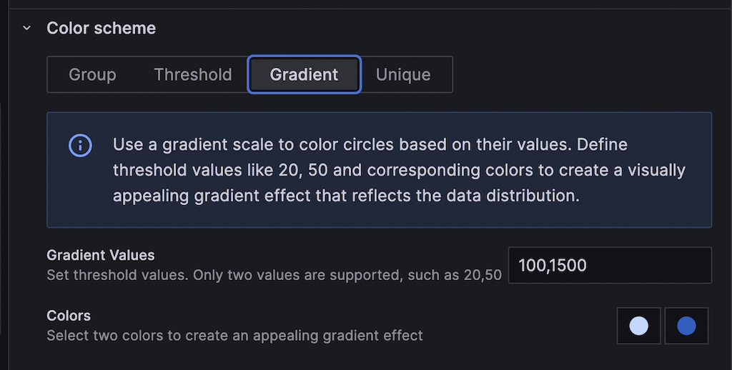
### Color scheme
* Multiple color schemes.
* Group - In the grouping scheme, circles are colored according to their group hierarchy.
* Colors - The start and end range of colors for the group hierarchy.
* Threshold - In the threshold scheme, circles are colored based on threshold values.
* Thresholds - Threshold values.
* Colors - Colors are applied for different threshold values.
* Gradient - In the gradient scheme, circles are colored based on component values.
* Thresholds - Threshold values.
* Colors - The start and end range of colors for the gradient scale.
* Unique - In the unique scheme, different colors are applied to individual circles.
### Compatibility
Tested against the following databases:
* [InfluxDB](https://www.influxdata.com/)
* [OpenTSDB](http://opentsdb.net/)
* [Bosun](http://bosun.org/)
* [MySQL](http://docs.grafana.org/features/datasources/mysql/#using-mysql-in-grafana)
* For MySQL, utilize the CONCAT function in the SQL expression for the metric field to achieve multiple group hierarchies. Example SQL expression:
```sql
SELECT
UNIX_TIMESTAMP(date) as time_sec,
amt as value,
CONCAT(server, ',', org) as metric
FROM trade
WHERE $__timeFilter(date)
ORDER BY date ASC
```
This approach is expected to be working to other databases as well.
## Building
This plugin relies on [Plugin Tools](https://github.com/grafana/plugin-tools). The typical build sequence is as follows:
```BASH
npm install
npm run build
```
For development, you can run:
```BASH
npm run dev
```
### Docker Support
For convenient development and testing, you can simply execute the following command using the included docker-compose.yml file:
```BASH
docker-compose up
```
Then browse to
## Upgrade Implications
### Changes in D3 Pack Layout Symmetry
In the latest version of D3, the pack layout symmetry has been updated to accommodate a greater number of circles. Users migrating from the Angular version (v1.*.*) of this plugin may observe differences in their layout. Previously, D3 organized circles in a spiral form, but now it packs circles more densely, enhancing the overall arrangement.