https://github.com/dino977/operation-vessel
A vessel for holding table operation items. When operations exceed a certain number, the excess is placed separately in the [el-dropdown]
https://github.com/dino977/operation-vessel
component element-ui javascript jsx-renderer vue2
Last synced: 10 days ago
JSON representation
A vessel for holding table operation items. When operations exceed a certain number, the excess is placed separately in the [el-dropdown]
- Host: GitHub
- URL: https://github.com/dino977/operation-vessel
- Owner: Dino977
- Created: 2024-07-25T09:49:35.000Z (10 months ago)
- Default Branch: main
- Last Pushed: 2024-08-14T09:23:41.000Z (9 months ago)
- Last Synced: 2025-02-01T01:33:04.241Z (4 months ago)
- Topics: component, element-ui, javascript, jsx-renderer, vue2
- Language: JavaScript
- Homepage:
- Size: 228 KB
- Stars: 0
- Watchers: 1
- Forks: 0
- Open Issues: 0
-
Metadata Files:
- Readme: README.md
Awesome Lists containing this project
README
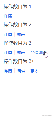


> A vessel for holding table operation items.

It will stay with Vue 2.x and Element-UI

## Pre-Demand

If you use [On Demand](https://element.eleme.cn/2.14/#/en-US/component/quickstart#on-demand) for Element-UI, make sure to import the following components:

- Divider

- Link

- Dropdown

- DropdownMenu

- DropdownItem

- Icon

## Install

```bash

npm install operation-vessel

```

## Quick Start

```javascript

/* main.js */

import OperationVessel from "operation-vessel";

Vue.use(OperationVessel);

```

```html

  Detail

  Edit

  Delete

  State Change

```

## Attributes

| Attribute           | Description                                                  | Type    | Accepted values                                              | Default            |

| :------------------ | :----------------------------------------------------------- | :------ | :----------------------------------------------------------- | :----------------- |

| boundary            | Boundary value of the more button appears                    | number  | ≥2                                                           | 3                  |

| trigger             | how to trigger                                               | string  | hover / click                                                | hover              |

| more-title          | Name of the more button                                      | string  | —                                                            | more               |

| more-icon           | Name of the icon to the right of the more button             | string  | [Element-UI icons](https://element.eleme.cn/#/en-US/component/icon) | el-icon-arrow-down |

| more-icon-visible   | Visibility of the icon                                       | boolean | —                                                            | false              |

| dropdown-attributes | Attributes of the [drop-down](https://element.eleme.cn/#/en-US/component/dropdown#dropdown-attributes) | object  | —                                                            | —                  |

| dropdown-menu-class | Name of the drop-down menu                                   | string  | —                                                            | —                  |

## Slot

| name    | Description                |

| ------- | -------------------------- |

| —       | Content of operation items |

| divider | Content of the divider     |

| moreBtn | Content of the more button |

## Extra Operation

If you use [Custom Directives](https://v2.vuejs.org/v2/guide/custom-directive.html) to control the display of operation items, you can try setting `$FILTER`

- It is a **function** which has two parameters. They are `node` and `directives`

- If **true** is returned, the operation item is **displayed**. Reverse hiding

If you want to adjust the default of props, you can try setting `$ATTRIBUTES`

- If the value of the **default** is **Object**, using function return values, such as `() => ({ xxx: xxx })`

```javascript

/* main.js */

import OperationVessel from "operation-vessel";

Vue.use(OperationVessel, {

  $FILTER: (node, directives) => {

    if (xxx) return false

    return true

  },

  $ATTRIBUTES: {

    moreTitle: "更多"

    dropdownAttributes: () => ({ trigger: 'click' })

  }

});

```