https://github.com/dirkster99/numericupdownlib
Implements numeric up down WPF controls to edit/display values (byte, integer, short, ushort etc.) with a textbox and optional up/down arrow (repeat) buttons. Value editing is possible by dragging the mouse vertically/horizontally, clicking up/down buttons, using up/down or left right cursor keys, spinning mousewheel on mouseover, or editing the textbox.
https://github.com/dirkster99/numericupdownlib
control css dark-theme dotnet library light light-theme mouse-drag-mode nuget-package numeric numericupdown repeat theme themes theming ui ui-components updown wpf-controls
Last synced: about 1 year ago
JSON representation
Implements numeric up down WPF controls to edit/display values (byte, integer, short, ushort etc.) with a textbox and optional up/down arrow (repeat) buttons. Value editing is possible by dragging the mouse vertically/horizontally, clicking up/down buttons, using up/down or left right cursor keys, spinning mousewheel on mouseover, or editing the textbox.
- Host: GitHub
- URL: https://github.com/dirkster99/numericupdownlib
- Owner: Dirkster99
- License: mit
- Created: 2017-08-02T15:12:45.000Z (almost 9 years ago)
- Default Branch: master
- Last Pushed: 2023-07-09T04:36:05.000Z (almost 3 years ago)
- Last Synced: 2025-03-25T23:24:31.041Z (over 1 year ago)
- Topics: control, css, dark-theme, dotnet, library, light, light-theme, mouse-drag-mode, nuget-package, numeric, numericupdown, repeat, theme, themes, theming, ui, ui-components, updown, wpf-controls
- Language: C#
- Homepage:
- Size: 428 KB
- Stars: 83
- Watchers: 6
- Forks: 15
- Open Issues: 9
-
Metadata Files:
- Readme: Readme.md
- License: License.md
Awesome Lists containing this project
README
[](https://ci.appveyor.com/project/Dirkster99/numericupdownlib)
[](https://github.com/Dirkster99/NumericUpDownLib/releases/latest)
[](http://nuget.org/packages/Dirkster.NumericUpDownLib)
 
# Overview
## Fixes and Features Added in Version 3.4
- [#55 Bugfix: Format-Text must return parsed value, else value in textbox will be overwritten with "LastEditingNumericValue" if "IsUpdateValueWhenLostFocus" is enabled on lost focus](https://github.com/Dirkster99/NumericUpDownLib/pull/55)
- [#56 Feature optionally disable mouse wheel](https://github.com/Dirkster99/NumericUpDownLib/pull/56)
This release has been authored by [Jürgen Holzer](https://github.com/jholzer) :pray:
## Fixes and Features Added in Version 3.3.1
- [#54 LastEditingNumericValue should be as same as Value when ValueChanged](https://github.com/Dirkster99/NumericUpDownLib/pull/54)
This release has been authored by [heartacker](https://github.com/heartacker) :pray:
## Fixes and Features Added in Version 3.3
### Bug Fixes
- [#53 Fixes "FormatString not working with custom texts", "Control not scaling correctly with HorizontalAlignment set to 'Stretch'"](https://github.com/Dirkster99/NumericUpDownLib/pull/53)
This release has been authored by [Jürgen Holzer](https://github.com/jholzer) :pray:
## Fixes and Features Added in Version 3.3
### Bug Fixes
- [Add AbstractBaseUpDown MinWidth virtual property](https://github.com/Dirkster99/NumericUpDownLib/pull/49)
- [do not adjust the control panel length when use mouse to drap the control of displayLength](https://github.com/Dirkster99/NumericUpDownLib/pull/48)
## Fixes and Features Added in Version 3.2
### Bug Fixes
- [Add AbstractBaseUpDown MinWidth virtual property](https://github.com/Dirkster99/NumericUpDownLib/pull/49)
- [do not adjust the control panel length when use mouse to drap the control of displayLength](https://github.com/Dirkster99/NumericUpDownLib/pull/48)
### Features Added
- [WaterMark support](https://github.com/Dirkster99/NumericUpDownLib/pull/47)
Use the Watermark binding to display a default string (when the user deletes all characters in the textbox portion) to hint at the expected input format.
- [add support command binding](https://github.com/Dirkster99/NumericUpDownLib/pull/46)
Use the new **Command** binding to process the event when the user clicks on the Up/Dowm button of the UpDown Control.
This release has been authored by [heartacker](https://github.com/heartacker) and [Ryan Weldin](https://github.com/rweldin) :pray:
## Features Added in Version 3.1
- [addr support update value when lostfocus,Fixes #36 #38](https://github.com/Dirkster99/NumericUpDownLib/pull/38)
Please use the `IsUpdateValueWhenLostFocus` property.
- [support align the value to left/center/right #41](https://github.com/Dirkster99/NumericUpDownLib/pull/41)
Please use the `HorizontalContentAlignment` property.
- [add support to force trigger the ValueChanged event with ctrl+enter #39](https://github.com/Dirkster99/NumericUpDownLib/pull/39)
Please use Control+Enter to trigger a value changed event without having to actually change a value.
This shortcut cannot be configured out.
- [support disable editingTip Fixes #37 #43](https://github.com/Dirkster99/NumericUpDownLib/pull/43)
Please use the `EnableValidatingIndicator` property.
- [fix: the cursor will focus to the PART_Measuring_Element by mistake #44](https://github.com/Dirkster99/NumericUpDownLib/pull/44)
This release has been authored by [heartacker](https://github.com/heartacker) :pray:
## Features Added in Version 3.0
- Display and Edit of Hex values
- Text portion editing can be:
- Cancelled with Escape key or can be
- Okay'ed with Enter Key
- The Edit TextBox displays during editing a Red or Green indicator (in upper left corner) depending on whether current text is:
- a valid number (GREEN) or
- not valid number (RED)
- Dependency Features Added:
- IsLargeStepEnabled
- FormatString
- NumberStyle
- Improved Style/Template
Thanx for contributing go to [heartacker](https://github.com/heartacker) :pray:
## More Features
This library implements numeric up down WPF controls to edit a value:
- by dragging the mouse vertically/horizontally (see recording below) or
- by clicking up/down arrow (repeat) buttons or
- up/down or left right cursor keys or
- spinning mousewheel up down on mouseover or
- editing a textbox
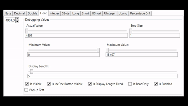
Each control implementation is specific for a certain .Net data type:
| Data Type | Control |
| :--- | :--- |
| byte | ByteUpDown control|
| decimal | DecimalUpDown control|
| double | DoubleUpDown control|
| float | FloatUpDown control|
| integer | IntegerUpDown control|
| long | LongUpDown control|
| sbyte | SbyteUpDown control|
| short | ShortUpDown control|
| ushort | UshortUpDown control|
| uint | UintUpDown control|
| ulong | UlongUpDown control|
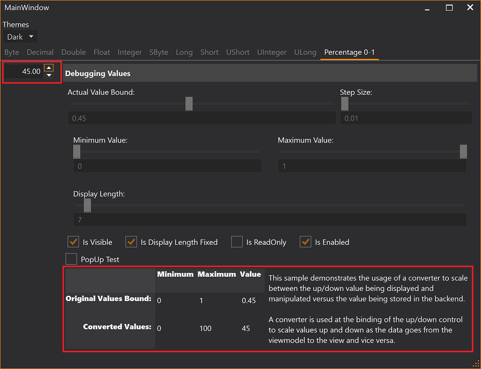
Percentages can be edit at [0-100] while backend viewmodels handles [0-1] values,
see FactorToDoubleConverter and PercentageUpDownDemo in demo clients at project site.
Controls are fully themeable. Project site contains demos for:
- Dark/Light theme and
- Generics theme
test clients.
More Features:
- Small Increments and Decrements can be configured to be 1 or any greater value than 1.
- Large Small Increments and Decrements can be configured to be 10 or any other value greater 1.
- The width of the control can be configured to be fixed (textbox will scroll inside when text is too large)
- Up/Down button is disabled when min or max limit is already reached
- Up/Down button can be configured to be invisible
- Mouse drag mode for editing value can be enabled/disabled
- SelectAll on GotFocus of TextBox
- IsReadOnly property disables the textbox portion but leaves all other funtions for Increment/Decrement available
# LargeStepSize and StepSize
There are mouse and keyboard input methods that support 2 different configurable increment/decrement values.
## Mouse Drag Mode
The user can hover the mouse over the textbox portion of the control and:
- left click/drag vertically or
- left click/drag horizontally
to change the current value with the size configured in *StepSize* or *LargeStepSize* dependency property.
## Mouse Wheel
The user can hover the mouse over the textbox portion and spin the mouse wheel with:
- no modifier key pressed or
- a modifier key pressed
to change the current value with the size configured in *StepSize* or *LargeStepSize* dependency property.
The modifier key for changing the value with *LargeStepSize* can be configured in the
*MouseWheelAccelaratorKey* dependency property.
## Cursor Keys
The user can click into the textbox portion of the control and:
- press cursor left or right or
- press cursor up and down
to change the current value with the size configured in *StepSize* or *LargeStepSize* dependency property.
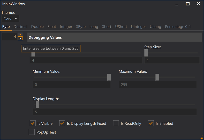
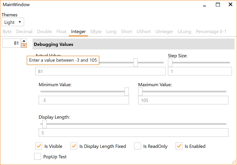
# Demo Applications
There is a demo application that shows the usage of the control (Light/Black themes enabled) and documents the features,
such as, the ability to configure a minimum and maximum value that can be used to keep the resulting
value within a given bound.
## Theming
Load *Light* or *Dark* brush resources in you resource dictionary to take advantage of existing definitions.
```XAML
```
```XAML
```
These definitions do not theme all controls used within this library. You should use a standard theming library, such as:
- [MahApps.Metro](https://github.com/MahApps/MahApps.Metro),
- [MLib](https://github.com/Dirkster99/MLib), or
- [MUI](https://github.com/firstfloorsoftware/mui)
to also theme standard elements, such as, button and textblock etc.
Visit the project's [Wiki](https://github.com/Dirkster99/NumericUpDownLib/wiki) for more details.