https://github.com/dogusteknoloji/compose-date-picker
Android DatePicker with month and year build with Compose UI
https://github.com/dogusteknoloji/compose-date-picker
android compose-ui datepicker kotlin-android
Last synced: 9 months ago
JSON representation
Android DatePicker with month and year build with Compose UI
- Host: GitHub
- URL: https://github.com/dogusteknoloji/compose-date-picker
- Owner: DogusTeknoloji
- License: mit
- Created: 2021-10-13T07:40:37.000Z (over 4 years ago)
- Default Branch: main
- Last Pushed: 2022-12-22T11:01:40.000Z (over 3 years ago)
- Last Synced: 2025-07-20T05:53:20.683Z (11 months ago)
- Topics: android, compose-ui, datepicker, kotlin-android
- Language: Kotlin
- Homepage:
- Size: 527 KB
- Stars: 66
- Watchers: 6
- Forks: 8
- Open Issues: 2
-
Metadata Files:
- Readme: README.md
- License: LICENSE
Awesome Lists containing this project
README
# Compose Date Picker - Select month and year
[](https://jitpack.io/#DogusTeknoloji/compose-date-picker)
Compose Date Picker tries to offer you the year and month pickers which you can customize for your requirements. The library complately written with **Jetpack Compose**.
Support for Android 5.0 (API level 21) and up.
**Screenshots**
| 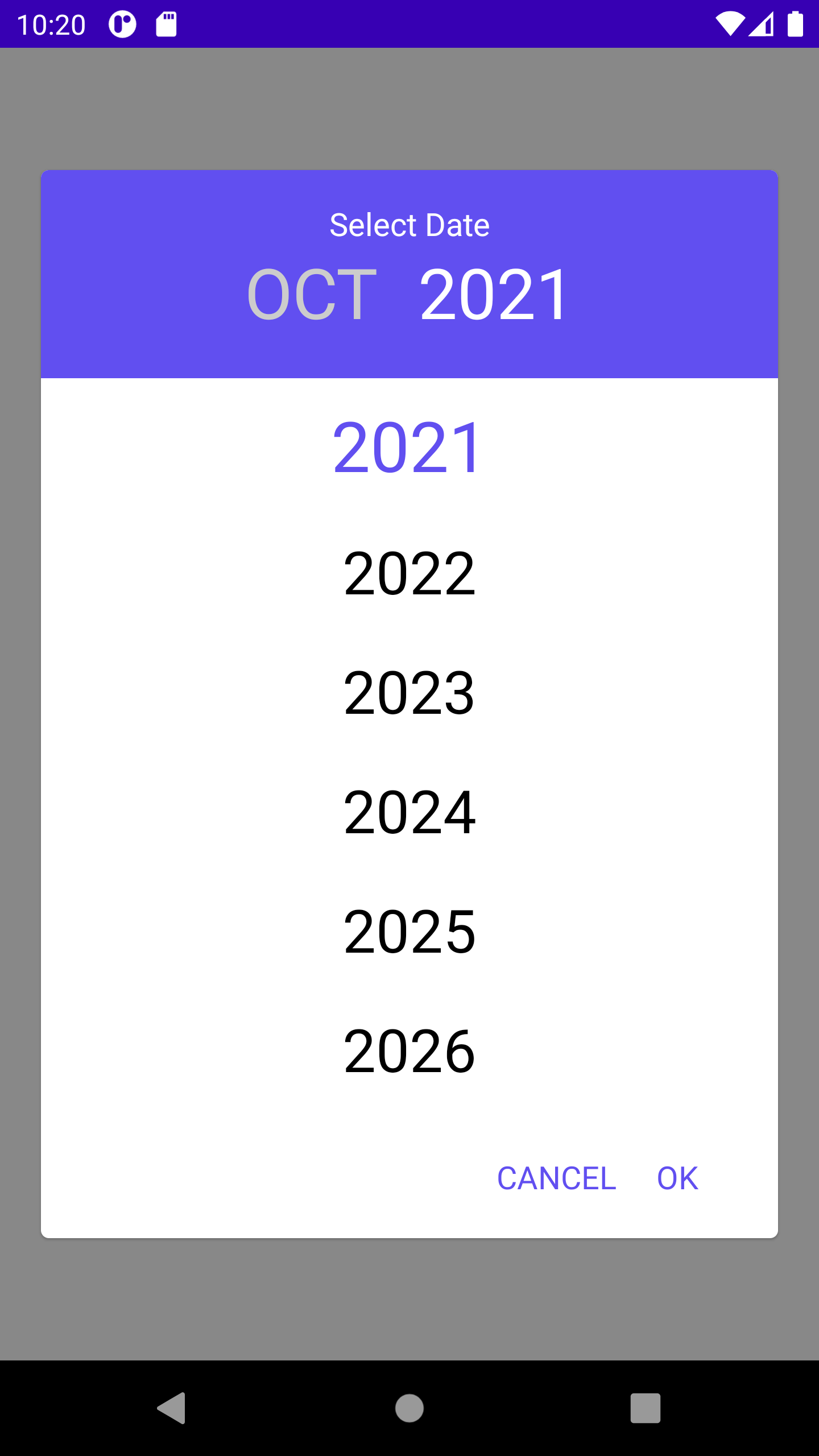 | 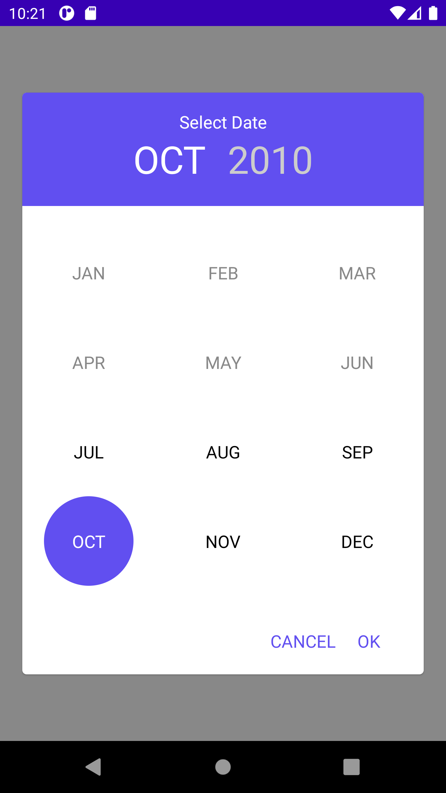 |
|--|--|
|  | .png) |
|||
| .png) | .png)
## Implementation
Add it in your root build.gradle at the end of repositories:
```gradle
allprojects {
repositories {
...
maven { url 'https://jitpack.io' }
}
}
```
The easiest way to add the Compose Date Picker library to your project is by adding it as a dependency to your `build.gradle`
```gradle
dependencies {
implementation 'com.github.DogusTeknoloji:compose-date-picker:1.1.0'
}
```
## Usage Compose Date Picker
ComposeCalendar(
minDate: Date? = null, // Set min selectable date
maxDate: Date? = null, // Set max selectable date
locale: Locale = Locale.getDefault(), // Set locale for localization
title: String = "", // Set title
listener: SelectDateListener, // Set Listener for selected date
calendarType: CalendarType = CalendarType.MONTH_AND_YEAR, // Set calendar type for ui type
themeColor: Color = Color(0xFF614FF0), // Set picker color
unselectedColor: Color = Color.White, // Set unselectedText color, when using dark mode you need to handle it
negativeButtonTitle:String = "CANCEL", // Set negative button text
positiveButtonTitle:String = "OK", // Set positive button text
monthViewType: MonthViewType? = MonthViewType.ONLY_MONTH // Set month view type
)
**Listener**
interface SelectDateListener {
fun onDateSelected(date: Date)
fun onCanceled()
}
**MonthViewType**
enum class MonthViewType {
ONLY_MONTH,
ONLY_NUMBER,
ONLY_NUMBER_ONE_COLUMN, // Just like Year view
BOTH_NUMBER_AND_MONTH
}
**CalendarType**
enum class CalendarType {
ONLY_MONTH,
ONLY_YEAR,
MONTH_AND_YEAR,
ONE_SCREEN_MONTH_AND_YEAR
}
**Compose Sample**
val calendar = Calendar.getInstance()
calendar.set(Calendar.YEAR, 2010)
calendar.set(Calendar.MONTH, 6)
val calendarMax = Calendar.getInstance()
calendarMax.set(Calendar.YEAR, 2032)
calendarMax.set(Calendar.MONTH, 9)
Box(Modifier
.fillMaxSize()
.background(color = Color.Gray), contentAlignment = Alignment.Center) {
ComposeCalendar(minDate = calendar.time,
maxDate = calendarMax.time,
locale = Locale("en"),
title = "Select Date",
listener = object : SelectDateListener {
override fun onDateSelected(date: Date) {
Log.i("DATE", date.toString())
}
override fun onCanceled() {
setOpen(false)
}
})
}
**XML Layout Sample**
//XML Layout
//Activity-Fragment
binding.composeDatePickerView.apply{
setContent{
ComposeCalendar(minDate = calendar.time,
maxDate = calendarMax.time,
locale = Locale("en"),
title = "Select Date",
listener = object : SelectDateListener {
override fun onDateSelected(date: Date) {
Log.i("DATE", date.toString())
}
override fun onCanceled() {
setOpen(false)
}
})
}
}
Design inspired by https://github.com/premkumarroyal/MonthAndYearPicker