https://github.com/douglasjunior/react-native-simple-dialogs
⚛ Cross-platform React Native dialogs based on the Modal component
https://github.com/douglasjunior/react-native-simple-dialogs
android cross-platform dialog hacktoberfest ios modal popup react-native
Last synced: about 1 year ago
JSON representation
⚛ Cross-platform React Native dialogs based on the Modal component
- Host: GitHub
- URL: https://github.com/douglasjunior/react-native-simple-dialogs
- Owner: douglasjunior
- License: mit
- Created: 2017-06-18T17:57:06.000Z (about 9 years ago)
- Default Branch: master
- Last Pushed: 2025-04-12T01:14:13.000Z (over 1 year ago)
- Last Synced: 2025-04-12T02:29:38.001Z (over 1 year ago)
- Topics: android, cross-platform, dialog, hacktoberfest, ios, modal, popup, react-native
- Language: TypeScript
- Homepage: https://www.npmjs.com/package/react-native-simple-dialogs
- Size: 1.7 MB
- Stars: 413
- Watchers: 5
- Forks: 56
- Open Issues: 3
-
Metadata Files:
- Readme: README.md
- Funding: .github/FUNDING.yml
- License: LICENSE
Awesome Lists containing this project
- awesome-react-native - react-native-simple-dialogs ★97 - Cross-platform simple dialogs for React Native based on the Modal component. (Components / UI)
- awesome-react-native - react-native-simple-dialogs - Cross-platform simple dialogs for React Native based on the Modal component.  (Components / Dialog/Modal/Alert)
- awesome-reactnative-ui - react-native-simple-dialogs - platform simple dialogs for React Native based on the Modal component.|<ul><li>Last updated : This week</li><li>Stars : 124</li><li>Open issues : 6</li></ul>|| (Others)
- awesome-react-native - react-native-simple-dialogs ★97 - Cross-platform simple dialogs for React Native based on the Modal component. (Components / UI)
- fucking-awesome-react-native - react-native-simple-dialogs ★97 - Cross-platform simple dialogs for React Native based on the Modal component. (Components / UI)
- awesome-react-native - react-native-simple-dialogs ★97 - Cross-platform simple dialogs for React Native based on the Modal component. (Components / UI)
- awesome-react-native - react-native-simple-dialogs ★97 - Cross-platform simple dialogs for React Native based on the Modal component. (Components / UI)
- awesome-reactnative-ui - react-native-simple-dialogs - platform simple dialogs for React Native based on the Modal component.|<ul><li>Last updated : This week</li><li>Stars : 124</li><li>Open issues : 6</li></ul>|| (Others)
README
# React Native Simple Dialogs
[](https://github.com/douglasjunior/react-native-simple-dialogs/blob/master/LICENSE)
[](https://www.npmjs.com/package/react-native-simple-dialogs?activeTab=versions)
[](https://www.npmjs.com/package/react-native-simple-dialogs)
⚛ Cross-platform React Native dialogs based on the Modal component.
## Features
- [Custom Dialog](#custom-dialog)
- [Confirm Dialog](#confirm-dialog)
- [Progress Dialog](#progress-dialog)
## Expo Snack
An
[Expo Demo Link](https://snack.expo.io/@douglasjunior/react-native-simple-dialogs-example)
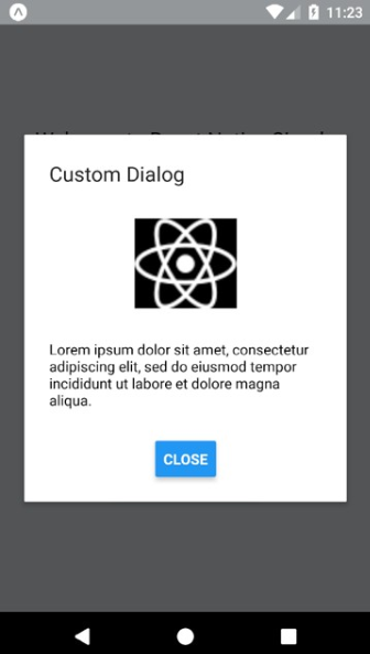
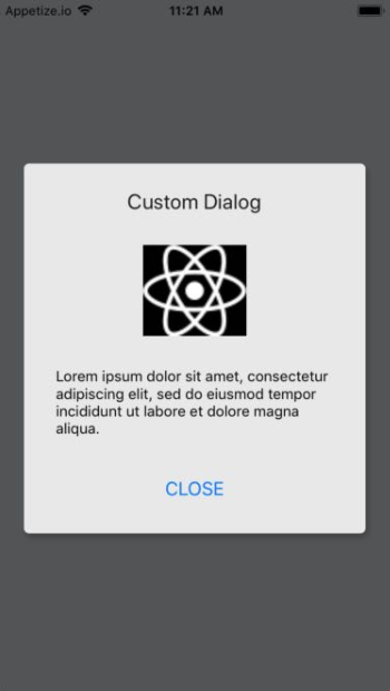
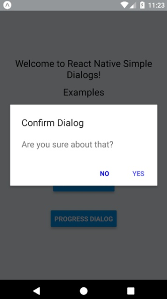
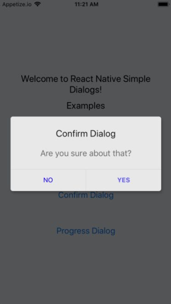
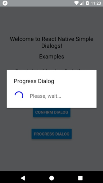
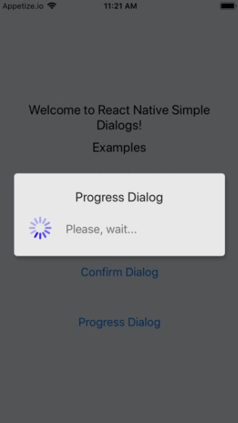
## Screenshots
| Android | iOS |
| - | - |
|  |
|  |
|
|  |
|  |
|
|  |
|  |
|
## Requirements
- React Native >= 0.44.0
## NOTES
- for RN 0.58.0 or later use react-native-simple-dialogs@latest
- for RN 0.56.0 ... 0.57.8 use react-native-simple-dialogs@1.0.0
- for RN 0.44.0 ... 0.55.4, use react-native-simple-dialogs@0.3.1
## Install
```bash
yarn add react-native-simple-dialogs
```
Or
```bash
npm i -S react-native-simple-dialogs
```
## Use
### Custom Dialog
```jsx
import { Dialog } from 'react-native-simple-dialogs';
this.setState({dialogVisible: false})} >
// your content here
```
#### Available props
| Name | Type | Default | Description |
| --------------------------- | --------------------------------------------------------------------------------------------------- | ---------- | ----------------------------------------------------------------------------------------------------------------------------------------------------------- |
| visible | Boolean | false | Show the modal? |
| onRequestClose | Function | null | Callback that's called when users taps the hardware back button on Android |
| animationType | Enum('none', 'slide', 'fade') | 'none' | Controls how the modal animates |
| onShow | Function | null | Callback that's called once the modal has been shown |
| onOrientationChange | Function | null | Callback that's called when the orientation change while the modal is being displayed on iOS |
| supportedOrientations | Array of Enum('portrait', 'portrait-upside-down', 'landscape', 'landscape-left', 'landscape-right') | 'portrait' | Allowed orientation while modals is being shown. More info at [react-native docs](https://facebook.github.io/react-native/docs/modal#supportedorientations) |
| statusBarTranslucent | Boolean | null | Determines whether your modal should go under the system statusbar. More info at [react-native docs](https://facebook.github.io/react-native/docs/modal#statusbartranslucent-android) |
| onTouchOutside | Function | null | Callbac that's called when users tap outside the shown modal |
| title | String | null | Modal's title |
| titleStyle | [Text StyleSheet](https://facebook.github.io/react-native/docs/text-style-props) | null | Custom text style object for modal's title |
| dialogStyle | [View StyleSheet](https://facebook.github.io/react-native/docs/view-style-props) | null | Custom view style for dialog box |
| contentStyle | [View StyleSheet](https://facebook.github.io/react-native/docs/view-style-props) | null | Custom view style for dialog content wrapper |
| buttonsStyle | [View StyleSheet](https://facebook.github.io/react-native/docs/view-style-props) | null | Custom view style for dialog button wrapper |
| overlayStyle | [View StyleSheet](https://facebook.github.io/react-native/docs/view-style-props) | null | Custom view style for dialog overlay |
| buttons | React Node | null | Modal button component |
| keyboardDismissMode | Enum('none', 'on-drag', 'interactive') | null | [Determines whether the keyboard gets dismissed in response to a drag.](https://facebook.github.io/react-native/docs/scrollview#keyboarddismissmode) |
| keyboardShouldPersistTaps | Enum('always', 'never', 'handled', false, true) | null | [Determines when the keyboard should stay visible after a tap.](https://facebook.github.io/react-native/docs/scrollview#keyboardshouldpersisttaps) |
### Confirm Dialog
```jsx
import { ConfirmDialog } from 'react-native-simple-dialogs';
// with message
this.setState({dialogVisible: false})}
positiveButton={{
title: "YES",
onPress: () => alert("Yes touched!")
}}
negativeButton={{
title: "NO",
onPress: () => alert("No touched!")
}}
/>
// with custom content
this.setState({dialogVisible: false})}
positiveButton={{
title: "OK",
onPress: () => alert("Ok touched!")
}} >
// your content here
```
#### Available props
| Name | Type | Default | Description |
| ----------------- | -------------------------------------------------------------------------------- | ------------ | --------------------------------------------------------------------------------------------- |
| ...{Dialog.props} | Dialog Props | null | Same props as Dialog Component |
| message | String | null | Message shown in the confirm dialog |
| messageStyle | [Text StyleSheet](https://facebook.github.io/react-native/docs/text-style-props) | null | Custom text style for message |
| negativeButton | Button Props | null | Button element object to describe the negative button. See below for detailed shape of button |
| positiveButton | Button Props | **REQUIRED** | Button element object to describe the positive button. See below for detailed shape of button |
##### Button props
| Name | Type | Default |
| ---------- | -------------------------------------------------------------------------------- | ------------ |
| title | String | **REQUIRED** |
| onPress | Function | **REQUIRED** |
| disabled | Boolean | null |
| titleStyle | [Text StyleSheet](https://facebook.github.io/react-native/docs/text-style-props) | null |
| style | [View StyleSheet](https://facebook.github.io/react-native/docs/view-style-props) | null |
### Progress Dialog
```jsx
import { ProgressDialog } from 'react-native-simple-dialogs';
```
#### Available props
| Name | Type | Default | Description |
| ---------------------- | -------------------------------------------------------------------------------- | ------------ | ------------------------------------------------------- |
| ...{Dialog.props} | Dialog Props | null | Same props as Dialog Component |
| message | String | null | Message shown in the progress dialog |
| messageStyle | [Text StyleSheet](https://facebook.github.io/react-native/docs/text-style-props) | null | Custom text style for message |
| activityIndicatorColor | color | null | The foreground color of the spinner |
| activityIndicatorSize | enum('small', 'large'), number | null | Size of the indicator. Number only supported on Android |
| activityIndicatorStyle | [View StyleSheet](https://facebook.github.io/react-native/docs/view-style-props) | null | Custom style for the activity indicator |
More info on the [sample project](https://github.com/douglasjunior/react-native-simple-dialogs/blob/master/Sample/src/App.js).
## Contribute
New features, bug fixes and improvements are welcome! For questions and suggestions use the [issues](https://github.com/douglasjunior/react-native-simple-dialogs/issues).

[](https://www.paypal.com/cgi-bin/webscr?cmd=_s-xclick&hosted_button_id=E32BUP77SVBA2)
## Star History
[](https://star-history.com/#douglasjunior/react-native-simple-dialogs)
## License
```
The MIT License (MIT)
Copyright (c) 2017 Douglas Nassif Roma Junior
```
See the full [license file](https://github.com/douglasjunior/react-native-simple-dialogs/blob/master/LICENSE).